Imagine creating a timeline of your country’s whole history stretching back to its inception.
It would be no small task, and simply weighing the relative importance of so many great people, technological achievements, and pivotal events would be a tiny miracle in itself.
While that seems like a challenge, imagine going a few steps further. Instead of a timeline for just one country, what about creating a graphical timeline showing the history of the entire world over a 4,000 year time period, all while having no access to computers or the internet?
An All-Encompassing Timeline?
Today’s infographic, created all the way back in 1931 by a man named John B. Sparks, maps the ebb and flow of global power going all the way back to 2,000 B.C. on one coherent timeline.
View a high resolution version of this graphic
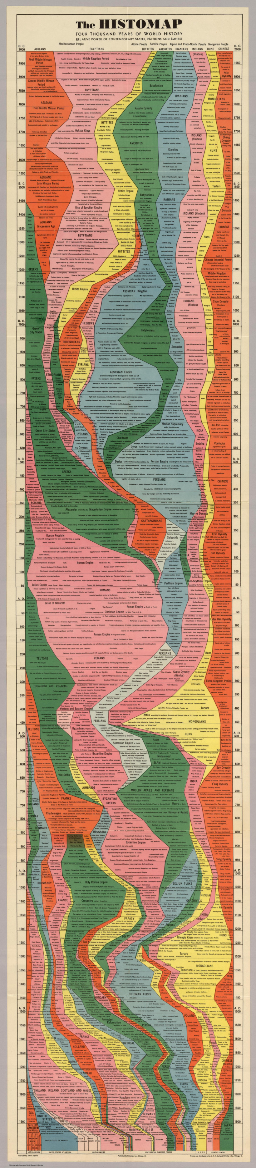
Histomap, published by Rand McNally in 1931, is an ambitious attempt at fitting a mountain of historical information onto a five-foot-long poster. The poster cost $1 at the time, which would equal approximately $18 when accounting for inflation.
Although the distribution of power is not quantitatively defined on the x-axis, it does provide a rare example of looking at historic civilizations in relative terms. While the Roman Empire takes up a lot of real estate during its Golden Age, for example, we still get a decent look at what was happening in other parts of the world during that period.
The visualization is also effective at showing the ascent and decline of various competing states, nations, and empires. Did Sparks see world history as a zero-sum exercise; a collection of nations battling one another for control over scarce territory and resources?
Timeline Caveats
Crowning a world leader at certain points in history is relatively easy, but divvying up influence or power to everyone across 4,000 years requires some creativity, and likely some guesswork, as well. Some would argue that the lack of hard data makes it impossible to draw these types of conclusions (though there have been other more quantitative approaches.)
Another obvious criticism is that the measures of influence are skewed in favor of Western powers. China’s “seam”, for example, is suspiciously thin throughout the length of the timeline. Certainly, the creator’s biases and blind spots become more apparent in the information-abundant 21st century.
Lastly, Histomap refers to various cultural and racial groups using terms that may seem rather dated to today’s viewers.
The Legacy of Histomap
John Spark’s creation is an admirable attempt at making history more approachable and entertaining. Today, we have seemingly limitless access to information, but in the 1930s an all encompassing timeline of history would have been incredibly useful and groundbreaking. Indeed, the map’s publisher characterized the piece as a useful tool for examining the correlation between different empires during points in history.

Critiques aside, work like this paved the way for the production of modern data visualizations and charts that help people better understand the world around them today.
Without a map who would attempt to study geography? –John B. Sparks
This post was first published in 2017. We have since updated it, adding in new content for 2021.
Mapped: Gas Prices by U.S. State in 2026
Gas prices may be high nationwide, but living in one state or another can amount to over $30 difference at the pump.

Published
September 29, 2026 9:53 am

Where Gas Is Most Expensive in America
Key Takeaways
- The average price of gas in the U.S. is $4.48 per gallon as of September 2026, up more than a dollar from the previous year.
- California has the highest average gas price in the country at $6.24 per gallon, while Texas and Indiana tie for the lowest at $3.96.
- Filling a 15-gallon tank costs about $34 more in California than in the two cheapest states.
Where you fill up can make a significant difference in what you pay at the pump.
This map shows average regular gasoline prices across the U.S. using September 2026 data from AAA Fuel Tracker. Prices are per gallon and rounded to the nearest cent.
Where Gas Prices Run Highest and Lowest
The broader divide is regional. The highest fuel prices are concentrated in the West, while much of the South sits below the $4.48 national average.
The table below ranks prices from highest to lowest in the 50 states and Washington, D.C.
| Rank | State or District | Average Gas Price in September 2026 ($) |
|---|---|---|
| 1 | California | 6.24 |
| 2 | Hawaii | 5.57 |
| 3 | Washington | 5.55 |
| 4 | Nevada | 5.37 |
| 5 | Oregon | 5.09 |
| 6 | Alaska | 5.07 |
| 7 | Idaho | 5.00 |
| 8 | Utah | 4.98 |
| 9 | Illinois | 4.85 |
| 10 | Michigan | 4.81 |
| 11 | Arizona | 4.78 |
| 12 | Montana | 4.61 |
| 13 | Pennsylvania | 4.55 |
| 13 | Wyoming | 4.55 |
| 15 | New Mexico | 4.53 |
| 16 | Connecticut | 4.49 |
| 16 | New York | 4.49 |
| 18 | Vermont | 4.46 |
| 19 | District of Columbia | 4.43 |
| 19 | Maine | 4.43 |
| 19 | Ohio | 4.43 |
| 22 | Massachusetts | 4.40 |
| 22 | Nebraska | 4.40 |
| 22 | New Jersey | 4.40 |
| 25 | Rhode Island | 4.39 |
| 25 | Wisconsin | 4.39 |
| 27 | Florida | 4.38 |
| 28 | Minnesota | 4.37 |
| 28 | New Hampshire | 4.37 |
| 28 | West Virginia | 4.37 |
| 31 | Delaware | 4.35 |
| 32 | Iowa | 4.33 |
| 32 | Maryland | 4.33 |
| 34 | South Dakota | 4.32 |
| 35 | Colorado | 4.31 |
| 36 | North Dakota | 4.26 |
| 37 | Virginia | 4.24 |
| 38 | Missouri | 4.18 |
| 39 | Kansas | 4.17 |
| 40 | Kentucky | 4.16 |
| 41 | North Carolina | 4.13 |
| 42 | Oklahoma | 4.12 |
| 43 | Georgia | 4.11 |
| 44 | Alabama | 4.09 |
| 45 | Arkansas | 4.06 |
| 45 | Tennessee | 4.06 |
| 47 | South Carolina | 4.05 |
| 48 | Louisiana | 4.03 |
| 49 | Mississippi | 4.00 |
| 50 | Indiana | 3.96 |
| 50 | Texas | 3.96 |
| -- | 🇺🇸 U.S. National Average | 4.48 |
Part of the difference reflects the journey fuel takes to reach a station. Longer distances from refineries, ports, and distribution terminals can mean higher transportation costs, which can push up retail prices.
States such as Louisiana and Texas also benefit from extensive oil and refining infrastructure, helping keep distribution costs relatively low.
Why California Costs So Much More
California’s premium goes beyond taxes. The Golden State requires a special gasoline blend designed to reduce air pollution, which costs more to produce. State environmental programs also add compliance costs for fuel suppliers, alongside state and local taxes.
The state’s specialized fuel comes from a relatively limited pool of suppliers. California is geographically separated from major U.S. refining centers along the Gulf Coast, and only some refineries elsewhere can produce gasoline that meets its requirements. Bringing in additional supply is therefore more complicated than simply sourcing cheaper fuel from another state.
This becomes especially important when a refinery shuts down for maintenance or experiences an unexpected outage. Replacement supplies can take time to arrive, leaving the market more vulnerable to price spikes. The same factors that keep California expensive under normal conditions can make disruptions more painful for drivers.
No Relief This Fall
Gas prices usually ease after the summer driving season. Demand falls as travel slows, while cooler weather allows refiners to use less expensive gasoline components that would evaporate too easily in summer heat. The seasonal change in fuel requirements can help reduce costs even without a decline in global oil prices.
This September, however, that usual pattern has been disrupted. Expensive crude oil and continued volatility in the Strait of Hormuz have pushed up prices at the pump. The national average of $4.48 per gallon is the highest on record for late September.
Local advantages offer only partial protection from those pressures. Gasoline prices generally track crude oil costs, so even states with lower distribution costs and taxes remain exposed to oil-market disruptions.
Learn More on the Voronoi App
To compare these prices with major global events, check out Oil Prices and Geopolitical Events on Voronoi.
Where the Richest 0.1% Hold More Wealth Than the Bottom 80%
In just 27 countries around the world, the richest of the rich own more wealth than the bottom 80% of the population combined.
Published
September 29, 2026 7:09 am

Where Does the Top 0.1% Own More Than the Bottom 80%?
Key Takeaways
- In 27 countries, the wealthiest 0.1% own more than the bottom 80% combined.
- This group includes some of the world’s largest countries, including Brazil, Russia, India, South Africa, and the United States.
- Sweden stands out as the only EU country where the top 0.1% crosses this threshold.
How concentrated does wealth have to become before the richest 0.1% own more than the bottom 80% of the population combined?
This world map identifies the countries where that threshold has been crossed, using the latest World Inequality Database estimates (2024). The estimates cover personal wealth among adults aged 20 and older in each country.
Where Wealth Is Most Concentrated
The countries shown in red span economies with very different histories and institutions, from the United States and South Africa to India and Sweden.
Even within this group, there is wide variation in the degree of wealth concentration. In South Africa, for example, the bottom 80% hold less than 5% of the country’s wealth. Meanwhile, the richest 0.1% hold nearly 30%, a share exceeded only by Russia among these 27 countries.
The table below ranks the 27 countries by the share of wealth held by their richest 0.1%.
| Rank | Country | Top 0.1% wealth share | Bottom 80% wealth share |
|---|---|---|---|
| 1 | 🇷🇺 Russia | 32.21% | 14.59% |
| 2 | 🇿🇦 South Africa | 29.95% | 4.70% |
| 3 | 🇮🇳 India | 29.69% | 22.92% |
| 4 | 🇸🇿 Eswatini | 28.36% | 14.22% |
| 5 | 🇧🇿 Belize | 22.56% | 19.07% |
| 6 | 🇲🇽 Mexico | 21.93% | 15.62% |
| 7 | 🇮🇶 Iraq | 21.87% | 14.88% |
| 8 | 🇳🇦 Namibia | 21.56% | 15.15% |
| 9 | 🇨🇱 Chile | 21.52% | 15.61% |
| 10 | 🇧🇷 Brazil | 21.46% | 15.69% |
| 11 | 🇱🇧 Lebanon | 21.11% | 20.30% |
| 12 | 🇿🇼 Zimbabwe | 21.06% | 15.91% |
| 13 | 🇧🇼 Botswana | 21.05% | 15.60% |
| 14 | 🇨🇴 Colombia | 21.00% | 15.64% |
| 15 | 🇾🇪 Yemen | 20.78% | 15.84% |
| 16 | 🇲🇿 Mozambique | 20.73% | 15.88% |
| 17 | 🇬🇪 Georgia | 20.68% | 20.66% |
| 18 | 🇵🇪 Peru | 20.50% | 16.07% |
| 19 | 🇦🇴 Angola | 20.40% | 16.16% |
| 20 | 🇧🇭 Bahrain | 20.15% | 16.38% |
| 21 | 🇶🇦 Qatar | 19.89% | 16.60% |
| 22 | 🇴🇲 Oman | 19.55% | 16.88% |
| 23 | 🇿🇲 Zambia | 18.98% | 17.36% |
| 24 | 🇨🇬 Republic of the Congo | 18.65% | 17.64% |
| 25 | 🇺🇸 U.S. | 18.38% | 15.82% |
| 26 | 🇺🇾 Uruguay | 18.30% | 14.38% |
| 27 | 🇸🇪 Sweden | 13.86% | 10.84% |
Percentages of total wealth do not add up to 100% because the remainder is held by people between the 80th and 99.9th percentiles.
Wealth inequality and income inequality measure different things. Income captures money earned over a period of time, while wealth reflects accumulated assets such as homes, businesses, investments, and savings, minus debts. Inheritance can therefore shape wealth disparities long before differences in annual earnings do.
The Persistence of Wealth Gaps
Owning assets creates opportunities that wages alone do not. A home can appreciate, shares can pay dividends, and a business can generate profits. Reinvesting those returns can build wealth further, while someone without savings must first create room in their budget to begin accumulating assets.
South Africa offers a striking example of how durable these differences can be. One study covering 1993–2017 found no sustained decline in wealth inequality after the end of apartheid. Financial assets dominated the portfolios of the richest 0.1%, while housing and pensions were the main holdings of the bottom 90%.
These findings point to inheritance and relative starting positions as important factors. Accumulating wealth over a lifetime does not necessarily erase advantages established at the beginning, helping explain why wealth gaps can persist across generations.
Why Does Sweden Stand Out?
Countries such as Brazil, Colombia, or India may be less surprising in this context, but Sweden stands apart because of its reputation for relatively low income inequality and a strong social safety net.
However, relatively equal incomes can coexist with concentrated asset ownership. Generous healthcare, childcare, education, and retirement programs mean many lower-income Swedes have less need to accumulate private financial assets to pay for essential services.
Sweden’s tax system also treats income and accumulated wealth differently. The country abolished its gift and inheritance taxes in 2004 and its net wealth tax in 2007.
No other country in the European Union appears in this group. However, that does not necessarily mean other EU countries have broadly equal wealth distributions.
The Top 0.1% in Wealth vs. Bottom 80% For Every Country
The table below lists countries and territories worldwide alongside the shares of wealth held by their top 0.1% and bottom 80%.
| Country/Territory | Top 0.1% wealth share | Bottom 80% wealth share |
|---|---|---|
| 🇦🇫 Afghanistan | 9.45% | 25.72% |
| 🇦🇱 Albania | 8.70% | 26.63% |
| 🇩🇿 Algeria | 12.49% | 22.79% |
| 🇦🇩 Andorra | 8.95% | 26.32% |
| 🇦🇮 Anguilla | 12.31% | 22.95% |
| 🇦🇬 Antigua and Barbuda | 12.28% | 22.97% |
| 🇦🇷 Argentina | 11.24% | 24.40% |
| 🇦🇲 Armenia | 10.76% | 25.47% |
| 🇦🇼 Aruba | 12.31% | 22.95% |
| 🇦🇺 Australia | 10.02% | 26.12% |
| 🇦🇹 Austria | 14.62% | 23.53% |
| 🇦🇿 Azerbaijan | 9.11% | 26.12% |
| 🇧🇸 Bahamas | 14.61% | 20.99% |
| 🇧🇩 Bangladesh | 9.61% | 25.55% |
| 🇧🇧 Barbados | 13.49% | 22.67% |
| 🇧🇾 Belarus | 8.47% | 26.96% |
| 🇧🇪 Belgium | 4.12% | 31.18% |
| 🇧🇯 Benin | 9.96% | 25.17% |
| 🇧🇲 Bermuda | 12.02% | 23.21% |
| 🇧🇹 Bhutan | 9.62% | 25.54% |
| 🇧🇴 Bolivia | 14.60% | 21.00% |
| 🇧🇶 Bonaire | 12.24% | 23.01% |
| 🇧🇦 Bosnia and Herzegovina | 8.71% | 26.62% |
| 🇧🇳 Brunei Darussalam | 8.93% | 26.34% |
| 🇧🇬 Bulgaria | 11.02% | 24.75% |
| 🇧🇫 Burkina Faso | 11.17% | 23.98% |
| 🇧🇮 Burundi | 11.03% | 24.11% |
| 🇨🇻 Cabo Verde | 12.38% | 22.88% |
| 🇰🇭 Cambodia | 10.56% | 24.56% |
| 🇨🇲 Cameroon | 11.22% | 23.93% |
| 🇨🇦 Canada | 14.81% | 30.63% |
| 🇰🇾 Cayman Islands | 12.33% | 22.93% |
| 🇨🇫 Central African Republic | 13.19% | 22.19% |
| 🇹🇩 Chad | 10.75% | 24.37% |
| 🇨🇳 China | 17.08% | 21.17% |
| 🇰🇲 Comoros | 13.19% | 22.18% |
| 🇨🇷 Costa Rica | 13.08% | 22.28% |
| 🇭🇷 Croatia | 8.90% | 26.56% |
| 🇨🇺 Cuba | 10.66% | 24.47% |
| 🇨🇼 Curacao | 12.33% | 22.93% |
| 🇨🇾 Cyprus | 12.34% | 20.86% |
| 🇨🇿 Czech Republic | 13.68% | 25.60% |
| 🇨🇮 Côte d’Ivoire | 10.09% | 25.03% |
| 🇨🇩 DR Congo | 15.45% | 20.29% |
| 🇩🇰 Denmark | 10.60% | 29.37% |
| 🇩🇯 Djibouti | 12.82% | 22.50% |
| 🇩🇲 Dominica | 12.29% | 22.96% |
| 🇩🇴 Dominican Republic | 10.34% | 24.78% |
| 🇪🇨 Ecuador | 10.47% | 24.65% |
| 🇪🇬 Egypt | 13.95% | 22.93% |
| 🇸🇻 El Salvador | 10.18% | 24.94% |
| 🇬🇶 Equatorial Guinea | 10.37% | 24.75% |
| 🇪🇷 Eritrea | 9.43% | 25.74% |
| 🇪🇪 Estonia | 14.56% | 18.76% |
| 🇪🇹 Ethiopia | 9.44% | 25.74% |
| 🇫🇲 Micronesia | 12.09% | 23.14% |
| 🇫🇯 Fiji | 11.98% | 23.24% |
| 🇫🇮 Finland | 6.11% | 26.07% |
| 🇫🇷 France | 13.34% | 25.43% |
| 🇵🇫 French Polynesia | 12.01% | 23.21% |
| 🇬🇦 Gabon | 9.93% | 25.20% |
| 🇬🇲 Gambia | 11.38% | 23.78% |
| 🇩🇪 Germany | 13.35% | 25.46% |
| 🇬🇭 Ghana | 12.20% | 23.04% |
| 🇬🇮 Gibraltar | 8.95% | 26.31% |
| 🇬🇷 Greece | 8.26% | 22.29% |
| 🇬🇱 Greenland | 12.06% | 23.17% |
| 🇬🇩 Grenada | 12.35% | 22.91% |
| 🇬🇹 Guatemala | 14.57% | 21.02% |
| 🇬🇬 Guernsey | 8.95% | 26.31% |
| 🇬🇳 Guinea | 9.16% | 26.05% |
| 🇬🇼 Guinea-Bissau | 9.60% | 25.55% |
| 🇬🇾 Guyana | 14.58% | 21.01% |
| 🇭🇹 Haiti | 14.56% | 21.03% |
| 🇭🇳 Honduras | 14.59% | 21.00% |
| 🇭🇰 Hong Kong | 20.03% | 21.24% |
| 🇭🇺 Hungary | 16.85% | 20.42% |
| 🇮🇸 Iceland | 6.98% | 23.44% |
| 🇮🇩 Indonesia | 8.32% | 22.24% |
| 🇮🇷 Iran | 10.83% | 24.30% |
| 🇮🇪 Ireland | 7.73% | 16.05% |
| 🇮🇲 Isle of Man | 8.95% | 26.32% |
| 🇮🇱 Israel | 16.07% | 21.90% |
| 🇮🇹 Italy | 9.20% | 26.06% |
| 🇯🇲 Jamaica | 14.58% | 21.01% |
| 🇯🇵 Japan | 10.20% | 25.04% |
| 🇯🇪 Jersey | 8.95% | 26.31% |
| 🇯🇴 Jordan | 12.45% | 22.82% |
| 🇰🇿 Kazakhstan | 13.14% | 24.65% |
| 🇰🇪 Kenya | 11.06% | 24.08% |
| 🇰🇮 Kiribati | 11.97% | 23.25% |
| 🇽🇰 Kosovo | 8.61% | 26.75% |
| 🇰🇼 Kuwait | 10.18% | 24.94% |
| 🇰🇬 Kyrgyzstan | 9.80% | 25.34% |
| 🇱🇦 Laos | 11.44% | 23.73% |
| 🇱🇻 Latvia | 12.39% | 25.98% |
| 🇱🇸 Lesotho | 12.75% | 22.56% |
| 🇱🇷 Liberia | 9.89% | 25.25% |
| 🇱🇾 Libya | 11.02% | 24.12% |
| 🇱🇮 Liechtenstein | 10.31% | 25.92% |
| 🇱🇹 Lithuania | 9.96% | 25.17% |
| 🇱🇺 Luxembourg | 17.18% | 26.98% |
| 🇲🇴 Macao | 9.62% | 25.53% |
| 🇲🇬 Madagascar | 10.93% | 24.21% |
| 🇲🇼 Malawi | 11.59% | 23.59% |
| 🇲🇾 Malaysia | 14.05% | 24.81% |
| 🇲🇻 Maldives | 9.33% | 25.86% |
| 🇲🇱 Mali | 10.23% | 24.89% |
| 🇲🇹 Malta | 4.66% | 32.44% |
| 🇲🇭 Marshall Islands | 11.97% | 23.25% |
| 🇲🇷 Mauritania | 9.40% | 25.78% |
| 🇲🇺 Mauritius | 11.10% | 24.05% |
| 🇲🇩 Moldova | 9.18% | 26.04% |
| 🇲🇨 Monaco | 17.49% | 23.85% |
| 🇲🇳 Mongolia | 9.79% | 25.35% |
| 🇲🇪 Montenegro | 8.82% | 26.49% |
| 🇲🇸 Montserrat | 12.32% | 22.93% |
| 🇲🇦 Morocco | 11.64% | 23.64% |
| 🇲🇲 Myanmar | 9.76% | 25.38% |
| 🇳🇷 Nauru | 12.05% | 23.17% |
| 🇳🇵 Nepal | 10.39% | 25.40% |
| 🇳🇱 Netherlands | 4.44% | 36.66% |
| 🇳🇨 New Caledonia | 12.05% | 23.18% |
| 🇳🇿 New Zealand | 8.92% | 26.53% |
| 🇳🇮 Nicaragua | 14.55% | 21.04% |
| 🇳🇪 Niger | 10.27% | 24.85% |
| 🇳🇬 Nigeria | 14.49% | 24.11% |
| 🇰🇵 North Korea | 9.90% | 25.24% |
| 🇲🇰 North Macedonia | 8.40% | 27.06% |
| 🇳🇴 Norway | 12.28% | 30.13% |
| 🇵🇰 Pakistan | 9.68% | 25.47% |
| 🇵🇼 Palau | 12.07% | 23.16% |
| 🇵🇸 Palestine | 14.01% | 21.49% |
| 🇵🇦 Panama | 14.55% | 21.03% |
| 🇵🇬 Papua New Guinea | 10.79% | 24.34% |
| 🇵🇾 Paraguay | 14.58% | 21.01% |
| 🇵🇭 Philippines | 13.11% | 24.04% |
| 🇵🇱 Poland | 15.17% | 22.90% |
| 🇵🇹 Portugal | 9.40% | 24.09% |
| 🇵🇷 Puerto Rico | 12.30% | 22.96% |
| 🇷🇴 Romania | 10.07% | 25.44% |
| 🇷🇼 Rwanda | 14.24% | 21.30% |
| 🇰🇳 Saint Kitts and Nevis | 20.56% | 20.77% |
| 🇱🇨 Saint Lucia | 12.35% | 22.91% |
| 🇻🇨 Saint Vincent and the Grenadines | 12.22% | 23.02% |
| 🇼🇸 Samoa | 12.08% | 23.15% |
| 🇸🇲 San Marino | 8.95% | 26.31% |
| 🇸🇹 Sao Tome and Principe | 13.28% | 22.11% |
| 🇸🇦 Saudi Arabia | 14.13% | 21.39% |
| 🇸🇳 Senegal | 10.47% | 24.65% |
| 🇷🇸 Serbia | 9.49% | 25.68% |
| 🇸🇨 Seychelles | 9.27% | 25.93% |
| 🇸🇱 Sierra Leone | 10.97% | 24.17% |
| 🇸🇬 Singapore | 14.29% | 23.53% |
| 🇸🇽 Sint Maarten (Dutch part) | 12.24% | 23.01% |
| 🇸🇰 Slovakia | 5.04% | 33.89% |
| 🇸🇮 Slovenia | 12.24% | 27.47% |
| 🇸🇧 Solomon Islands | 12.00% | 23.22% |
| 🇸🇴 Somalia | 11.51% | 23.66% |
| 🇰🇷 South Korea | 6.63% | 14.97% |
| 🇸🇸 South Sudan | 13.04% | 22.31% |
| 🇪🇸 Spain | 10.17% | 27.79% |
| 🇱🇰 Sri Lanka | 11.73% | 23.46% |
| 🇸🇩 Sudan | 10.25% | 24.87% |
| 🇸🇷 Suriname | 14.59% | 21.00% |
| 🇨🇭 Switzerland | 16.38% | 22.21% |
| 🇸🇾 Syria | 17.24% | 18.81% |
| 🇹🇼 Taiwan | 12.92% | 23.13% |
| 🇹🇯 Tajikistan | 9.65% | 25.50% |
| 🇹🇿 Tanzania | 14.09% | 21.64% |
| 🇹🇭 Thailand | 17.90% | 20.22% |
| 🇹🇱 Timor-Leste | 9.48% | 25.69% |
| 🇹🇬 Togo | 10.85% | 24.28% |
| 🇹🇴 Tonga | 12.03% | 23.20% |
| 🇹🇹 Trinidad and Tobago | 14.56% | 21.03% |
| 🇹🇳 Tunisia | 14.75% | 20.87% |
| 🇹🇲 Turkmenistan | 11.91% | 23.30% |
| 🇹🇨 Turks and Caicos Islands | 12.30% | 22.95% |
| 🇹🇻 Tuvalu | 12.06% | 23.17% |
| 🇹🇷 Türkiye | 15.40% | 20.33% |
| 🇺🇬 Uganda | 14.79% | 20.84% |
| 🇺🇦 Ukraine | 9.78% | 26.55% |
| 🇦🇪 United Arab Emirates | 12.77% | 22.75% |
| 🇬🇧 United Kingdom | 6.92% | 25.73% |
| 🇺🇿 Uzbekistan | 10.43% | 24.69% |
| 🇻🇺 Vanuatu | 12.01% | 23.21% |
| 🇻🇪 Venezuela | 15.97% | 20.67% |
| 🇻🇳 Viet Nam | 10.62% | 24.95% |
| 🇻🇬 Virgin Islands, British | 12.25% | 23.00% |
Learn More on the Voronoi App
To see how inequality in Europe is changing, check out The Euro Area Saw a Slight Decrease in Inequality Over Past 5 Years on Voronoi.