Life Expectancy vs. Healthcare Spending (1970-2023)
See visuals like this from many other data creators on our Voronoi app. Download it for free on iOS or Android and discover incredible data-driven charts from a variety of trusted sources.
Key Takeaways
- Life expectancy is one proxy for comparing health outcomes across countries.
- The U.S. spends more than twice as much per capita on healthcare as other high-income countries, yet has a lower life expectancy than the OECD average.
- Several factors—many outside the healthcare system itself—help explain this gap.
As Warren Buffett popularized: “Price is what you pay, value is what you get”.
Just because someone pays the most, doesn’t mean that they extract the biggest payoff from a product or service.
Today’s visual from Our World in Data that compares life expectancy with healthcare spending per capita hints at exactly this paradox.
Interactive Version
First of all, here’s an interactive version of the chart above to play with:
You can add and subtract countries by clicking on “Select Countries and Regions”. You can also edit the years shown.
The Data on Life Expectancy vs. Healthcare Spending
Below is the data for 51 countries for the year 2023:
| Rank | Country | Life expectancy (2023) | Health expenditure per capita (2023) |
|---|---|---|---|
| 1 | 🇯🇵 Japan | 84.71 | $4,806 |
| 2 | 🇰🇷 South Korea | 84.33 | $4,055 |
| 3 | 🇨🇭 Switzerland | 83.95 | $7,930 |
| 4 | 🇦🇺 Australia | 83.92 | $5,778 |
| 5 | 🇮🇹 Italy | 83.72 | $4,046 |
| 6 | 🇪🇸 Spain | 83.67 | $3,901 |
| 7 | 🇫🇷 France | 83.33 | $6,036 |
| 8 | 🇳🇴 Norway | 83.31 | $7,424 |
| 9 | 🇲🇹 Malta | 83.30 | $4,941 |
| 10 | 🇸🇪 Sweden | 83.26 | $6,204 |
| 11 | 🇮🇸 Iceland | 82.69 | $5,228 |
| 12 | 🇨🇦 Canada | 82.63 | $5,981 |
| 13 | 🇮🇪 Ireland | 82.41 | $5,689 |
| 14 | 🇮🇱 Israel | 82.41 | $3,154 |
| 15 | 🇵🇹 Portugal | 82.36 | $3,906 |
| 16 | 🇱🇺 Luxembourg | 82.23 | $6,078 |
| 17 | 🇳🇱 Netherlands | 82.16 | $6,273 |
| 18 | 🇧🇪 Belgium | 82.12 | $6,123 |
| 19 | 🇳🇿 New Zealand | 82.09 | $4,938 |
| 20 | 🇦🇹 Austria | 81.96 | $6,361 |
| 21 | 🇩🇰 Denmark | 81.93 | $5,823 |
| 22 | 🇫🇮 Finland | 81.91 | $5,375 |
| 23 | 🇬🇷 Greece | 81.86 | $2,943 |
| 24 | 🇨🇾 Cyprus | 81.65 | $3,869 |
| 25 | 🇸🇮 Slovenia | 81.60 | $4,118 |
| 26 | 🇩🇪 Germany | 81.38 | $7,248 |
| 27 | 🇬🇧 United Kingdom | 81.30 | $5,413 |
| 28 | 🇨🇱 Chile | 81.17 | $2,964 |
| 29 | 🇨🇷 Costa Rica | 80.80 | $1,565 |
| 30 | 🇨🇿 Czechia | 79.83 | $3,943 |
| 31 | 🇺🇸 United States | 79.30 | $12,023 |
| 32 | 🇪🇪 Estonia | 79.15 | $2,921 |
| 33 | 🇵🇱 Poland | 78.63 | $3,125 |
| 34 | 🇭🇷 Croatia | 78.58 | $2,751 |
| 35 | 🇸🇰 Slovakia | 78.34 | $2,672 |
| 36 | 🇨🇳 China | 78.20 | $1,086 |
| 37 | 🇵🇪 Peru | 77.74 | $817 |
| 38 | 🇨🇴 Colombia | 77.73 | $1,537 |
| 39 | 🇦🇷 Argentina | 77.40 | $2,850 |
| 40 | 🇹🇷 Turkey | 77.16 | $1,846 |
| 41 | 🇭🇺 Hungary | 77.02 | $2,613 |
| 42 | 🇱🇻 Latvia | 76.19 | $2,494 |
| 43 | 🇱🇹 Lithuania | 76.03 | $3,224 |
| 44 | 🇷🇴 Romania | 75.94 | $2,373 |
| 45 | 🇧🇬 Bulgaria | 75.64 | $2,612 |
| 46 | 🇲🇽 Mexico | 75.07 | $1,244 |
| 47 | 🇧🇷 Brazil | 74.87 | $1,661 |
| 48 | 🇮🇳 India | 71.70 | $290 |
| 49 | 🇺🇦 Ukraine | 71.63 | $1,429 |
| 50 | 🇮🇩 Indonesia | 71.15 | $376 |
| 51 | 🇿🇦 South Africa | 65.45 | $1,218 |
| -- | Average | 79.74 | $3,986 |
The clear takeaway is that while most high and upper-middle income countries cluster around the same trajectory, the United States is a clear outlier.
On average, the countries on the above list have a life expectancy of 79.74 years for a cost of $3,986 per person, while the U.S. has a life expectancy of 79.3 and spend of $12,023 per person.
Peer countries (Canada, UK, Germany, Japan, France, Italy) spend about half of what the U.S. does on healthcare per capita on average, but all have better life expectancy outcomes.
Why is the U.S. an Outlier?
While the U.S. excels in advanced and specialized medical care, life expectancy outcomes are held back by lifestyle and social factors rather than clinical capability.
Higher rates of obesity, chronic disease, opioid overdoses, gun violence, and traffic fatalities all weigh on average lifespan.
At the same time, healthcare access is uneven, with large gaps by income, race, and geography. As a result, additional spending often goes toward higher prices and end-of-life care, producing diminishing returns in overall life expectancy.
Learn More on the Voronoi App 
View the highest and lowest life expectancy rates around the world in this map.

This article was published as a part of Visual Capitalist's Creator Program, which features data-driven visuals from some of our favorite Creators around the world.
Healthcare
Mapped: America’s Healthiest States, Ranked
America’s healthiest states cluster in one distinct region, highlighting how social, economic, and clinical factors shape health outcomes.
Published
6 days ago
on
January 24, 2026

Mapped: America’s Healthiest States, Ranked
See visuals like this from many other data creators on our Voronoi app. Download it for free on iOS or Android and discover incredible data-driven charts from a variety of trusted sources.
Key Takeaways
- New Hampshire ranks as the healthiest state in America, followed by Massachusetts and Vermont.
- Falling in last place is Louisiana, influenced by low physical activity rates and high levels of food insecurity.
“Blue Zones” are regions of the world where people live longer and healthier lives, supported by habits that boost longevity.
Loma Linda, California is one of the few recognized Blue Zones, alongside Okinawa, Japan and Ikaria, Greece. Just as place can have a powerful influence on health outcomes, differences vary meaningfully across America.
This graphic shows the healthiest U.S. states, based on data from America’s Health Rankings Report by the UnitedHealth Foundation.
The Northeast Produces America’s Healthiest States
For the analysis, states were measured on 99 indicators such as economic hardship, smoking rates, and mortality rates. Overall values were measured in z-scores, with a score of 0 representing the national average.
Below, we show each state’s health rankings in 2025:
| Rank | State | Overall Score 2025 |
|---|---|---|
| 1 | New Hampshire | 0.99 |
| 2 | Massachusetts | 0.91 |
| 3 | Vermont | 0.91 |
| 4 | Connecticut | 0.68 |
| 5 | Utah | 0.64 |
| 6 | Minnesota | 0.63 |
| 7 | Washington | 0.61 |
| 8 | Maryland | 0.59 |
| 9 | Hawaii | 0.54 |
| 10 | Rhode Island | 0.51 |
| 11 | New Jersey | 0.51 |
| 12 | Colorado | 0.51 |
| 13 | Maine | 0.47 |
| 14 | Virginia | 0.40 |
| 15 | North Dakota | 0.37 |
| 16 | Idaho | 0.26 |
| 17 | Iowa | 0.24 |
| 18 | Delaware | 0.23 |
| 19 | Oregon | 0.21 |
| 20 | Nebraska | 0.20 |
| 21 | Wisconsin | 0.16 |
| 22 | North Carolina | 0.13 |
| 23 | South Dakota | 0.12 |
| 24 | California | 0.10 |
| 25 | New York | 0.09 |
| 26 | Pennsylvania | 0.07 |
| 27 | Kansas | 0.03 |
| 28 | Illinois | -0.03 |
| 29 | Wyoming | -0.04 |
| 30 | Florida | -0.05 |
| 31 | Montana | -0.05 |
| 32 | Arizona | -0.06 |
| 33 | Michigan | -0.08 |
| 34 | Ohio | -0.11 |
| 35 | Alaska | -0.13 |
| 36 | South Carolina | -0.18 |
| 37 | Indiana | -0.21 |
| 38 | Georgia | -0.27 |
| 39 | Missouri | -0.29 |
| 40 | Texas | -0.32 |
| 41 | New Mexico | -0.37 |
| 42 | Nevada | -0.39 |
| 43 | Kentucky | -0.50 |
| 44 | Tennessee | -0.55 |
| 45 | Oklahoma | -0.62 |
| 46 | West Virginia | -0.73 |
| 47 | Alabama | -0.75 |
| 48 | Mississippi | -0.77 |
| 49 | Arkansas | -0.83 |
| 50 | Louisiana | -0.94 |
The small state of New Hampshire leads the nation with a score of 0.99.
The state’s social and economic factors—seeing the lowest food insecurity, homicide rates, and highest high school completion—drive health outcomes. Additionally, it ranks among the top five in indicators like exercise rates and fruit and vegetable consumption.
As we can see, the Northeastern states of Massachusetts, Vermont, and Connecticut all follow next in line.
Utah, ranking in fifth, stands as a regional outlier. Notably, it ranks first nationally across indicators including smoking rates and income inequality. However, factors such as low public health funding and a lack of primary care providers weigh on its ranking.
Interestingly, Kansas and Illinois, both Midwestern states, had health scores falling closest to the national average.
Where Are the Least Healthy States?
Southern states, by contrast, see the lowest scores in health nationwide. Louisiana, with a score of -0.94 ranked worst overall, followed by bordering states, Arkansas (-0.83), and Mississippi (-0.77).
Beyond economic hardship, these states see some of the nation’s highest homicide rates, severe income inequality, and low levels of physical activity. Together, this highlights how health outcomes are shaped by a web of social and economic conditions.
Learn More on the Voronoi App
To learn more about this topic, check out this graphic on America’s most common drugs.
Healthcare
Ranked: America’s Most Expensive Drugs
America’s most expensive drugs now top $4 million per dose. See why gene therapies carry record-breaking price tags.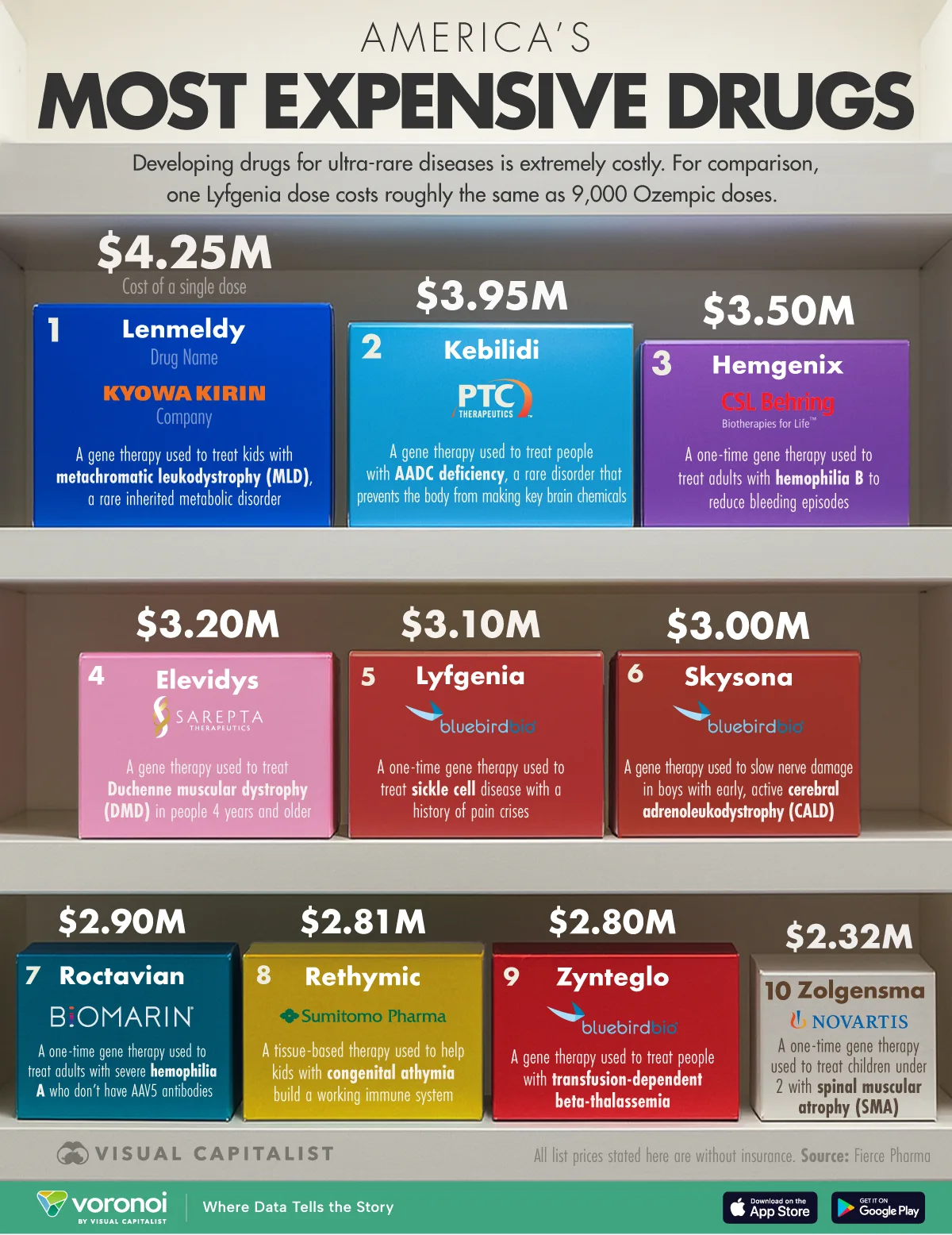
Published
3 months ago
on
October 30, 2025
Ranked: America’s Most Expensive Drugs
This was originally posted on our Voronoi app. Download the app for free on iOS or Android and discover incredible data-driven charts from a variety of trusted sources.
Key Takeaways
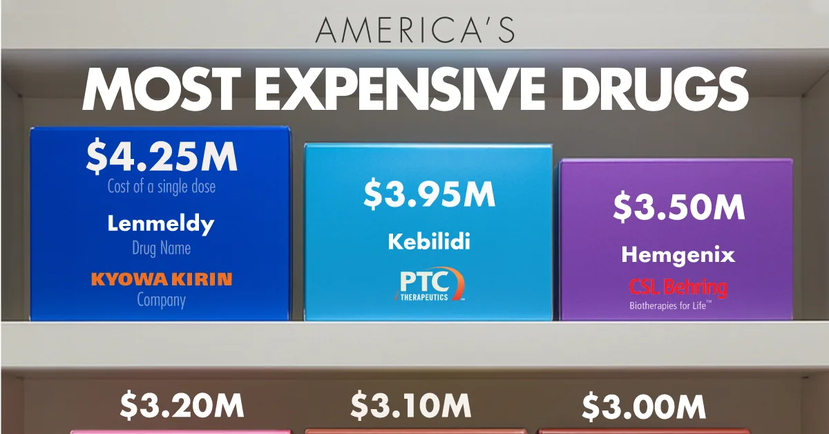
- Lenmeldy is America’s priciest drug in 2025 at $4.25 million per dose.
- One Lenmeldy treatment equals roughly 12,500 Ozempic doses ($342 each, before insurance)
In 2025, the soaring cost of cutting-edge gene therapies has pushed individual drug prices to record highs.
The latest ranking of America’s most expensive drugs highlights how a single treatment can rival the price of a luxury home.
The data for this visualization comes from Fierce Pharma. It lists the 10 priciest U.S. drugs, all topping $2 million per course and most offering one-time, potentially curative benefits
Gene Therapies Dominate the Leaderboard
Lenmeldy, a treatment for the ultrarare disorder metachromatic leukodystrophy, costs $4.25 million per dose, eclipsing every other therapy launched to date.
| Rank | Drug Name | Cost Per Dose | Company | Used For |
|---|---|---|---|---|
| 1 | Lenmeldy | $4,250,000 | Kyowa Kirin | A gene therapy used to treat kids with metachromatic leukodystrophy (MLD), a rare inherited metabolic disorder |
| 2 | Kebilidi | $3,950,000 | PTC Therapeutics | A gene therapy used to treat children & adults with AADC deficiency, a rare disorder that prevents the body from making key brain chemicals |
| 3 | Hemgenix | $3,500,000 | CSL Behring | A one-time gene therapy used to treat adults with hemophilia B to reduce bleeding episodes |
| 4 | Elevidys | $3,200,000 | Sarepta Therapeutics | A gene therapy used to treat Duchenne muscular dystrophy (DMD) in people 4 years and older |
| 5 | Lyfgenia | $3,100,000 | bluebird bio | A one-time gene therapy used to treat sickle cell disease with a history of pain crises |
| 6 | Skysona | $3,000,000 | bluebird bio | A gene therapy used to slow nerve damage in boys with early, active cerebral adrenoleukodystrophy (CALD) |
| 7 | Roctavian | $2,900,000 | BioMarin | A one-time gene therapy used to treat adults with severe hemophilia A who don’t have AAV5 antibodies |
| 8 | Rethymic | $2,810,000 | Sumitomo Pharma | A tissue-based therapy used to help kids with congenital athymia build a working immune system |
| 9 | Zynteglo | $2,800,000 | bluebird bio | A gene therapy used to treat people with transfusion dependent beta thalassemia |
| 10 | Zolgensma | $2,320,000 | Novartis | A one-time gene therapy used to treat children under 2 with spinal muscular atrophy (SMA) |
Note: Bluebird Bio is now Genetix Biotherapeutics after acquisition by two private equity firms.
Lenmeldy’s list price equals roughly 12,500 doses of popular diabetes drug Ozempic at its pre-insurance list price.
While the number seems astronomical, payers weigh it against lifelong care costs that can exceed $10 million for untreated MLD patients.
Similarly, third-ranked Hemgenix’s one-time $3.5 million cost compares with up to $20 million for decades of clotting-factor infusions.
Even at multimillion-dollar stickers, pay-once gene therapies can offer health-economic value over chronic treatments.
In fact, every drug on the top 10 list is a gene or cell-based therapy—scientific breakthroughs that replace or repair faulty genetic instructions.
Because they aim to cure rare and deadly conditions in a single dose, their development and manufacturing pipelines are complex, bespoke, and expensive.
Bluebird Bio’s Three-Drug Footprint
No company appears more often than Bluebird Bio, which places Lyfgenia, Skysona, and Zynteglo on the list.
Each addresses a different inherited blood or metabolic disorder, yet all share core technology roots developed over a decade.
Despite regulatory scrutiny and manufacturing setbacks, the company’s persistence has translated into multiple FDA approvals.
The cluster illustrates how a single firm can dominate a high-value therapeutic niche.
Bluebird Bio was acquired in June, 2025 by private equity firms Carlyle Group and SK Capital.
Learn More on the Voronoi App
For related coverage, check out Where Americans Pay the Most (and Least) for Health Insurance on Voronoi, the new app from Visual Capitalist.