
All of the World’s Money and Markets in One Visualization
In the current economic circumstances, there are some pretty large numbers being thrown around by both governments and the financial media.
The U.S. budget deficit this year, for example, is projected to hit $3.8 trillion, which would be more than double the previous record set during the financial crisis ($1.41 trillion in FY2009). Meanwhile, the Fed has announced “open-ended” asset-buying programs to support the economy, which will add even more to its current $7 trillion balance sheet.
Given the scale of these new numbers—how can we relate them back to the more conventional numbers and figures that we may be more familiar with?
Introducing the $100 Billion Square
In the above data visualization, we even the playing field by using a common denominator to put the world’s money and markets all on the same scale and canvas.
Each black square on the chart is worth $100 billion, and is not a number to be trifled with:
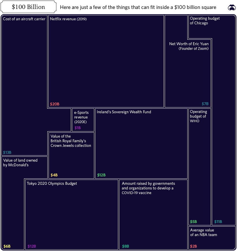
In fact, the entire annual GDP of Cuba could fit in one square ($97 billion), and the Greek economy would be roughly two squares ($203 billion).
Alternatively, if you’re contrasting this unit to numbers found within Corporate America, there are useful comparisons there as well. For example, the annual revenues of Wells Fargo ($103.9 billion) would just exceed one square, while Facebook’s would squeeze in with room to spare ($70.7 billion).
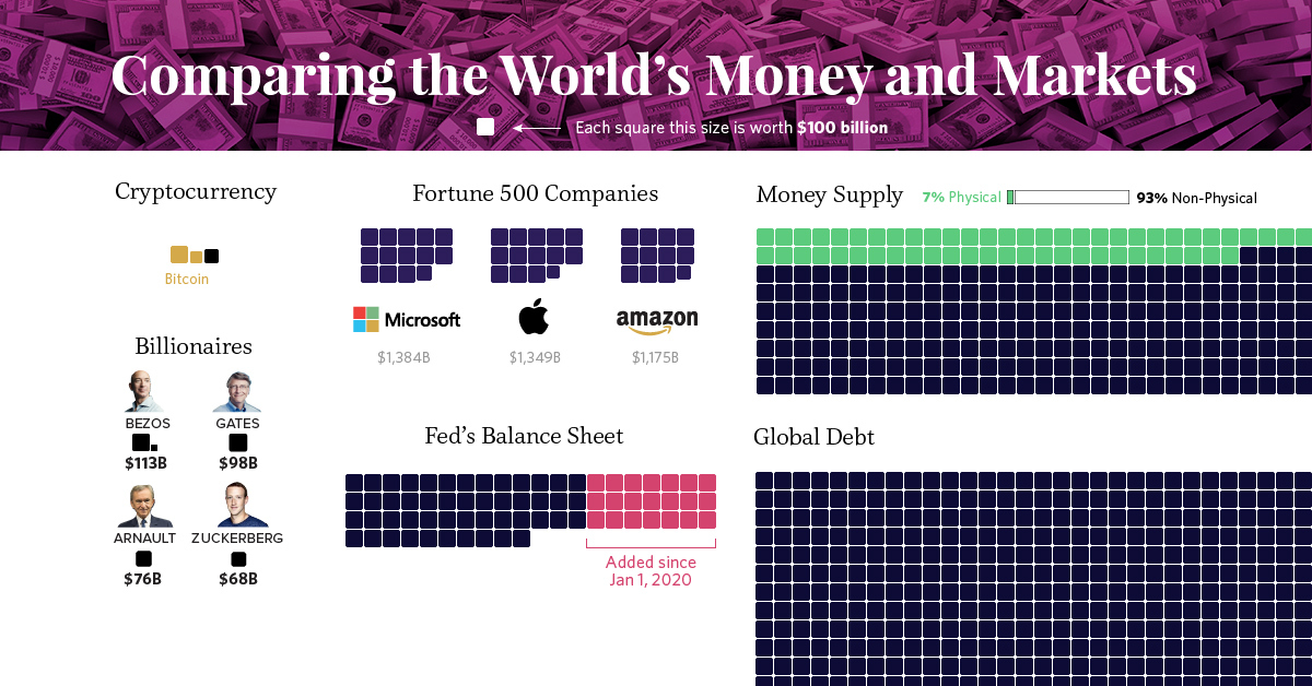
Billions, Trillions, or Quadrillions?
Here’s our full list, which sums up all of the world’s money and markets, from the smallest to the biggest, along with sources used:
| Category | Value ($ Billions, USD) | Source |
|---|---|---|
| Silver | $44 | World Silver Survey 2019 |
| Cryptocurrencies | $244 | CoinMarketCap |
| Global Military Spending | $1,782 | World Bank |
| U.S. Federal Deficit (FY 2020) | $3,800 | U.S. CBO (Projected, as of April 2020) |
| Coins & Bank Notes | $6,662 | BIS |
| Fed's Balance Sheet | $7,037 | U.S. Federal Reserve |
| The World's Billionaires | $8,000 | Forbes |
| Gold | $10,891 | World Gold Council (2020) |
| The Fortune 500 | $22,600 | Fortune 500 (2019 list) |
| Stock Markets | $89,475 | WFE (April 2020) |
| Narrow Money Supply | $35,183 | CIA Factbook |
| Broad Money Supply | $95,698 | CIA Factbook |
| Global Debt | $252,600 | IIF Debt Monitor |
| Global Real Estate | $280,600 | Savills Global Research (2018 est.) |
| Global Wealth | $360,603 | Credit Suisse |
| Derivatives (Market Value) | $11,600 | BIS (Dec 2019) |
| Derivatives (Notional Value) | $558,500 | BIS (Dec 2019) |
| Derivatives (Notional Value - High end) | $1,000,000 | Various sources (Unofficial) |
Derivatives top the list, estimated at $1 quadrillion or more in notional value according to a variety of unofficial sources.
However, it’s worth mentioning that because of their non-tangible nature, the value of financial derivatives are measured in two very different ways. Notional value represents the position or obligation of the contract (i.e. a call to buy 100 shares at the price of $50 per share), while gross market value measures the price of the derivative security itself (i.e. $1.00 per call option, multiplied by 100 shares).
It’s a subtle difference that manifests itself in a big way numerically.
Correction: Graphic updated to reflect the average value of an NBA team.
Markets
Ranked: The Companies Holding the Most Cash in the World
Which companies hold the most cash on their balance sheets? See the top 50 companies ranked by cash and short-term investments. 
Published
11 hours ago
on
February 20, 2026

Ranked: The Companies Holding the Most Cash in the World
See visuals like this from many other data creators on our Voronoi app. Download it for free on iOS or Android and discover incredible data-driven charts from a variety of trusted sources.
Key Takeaways
- Financials dominate the list—13 of the top 50 are financial services firms.
- Berkshire Hathaway is the clear outlier, sitting on a record $382B, the largest cash position in its history—more than Microsoft, Alphabet, and Amazon combined.
The cash that companies hold is important for paying employees, funding operations, and as a measure of financial health.
This chart shows the 50 companies with the largest cash holdings, using data from TradingView to highlight who is sitting on the largest war chests.
This metric captures a company’s most liquid assets: cash plus short-term securities like T-bills that typically mature within a year.
Which Companies Hold the Most Cash?
Berkshire Hathaway leads the rankings with an impressive $382 billion.
The data table below shows the top 50 companies worldwide with the largest cash and short-term securities holdings:
| Rank | Company | Cash and short-term investments holdings (billions) |
|---|---|---|
| 1 | Berkshire Hathaway | $381.7 |
| 2 | CITIC Limited | $171.5 |
| 3 | Daiwa Securities Group | $131.4 |
| 4 | Alphabet | $126.8 |
| 5 | Amazon | $126.3 |
| 6 | Taiwan Semiconductor Manufacturing | $97.8 |
| 7 | Interactive Brokers Group | $93.4 |
| 8 | Microsoft | $89.5 |
| 9 | Charles Schwab | $88.9 |
| 10 | Meta Platforms | $82.4 |
| 11 | Volkswagen | $76.9 |
| 12 | PDD Holdings | $69.5 |
| 13 | Apple | $66.9 |
| 14 | NVIDIA | $60.6 |
| 15 | Tencent | $59.2 |
| 16 | Alibaba Group Holding | $58.2 |
| 17 | Saudi Aramco | $56.0 |
| 18 | Contemporary Amperex Technology | $51.6 |
| 19 | Toyota Motor | $50.5 |
| 20 | SBI Holdings | $50.0 |
| 21 | China State Construction Engineering | $48.5 |
| 22 | American Express | $47.8 |
| 23 | SoftBank Group | $45.8 |
| 24 | Tesla | $44.5 |
| 25 | China Mobile | $43.8 |
| 26 | Daou Technology | $43.7 |
| 27 | Hon Hai Precision Industry | $42.5 |
| 28 | CNPC Capital | $41.9 |
| 29 | Japan Securities Finance | $41.0 |
| 30 | PetroChina | $40.7 |
| 31 | Hong Kong Exchanges & Clearing | $39.4 |
| 32 | Fannie Mae | $39.4 |
| 33 | Stellantis | $38.7 |
| 34 | Ford Motor | $38.5 |
| 35 | International Holding Company | $37.6 |
| 36 | Intel | $37.4 |
| 37 | BP | $36.8 |
| 38 | Rakuten Group | $36.0 |
| 39 | CNOOC | $35.8 |
| 40 | Nomura Holdings | $35.7 |
| 41 | SAIC Motor | $35.1 |
| 42 | Honda Motor | $30.9 |
| 43 | Deutsche Boerse | $30.6 |
| 44 | General Motors | $30.6 |
| 45 | Shell | $30.3 |
| 46 | JD.com | $29.6 |
| 47 | Boeing | $29.4 |
| 48 | China Railway Group | $28.6 |
| 49 | TotalEnergies | $28.3 |
| 50 | Daou Data | $26.8 |
Source: TradingView | Cash and Short-Term Investments | as of Feb 11, 2026
Following Berkshire are CITIC—a Chinese state-backed financial conglomerate—and Daiwa Securities Group, one of Japan’s biggest financial brokerages.
Big Tech rounds out the top five, with Alphabet holding $127 billion and Amazon holding $126 billion.
Why Buffett Holds So Much Cash
Among the top 50 companies, the Financials sector collectively holds the largest cash reserves at $1.2 trillion—partially driven by strict capital rules requiring banks to maintain large liquid buffers.
Berkshire Hathaway is different: its cash position is strategic, not regulatory.
After 12 straight quarters as a net seller of stocks, Buffett and the team have parked much of the company’s liquidity in short-term U.S. Treasury bills, implying that equity valuations look expensive.
The Oracle’s cash and cash equivalents as a percentage of total assets is at an all-time high—roughly 31% of total assets.
Historically, this has coincided with periods when he waits for a major economic or market dislocation before deploying capital as prices begin to mean-revert—quietly accumulating dry powder in the meantime.
Why Big Tech Holds So Much Cash
The Magnificent Seven: Alphabet, Amazon, Meta, Microsoft, Apple, Nvidia and Tesla collectively hold $597 billion—enough to buy most S&P 500 companies.
Traditionally, Big Tech companies are massive cash machines: high gross margins and scalable cost structures mean incremental revenue converts into cash quickly.
Despite spending heavily to build AI factories, they’ve used little of their cash reserves to finance them—opting instead for debt.
They hold large cash stockpiles both to fund acquisitions and guard against potential economic turmoil, such as threats from tariffs or geopolitical conflicts.
Learn More on the Voronoi App 
To learn more about the world’s largest companies, check out this graphic on Voronoi.
Markets
Charted: The Growth of $100 by Asset Class (1965–2025)
See how $100 grew across stocks, gold, bonds, real estate, and cash, and what factors drove the biggest busts, and recoveries.
Published
1 day ago
on
February 19, 2026

Charted: The Growth of $100 by Asset Class (1965–2025)
See visuals like this from many other data creators on our Voronoi app. Download it for free on iOS or Android and discover incredible data-driven charts from a variety of trusted sources.
Key Takeaways
- Stocks had the best returns, turning $100 into $43k—roughly 29x the return of cash and about 5x that of gold.
- Real estate and government bonds beat cash, by a factor of 1.4x and 1.9x respectively.
What would $100 invested in 1965 be worth today? For stocks, it would’ve multiplied 435 times, but other asset classes have significantly lower returns.
Here’s how each asset class performed over 60 years, based on data from NYU Stern professor Aswath Damodaran.
Stocks reflect S&P 500 total returns with dividends reinvested, real estate follows the Case-Shiller Home Price Index (price only), and cash represents three-month U.S. Treasury bills.
Stocks Outperform Other Asset Classes Since 1965
The table below shows the nominal (before inflation) returns of a $100 investment across six major asset classes between 1965 and 2025, with values representing the investment’s value at year-end:
| Year | Stocks | Gold | Corporate Bonds | Government Bonds | Real Estate | Cash |
|---|---|---|---|---|---|---|
| 1965 | $112 | $100 | $103 | $101 | $102 | $104 |
| 1966 | $101 | $100 | $100 | $104 | $103 | $109 |
| 1967 | $125 | $100 | $101 | $102 | $105 | $114 |
| 1968 | $139 | $112 | $105 | $105 | $110 | $120 |
| 1969 | $127 | $118 | $103 | $100 | $117 | $128 |
| 1970 | $132 | $106 | $109 | $117 | $127 | $136 |
| 1971 | $151 | $124 | $124 | $128 | $132 | $142 |
| 1972 | $179 | $185 | $139 | $132 | $136 | $148 |
| 1973 | $153 | $320 | $145 | $137 | $141 | $158 |
| 1974 | $114 | $531 | $138 | $139 | $155 | $170 |
| 1975 | $156 | $400 | $153 | $144 | $166 | $180 |
| 1976 | $193 | $383 | $184 | $168 | $179 | $189 |
| 1977 | $179 | $470 | $202 | $170 | $205 | $199 |
| 1978 | $191 | $644 | $208 | $168 | $238 | $213 |
| 1979 | $226 | $1,459 | $204 | $170 | $270 | $235 |
| 1980 | $298 | $1,680 | $197 | $164 | $290 | $262 |
| 1981 | $284 | $1,132 | $214 | $178 | $305 | $298 |
| 1982 | $342 | $1,309 | $276 | $236 | $307 | $331 |
| 1983 | $419 | $1,089 | $321 | $244 | $322 | $361 |
| 1984 | $444 | $878 | $371 | $277 | $337 | $397 |
| 1985 | $583 | $931 | $460 | $349 | $362 | $427 |
| 1986 | $691 | $1,108 | $562 | $433 | $396 | $454 |
| 1987 | $731 | $1,379 | $568 | $412 | $428 | $481 |
| 1988 | $852 | $1,169 | $657 | $446 | $458 | $514 |
| 1989 | $1,120 | $1,136 | $764 | $525 | $479 | $557 |
| 1990 | $1,086 | $1,100 | $808 | $557 | $475 | $600 |
| 1991 | $1,414 | $1,006 | $940 | $641 | $475 | $633 |
| 1992 | $1,520 | $948 | $1,069 | $701 | $478 | $656 |
| 1993 | $1,672 | $1,116 | $1,244 | $801 | $489 | $676 |
| 1994 | $1,694 | $1,092 | $1,229 | $736 | $501 | $705 |
| 1995 | $2,324 | $1,103 | $1,476 | $909 | $510 | $745 |
| 1996 | $2,851 | $1,052 | $1,554 | $922 | $522 | $784 |
| 1997 | $3,795 | $827 | $1,729 | $1,014 | $543 | $824 |
| 1998 | $4,870 | $820 | $1,870 | $1,165 | $578 | $865 |
| 1999 | $5,887 | $827 | $1,888 | $1,069 | $623 | $906 |
| 2000 | $5,355 | $782 | $2,065 | $1,247 | $681 | $961 |
| 2001 | $4,721 | $788 | $2,242 | $1,316 | $726 | $994 |
| 2002 | $3,684 | $989 | $2,513 | $1,515 | $796 | $1,010 |
| 2003 | $4,728 | $1,186 | $2,824 | $1,521 | $874 | $1,021 |
| 2004 | $5,236 | $1,241 | $3,115 | $1,589 | $993 | $1,035 |
| 2005 | $5,490 | $1,462 | $3,275 | $1,635 | $1,127 | $1,068 |
| 2006 | $6,347 | $1,801 | $3,448 | $1,667 | $1,146 | $1,120 |
| 2007 | $6,695 | $2,375 | $3,617 | $1,837 | $1,084 | $1,170 |
| 2008 | $4,248 | $2,478 | $3,492 | $2,206 | $954 | $1,187 |
| 2009 | $5,349 | $3,098 | $4,189 | $1,961 | $918 | $1,189 |
| 2010 | $6,142 | $4,004 | $4,583 | $2,127 | $880 | $1,190 |
| 2011 | $6,271 | $4,486 | $5,145 | $2,468 | $846 | $1,191 |
| 2012 | $7,267 | $4,741 | $5,629 | $2,542 | $900 | $1,192 |
| 2013 | $9,604 | $3,432 | $5,565 | $2,310 | $997 | $1,193 |
| 2014 | $10,902 | $3,436 | $6,163 | $2,558 | $1,041 | $1,193 |
| 2015 | $11,053 | $3,020 | $6,071 | $2,591 | $1,096 | $1,194 |
| 2016 | $12,354 | $3,265 | $6,770 | $2,609 | $1,154 | $1,197 |
| 2017 | $15,023 | $3,678 | $7,390 | $2,682 | $1,225 | $1,209 |
| 2018 | $14,388 | $3,644 | $7,155 | $2,682 | $1,281 | $1,233 |
| 2019 | $18,879 | $4,339 | $8,246 | $2,940 | $1,328 | $1,259 |
| 2020 | $22,281 | $5,388 | $9,120 | $3,273 | $1,466 | $1,263 |
| 2021 | $28,625 | $5,185 | $9,213 | $3,129 | $1,743 | $1,264 |
| 2022 | $23,462 | $5,214 | $7,810 | $2,571 | $1,841 | $1,290 |
| 2023 | $29,576 | $5,905 | $8,492 | $2,671 | $1,946 | $1,358 |
| 2024 | $36,934 | $7,438 | $8,639 | $2,627 | $2,023 | $1,429 |
| 2025 | $43,480 | $12,364 | $9,241 | $2,832 | $2,055 | $1,489 |
Numbers have been rounded. S&P 500 includes dividends. Cash represented by 3-Month U.S. T-Bills. Corporate Bonds represented by Baa corporate bonds. Real Estate represented by the Case-Shiller Home Price Index. | As of Dec-31-2025
Stocks can build wealth faster than other major assets because company profits tend to grow over time, dividends can be reinvested, and returns compound.
The trade-off is risk and volatility as stock prices can swing sharply up and down.
In this 60-year window, a large share of equity gains happened during two major bull cycles.
Two big bull runs drove most stock gains: 1982–2000 (about 17x) and the post-2008 rebound (about 10x), so missing either one could’ve significantly dampened investment returns.
How Drawdowns and Recoveries Affect Returns
Every asset class has faced major drawdowns and recoveries, but stocks were often the fastest to recover.
In 2008, equities fell 37% in a single year, then rebounded to new highs in roughly four years as aggressive Fed support steadied markets.
After the COVID-19 shock, bonds—long seen as a safe haven—suffered their worst two-year stretch in decades.
Gold saw the longest dry spell: after its 1980 peak, it took 26 years just to break even as high real rates and a strong dollar dragged on returns. Once it finally cleared that level, it nearly doubled again by 2011.
Real estate also took time after its major drawdown—after the housing bust in 2008/2009, prices needed about a decade to fully recover.
Together, these cycles show that while no asset class is immune to deep losses, recovery timelines can vary dramatically—and patience often matters as much as diversification.
Learn More on the Voronoi App
To learn more about stock performance over the last 152 years, check out this graphic on Voronoi which plots out each year’s S&P 500 return.