Summary: Skeuomorphism involves designing digital interfaces that imitate physical elements, reducing the learning curve for unfamiliar interactions.
Design trends are constantly changing and influencing the way we interact with technology. One such trend from the past is skeuomorphism. While it has since been criticized for its excesses, it brought a sense of familiarity from the physical world into the digital one.
When contemplating innovative future technologies, people tend to overlook the past. However, examining past trends and understanding their purposes can provide valuable insights into current needs. In the cyclical narrative of design, trends resurface in new shapes and forms.
Definition of Skeuomorphism
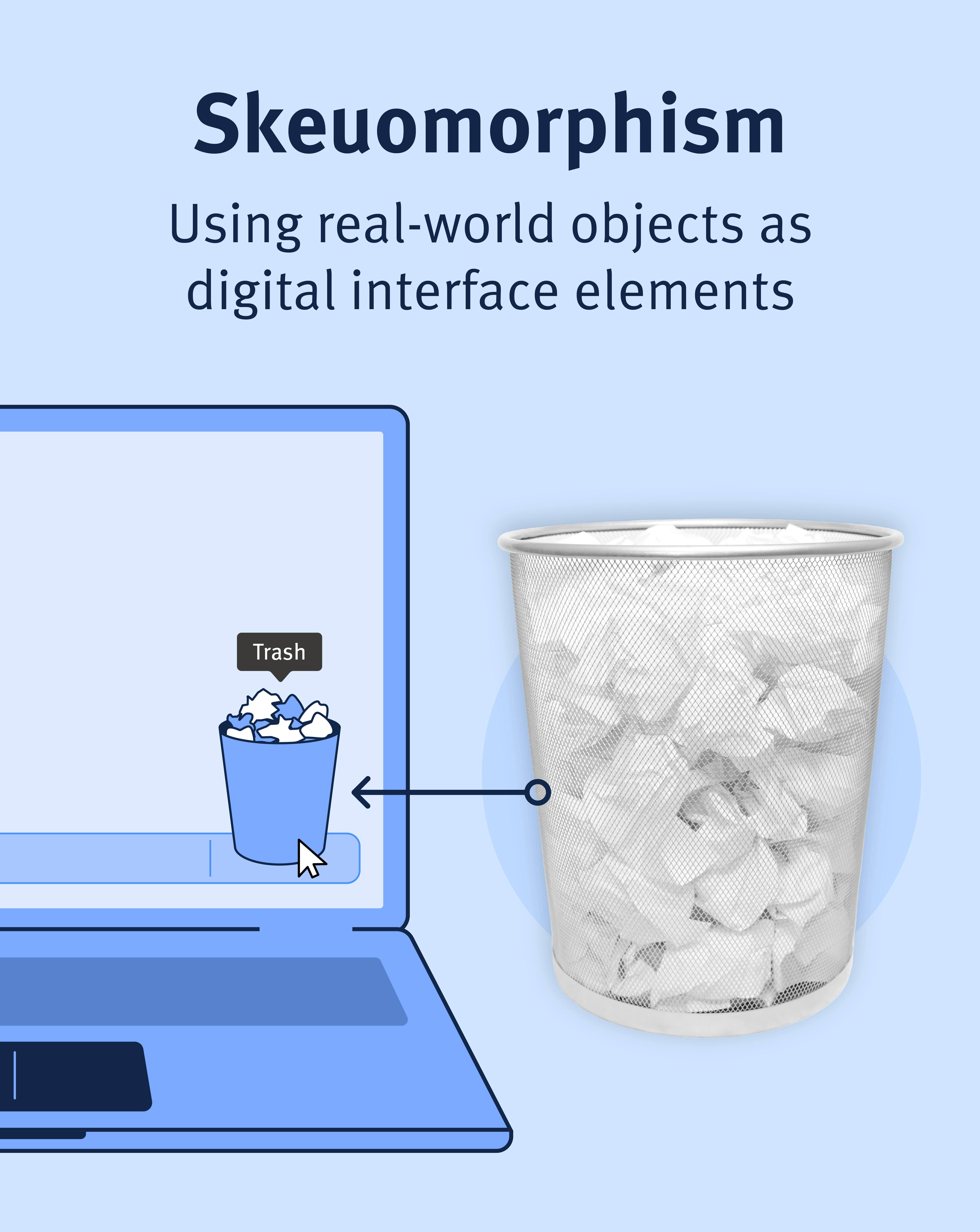
Skeuomorphism is a design practice incorporating real-world elements into digital interfaces to create a sense of familiarity with new interfaces.
In UX design, the word “skeuomorphism” can refer to:
- A functional learning aid: Designing an interface element or flow so that it resembles something in the real world. Designers have taken inspiration from physical objects to create interface elements, especially icons. These analogies simplify the learning process. In this sense, skeuomorphism has never been truly dead.
- A visual-design trend: Excessive use of real-world aspects that were not necessary to the design. In the early 2000's, interfaces mimicked the appearance of their physical counterparts, incorporating realistic textures, shadows, and gradients.
Skeuomorphism as a Functional Learning Aid
In the early days of digital interface design, skeuomorphic elements played a fundamental role in shaping user experiences.
Skeuomorphic design eased the transition to digital platforms by grounding interfaces in recognizable elements from the physical world and leveraging users’ preexisting mental models (a critical technique in UX design).
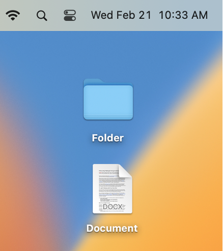
For example, icons in graphical user interfaces (GUIs) — trash bin, folder, document, floppy disk — emulated the appearance of traditional office materials. The familiar appearance of the icons made the purpose of these tools intuitive for early users. Many of these icons are still in use today.
Skeuomorphism as a Visual-Design Trend
The skeuomorphism trend has been critiqued for its excessive use of real-world aspects that are not necessary for functionality. This design trend prioritized aesthetic and familiar representation over digital efficiency. It was characterized by its rich, ornate designs that aimed to replicate the look and feel of physical objects within digital interfaces, using realistic textures, shadows, and gradients to create a three-dimensional effect.
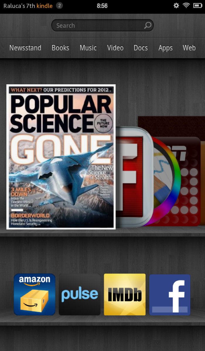
In the early 2010s, skeuomorphism was at its peak. The goal was to create digital interfaces that replicated the sensory experience of their physical counterparts as closely as possible.
Ereaders, like iBooks and Kindle, were designed to look like physical bookshelves. The reader could choose from a selection of virtual books on the shelf.
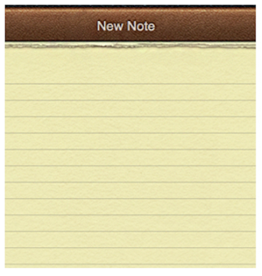
Note-taking apps featured a leather binding, complete with faux-ripped pages and shadowed indentations meant to provide a sense of depth.
Skeuomorphism can make an unfamiliar interface more approachable, making the user less likely to abandon it due to a lack of confidence. However, the trend also led to cluttered interfaces and slower load times, as the detailed textures and shadows required more graphical processing power. It also occasionally led to interactions that were, paradoxically, clunky and unintuitive in a digital medium, like in the Pizza Hut example below. Moreover, as the novelty wore off, these detailed skeuomorphic designs began to feel outdated and cumbersome, especially when simpler, cleaner interfaces proved to be more versatile and faster to navigate.

While this phase of skeuomorphism is often remembered for its excess, it also played an important part in the evolution of digital design. Over time, however, the skeuomorphism trend became clunky, outdated, and unfashionable.
Cyclical Nature of Design Trends
UX design trends are like fashion trends — wait long enough, and they come back into popularity.
In response to the limitations of skeuomorphism, the design community embraced flat design. This approach replaced skeuomorphism’s realistic imagery with a clean and minimalistic aesthetic. However, dropping all realistic textures and shadows caused ultra flat interfaces to have weak signifiers.
The limitations of flat design led to neumorphism, a nuanced evolution that reintroduces subtle skeuomorphic elements. Neumorphism can be seen as a combination of the clean simplicity of flat design and the realistic, three-dimensional elements of skeuomorphism. It reintroduces skeuomorphic elements in a subtle way.
Neumorphism never quite made it mainstream because it comes with its own set of problems. The low contrast does not offer sufficient visual weight, making the experience not accessible. Additionally, it is difficult to determine clickability, as neumorphism is often used inconsistently on nonclickable and clickable elements.
Design trends develop based on cultural shifts and users’ current needs. Each trend is a response to the one before, striving for a balance that resonates with the current users. The evolution from skeuomorphism to flat design to neumorphism illustrates how trends respond to one another, and how aspects of old trends resurface over time.
Conclusion
Skeuomorphism played an important role in the early stages of digital adaptation by using familiar objects from the physical world to make digital interfaces more user-friendly. However, it became less popular due to its overuse and the rise of minimalist design. Nevertheless, design trends are cyclical and responsive to user needs and cultural contexts, so skeuomorphic traits can be seen in modern design trends, such as neumorphism. As we move into the digital future, skeuomorphism is a reminder that well-designed interfaces strike a balance between innovation and familiarity.