Michele Coscia – Connecting Humanities

37 min read Original article ↗

Part of the Italian lore infused on me when growing up is to be disillusioned when it comes to interactions with politicians. Assuming that what a politician promises carries information about what they’re going to do is not the wisest way of living one’s life. This is a gut feeling and it could be completely wrong. It asks for verification and data: is it true that what politicians do in parliament is not similar to how they present themselves to the public?

The data to answer this question is what the excellent Christian Ivert Andersen provided, which eventually led to the publication of the paper “Disconnect between the Public Face and the Voting Behavior of Political Representatives,” which recently appeared in the journal Applied Network Science.

Christian had spotted some promising features about how elections are handled here in Denmark. Like in some other countries in the world, Denmark has a number of voting advice applications. These apps ask politicians for their position on a number of salient issues. This allows them to place the politicians somewhere into a political ideological space. The citizen can answer the same questions and figure out which politician is the closest to them — with the assumption they should vote for them, if they do not want to heed the Italian cautionary tales.

We decided to represent this data as a network: each node is a politician and each pair of politicians is connected if they agree on a significant number of issues. Altinget was kind enough to share their data with us for our work. We’ll get to the why we represent this data as a network, but for now let’s verify whether these networks make sense:

From A to D the networks corresponding to the 2011, 2015, 2019, and 2022 elections.

It seems they do! We clearly see the two blocks (red and blue) that are the ideological coalitions typical of the Danish political environment.

This data by itself is fascinating, but not enough to answer our question. It represents the “public face” of a politician: their explicitly stated position they use to campaign and attract votes. We need a data source for the actions they take once they are elected.

Luckily, Denmark publishes excruciatingly detailed reports of parliament actions in an open format. Unluckily, such an open format is a nightmare to work with, is highly fragmented, and I’m a bit concerned about Christian’s mental health after he had worked with it (get well soon, Christian!). With this data we can build a different network, this time connecting politicians according to their voting behavior similarity in parliament:

From A to D the networks corresponding to the 2011, 2015, 2019, and 2022 legislatures.

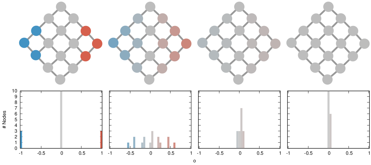
By analyzing the connections in these two networks we can create a numerical score which summarizes the ideology of a politician, depending on the politicians they’re connected to in the network — and who they are connected to and so on. I’ve been using such score as the node color in the network pictures in this post.

So: why networks? “Why not?” I would reply as a person whose obsession with networks has now reached pathological levels. But I know that’s not going to cut it. The reason we use networks is that they allow to calculate the distance between the two ideological scores we just built — one based on the politicians’ words, the other on their actions — in a more nuanced way.

Trivially, with two ideological scores, one would simply check their difference. However, the difference between ideological scores matters most for those politicians that are supposed to be ideologically close. It matters a lot if you’re shifting your position relative to the other members of your own party, more than if you do it relatively to parties that are not ideologically similar to you.

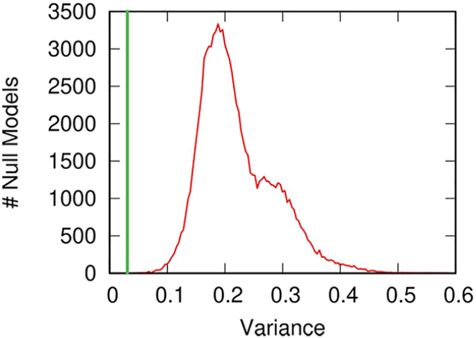
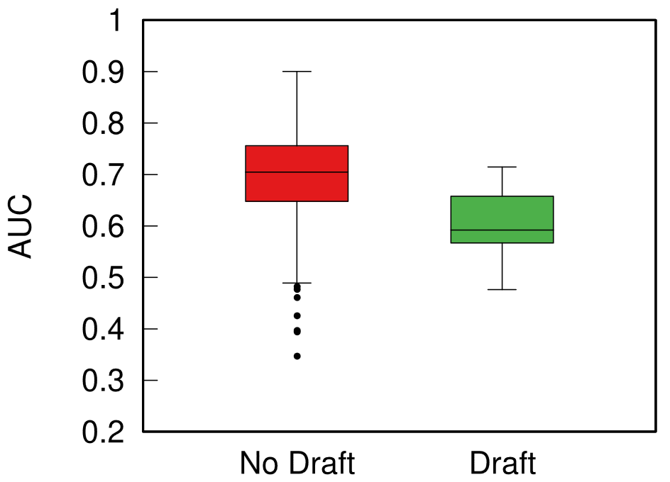
This nuanced distance estimation can be achieved by calculating the good old network distance measure I’ve been working with for the past few years. The only issue with it is that we just get a distance value and we need to contextualize it. To do so, we compare it with a null model: we calculate the same distance but we randomly shuffle the ideological scores on the networks. This way, we know what distance we should be seeing when there is no connection between the two ideological scores on the network.

In red, the number of null models (y axis) with a given words-to-actions distance (x axis). In green, the observed distance in the real data. From A to D corresponding to the 2011, 2015, 2019, and 2022 legislatures, above row for distances calculated on the networks based on campaign words, below for distances on the parliament action networks.

Above you see the distribution of expected distances in the null model in red, and the distance we observe as the green bar. Distressingly, the green bar is to the right of the expectation, and almost always significantly so. This means that the distance we observe — the actual difference between promises and actions — is larger than what we would expect in the scenario in which the two are randomly picked! To put it bluntly: how politicians present themselves during a campaign is significantly different from what they do in parliament once elected. Looks like my Italian guts were right.

But we shouldn’t put it bluntly, not yet at least. This study is just the first step and it does require substantial robustness checks. The most important of which is that the topics representatives in parliament vote on are not necessarily the same issues they’re asked about during the campaign. The most blatant case for this is that no one had asked anything about COVID during the 2019 campaign, but we all know what politicians had to deal with starting from early 2020. We should match the votes with specific questions and use only votes sufficiently similar to at least one question to build the parliament networks. We can do this, using some natural language processing magic, so that will come next.

From these very preliminary results, the most cautious lesson learned should be: maybe be wary of making your voting decisions based on a voting advice app. There are a number or reasons — not necessarily shady, as the COVID case exemplifies — that make them not exactly a faithful representation of what you’re voting for.

A couple of years ago, I worked with Marilena Hohmann and Karel Devriendt on a method to estimate ideological polarization on social media: the tendency of people to have more extreme opinions and to avoid contact with people holding a different opinion. Studying ideological polarization is interesting, but it misses a crucial piece of the puzzle: what happens when differing opinions – which may or may not be trying to avoid each other – collide? Are people actually having a debate and an exchange of ideas, or are they escalating to name-calling and generally toxic behavior?

Answering that question requires a method to estimate affective polarization, rather than merely ideological polarization. Once Marilena and I were done working with the latter, we rolled up our sleeves to work on the former. The result is the paper “Estimating affective polarization on a social network“, which appeared a few days ago on PLoS One.

The objective appears simple: to try and quantify what people with differing opinions do when they interact. Unpacking this objective requires some care, though. One could think that this is a simple correlation test: if the more people disagree the more they use toxic language, then affective polarization is high.

Such an approach, however, ignores that people might hate each other so much that they refuse to communicate altogether, or they are forcibly separated. An example is r/the_donald. For a time, it was one of the most active subreddits on Reddit, creating a strong polarized environment. At some point, the Reddit admins decided to ban the subreddit altogether, which resulted in an exodus of users. In the data, one would see a decrease in affective polarization, because there was less toxicity. In reality, discourse had become so toxic it had to stop, which we argue is a sign of a growing, nor decreasing, affective polarization.

The two components of affective polarization: above, the higher the correlation between disagreement and toxicity, the higher affective polarization. Below, the more separated the camps are, the higher affective polarization is.

So we still need to track the network of interactions, just like we did for ideological polarization, because ideology and affect are intertwined. Marilena and I spent a lot of blood and tears trying to be smart about finding a solution, but in the end – as is often the case – the simple route was the best one. We decided to add the affective component to the ideological polarization measure we already had. The older measure captures the social separation, while the correlation between disagreement and toxicity captures the affective component.

Once we had such a measure, we made a case study, analyzing the evolution of the social discourse on former Twitter (RIP) on COVID-19. We used data from February to July 2020, filtered using a set of keywords used in the early pandemic debate. Initially, the results were a bit confusing. While we did find a modest rise in the affective polarization levels, it seemed that affective polarization was mostly a flat line.

The overall level of affective polarization (y axis) over time (x axis).

This went a bit counter our expectation, but analyzing the social separation and the affective components separately told an insightful story (thanks reviewer #1 for prodding us in this direction, we owe you big time 🙂 ).

Above: the affective component. Below: the social segregation component.

The clear pattern was that, in the first couple of weeks, there was low social segregation but a high affective component. After this initial shock, social segregation skyrocketed and by week 9 it plateaued, while the affective component went down.

This is consistent with a narrative of a new topic coming to scene. As the topic is new, no one knows where they stand exactly, so everyone tends to interact with everyone (low social segregation). However, feelings run high, both because of the emergency itself and – possibly – because of previous conflicts between the users, which lead to renewed toxicity. As people get used to the new scenario and the clear factions emerge and stabilize, social segregation suddenly kicks in, and the factions stop talking, which also reduces the chances of using toxic language against the opposing side.

I think this exemplifies beautifully why the measure is useful. If we didn’t have a network measure, we would conclude that affective polarization was low after the first few weeks of the pandemic, because there was no correlation between disagreement and toxicity. Instead, affective polarization was still growing, and we failed to see the correlation because polarization was so high people weren’t event talking to each other any more.

There’s more work to do, of course, because we only tested a tiny scenario. Marlena and I are working on the final piece of our polarization trilogy, where all these great tools we built are finally put to use. Stay tuned!

The past fascinates us. I often fantasize about how our ancestors lived: what did they do? How did they relate to one another? Were their social networks similar to ours? Archaeology is the way we try to answer these questions if we do not have written records. The main problem is that archaeology finds stuff — material culture. Social relationships can’t be dug up from the mud.

Together with Camilla Mazzucato and a team of archeologists and biologists, we decided to investigate whether we could actually infer the social relationships from the material culture we found. The result was the paper “‘A Network of Mutualities of Being’: Socio-material Archaeological Networks and Biological Ties at Çatalhöyük“, which appeared in January in the Journal of Archaeological Method and Theory.

The paper focuses on the site of Çatalhöyük which was inhabited in the Neolithic for several millennia. Çatalhöyük is the ideal place to draw connections between found material culture and interpersonal relationships because of some peculiar habits in the culture which inhabited the site. Upon the construction of a new building in the settlement, in fact, the habit was to bury the dead in the foundations (humans are weird).

Having lots of dead bodies is fantastic (all of a sudden I sound like Hannibal Lecter) because now in the buildings we can find material culture and human remains, both of which had a connection with the building itself. From the human remains we can infer kinship relationships between buildings, because people related to each other are buried in them.

This is where the team of biologists come in. They analyze the DNA of the human remains to establish which pairs of individuals have a first, second, or third degree relationship. Once we have both material culture and kinship relationships between buildings we can start asking ourselves whether the two correlate or not.

One way to do it is by using network variance. We can connect buildings — the nodes in the network — if they share significant amounts of material culture. Then, for a given kinship group — a set of people with at least second or third degree relationships –, we can create a numeric node attribute: how many individuals from that family were buried in each building.

The Material Culture Network of Çatalhöyük: nodes are buildings, connected if they share significant amounts of material culture. The node size tells you about the number of artifacts found in the building. The edge size is the number of common artifacts and the color is the significance level. The node color tells you how many individuals from a specific kinship group are buried in the building.

The network variance of this attribute tells us how dispersed the family is in the material culture landscape. By comparing this with a null family — a family that buries individuals at random — we can know whether the real family tended to be more concentrated in the material culture space than expected, a sign that material culture and kinship correlate. Which is what we observe!

The number of null models (y axis) with a given null family network variance value (x axis). The green band is the network variance value of the observed kinship group. Lower value = less variance = more concentrated.

There are a number of possible alternative explanations, of course. One we checked for is geotemporal proximity. Buildings nearby each other and built around the same time also share more material culture and related individuals. So we control for geotemporal proximity and we see that the effect is still significant. In other words: it is more likely for related individuals to be buried in buildings with similar material culture, regardless of when and where these buildings were built. We also check the robustness of our results by slightly changing the way we build our networks, and the way we analyze the DNA remains — the result is still there.

Our result suggests a nice consequence: it is justified to say that sites containing the same material culture hosted individuals that were related to each other. Found material culture can tell us something interesting and meaningful about the shape and dynamics of past social networks.

After a year of dedicated effort, I’m glad to announce that the second version of my atlas for network science is finally out! Just like version one, the PDF is available free of charge both on arXiV and on the companion website, which also contains all the solutions to the exercises. If you’re a fan of physical books, you can buy it on Amazon.

Four years ago I published version one with the ambition of having a single text covering all I knew about network science in a coherent manner. The result was nice, but it had large margins of improvement. With this second edition, I aimed at improving the most egregious blind spots of the book.

The first one was about learning on graphs. Version one only had a small, confusing, imprecise chapter on this vast topic. That one chapter has blown up to four chapters, which now tackle shallow and deep learning more in depth. Of course none of those chapters get to the depth or sophistication of, say, Hamilton’s book, but I believe the value in having them in the Atlas is to show how much graph neural networks actually fit neatly into everything else from network science. They are not an extraneous body with esoteric methods: all GNNs do is adding some machine learning flavor to analyses we’ve been doing for decades, like using random walks to learn structural properties of the network.

Then, I decided to greatly expand on the background knowledge necessary to approach network science. This includes all the non-network techniques that will help you making sense of data. Again, what before was one background chapter became a whole book part with four chapters, covering probability theory, statistics, machine learning, and linear algebra.

The last major content addition is a chapter to deal with uncertain network data: what do you do when you’re unsure about the presence/absence of specific nodes/edges? There are more minor additions to the book, which are mentioned in the introduction.

Finally, last time no one yelled at me nearly enough for how tongue-in-cheek my introduction was. I took this as an encouragement to write an even more outlandish one. Fingers crossed someone will start a flame war on the social media du jour, and maybe the book goes viral and I get to retire with the $0.49 I make in profit per copy sold 🤞

Also bad news for those who want to stay healthy. All that added content means version two of the Atlas is even more back-breaking than version one:

The dinosaur is courtesy of my son.

For this book I had the additional help of a few more reviewers: Giovanni Puccetti, Matteo Magnani, Maria Astefanoaei, Daniele Cassese, and Paul Scherer. You’re very welcome to contact me if you find some more mistakes or if you have any grievances with the content — version one did ruffle some feathers.

So, if you want to become an expert on network science, a reminder: grab the free PDF on arXiV or on the website. And, if you really want to fuel my tiramisù addiction, you can always buy a physical copy on Amazon (or some other online seller). You could also go the Patreon route. I’ll see what I can cook in the next four years. Ta-ta.

Over the course of the last few months, I had the pleasure to find new teammates for several research projects I am involved in. I wanted to take a moment to thank them for being part of my research life — and they have the kindness of calling me their supervisor or principal investigator. Here they are, in the order they joined ITU:

Lasse Alsbirk is a co-financed PhD student and at the center of a multi-partnered research project. He will work at the intersection of the Danish Police (financial crimes section), the AI Pioneer Center, and NERDS @ ITU. His project will focus on the application and development of network science tools to fight financial crimes. He has valuable abroad experience, having received his master degree in Israel.

Anders Aagaard Kristensen joins NERDS as PhD student, coming from the University of South Denmark, where he was working on machine learning methods. His PhD project will be about the use of deep learning and generative models to understand leaves of absence in work data. The idea is to predict, simulate and, ultimately, make interventions, so that workers will have less taxing working schedules, leading to fewer leaves for sickness reasons. Anders works jointly with the National Research Center for Work Environment (NFA), which finances his fellowship and provides the data.

Nikos Salamanos joins as postdoctoral researcher, coming from the Cyprus University of Technology, where he was working on applying network analysis to study social media information dissemination. Nikos will work on an interdisciplinary Villum Synergy project on archaeological data, where he’ll develop network analysis methods to deal with highly biased and incomplete data. The idea is to test how network analysis can aid archaeological research, ultimately applying the newly developed techniques to data retrieved from the remnants of the Roman Empire. The Villum Synergy project is a collaboration with a team of archaeologists led by Tom Brughmans at Aarhus University.

Last year I was talking with a non-Italian, trying to convey to them how nearly the entirety of contemporary Italian music rests on the shoulders of Gianni Maroccolo — and the parts that don’t, should. In an attempt to find a way out of that conversation, they casually asked “wouldn’t it be cool to map out who collaborated with whom, to see whether it is true that Maroccolo is the Italian music Messiah?” That was very successful of them, because they triggered my network scientist brain: I stopped talking, and started thinking about a paper on mapping Italian music as a network and analyzing it.

One year later, the paper is published: “Node attribute analysis for cultural data analytics: a case study on Italian XX–XXI century music,” which appeared earlier this month on the journal Applied Network Science.

I spent the best part of last year crawling the Wikipedia and Discogs pages of almost 2,500 Italian bands. I recorded, for each album they released, the lineup of the song players and producers. The result was a bipartite network, connecting artists to the bands they contributed to. I tried to have a broad temporal span, starting from the 1902 of Enrico Caruso — who can be considered the first Italian musician of note (hehe) releasing actual records — until a few of the 2024 records that were coming out as I was building the network — so the last couple of years’ coverage is spotty at best.

Then I could make two projections of this network. In the first, I connected bands together if they shared a statistically significant number of players over the years. I used my noise corrected backboning here, to account for potential missing data and spurious links.

This is a fascinating structure. It is dominated by temporal proximity, as one would expect — it’s difficult to share players if the bands existed a century apart. This makes a neat left-to-right gradient timeline on the network, which can be exploited to find eras in Italian music production by using my node attribute distance measure:

The temporal dimension: nodes are bands, connected by significant sharing of artists. The node color is the average year of a released record from the band.

You can check the paper for the eras I found. By using network variance you can also figure out which years were the most dynamic, in terms of how structurally different the bands releasing music in those years were:

Network variance (y axis) over the years (x axis). High values in green show times of high dynamism, low values in red show times of structural concentration.

Here we discover that the most dynamic years in Italian music history were from the last half of the 1960s until the first half of the 1980s.

There is another force shaping this network: genre. The big three — pop, rock, electronic — create clear genre areas, with the smaller hip hop living at the intersection of them:

Just like with time, you can use the genre node attributes distances to find a genre clusters, through the lens of how they’re used in Italian music.

What about Maroccolo? To investigate his position, we need to look at the second projection of the artist-band bipartite network: the one where we connect artists because they play in the same bands. Unfortunately, it turns out that Maroccolo is not in the top ten most central nodes in this network. I checked the degree, closeness, and betweenness centralities. The only artist who was present in all three top ten rankings was Paolo Fresu, to whom I will hand over the crown of King of Italian Music.

I think Wikipedia is great. I spend tons of time on it. I especially like to read about history, because it allows me to quickly jump into obscure details about anything, without the need to scout for specialized literature that might be super hard to find. But one question always creeps in the back of my mind: am I reading something as fair as it can be? How much are the editors’ biases driving my discovery process? These are testable questions! And the subject of this blog post, and a paper I recently published.

I don’t need this judgemental look when I’m deep in a clicking rabbit hole that started wondering why Brown Noise is called that way…

The paper is “Traces Of Unequal Entry Requirement For Illustrious People On Wikipedia Based On Their Gender” recently published in the Advances in Complex Systems journal. This is mostly the product of brilliant Lea Krivaa‘s master thesis. In the paper, we decided to focus on a specific bias: the role gender plays in the inclusion criteria of notable people on Wikipedia.

The hypothesis is that women need to do more than men to “deserve” a Wikipedia page. The are a few problems with this hypothesis. For starters, we can’t really prove it by simply saying that there are way more men than women on Wikipedia. That can happen and still be fair, because Wikipedia is just working with whatever it can collect from the notoriously male-centric historiography. Moreover, a true fairness test is hard to make: it’s not feasible to collect from the already-biased archives every person’s CV and see that there are discarded CVs from women that are as good as some of the included men on Wikipedia. Good luck checking the Roman Empire CVs after the Visigoths sacked the capital in 410AD.

Gosh darn it, I’m doing the rabbit hole clicking thing again, am I? I’ll never be done writing this article…

However, it turns out that we can find traces of this glass entrance door by using some unexpected network science techniques. We built a network of notable people: we took the set of people from Pantheon, because it’s a curated list of people that are on multiple language Wikipedia editions — this ensures they’re not just a pet peeve of some local editor. Then we connected them with an edge if the page of one person has a hyperlink connecting it to the page of another.

Crucially, we’re able to estimate the weight of the edge with some natural language processing: we count the number of times the target of this hyperlink is mentioned in the page containing the link. Knowing the edge weight is fundamental, because then we can use my backboning method to know the significance of this weight: how likely is it to be a noisy link?

I don’t mean to brag (I do), but I’m quite big in the network backboning industry. Wait, am I on Wikipedia again? Please send help.

Backboning is done to sparsify a network, by dropping the least significant edges. But here we’re just interested in looking at the significance values themselves. By looking at them we discover something odd: the edges involving women are on average more significant. If we were to establish a high significance threshold, we would end up isolating (and dropping) way more men than women. This shouldn’t happen if there was no bias.

On the left we have the distribution of significance for all four types of edges (since it’s a directed network). On the right we have the share of nodes we isolate with a given edge significance threshold. In both cases, you can see women’s edges and nodes are more impervious to harsher significance thresholds.

Our interpretation is that this is a hint that the glass entrance door exist: to be included in multiple language Wikipedias, a woman needs to have more significant ties with other notable people than a man.

This might seem a stretch or a bit abstract, but there’s a neat way to test this interpretation. On March, Wikipedia has a tradition of celebrating the month by improving its coverage of notable women. This means that, in March, it is “easier” for a woman to get added to Wikipedia than normal. And we can confirm this with our analysis! If we only look at pages created in March, the gap we observe is noticeably smaller.

The dark lines (March pages) are closer to each other than the faded ones (all other months).

Of course all of this should be taken with a grain of salt. Since we rely on Pantheon’s curation of profiles, we inherit all of their biases. Moreover, we only focus on the 1750-1950 time period, for various data quality reasons. And there are other factors affecting how much we can read in this analysis. For instance it might be that we simply do not have enough women to include in Wikipedia, because of the male bias in historiography I already mentioned. However, we think this is an interesting question to ask, because we can do better to improve inclusivity. If the gap can shrink in March, we ask: why can’t it shrink the whole year around?

Cultural analytics means using data analysis techniques to understand culture — now or in the past. The aim is to include as many sources as possible: not just text, but also pictures, music, sculptures, performance arts, and everything that makes a culture. This winter I was fairly involved with the cultural analytics group CUDAN in Tallinn, and I wanted to share my experiences.

CUDAN organized the 2023 Cultural Data Analytics Conference, which took place in December 13th to 16th. The event was a fantastic showcase of the diversity and the thriving community that is doing work in the field. Differently than other posts I made about my conference experiences, you don’t have to take my word for its awesomeness, because all the talks were recorded and are available on YouTube. You can find them at the conference page I linked above.

My highlights of the conference were:

  • Alberto Acerbi & Joe Stubbersfield’s telephone game with an LLM. Humans have well-known biases when internalizing stories. In a telephone game, you ask humans to sum up stories, and they will preferably remember some things but not others — for instance, they’re more likely to remember parts of the story that conform to their gender biases. Does ChatGPT do the same? It turns out that it does! (Check out the paper)
  • Olena Mykhailenko’s report on evolving values and political orientations of rural Canadians. Besides being an awesome example of how qualitative analysis can and does fit in cultural analytics, it was also an occasion to be exposed to a worldview that is extremely distant from the one most of the people in the audience are used to. It was a universe-expanding experience at multiple levels!
  • Vejune Zemaityte et al.’s work on the Soviet newsreel production industry. I hardly need to add anything to that (how cool is it to work on Soviet newsreels? Maybe it’s my cinephile soul speaking), but the data itself is fascinating: extremely rich and spanning practically a century, with discernible eras and temporal patterns.
  • Mauro Martino’s AI art exhibit. Mauro is an old friend of mine, and he’s always doing super cool stuff. In this case, he created a movie with Stable Diffusion, recreating the feel of living in Milan without actually using any image from Milan. The movie is being shown in various airports around the world.
  • Chico Camargo & Isabel Sebire made a fantastic analysis of narrative tropes analyzing the network of concepts extracted from TV Tropes (warning: don’t click the link if you want to get anything done today).

But my absolute favorite can only be: Corinna Coupette et al.’s “All the world’s a (hyper)graph: A data drama”. The presentation is about a relational database on Shakespeare plays, connecting characters according to their co-appearances. The paper describing the database is… well. It is written in the form of a Shakespearean play, with the authors struggling with the reviewers. This is utterly brilliant, bravo! See it for yourself as I cannot make it justice here.

As for myself, I was presenting a work with Camilla Mazzucato on our network analysis of the Turkish Neolithic site of Çatalhöyük. We’re trying to figure out if the material culture we find in buildings — all the various jewels, tools, and other artifacts — tell us anything about the social and biological relationships between the people who lived in those buildings. We can do that because the people at Çatalhöyük used to bury their dead in the foundations of a new building (humans are weird). You can see the presentation here:

After the conference, I was kindly invited to hold a seminar at CUDAN. This was a much longer dive into the kind of things that interest me. Specifically, I focused on how to use my node attribute analysis techniques (node vector distances, Pearson correlations on networks, and more to come) to serve cultural data analytics. You can see the full two hour discussion here:

And that’s about it! Cultural analytics is fun and I look forward to be even more involved in it!

There was a nice paper published a while ago by the excellent Taha Yasseri showing that soccer is becoming more predictable over time: from the early 90s to now, models trying to guess who would win a game had grown in accuracy. I got curious and asked myself: does this hold only for soccer, or is it a general phenomenon across different team sports? The result of this question was the paper: “Which sport is becoming more predictable? A cross-discipline analysis of predictability in team sports,” which just appeared on EPJ Data Science.

My idea was that, as there is more and more money and professionalism in sport, those who are richer will become stronger over time, and dominate for a season, which will make them more rich, and therefore more dominant, and more rich, until you get Juventus, which came in first or second in almost 50% of the 119 soccer league seasons played in Italy.

My first step was to get data about 300,000 matches played across 49 leagues in nine disciplines (baseball, basket, cricket, football, handball, hockey, rugby, soccer, and volleyball). My second step was to blatantly steal the entire methodology from Taha’s paper because, hey, why innovate when you can just copy the best? (Besides, this way I could reproduce and confirm their finding, at least that’s the story I tell myself to fall asleep at night)

Predictability (y axis, higher means more predictable) over time (x axis) across all disciplines. No clear trend here!

The first answer I got was that Taha was right, but mostly only about soccer. Along with volleyball (and maybe baseball) it is one of the few disciplines that is getting more predictable over time. The rest of the disciplines are a mixed bag of non-significant results and actual decreases in predictability.

One factor that could influence these results is home advantage. Normally, the team playing home has slighter higher odds of winning. And, sometimes, not so slight. In the elite rugby tournament in France, home advantage is something like 80%. To give an idea, 2014 French champions Toulon only won 4 out of their 13 away games, and two of them were against the bottom two teams of the league that got relegated that season.

It’s all in the pilou pilou. Would you really go to Toulon and tell this guy you expect to win? Didn’t think so.

Well, this is something that actually changed almost universally across disciplines: home advantage has been shrinking across the board — from an average of 64% probability of home win in 2011 to 55% post-pandemic. The home advantage did shrink during Covid, but this trend started almost a decade before the pandemic. The little bugger did nothing to help — having matches played behind closed doors altered the dynamics of the games –, but it only sped up the trend, it didn’t create it.

What about my original hypothesis? Is it true that the rich-get-richer effect is behind predictability? This can be tested, because most American sports are managed under a socialist regime: players have unions, the worst performing teams in one season can pick the best rookies for the next, etc. In Europe, players don’t have unions and if you have enough money you can buy whomever you want.

Boxplot with the distributions of predictability for European sports (red) and American ones (green). The higher the box, the more predictable the results.

When I split leagues by the management system they follow, I can clearly see that indeed those under the European capitalistic system tend to be more predictable. So next time you’re talking with somebody preaching laissez-faire anarcho-capitalism tell them that, at least, under socialism you don’t get bored at the stadium by knowing in advance who’ll win.

Ideological polarization is the tendency of people to hold more extreme political opinions over time while being isolated from opposing points of view. It is not a situation we would like to get out of hand in our society: if people adopt mutually incompatible worldviews and cannot have a dialogue with those who disagree with them, bad things might happen — violence, for instance. Common wisdom among scientists and laymen alike is that, at least in the US, polarization is on the rise and social media is to blame. There’s a problem with this stance, though: we don’t really have a good measure to quantify ideological polarization.

This motivated Marilena Hohmann and Karel Devriendt to write a paper with me to provide such a measure. The result is “Quantifying ideological polarization on a network using generalized Euclidean distance,” which appeared on Science Advances earlier this month.

The components of our polarization definition, from top to bottom: (a) ideology, (b) dialogue, and (c) ideology-dialogue interplay. The color hue shows the opinion of a node, and its intensity is how strongly the opinion is held.

Our starting point was to stare really hard at the definition of ideological polarization I provided at the beginning of this post. The definition has two parts: stronger separation between opinions held by people and lower level of dialogue between them. If we look at the picture above we can see how these two parts might look. In the first row (a) we show how to quantify a divergence of opinion. Suppose each of us has an opinion from -1 (maximally liberal) to +1 (maximally conservative). The more people cluster in the middle the less polarization there is. But if everyone is at -1 or +1, then we’re in trouble.

The dialogue between parts can be represented as a network (second row, b). A network with no echo chambers has a high level of dialogue. As soon as communities of uniform opinions arise, it is more difficult for a person of a given opinion to hear the other side. This dialogue is doubly difficult if the communities themselves organize in the network as larger echo chambers (third row, c): if all communities talk to each other we have less polarization than if communities only engage with other communities that hold more similar opinions.

In this image, time flows from left to right: the first column is the initial condition with the node color proportional to its temperature, then we let heat flow through the edges. The plot on the second row shows the temperature distribution of the nodes.

The way we decided to approach the problem was to rely on the dark art spells of Karel, the Linear Algebra Wizard to simulate the process of opinion spreading. In practice, you can think the opinion value of each person to be a certain temperature, as the image above shows. Heat can flow through the connections of the network: if two nodes are at different temperatures they can exchange some heat per unit of time, until they reach an equilibrium. Eventually all nodes converge to the average temperature of the network and no heat can flow any longer.

The amount of time it takes to reach equilibrium is the level of polarization of the network. If we start from more similar opinions and no communities, it takes little to converge because there is no big temperature difference and heat can flow freely. If we have homogeneous communities at very different temperature levels it takes a lot to converge, because only a little heat can flow through the sparse connections between these groups. What I describe is a measure called “generalized Euclidean distance”, something I already wrote about.

Each node is a Twitter user reacting to debates and the election night. Networks on the top row, opinion distributions in the middle, polarization values at the bottom.

There are many measures scientists have used to quantify polarization. Approaches range from calculating homophily — the tendency of people to connect to the individuals who are most similar to them –, to using random walks, to simulating the spread of opinions as if they were infectious diseases. We find that all methods used so far are blind and/or insensitive to at least one of the parts of the definition of ideological polarization. We did… a lot of tests. The details are in the paper and I will skip them here so as not to transform this blog post into a snoozefest.

Once we were happy with a measure of ideological polarization, we could put it to work. The image above shows the levels of polarization on Twitter during the 2020 US presidential election. We can see that during the debates we had pretty high levels of polarization, with extreme opinions and clear communities. Election night was a bit calmer, due to the fact that a lot of users engaged with the factual information put out by the Associated Press about the results as they were coming out.

Each node is a congressman. One network per US Congress in the top row, DW-NOMINATE scores distributions in the middle row, and timeline of polarization levels in the bottom.

We are not limited to social media: we can apply our method to any scenario in which we can record the opinions of a set of people and their interactions. The image above shows the result for the US House of Representatives. Over time, congresspeople have drifted farther away in ideology and started voting across party lines less and less. The network connects two congresspeople if they co-voted on the same bill a significant number of times. The most polarized House in US history (until the 116th Congress) was the 113th, characterized by a debt-ceiling crisis following the full application of the Affordable Care Act (Obamacare), the 2014 Russo-Ukrainian conflict, strong debates about immigration reforms, and a controversial escalation of US military action in Syria and Iraq against ISIS.

Of course, our approach has its limitations. In general, it is difficult to compare two polarization scores from two systems if the networks are not built in the same way and the opinions are estimated using different measures. For instance, in our work, we cannot say that Twitter is more polarized than the US Congress (even though it has higher scores), because the edges represent different types of relations (interacting on Twitter vs co-voting on a bill) and the measures of opinions are different.

We feel that having this measure is a step in the right direction, because at least it is more accurate than anything we had so far. All the data and code necessary to verify our claims is available. Most importantly, the method to estimate ideological polarization is included. This means you can use it on your own networks to quantify just how fu**ed we are the healthiness of our current political debates.