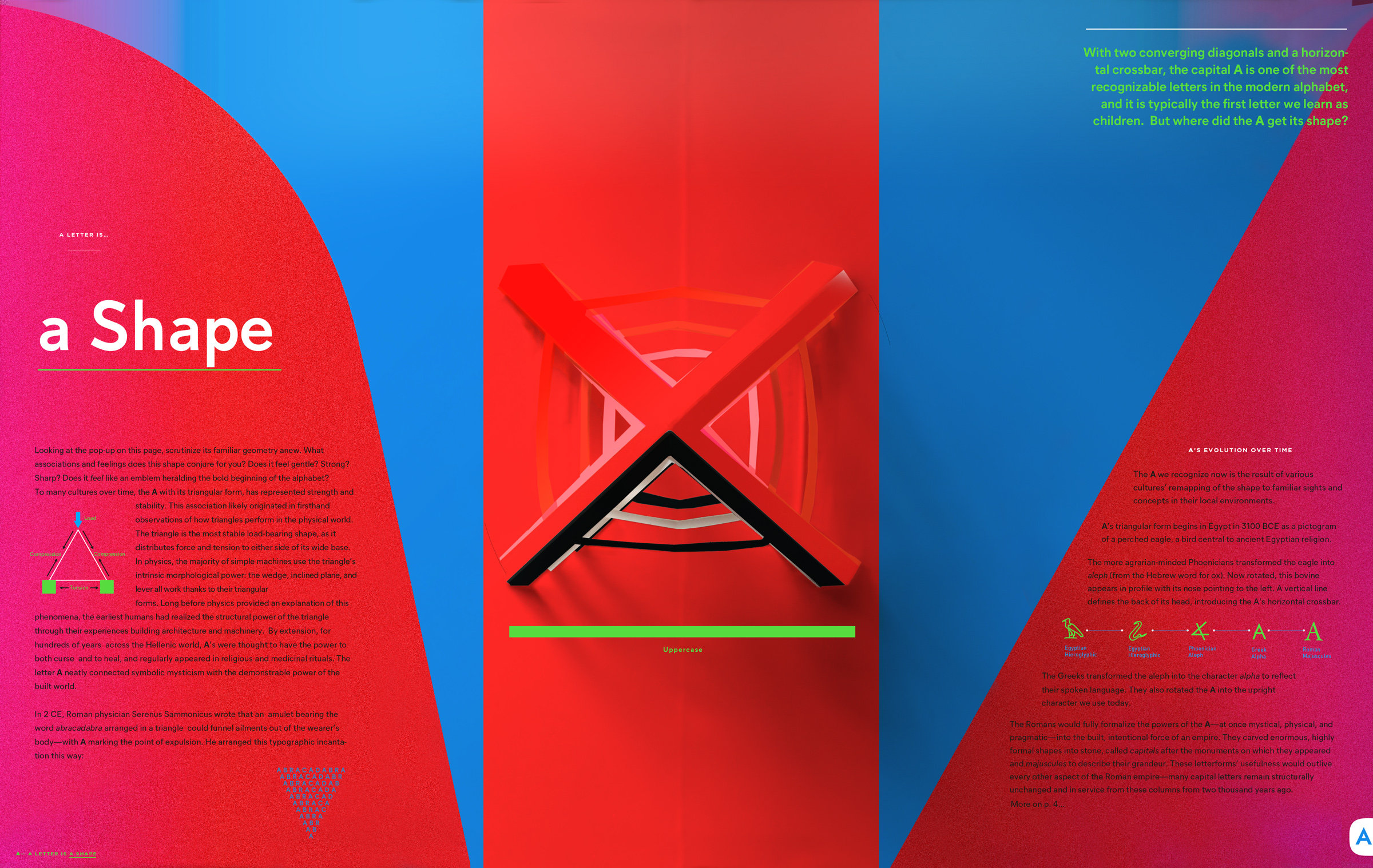
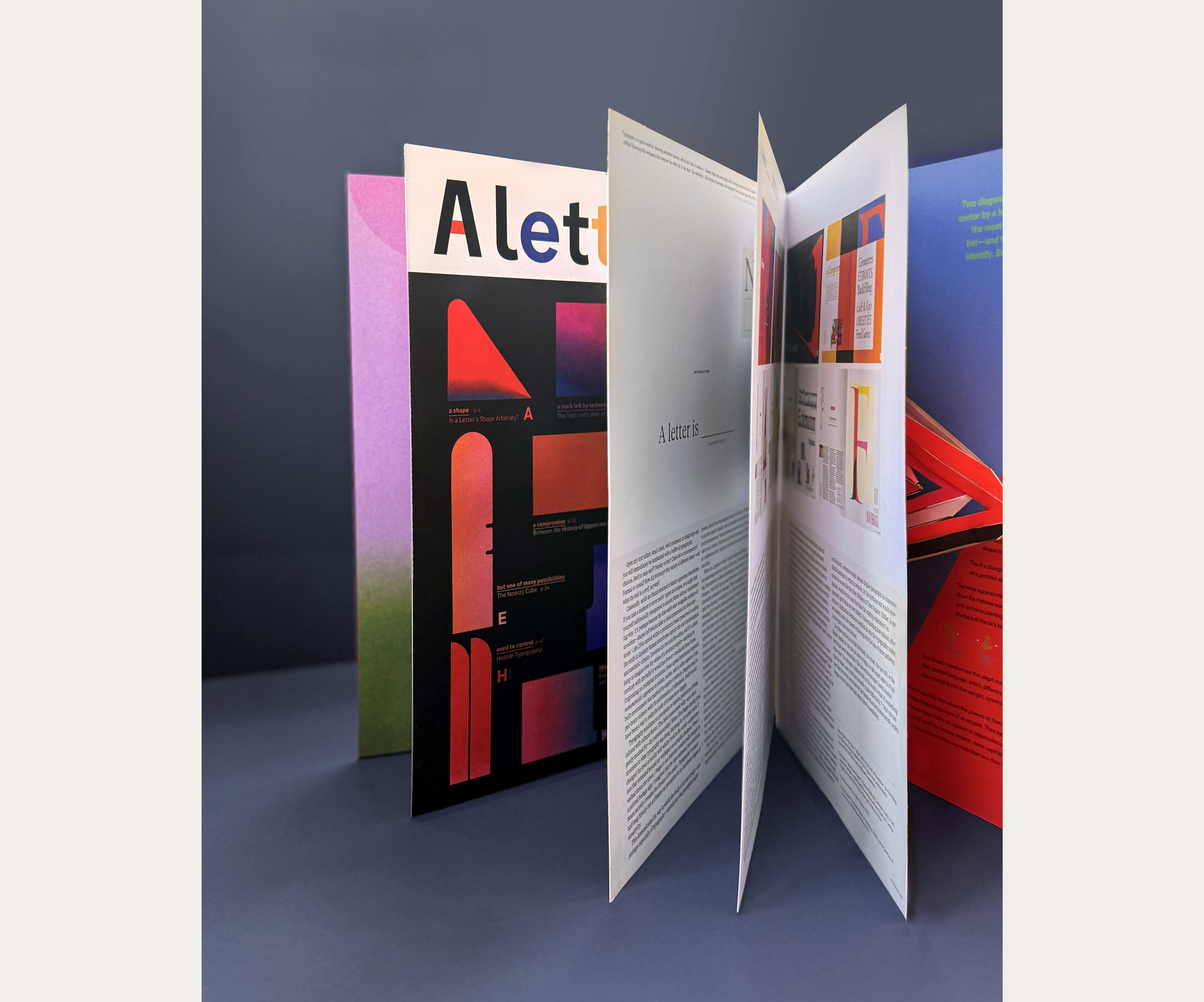
The pop-up book pages (A-Z) introduce and demonstrate typographic concepts. Curious readers are invited into the longer-form essay on each topic, drawn from the history of typographic design and technology. Letters are the smallest units of culture.
"This is the book that I've wanted for my students." —Nicole Killian, Director of the Design, Visual Comm. MFA at VCU
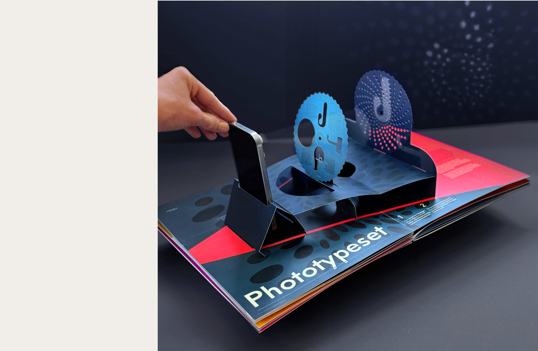
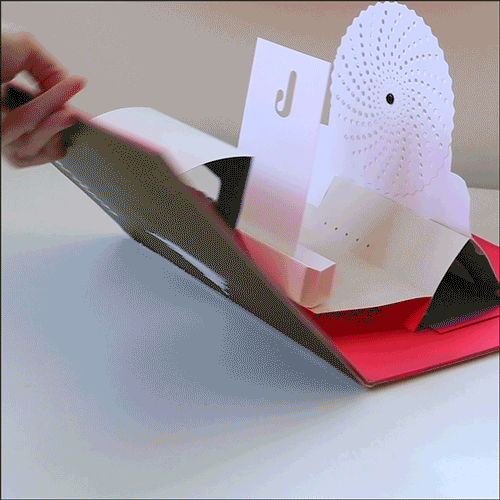
The letter J presents a rudimentary paper phototypesetting device to warp, bend, and distort projected characters.
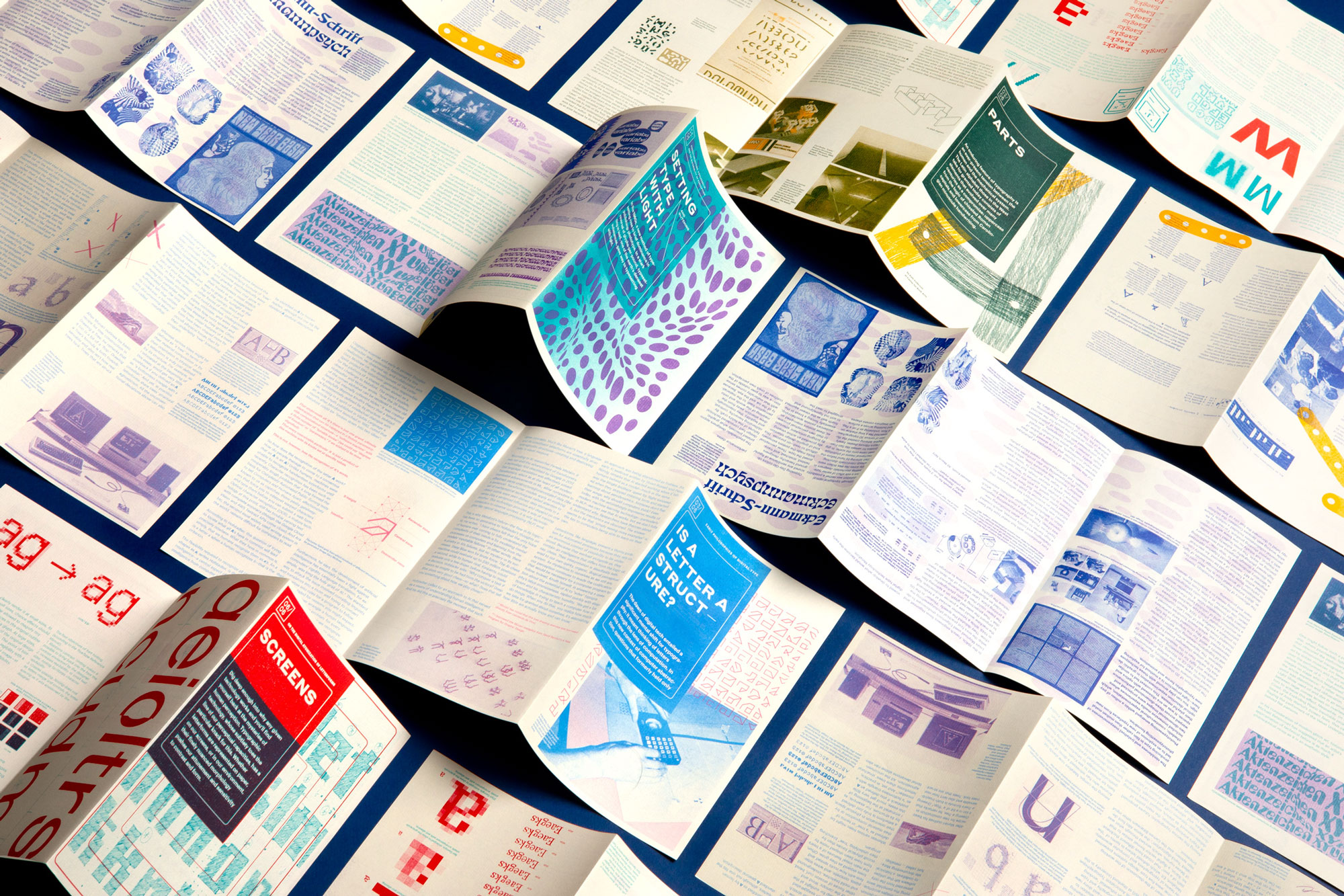
Type history research is color-coded, printed in risographed duotone. This helps to visually connect the essay to the pop-up and keep the reader oriented.
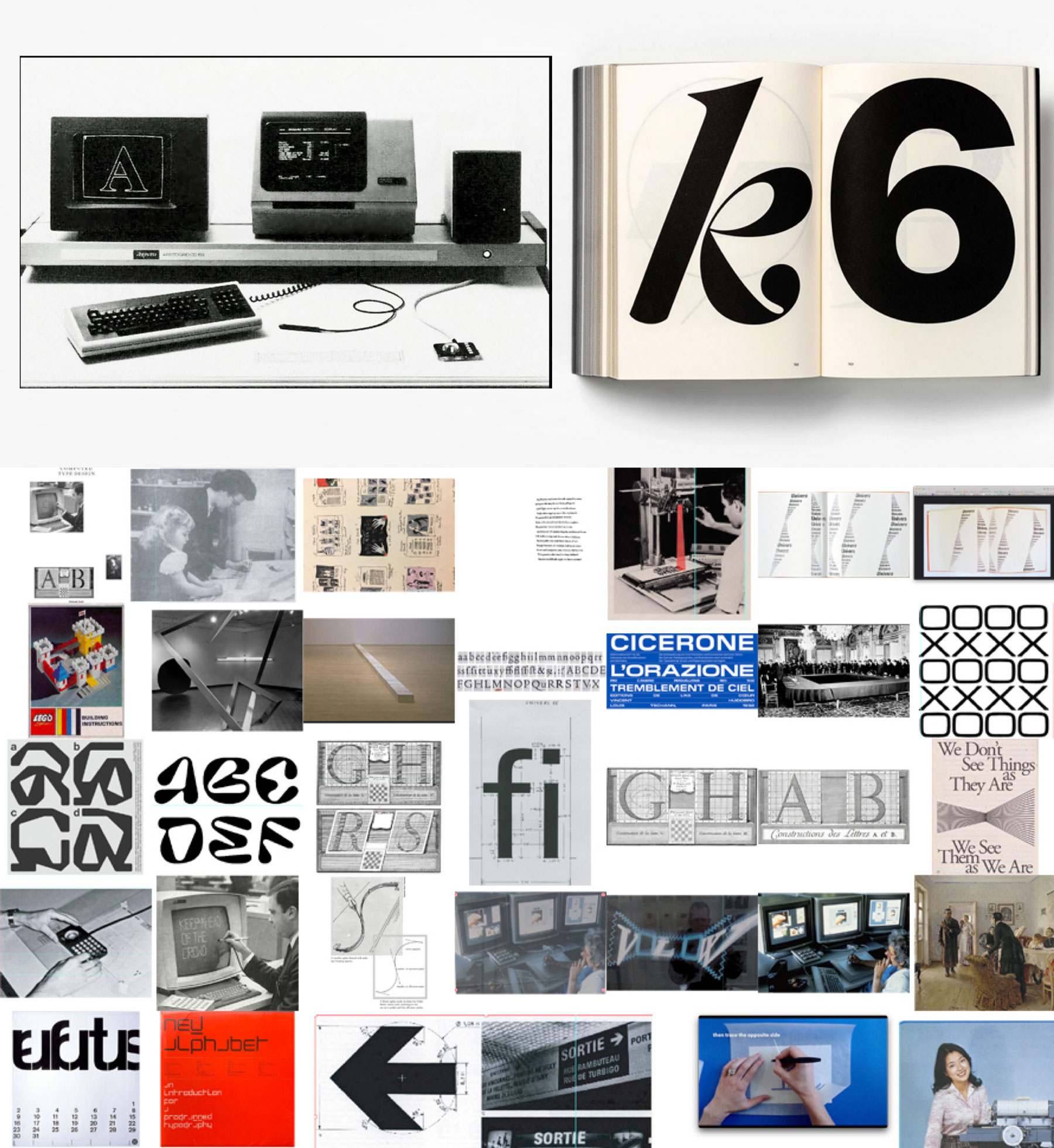
L: An essay on Phototypesetting and the Psychedelic Era | R: Images documenting type's transition from metal to digital
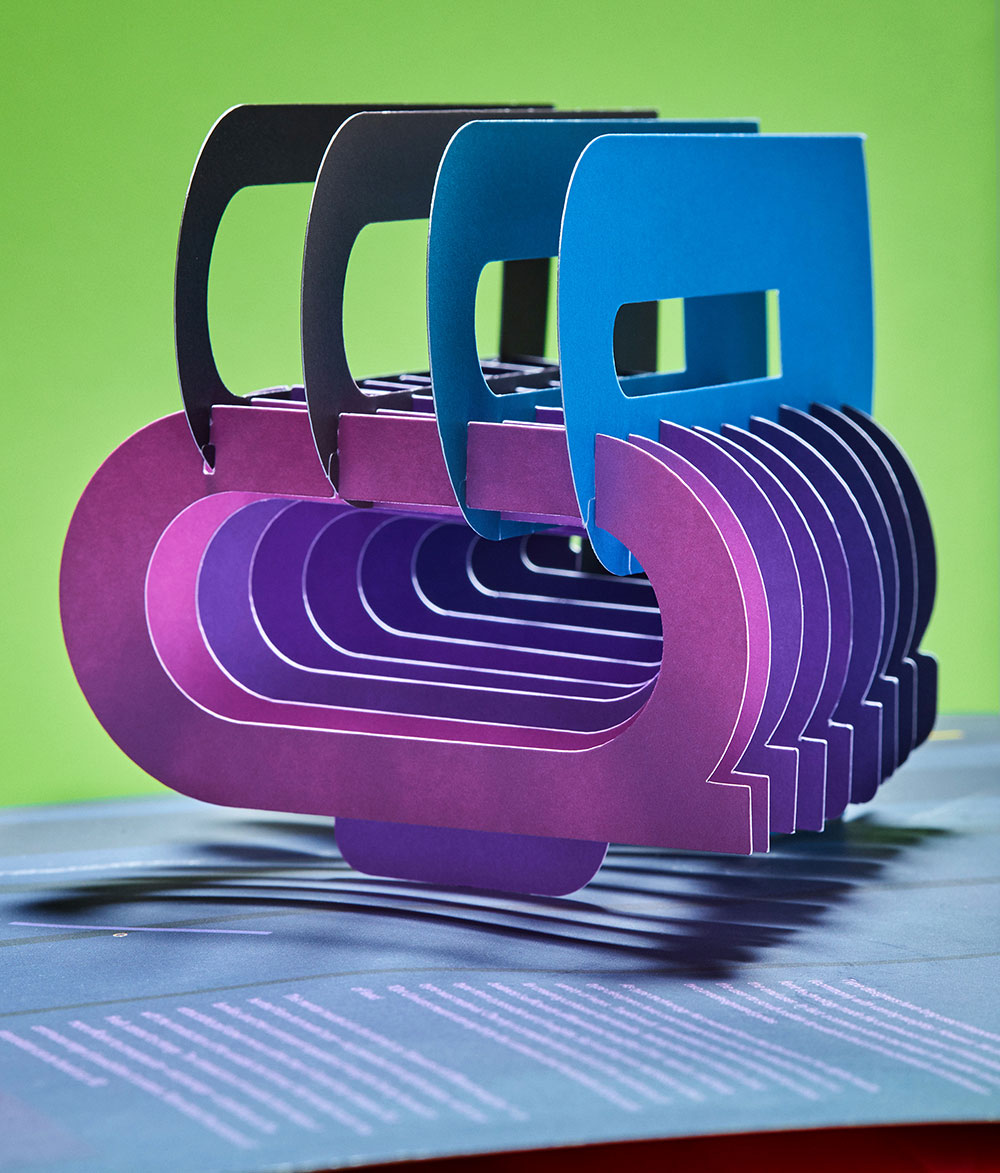
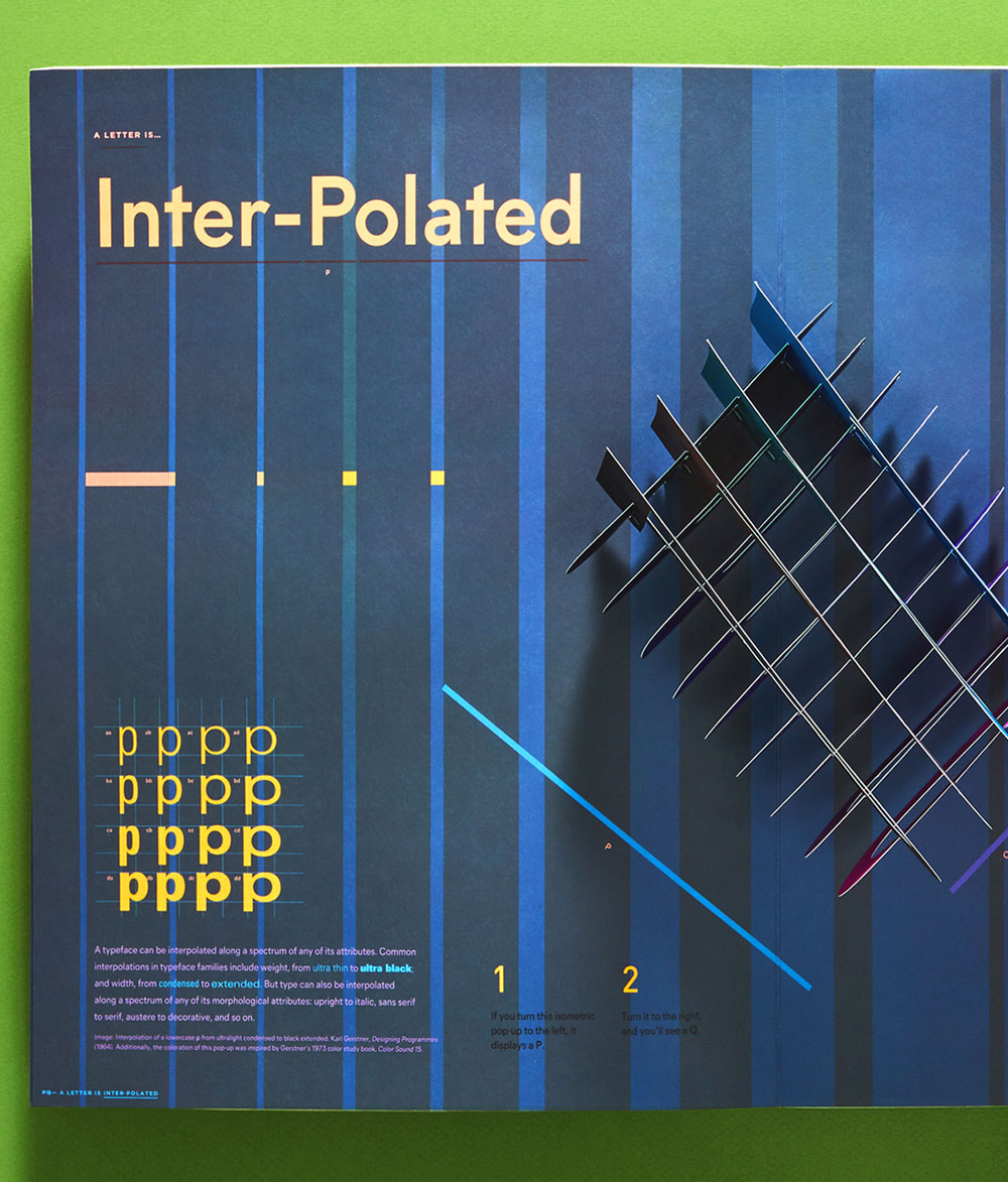
P from one side, Q from the other | On the topic of interpolation in font families
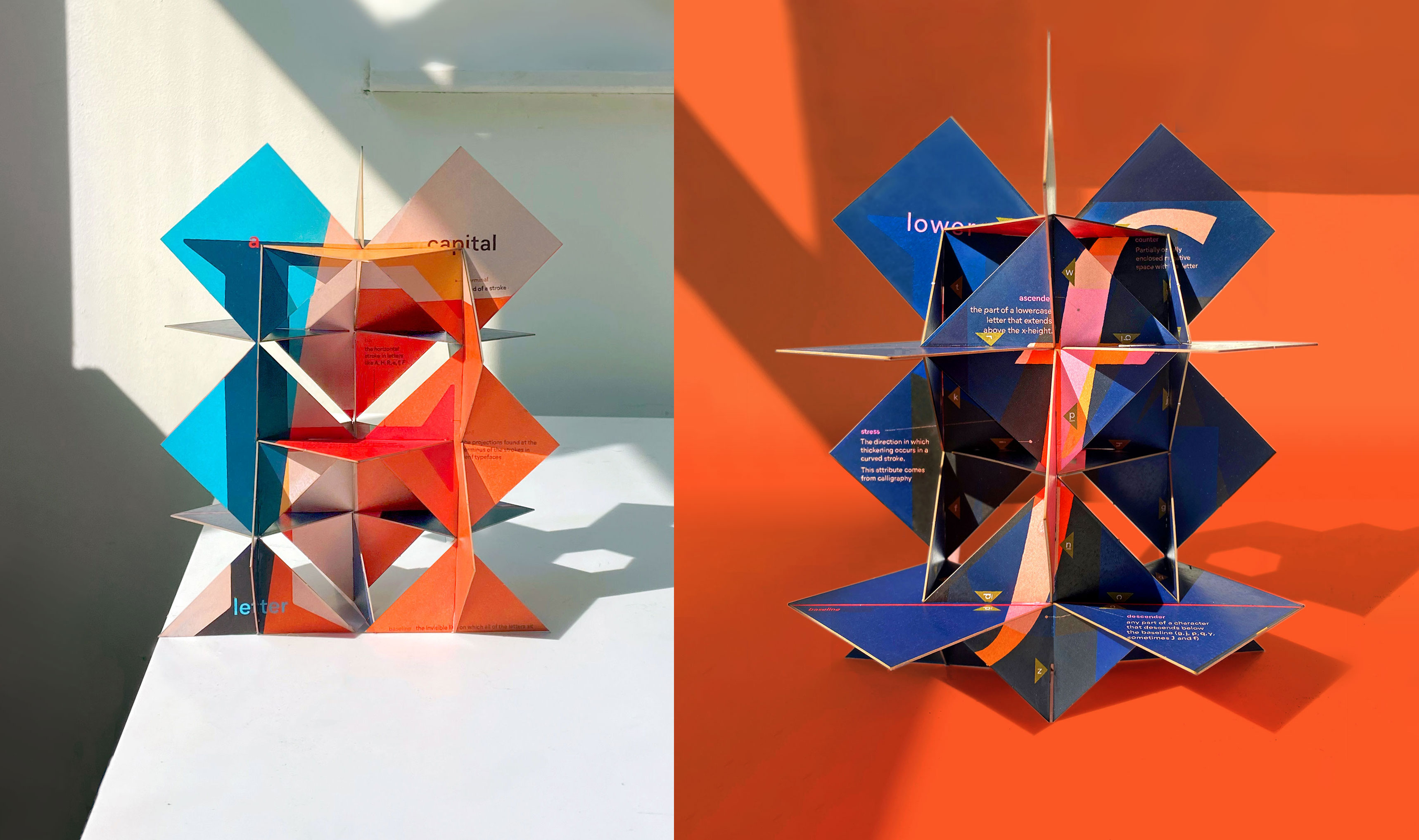
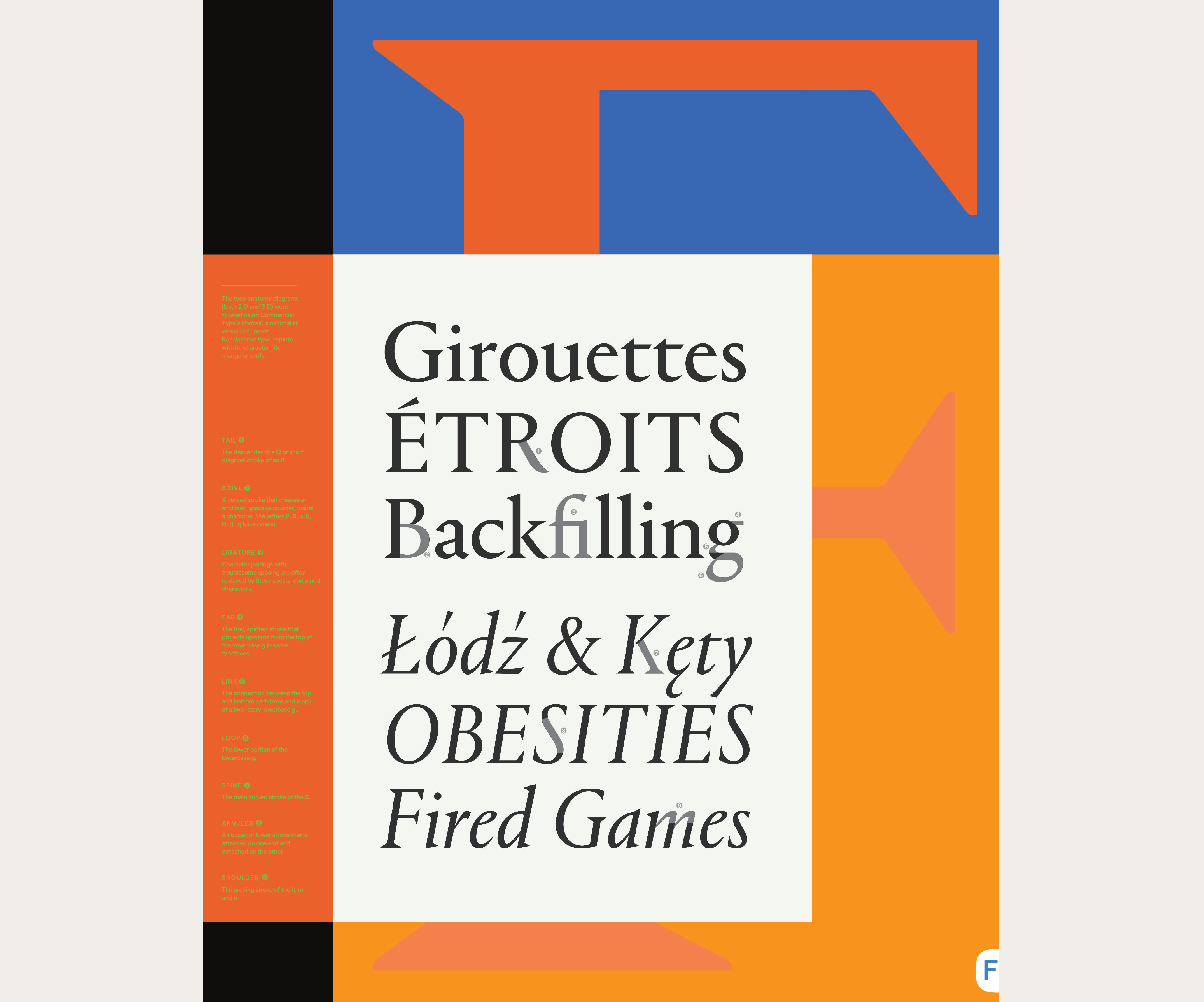
A letterform anatomy puzzle for the letter F
Prototypes: L: Wim Crouwel's letter g for the Stedelijk Museum | R: Phototype pop-up demo
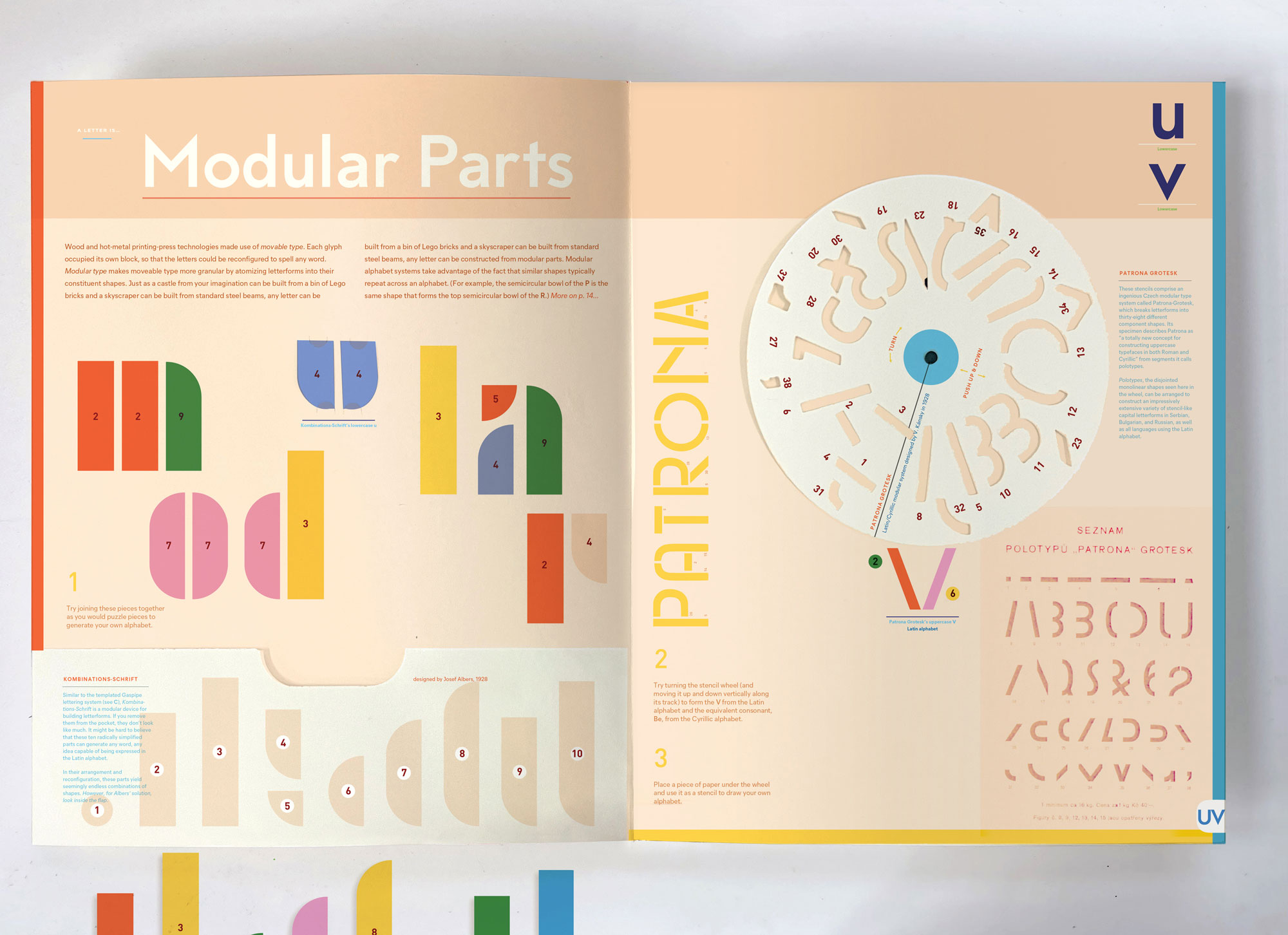
UV translates modular alphabet Patrona Grotesk into a stencil and Josef Albers' KombinationsSchrift into building blocks.