![]()
Jim Fisher
May 10, 2025
When we build something new at Granola, we first create a dot-plot. This data table mostly replaces analytics like funnels and DAUs. Our dot-plot looks like:
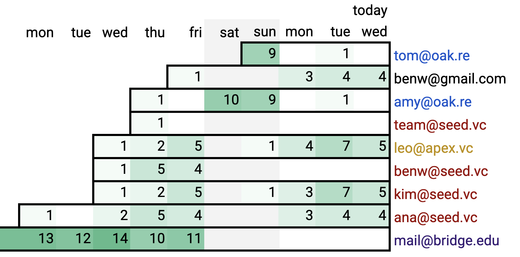
It shows users, sorted by sign-up, with how many meetings they had each day. You stand and stare at it on the Giant TV, until your brain says something like
- "Ben churned ... no wait, he switched to his Gmail? Why?"
- "Looks like Ana invited her colleagues?"
- "Are several people using mail@bridge.edu? Would a .edu discount help?"
Those are questions about user behavior. Stare at the dot-plot yourself, and you'll find several more!† This is why the dot-plot drives our iteration loop. Observe behavior, ask about it, make product change, repeat.
These questions are possible because the dot-plot is data, not analytics. Imagine our TV instead showed analytics like:
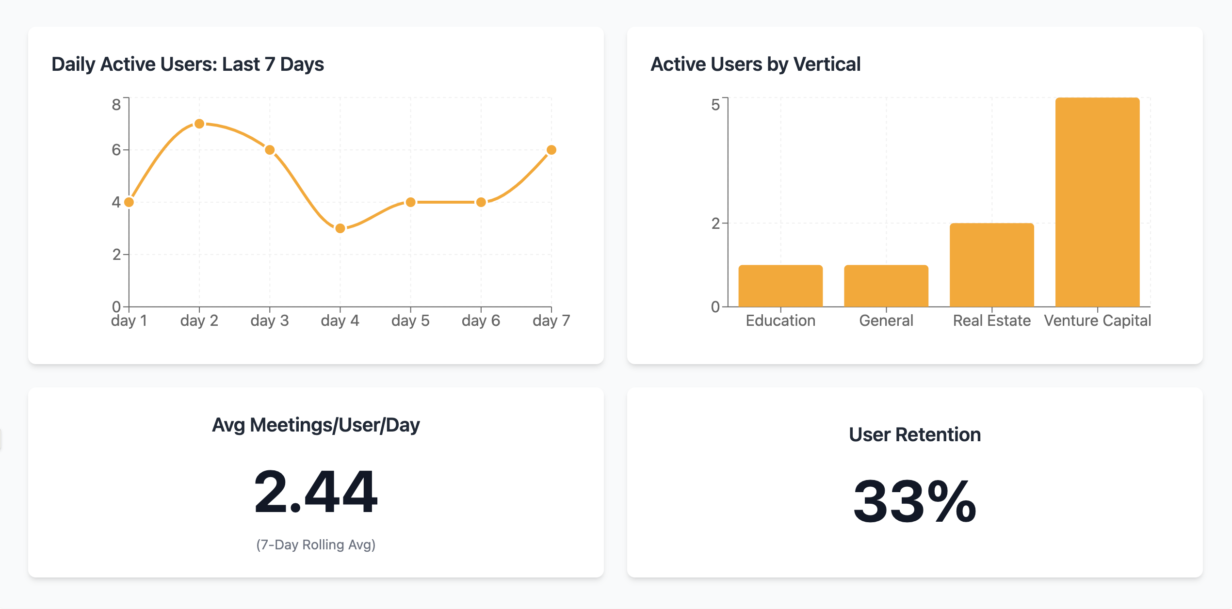
Those charts are too abstract to spark theories of user behavior. _2.44 meetings/day_ gives you bad intuition — averages hide distributions! 33% retention, but _who_ stopped using it, and _why_? Without the individuals, you can't see their behavior, or ask them about it.
Our advisor David Lieb taught us the dot-plot after seeing us digging through Amplitude. We never went back: for the entire year before launch, the dot-plot was the only dashboard on our wall.
Now I hear you saying, "but we have thousands of sign-ups every day. Don't we need to switch to analytics?" But dot-plots can work at scale too! After launch, we added a team dot-plot:
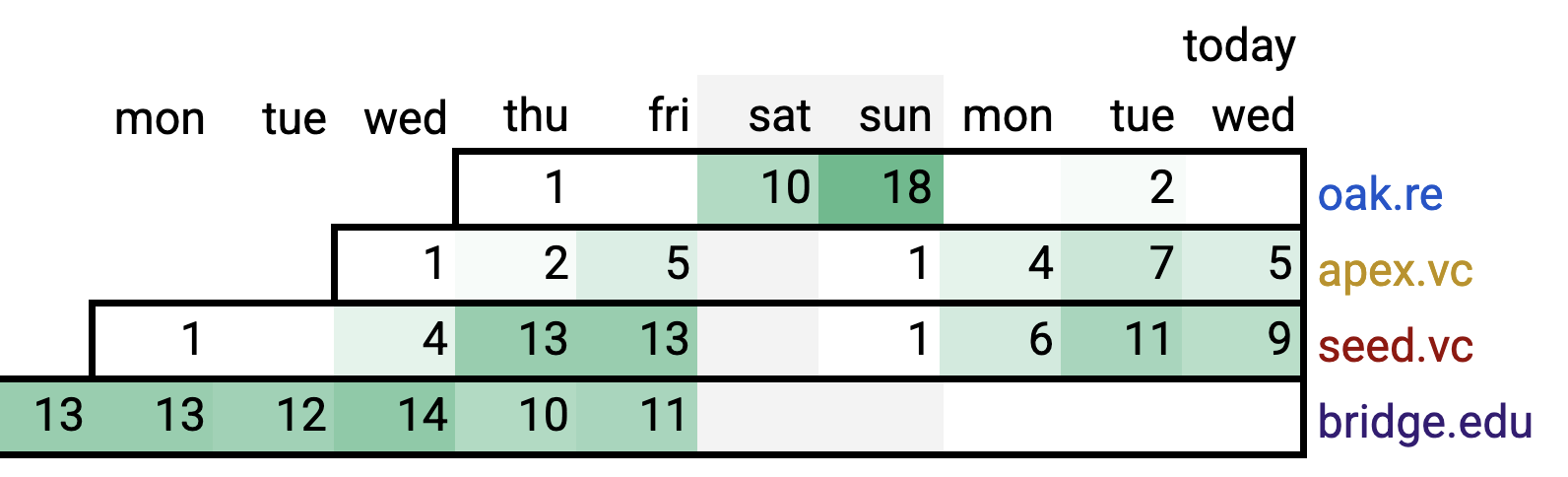
Clicking a team goes to their user dot-plot, where you can see how Granola grows within a team. We also use dot-plots for each new project! This the only dashboard for Granola for Windows:
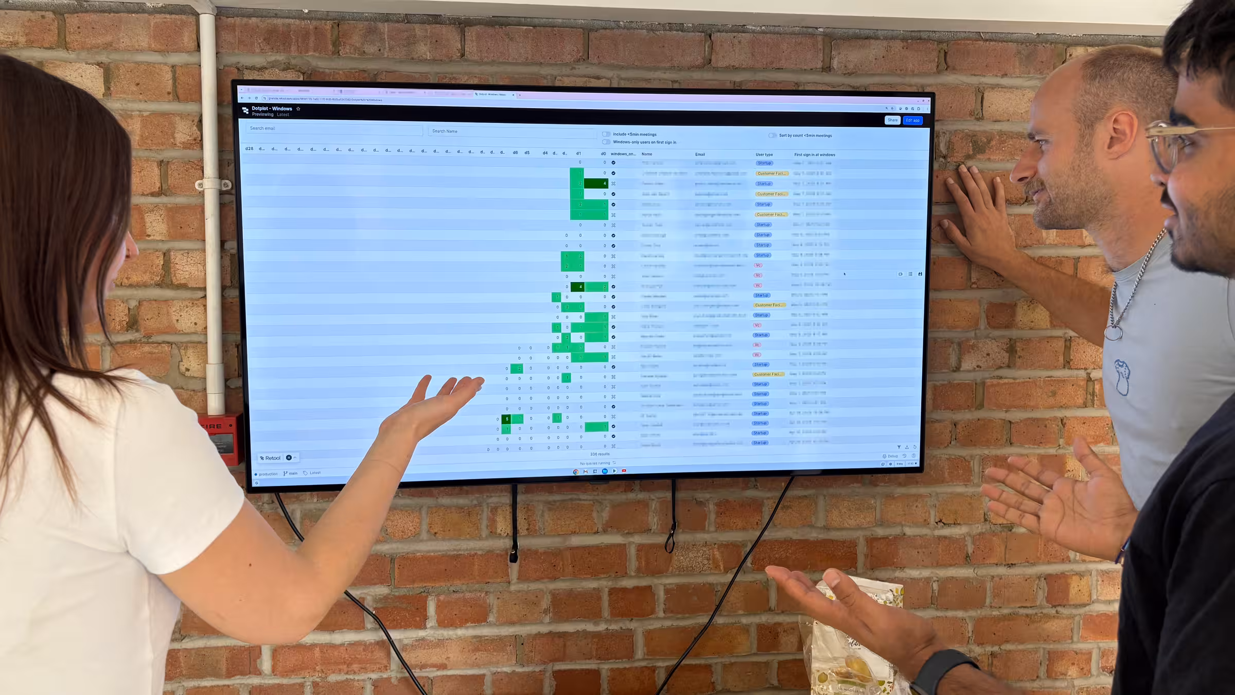
(Photo only slightly staged.) Why does no one stop and stare at your analytics TV? It's because analytics presume a handful of fixed questions, and give you the answers. But people are not looking for _answers_. They're hunting for new _questions_, _theories_, _stories_, _surprises_ that will help them iterate.
TL;DR: avoid early analytics: they'll give you answers before you know the right questions. Instead, show the data, optimized for eyeballing user behavior. Dot-plots are how we eyeball usage at Granola — how can you eyeball usage of _your_ product?
p.s.: Nikita Bier recommends a different kind of plot. But note the key similarity: showing individual users, not analytics! Thanks Guy Aglionby for the pointer.
p.p.s.: See also how to evolve a product, about our early-stage software development principles.
† some more questions you might ask from that dot-plot:
- _Why did team@seed.vc churn?_ Maybe it's just for billing?
- _Why is first-day usage always low?_
Just testing out the product?
- _Why do Kim and Leo look the same?_
Working together at different firms?
- _Why are there no sign-ups this week?!_ School holiday?
- _Hey, realtors work weekends?_ Bet their Friday digest emails are bad!
- ...
![]()
Jim Fisher, Founding Engineer
Share