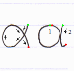
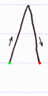
The first of the two is the most typical, “the Greek way” of writing an alpha. Some Greeks, however, write it just like a common hand-written version of the Roman a, as shown on the right. If you prefer your writing to look more genuinely Greek, use the first way; but if you like the safety of the familiar, you may use the second way.
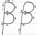
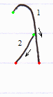
Two ways to draw a beta, differing only in the starting point of the strokes. The first way yields a more squarish beta at the top, and is done in two strokes. The second way yields a more roundish top, and is done in a single stroke (but starts a bit awkwardly at the bottom). Use whatever seems more convenient to you.
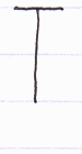
Note: many non-native writers tend to put a little vertical “tail” at the end of the second stroke, seeing it in printed forms of this letter ( Γ ). That’s a serif! It does not belong to the basic form of gamma any more than the serifs at the end of the horizontal bar of a capital T belong to it. When we write, we usually do not mark the serifs.
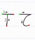
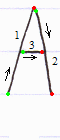
Not really different, the two ways depend on where you make the crossing point. Making it higher than the notebook line (first way) is more convenient in handwriting. Making it right at the line (second way) is more like the printed letter.
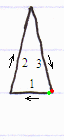
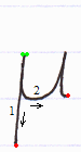
An alternative order to draw the strokes is just as in A, with the horizontal line (3rd stroke) being the base of the triangle.
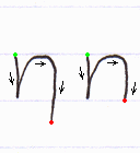
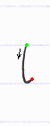
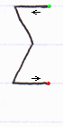
When written quickly, the angle at the top-left usually comes out as a curve.
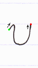
An alternative way to draw this letter is like a c with a horizontal line in the middle (like this: є, or just as the math symbol for “belongs” — for whomever is familiar with that — but in small size).
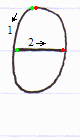
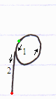
The length of the top horizontal line doesn’t matter. Also, that line is sometimes slightly curved like a wide-open bowl. The hook at the bottom can be more closed or more open.
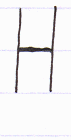
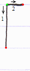
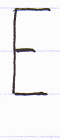
Same as Roman H (but note that this is the Greek vowel eta).
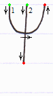
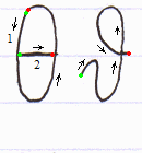
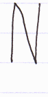
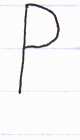
The first form is less common, but more consistent with Greek-style hand-writing. The second form is more common, and appears more familiar to non-Greeks, since it’s identical to the Roman letter n.
The first form is thinner than its corresponding capital letter. The second form is cursive.
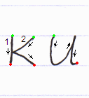
The second form (which looks like the Roman u) is cursive but quite common — perhaps more common than the first form.
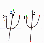
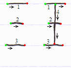
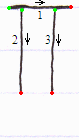
Sometimes stroke #1 ends with a little hook pointing to the right.
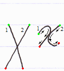
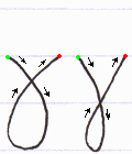
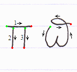
Drawing the strokes in the given order makes it a bit more cursive (preparing for the next letter). But you can also draw a Roman u first, and then extend the line on the left.
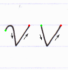
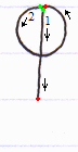
If you want to distinguish the Greek ν from the Roman v, use the first form.
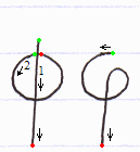
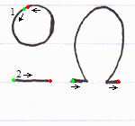
A very rare letter. The second form probably exists so that the letter doesn’t appear discontinuous.
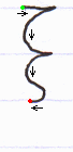
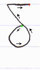
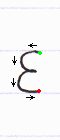
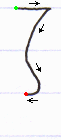
Looks complicated, but it’s actually like a lowercase zeta (see it above), the curve of which has acquired an extra spike. Another way to see it is as a final sigma (or Roman s) on top of which stands a lowercase cursive tau (see it below).
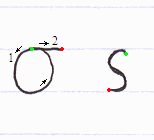
Note: some books written by non-Greek authors might suggest the Byzantine form c instead. Nobody writes a sigma like that today, save for the Greek Orthodox Church.