Recommended practices for technical documentation
Publish date: Mar 4, 2023
Last updated: Jul 29, 2025
6549 Words
Applying the principles of good technical communication to the practice of technical documentation. Write better, guess less.
In the preceding document, I listed the general principles of good technical writing. In this document, I list how I apply these principles to edit various levels of technical documentation.
Have faith! Once you know a technique, you’ll quickly find many places where you can make a document more readable. For example, you probably already know a few techniques to touch up this ancient doc.

This list begins with practices that apply to information at the broadest scope, then narrows downward. In this narrowing process, I start from the edits that are often the most difficult and context-dependent and finish with the edits that experienced writers can apply quite mechanically.
For each guideline, I try to not only provide a rule but also explain why these edits usually improve the text. The justification for each edit is grounded in the principles listed in the preceding document. I also provide examples, especially for recommendations based on some syntactical change.
Finally, I want to mention that nothing in this list is my original idea. So I do my best to provide quality sources.
A very short summary
This document is long. If you don’t want to read it all, here are the highlights.
- Put the most important information at the start of every section.
- This way, the widest possible audience accesses the most widely applicable details.
- Create pages that are easy for readers to scan.
- People don’t read, and that’s okay! Help them read less.
- Write short paragraphs.
- This helps people scan.
- Try to write short sentences—aim for 20 words or less.
- This reduces reader effort and leaves less possibility of misinterpretation.
- Use a style guide.
- This helps ensure that you can apply consistent formatting and terminology.
Global structure
The following recommendations apply to every level of your documentation set. When you start writing docs, you’ll save future writers much time if you keep these in mind. From an information-architecture standpoint, these global design choices also most influence the organization of your information environment (probably your documentation website). To borrow a metaphor from Stewart Brand, they are the shearing layers of a building: you can’t change the decisions about these elements without also changing all the stuff inside.
However, while these recommendations apply to how you design a sidebar or top-level table of contents, they also apply to individual smaller units, like paragraphs.
Put the most important information first

Why?
To maximize the signal-to-noise ratio, use beginnings to communicate the most essential information.
If you write for a broad audience, assume that most readers will read only a small portion of your text. If the documentation is of any reasonable size, some parts will be irrelevant to some members of the audience. However, though few read all documentation, most read at least the beginning parts.
By putting the most essential information at the beginning, readers can:
- Quickly get the most broadly applicable information
- Decide whether the subject of a page or paragraph is relevant to their needs
- Navigate through docs that are organized in increasingly specific units
- (If the reader is proficient) Get enough information to fill in essential details themselves
- (If the reader is not proficient) Learn the fundamentals before wading into the details
This practice is recommended across many disciplines. Journalists call it the inverted pyramid; military correspondents call it the bottom-line up front (BLUF); designers call it progressive disclosure; and for forum posters, it might be the too long; didn’t read(TL;DR).
The design practice applies to all units of your docs. The first sentence of the page should be the most important sentence. The first section should be the most important; the first paragraph of a section should say the section’s key info; and the first sentence of paragraph should express the paragraph’s most important idea.
This is a critical structural change. Along with structuring content according to different needs, I’d say it’s my most important editorial duty. It’s also the hardest, because it requires the most understanding of what the information is and how it can be most useful to readers.
Underlying principles: people don’t read, understand reader context
Says who?
- Animalz: The military standard that can make your writing more powerful
- Purdue Writing Lab: The Inverted Pyramid structure
- Mensh and Kording: “Allocate time where it matters: title, abstract, figures, and outlining”. Ten simple rules for structuring papers.
Structure content according to different reader needs

Why?
Readers come to documentation for different reasons:
- To practice (tutorial)
- To follow instructions as they build something for practical use (how-to guide)
- To look something up (reference)
- To learn something (explanation)
As you write your docs, design each unit of content to address a specific need. As a side effect of breaking docs into digestible topics, writers have a sturdier foundation to write and build upon.
Underlying principles: understand information context, make it easy for future writers
Says who?
The idea of separating content into task, concept, and reference has been around for a long time. It’s mentioned in Developing Quality Technical Information: A Handbook for Writers and Editors.
As far as I know, Daniele Procida was the first to add the tutorial to the schematic. You can read about his system at Diataxis.fr.
Don't get too hierarchical
Why?
Deep information hierarchies reduce coherence and impose a categorization that may be illogical to the reader’s context.
Avoid stranding readers in deeply nested structures. This advice applies to every level of documentation design, from homepage organization down to the choice of adjectives (the Sentences section provides some examples of over-nesting on the syntactical level).
Some hierarchy is well and good: grouping and sub-grouping creates structure. At some level, documentation almost must organize information in some kind of hierarchy. For example, you might categorize information by application type, reader need, or workflow. Even if the structure goes for a totally flat, tag-based design, the information still likely exists in some hierarchical URL scheme.
However, while undeniably useful, all information hierarchies are also arbitrary. And categories become vaguer as the number of items grows. A deep hierarchy might be logical to the writer, but it also imposes a way of navigating and thinking about information that might be illogical or meaningless to the reader.
The experience can be especially incoherent for readers coming from search results—that’s a large number of readers. The results page links directly to the page with the info that matches their query; the intrinsic organization of the document is irrelevant. But if readers want to explore further, they then must navigate a hierarchy that’s completely unfamiliar to them.
If you find yourself getting deeply nested, look for ways to flatten out:
- Reset headings
- Reorganize categories
- Rely on well-placed links to connect information.
Underlying principles: be coherent, understand reader context
Says who?
- Edward Tufte provides a great and witty explanation of the dangers of too much hierarchy in The Cognitive Style of Powerpoint In short, nested bullet points contributed to fatal aerospace disasters.
- John Luc Doumont. “[An effective hierarchical structure] consists of a limited number of items at every level”. Trees, Maps, and Theorems.
- Mark Baker. “Many hierarchies that we use are unnatural and distort the subject matter”. Every Page is Page One.
- Tim Peters. “Flat is better than nested.” The Zen of Python
Design with fractals in mind
Why?
In nature, many structures are self-repeating. In technical documents, a degree of self-replication can help readers navigate.
Smaller parts should suggest the structure of the whole; and bigger parts should show the details that can be fractally zoomed in upon. This connects closely with putting the bottom line up front and using templates.
Underlying principles: understand information context, be consistent
Says who?
- Jean Luc Doumont. “Designing fractal like documents”. Trees, Maps, and Theorems
Document design
The next recommendations apply to the level of the page. Really, they’re all variations on the same two recommendations:
- Make pages that are easy to scan.
- Organize text according to how related the information is.
Make content scannable
Why?
If you assume that people don’t read, you need to design documents that help readers read the least amount possible.
By breaking up tables into lists, grouping things according to proximity, and adding uniform formatting, you’ll also make the text more accessible.
Underlying principles: support scanning
Says who?
- Nielsen Norman Group. Concise, SCANNABLE, and Objective.
- Microsoft style guide. Scannable content. This also has good practical advice.
| Avoid: # About |
| Prefer: # About rockets |
Why?
Descriptive headings make a page more scannable and accessible.
By paying attention to your headings and making them meaningful, your document will be self-describing. This has the side benefit of turning ToCs into TL;DRs.
Web crawlers also look at heading text, so descriptive headings can improve your SEO as well.
Underlying principles: make scannable content, be accessible, understand information context
Says who?
- Access guide. Write descriptive headings and labels
Use templates
Why?
Readers who come to one page expect it to have the same structure as other similar pages. Otherwise, the reading experience is incoherent.
From the writer’s side, templates help standardize processes. As information grows, the same problems of organization inevitably recur. With templates for different content, readers can scan easier, and writers think less about design. If the information has a uniform structure, you also might be able to programmatically generate the document, making style changes much easier to apply globally. (I did it with this page).
Underlying principles: support scanning, be coherent, make it easy for future writers
Says who?
- NN Group. Maintain Consistency and Adhere to Standards
- Ankithi Tripath. Documentation and the Good Docs Project.
I also recommend the template repos that The Good Docs project puts out. They’ve done the work making the templates so that we don’t have to.
Increase the C.R.A.P.
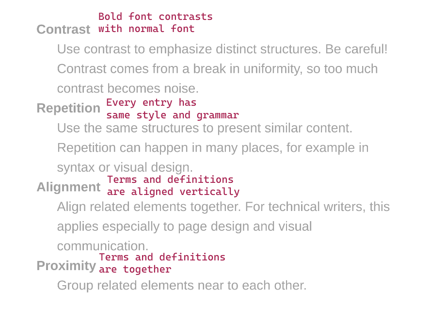
Why?
That’s C.R.A.P., not crap: contrast, repetition, alignment, and proximity. This acronym came from the work of designer Robin Williams.
If you conciously use these four patterns to arrange your text, you’ll naturally emphasize the relationships between the page’s information. Readers will appreciate both the logical flow and the improved readability.
- Contrast
- Happens when you deviate from the dominant pattern.
- Use it to call attention.
- Repetition
- Happens when your repeat visual or syntatic structures.
- Use it to create patterns that make it easier to navigate a page, or determine relationships in a sentence, list, or table.
- Alignment
- Happens when text elements have the same vertical or horizontal orientation.
- Applications include in diagrams, tables, and lists.
- Proximity
- Happens when two elements are near to each other.
- Proximity naturally creates a perceived relationship. Proximity is thus the main tool you have to structure information in a way that makes the most sense for your readers.
Underlying principles: support scanning
Says who?
- Robin Williams. The Non-Designer’s Design Book
Paragraphs
Generally, paragraphs in software documentation should be contained to one idea and written in a way that’s easy to scan. Sometimes, I’m tempted to over-correct and make all paragraphs only one or two sentences. This isn’t a good idea either: if you don’t group sentences into paragraphs, your readers will be forced to find the inter-sentence relationships for you.
Use small paragraphs
Why? Everyone dreads the wall of text. Breaking paragraphs into units that develop single ideas makes the content more digestible.
Underlying principles: be clear, be concise
Says who?
- Cormac McCarthy. “Limit each paragraph to a single message.” From Novelist Cormac McCarthy’s tips on how to write a great science paper.
Break repetitive text into lists
Why?
Long paragraphs are hard to read and important information gets missed by scanners. You can solve both of these problems with good use of ordered and unordered lists.
What’s more, lists can enforce the type of content the reader is looking at, as discussed more in the formatting section.
Says who? Suzan Last. “[Lists] emphasize important ideas. also increase the readability of text by simplifying long sentences or paragraphs and adding aesthetic passive space to make reading more pleasant.” Technical Writing Essentials.
Order instructions in the sequence they are experienced
| Avoid: Add files from the files tab. |
| Prefer: In the files tab, add files. |
Why? If the instructions are out of order, the text is incoherent and hard to read. Sometimes, a disordered procedure can even trick readers into doing something bad and irreversible.
Underlying principles: be coherent
Exceptions:
In ordered instructions, the sequence is important and there are no exceptions. This guideline applies to both paragraphs and sentences.
In reference docs, beginning a line with the result can make it easier for readers to scan for what they want to do. In prose paragraphs, you can also ignore this guideline when the syntax becomes tortured or indirect.
Says who?
Begin sentences with information from the last
| Avoid: Network protocols transmit data in packets. Sending a single large binary would clog up the tubes of the internet, so the packet-transmission strategy is more reliable. |
| Prefer: Network protocols use packets to transmit data. This transmission strategy is more reliable because sending a single large binary would clog up the tubes of the internet. |
Why? This given-new form of writing makes sentence relationships more coherent, providing what writers often call flow.
Underlying principles: be coherent
Says who?
- Richard Nordquist. The Given-Before-New Principle.
- Janice Redish. Letting Go of the Words: Writing Web Content that Works.
- Discussed in Clarity and Grace with many examples.
Use parallel constructions
| Avoid: To strive, to seek, to find, and not to be yielding. |
| Prefer: To strive, to seek, to find, and not to yield. |
Why? Parallel structures are patterns, which help the reader organize and scan information. This guideline applies to both paragraphs and sentences.
Underlying principles: be consistent, use effective repetition
Exceptions: In a long list, minor breaks in parallelism can be acceptable for economy. Experienced writers sometimes intentionally break parallelism for emphasis.
Says who?
- Google writing course. Keep list items parallel
Sentences (and phrases and words)
Sentences are the molecules of a text. True, they have smaller particles: letters, words, clauses, and phrases. But the sentence is the basic moveable unit of a text.
If you have an unclear, incoherent, or inaccurate sentence, your text fails on the elementary level. The most well-structured text is still unreadable if it has unreadable sentences. For this, even though creating a useful structure is the hard part, I’d say that readable sentences are the most important part of a technical text.
Structure is critical too, as is formatting. But, I’m going to claim that a high attention to sentences naturally imparts a higher attention to structure. This is the only uncited claim in this long, long, guide.
Keep sentences short
| Avoid: In order to do this, make sure you are able to do that. |
| Prefer: To do this, make sure you can do that. |
Why?
Shorter sentences are usually more readable, scannable, and accessible. For readers, short sentences mean less reading time, and less room for interpretation.
The aim of limiting characters also makes the writer’s job a bit simpler. Simpler_ isn’t necessarily easier, but the constraint reduces the number of decisions to make.
Underlying principles: be concise, be clear, be accessible, support scanning
Exceptions:
Presenting just enough information satisfy your audience is one of the hardest parts of technical communication. Sometimes, shortness can do more harm than good. If you’re too brief, you might:
- Lower accuracy. If a message is too short, it can be imprecise and therefore less accurate. Precision is a quality of accuracy.
- Nest too much. A shorter message might end up embedding too much information. Refer to Avoid nested information for examples.
- Ask readers to infer to much. The message
system erroris brief, but how useful is it? - Create a monotonous tone. This is more a matter of aesthetics, so be judicious.
Says who?
- Ann Wylie: How long should a sentence be?
- Gov.uk: Why 25 words is our limit
Avoid noun forms when a verb form is possible
| Avoid: We need to do some experimentation. |
| Prefer: We need to experiment. |
Why? Noun forms, or nominalizations, bloat a text. If a noun can serve as a verb, it’s better to use it. This shortens the sentence and improves directness.
Underlying principles: be concise, be clear
Exceptions: Use nominalizations if they make communication more precise. This is a common case when the nominalization is its own special technical term, like authentication or nominalization.
Says who?
- Style: Lessons in Clarity and Grace devotes a whole chapter to this topic.
Avoid densely nested information
| Avoid: My second Bash associative array blog post is here. |
| Prefer: Here’s my second blog post about associative arrays in Bash. |
Why?
By nesting, I mean when one unit of information modifies another. Nesting creates a high cognitive demand on readers, and sometimes it can be extremely hard to work out the relationship between units.
Some common nested structures include:
- Stacked adjectives. For example, “packet switched data communication network protocol problem”
- Nested prepositional phrases. For example, “the program runs for the duration of the time set in the
durationobject of the callback to the script.”
If you can’t break the sentence into multiple sentences, you can usually mitigate the problem through dependent clauses:
- Break the phrase into smaller units of noun-verb relations (refer to avoid nominalization).
- Break sentences up into conditionals (that is, starting a subclause with “if” or “when”).
- Use relative pronouns to clarify relationships.
For example, sentences like these are pretty common—and pretty hard to read:
The packet-switched data-communication network protocol problem is well known.
Compound adjectives bury the subject. Even with hyphens, it’s hard to understand what words are modifying what.
Usually these sentences happen when writers try to cram too much in one place. Often, the best way out is to expand. Let the sentence breath a bit.
A well-known problem arises
when network protocols use
packet switching to commmunicate data.
- Invert the predicate, so the subject is short and the verb appears early.
- Use a relative pronoun, when, to make a subordinate clause that informs the reader about conditions that make this subject.
- Turn one of the nominalizations, communication, into a verb phrase. Keep the nominalization that has a special technical meaning.
One disclaimer: I don’t know anything about packet switching, so that sentence is probably gibberish. For a little more authority, this example takes topics that I know from my work with performance testing. It’s something that I even could have written in a first draft.
Stress testing with closed-model virtual-user scheduling can lead to results with coordinated-omission vulnerabilities.
I’ll annotate some faults:
Stress testing with
closed-model virtual-user scheduling
might lead to results
with coordinated-omission vulnerabilities.
- The subject, testing, is far from the verb, lead to.
- A long prepostional phrase modifies this subject.
- That prepositional phrase has a nested stack of adjective phrases made from nouns.
- A gerund is used where a verb form could be better.
- The verb is a phrasal verb, adding room for misinterpretation.
- The object complement is another prepositional phrase with nominalized phrases modifying each other.
How would you flatten this sentence? There are many ways to fix this sentence, including by splitting it into multiple sentences, but you can keep it one sentence too. Try to use less nouns, less adjectives, more verbs, and more clauses.
Here's my attempt:
If your stress tests use the closed model to schedule virtual users, the results might be vulnerable to coordinated omission.
Underlying principles: be coherent
Exceptions:
Nested information can make the sentence shorter. Sometimes, brevity might justify density. This is especially true when real estate is scarce, like for sidebar titles.
But, it’s also often a matter of common sense. Do you prefer “the long wooden table in the dining room” or “the table is long. It’s made of wood. It’s in the dining room”? As always, use your judgment.
Says who?
- Donald Knuth(reported), “Resist the temptation to use long strings of adjectives”, from Lecture on technical writing
- Zen of Python: “Flat is better than nested”
- Legal writing: Concision tip: eliminate prepositions
- Richard Nordquist, “Good vs. bad embedding”
| Avoid: A sentence that splits its supposed subject off from its verb or that splits its verb off from its object makes the readers—quite understandably—confused. |
| Prefer: If a sentence splits its subject from its verb or its verb from its object, it confuses readers. |
Why? Sentences like this one, called middle-branching sentences, where a comma-separated phrase separates the subject from the verb, break up the flow of a sentence. English syntax is based on word order. Any time you split the constituents of an English sentence from the parts they most closely relate to, readers must keep more information in their memory.
Underlying principles: be clear, be coherent
Exceptions: In technical documentation, a middle-branching sentence is probably never necessary. However, they can help provide quick clarifications of terminology (for example, “These functions, named callbacks, run only after…”) Sometimes, branching a sentence off with dashes—like this— can quickly add examples, qualify statements, and create suspense. These effects are mostly rhetorical, so be careful about using them, especially outside of explanatory text.
Says who?
- Plainlanguage.gov: Keep the subject and verb close Together
Get to the subject quickly
| Avoid: The thing that I wanted to tell you in the car yesterday while you were talking on your phone was that I liked your book. |
| Prefer: I liked your book. I wanted to tell you in the car yesterday, but you were on your phone. |
Why?
Delaying the subject increases demand on reader memory. When the verb comes, readers must group all the information as one thing. Note that in the example “bad” sentence, the main verb is is: The thing that I wanted to tell you in the car yesterday while you were talking on your phone functions as one huge subject.
To mitigate this, break the sentence up into independent and dependent clauses.
Says who?
- Style: The Basics of Clarity and Grace recommends using no more than six words before getting to the verb.
Just say "you"
| Avoid: Users can use the whiteboard to sketch. |
| Prefer: You can use the whiteboard to sketch. |
Why? The second person is more direct, and it avoids the massive naming problems that can arise when trying to group people within a single label.
Underlying principles: be correct, be clear
Says who?
- Daniel D. Beck, “Every style guide I could find—from Microsoft, Google, Apple, and more—says to use the second person.” The second person is OK in developer documentation
Use the imperative mood
| Avoid: You can use the whiteboard to sketch. |
| Prefer: Use the whiteboard to sketch. |
Why? The imperative is shorter and more direct. If you agree to write in the second person, then the imperative, whose implied subject is “you”, is the natural next step. The imperative functions especially well in procedures.
Underlying principles: be short
Exceptions: Outside of procedures, the imperative isn’t always necessary. Be especially careful if it makes a text come off as pushy.
Says who?
- Every technical style guide
Avoid negation
| Avoid: It’s not easy to understand a sentence that isn’t in the positive mood. |
| Prefer: It’s hard to understand a sentence that is in the negative mood. |
Why? It can be extremely difficult to parse a negative sentence. What’s more, negative constructions are almost always longer.
Underlying principles: be clear
Exceptions: Negatives are inevitable. At some point, you need to say what something does not do. But be mindful of whether every negative construction you use is necessary.
Says who?
- Plain language: Use positive language
- Google: Avoid double negatives
- Language Log has a long running list of examples of misnegation
Prefer simple verb forms
| Avoid: After you have done this, it would be a good idea to do that. |
| Prefer: After you do this, it’s a good idea to do that. |
Why?
In other words, use the present tense and the simple verbal aspect as much as possible. Sticking to the present simple generally brings the following benefits:
- The sentences are shorter.
- The sentences are easier for all to understand, but especially for readers for whom English is a second language.
- Constructions that have non-simple aspects (such as have been, is doing) or unreal moods (such as would be) bring more complexity to the sentence.
Underlying principles: be clear, be concise, be accessible
Says who?
- John Maloney: You can go a long way in the present tense
Avoid the passive mood
| Avoid: The whiteboard can be used for sketching. |
| Prefer: You can use the whiteboard for sketching. |
Why?
The active voice is more direct and usually makes shorter sentences. Contrarily, the passive voice can make action unclear and sentences more verbose.
If you write from the second-person perspective, you usually can rearrange a passive sentence into an active sentence that starts with you.
Underlying principles: be clear
Exceptions:
The passive has a few valid uses:
- To emphasize the object
- For when the action has no obvious subject
- To create flow between the previous sentence (at times)
Says who?
- Google: “In general, use active voice”
Avoid the future

| Avoid: When you start the machine, it will emit vapor. |
| Prefer: After you start the machine, it emits vapor. |
Why? Refer to Use simple verb forms.
Exceptions:
When you need to talk about an actual future event, by all means use the future:
This will be deprecated in two cycles.
Says who?
- Microsoft. “The present tense is often easier to read and understand than the past or future tense. It’s the best choice for most content.” Verbs
Avoid -ing forms
| Avoid: Safety is a reason for having a backup. |
| Prefer: Safety is a reason to have a backup. |
Why?
Gerunds are longer, more grammatically ambiguous, and translate poorly in many languages.
If the form isn’t functioning as a noun, then it’s probably in a progressive phrase, which you should avoid anyway if you prefer simple forms.
Underlying principles: be short, be accessible
Says who?
- Microsoft does a great job describing the ambiguity of Words ending in -ing
- Sarah Maddox. Death of the gerund in technical documentation
- Roy Peter Clark, “Tool 6: Take it easy on the -ings”, Writing Tools.
Use the correct modal
| Avoid: You should authenticate with a basic token. |
| Prefer: You must authenticate with a basic token. |
Why?
A modal verb is a verb that modifies another verb in a way that also changes its relationship to reality. The sentence I could be running has two auxiliary verbs, but only one modal: could. Adding could to this sentence indicates an expression of possibility.
Here are the most common modals that arise in technical documentation:
| Modal | Use |
|---|---|
| Must and must not | Requirements |
| Should and should not | Strong advice |
| May | Optional actions |
| Might | Possibility |
Use the correct modal. Otherwise, you’ll give a false sense of requirements, or a false mood of hypothetical relation.
Underlying principles: be correct
Exceptions:
Some modals are unnecessary and can be left out, but I can’t think of any acceptable reason to use an incorrect modal.
In “normal English,” though, may and might are more or less equivalent, but RFC 2119 designates MAY as a special key word. Moreover, may has a secondary use of asking permission, which could create further ambiguity. So I try to avoid using may to express probability, even though it would be equivalent to might in normal speech.
Says who?
- RFC 2119: Key words to indicate requirement levels
- Perfect English grammar: Modal verbs
Avoid ambiguous pronouns
| Avoid: John and Jim went in his car. |
| Prefer: John and Jim went in John’s car. |
Why? If a pronoun can possibly mean two things, name the object explicitly. A little redundancy is far better than ambiguity.
Underlying principles: be clear, be correct
Exceptions:
None. Stylistically, constant repetition of subjects can become monotonous. Over-correcting for this will make a text bloated. Often, you can rewrite a sentence to make constituents clear even with pronouns.
But, ambiguity has no excuse.
Says who?
- Swarthmore Writing Associates Program: Pronoun reference
- Zen of python: Explicit is better than implicit.
Write for multiple devices
| Avoid: In the example above, |
| Prefer: In the preceding example, |
Why?
Writing for multiple machines improves accessibility, and accessibility future proofs texts.
More people read from mobile devices everyday. Even on computers, not everybody uses a mouse. For people who use screen readers, directional language makes no sense.
Underlying principles: be accessible
Says who?
- Microsoft: Describing interactions with UI
Don't over-describe UI
| Avoid: Go to the Files tab in the top-right corner and press the blue Save button in the bottom-left corner. |
| Prefer: Go to Files, and select Save. |
Why? UIs can change much more often than overall goals. Describing things in a way that can make sense across iterations reduces maintenance in the future.
Underlying principles: be concise, be correct
Exceptions:
Ignore this rule when:
- You can’t rely on the application design to make navigation sensible. (Yes, this points to a deeper problem!).
- You’re writing for audiences who aren’t familiar with computers. (Hopefully the UI is stable then!)
Says who?
- Google: UI elements and interaction
In task-based docs, put the action first
| Avoid: Use the toggle to change colors. |
| Prefer: To change colors, use the toggle. |
Why?
In task-based docs, readers scan for the action.
Beginning with an infinitive of purpose helps readers scan for their goal.
It’s also more economical than starting with “if” (if you want to change…).
Underlying principles: support scanning
Exceptions: This is contrary to the recommendation to order information in the sequence described. So, in explanatory text, put the result after the set up.
Says who?
- Microsoft: “Lead with what’s most important”. Scannable content
Use descriptive link text
| Avoid: Click here for a list of cars. |
| Prefer: List of cars. |
Why?
Here conveys no semantic meaning, so the preceding link text decreases the signal-to-noise ratio. As importantly, people who use screen readers often use link text to scan. Just hearing this over and over is worse than useless.
Besides that, links visually jump out, too. So descriptive links support scanning for everyone.
Underlying principles: be accessible support scanning, be concise
Says who?
- WCAG: Link purpose (in context).
When discussing groups, prefer the plural
| Avoid: The reader can use a bookmark to save his place. |
| Prefer: Readers can use bookmarks to save their places. |
Why? Most times, the plural makes it easier for the writer to avoid gendering a text. It also slightly shortens a sentence to change from a user to users.
Underlying principles: be accessible, be concise
Says who?
- Kesi Parker: How to Make Your Documentation Gender Neutral
Formatting
Compared to good sentences and useful structure, formatting is less important. But consistent formatting highlights the structure of information.
Only one formatting rule is very important. Use a style guide
Use a style guide
Why?
Standardized formatting creates a coherent experience for readers. It also greatly reduces the need for writers to guess about formatting. As a bonus, standardized formatting makes regex operations easier and more useful.
When you start writing, use a style guide. It takes much work to make a guide from scratch. Instead, do what we all do: pick either Microsoft’s or Google’s, and then gradually add rules according to your use case.
Underlying principles: be consistent, make it easy for future writers
Says who?
- WriteTheDocs. “A consistent tone and style makes your content easier to read, reducing cognitive load and increasing their confidence in the content’s authority”. Style guides
Format consistently
Why?
Using consistent formatting is just an application of a style guide, but it’s arguably the most common one. Writers should not have to constantly make decisions about when to use bold, or italics, or monospace. Just follow the rules of the style guide.
Here’s my general theory of text markup:
| Use this | For this purpose |
|---|---|
| Bold | To make text jump out the scanning reader |
| Italics | To emphasize special terms |
| Monospace font | For code, mutable text, or input |
Says who? Google. Text-formatting summary.
Punctuate appropriately
Why? What more can I say here? Punctuation enforces consistency and separates syntactic structures into more digestible constituents.
Underlying principles: be consistent
Says who?
- You need to choose the punctuation guide that works for you. I like _The Gotham Grammarian, because it’s useful, precise, and free.
Use the right list for the right content
Why?
The list you use influences how readers process content. On the internet, you’ll typically see four types of lists. Use these types to emphasize their contents.
| When… | Use… |
|---|---|
| Sequence doesn’t matter | Unordered list (“bullets”) |
| Sequence matters | Ordered list (“numbered”) |
| The user must choose an option | Lettered list |
| You need to define or describe a list of terms | Description list. |
A good choice of list coheres with what a reader expects.
Numbered lists put things in order. This is great when a user wants to see the previous or next step in a procedure. This is confusing when the order is meaningless.
Letters indicate options. These lists look like multiple-choice tests, a form which, for better or worse, many readers are familiar with.
Description lists are usually multi-line, with the definition indented after the term. This pleasing structure gives the writer more real-estate to define, while letting readers scan for what they want. In this way, terms can stay closes
Underlying principles: be coherent
Says who?
- Google style guide. Lists
Examples of list types
Conclusion
Every recommendation on this list goes back to a core principle. No recommendation on this list is new; some ideas are probably thousands of years old.
It’s also worth noting that most proposed edits have multiple reasons, and sometimes one reason overrides another. Technical writing is a subset of information management, and information management is a holistic discipline. Some edits support each other; other edits balance different needs. Everything connects. Good luck!
Acknowledgments
I’d like to thank Alia Michaels and Ian Maddaus for their great feedback on early versions of this doc.
Of course, I’m also indebted to all the written works that I cite in the next section.