Anytime an exciting new web technology starts to land in browsers, developers want to know “when in the world am I going to be able to use this?”
Currently, the finalized syntax for Grid Lanes is available in Safari Technology Preview. Edge, Chrome and Firefox have all made significant progress on their implementations, so it’s going to arrive sooner than you think.
Plus, you can start using it as soon as you want with progressive enhancement. This article will show you how.
(If you haven’t heard of Grid Lanes yet, it’s a new tool for layout that makes it easy to create masonry-style layouts in CSS alone. Read Introducing CSS Grid Lanes to learn all about it. And read New Safari developer tools provide insight into CSS Grid Lanes to learn about our new developer tooling that makes using Grid Lanes it even easier.)
Current status of implementations
Where are browsers in the process of getting ready to ship support for Grid Lanes? Let’s look at the progress that’s been made over the last seven years.
Firefox was first
It’s the team that was at Mozilla in 2019-2020 who wrote the original CSS Working Group Editor’s Draft for Grid level 3, proposing concrete ideas for how masonry-style layouts would work in CSS. The feature shipped in Firefox Nightly in very early 2020. Some of the syntax has since changed, but under the hood, the way this new layout feature relies on and expands CSS Grid is basically the same, which means much of the heavy lifting for implementing it in the Gecko layout engine is underway.
Firefox does need to update their implementation (including updating to the new syntax and adding the new flow-tolerance property, among other things) but if you want to try it out in Firefox today, you can enter about:config in the URL bar, search for “masonry” and set the flag to true — or use Firefox Nightly where it’s already on by default. (At the moment, remember to use the original grid-template-*: masonry syntax to trigger this layout, instead of display: grid-lanes.)
Safari picked up the pace
In 2022, Safari’s WebKit team picked up where Mozilla left off in 2020, and started implementing the same original proposal for CSS Grid Layout Level 3. We also restarted the discussion inside the CSS Working Group, hoping to advance the original Editor’s Draft to a point where it was mature enough that browsers could feel confident shipping.
The WebKit implementation was enabled on-by-default in Safari Technology Preview 163 in February 2023. It’s been updated continuously as the CSS specification has changed.
You can use Safari Technology Preview today to try out the official web standard, make demos using display: grid-lanes, and learn how it works. Keep an eye on the Safari Release notes to see when it ships in Safari beta.

Chrome & Edge are on board, too
A variation for how masonry layouts could work in CSS landed in Chrome and Edge 140 behind a flag in July 2025. Rather than implementing the same syntax as Safari and Firefox, Chromium experimented with an alternative proposal. This drove debates in the CSSWG about how exactly this feature should work and what its syntax should be. With key syntax decisions now finalized, Chromium engineers at Edge are updating their implementation. Keep an eye on the Chrome Status issue for the latest news.
Bottom line — all the major browser engines are making progress. Now is a great time to learn how Grid Lanes works. And consider if, when and how you could start using it.
Yes, you can start using it kinda soon-ish
Great developers are always mindful of users whose browsers don’t have support. Not only does it take time for all browsers to ship new features, it takes time for all users to update. But this does not mean you have to wait multiple years before using new technologies. It just means you just have to be savvy.
You can progressively enhance your code to create masonry-style layouts, and support older browsers, both at the same time. How? As always, there are multiple options. Which choice is best for you depends on your use case, your team, and your code base. Let’s go through three different approaches you could use:
Option 1: Polyfill — use a JavaScript library as a backup for Grid Lanes
One common trick for using a new CSS feature when it’s still not available in all browsers is to use a polyfill — i.e.: use JavaScript to fill in the missing functionality.
Lucky for you, there are already tried and true JS libraries out in the world for creating masonry layouts. Masonry.js is a popular one. Perhaps you are using it now. You can keep using it by itself, and ignore Grid Lanes. Or you can switch to using the JS library as a polyfill.
The approach here is to go ahead and use CSS Grid Lanes to handle the layout in CSS alone — in browsers with support for Grid Lanes, even if that’s still only preview browsers. At the same time, architect your code to also work with a JavaScript library. Test in a browser without support for Grid Lanes to make sure the JS layout works.
The key is to structure your code with conditionals, so browsers with Grid Lanes support use CSS, while those without use JS. In your CSS, use Feature Queries to ensure the right CSS is used under the right conditions. In JavaScript, use if statements.
For example, you can structure your CSS like this:
/* Native Grid Lanes for supporting browsers */
@supports (display: grid-lanes) {
  .grid {
    display: grid-lanes;
    grid-template-columns: repeat(auto-fill, minmax(200px, 1fr));
    gap: 1lh;
  }
}

/* Additional CSS needed only for browsers without Grid Lanes */
@supports not (display: grid-lanes) {
  .grid-item {
    margin: 1lh;
  }
  /* Perhaps also include a fallback layout in case JS doesn't run */
}
Then in JavaScript, you can check to see whether or not Grid Lanes is supported. If not, load the file. And then start using Masonry JS (or another library), according to its documentation.
// Check if CSS Grid Lanes is NOT supported
if (!CSS.supports('display', 'grid-lanes')) {

    // Dynamically load masonry.js
    const script = document.createElement('script');
    script.src = 'https://unpkg.com/masonry-layout@4/dist/masonry.pkgd.min.js';
    script.onload = function() {

    // Use Masonry.js after the script loads
    new Masonry('.grid', {
        itemSelector: '.grid-item',
        columnWidth: 200,
    });
    };
    document.head.appendChild(script);
}
It’s important to conditionally load the JS library only if the browser doesn’t support Grid Lanes. There’s no reason to have all users download and run the JS file when some percent don’t need it. That percentage might be small today (even zero), but over time it will grow to 100%.
Save future you the task of having to change your code later. Structure it today so in a future when all users have Grid Lanes, no one has to do anything. Users get the best experience, even if no one on your team ever cleans out the old code.
With this technique, browsers with Grid Lanes support use pure CSS, while older browsers load and use JavaScript. By switching to using the JavaScript library a polyfill, not as the primary layout mechanism, increasing numbers of users will get the benefit of a faster and more robust layout sooner.
Of course, maybe this won’t work for your project. Maybe it’s too complicated to architect your HTML and surrounding layout to work for both Grid Lanes and a masonry library at the same time. So what are the other options?
Option 2: Don’t use Grid Lanes — use another layout in CSS instead
Of course, you might be screaming “it’s too early to use Grid Lanes!” There is always the option of simply waiting to use a new technology. Perhaps another layout mode in CSS like Grid level 1, Flexbox or Multicolumn are good enough for your needs. And you can hold off using any tool for accomplishing a masonry-style layout until you feel more confident about Grid Lanes.
CSS Multicolumn is an interesting option that you might not be familiar with. It shipped in browsers decades ago (before Can I Use kept track). With origins that date back to the 1990s, Multicolumn suffered from the fate of most early CSS — the specification was not detailed enough, and that resulted in a lot of differences between browser implementations. This frustrated developers, resulting in Multicolumn falling out of favor.
In more recent years, Multicolumn level 1 has gotten a lot of love, and the specification now contains far more detail. This has helped browsers squash interop bugs. There’s even a Multicolumn level 2 specification bringing new features in the future. There’s still more work to do to create true interoperability, but it’s worth reconsidering Multicolumn to see if can solve your use case today.
Multicolumn and Grid Lanes can result in very similar-looking layouts. They are fundamentally different, however, in the way content flows. These differences impact the order of what comes into focus when tabbing through content, readability / scanability, and user experience. So consider carefully.
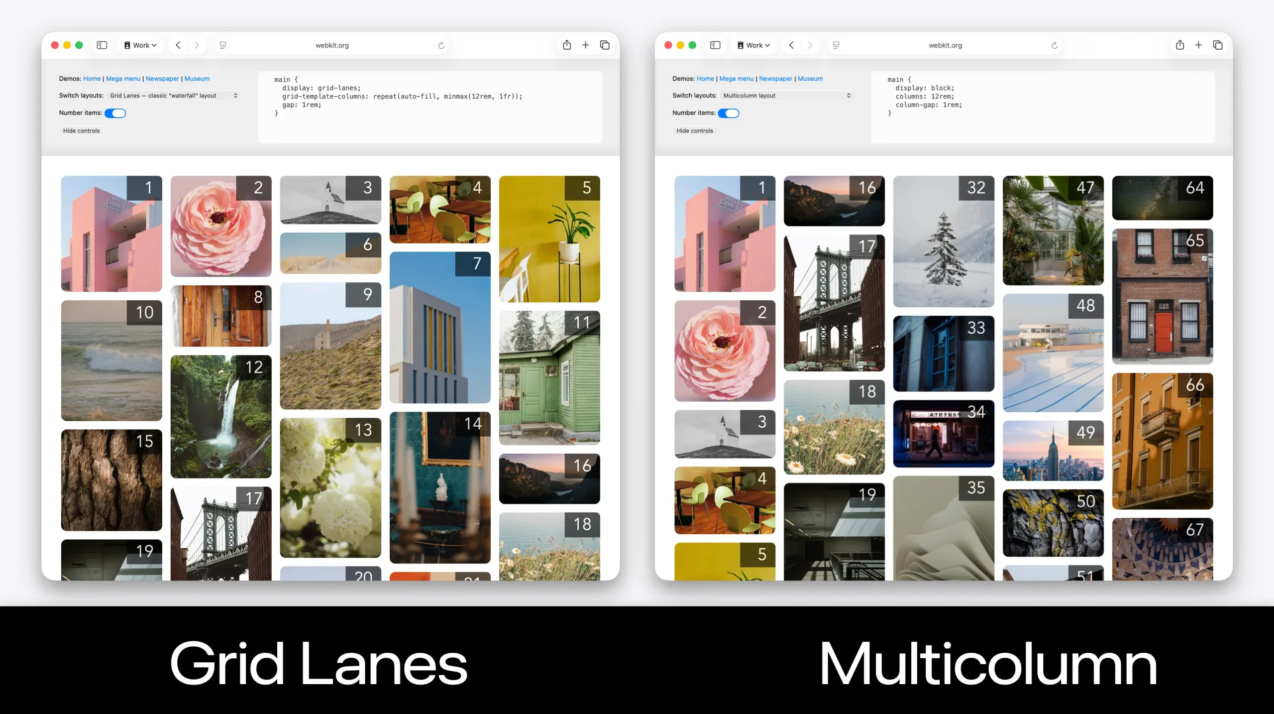
Try out the demos we created to compare how Multicolumn and Grid Lanes work. Select different layouts from the dropdown menus, and turn on item numbers to emphasize the difference.
Option 3: Use Grid Lanes — along with a fallback layout in CSS
While “don’t use Grid Lanes” is always an option, perhaps the best approach is to write your code so that Grid Lanes is used when supported, and another layout mode in CSS is used as the fallback. This avoids using JavaScript for layout, while still delivering the newer layout to the users who do have support.
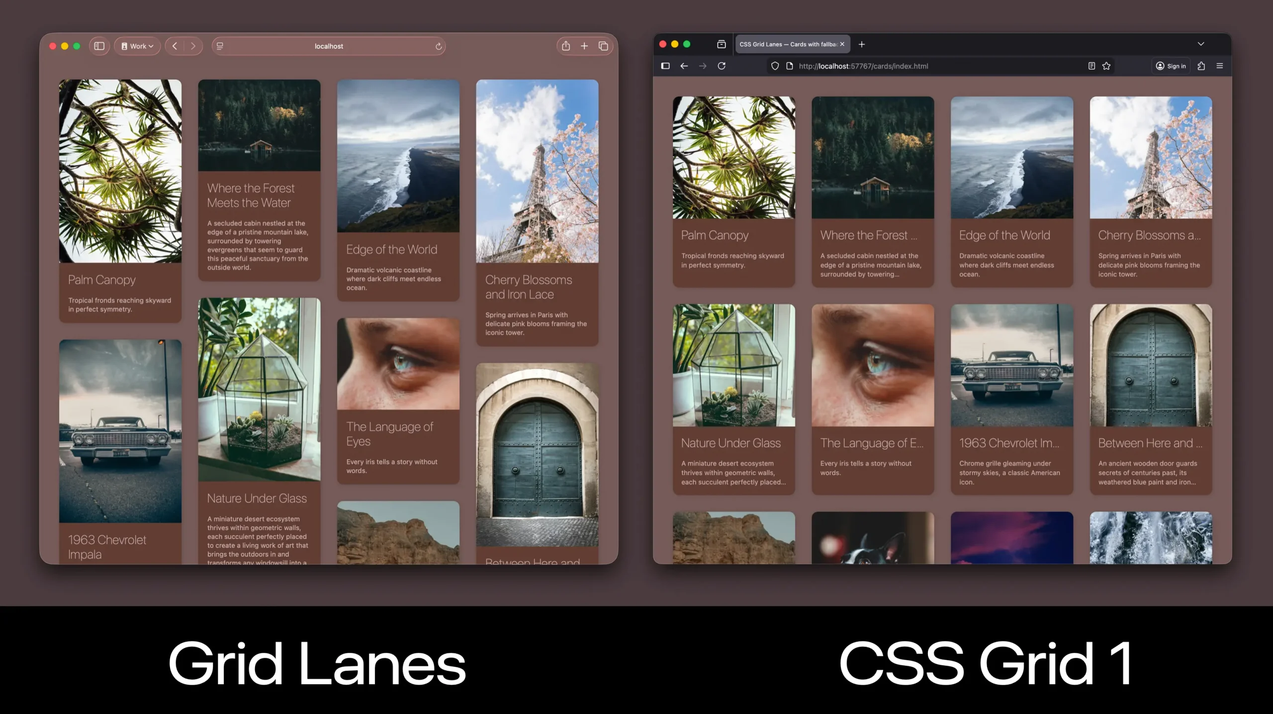
For example, let’s imagine we want to use Grid Lanes, and leverage CSS Grid (level 1) when Grid Lanes isn’t supported. To make the original Grid layout work, can use CSS to force all the items be the same aspect ratio by cropping images and truncating text.
To do this, we can apply layout to the container using the display property — twice. First we’ll declare display: grid, then we’ll immediately declare display: grid-lanes.
.grid-container {
  display: grid;
  display: grid-lanes; /* will override grid in browsers that support */
  grid-template-columns: repeat(auto-fill, minmax(200px, 1fr));
  gap: 1lh;
}
In browsers that support Grid Lanes, the second declaration will override the first. The display: grid rule will be ignored. And the layout will use Grid Lanes, resulting in a layout that packs content of different aspect ratios into a set of columns.
In browsers that do not support Grid Lanes, the browser will ignore the second declaration. It sees display: grid-lanes and goes “what? That’s not a thing. You must have misspelled something. Ignore!” This leaves grid as the layout that’s applied. The content will be laid out into clear rows as well as columns.
This is a tried and true technique that’s been used by developers for over two decades — relying on the fact that CSS just ignores anything it doesn’t understand. It does not throw an error message. It does not stop parsing. It just ignores that line of code and moves along.
We can also use a Feature Query to write code that only gets applied in browsers without support for Grid Lanes. Let’s use the aspect-ratio property to force all images into the same aspect ratio. And use object-fit: cover to crop those images to fit in the box, instead of letting them be squished.
/* Additional CSS for browsers without Grid Lanes support */
@supports not (display: grid-lanes) {
  .grid-item {
    img {
      aspect-ratio: 1; /* resize every image into a square */
      object-fit: cover; /* crop, don't squish the image */
    }
    h3 {
      white-space: nowrap; /* don't wrap the headline */
      overflow: hidden; /* crop the extra */
      text-overflow: ellipsis; /* add an ellipsis if it overflows */
    }
    p {
      display: -webkit-box; /* current practice in all browsers */
      -webkit-box-orient: vertical;
      -webkit-line-clamp: 3; /* clamps to this many lines of text */
      overflow: hidden;
    }
  }
}
We can force our headline to not wrap with white-space: nowrap. Once the headline is on one line, we can hide whatever doesn’t fit with overflow: hidden. Then, text-overflow: ellipsis adds “…” to the end of what’s visible.
When we want to truncate multi-line text to a specific number of lines, we can use the -webkit-line-clamp technique. While originally invented by the WebKit team long ago when prefixes were the best practice for browsers rolling out new ideas, today -webkit-box, -webkit-box-orient and -webkit-line-clamp are supported by all browsers. (No browser has shipped a replacement yet because a complete web standard for defining such a tool is still under debate.)
This approach results in a masonry-style waterfall layout being delivered to the browsers that support Grid Lanes, while a more traditional layout of equal-sized boxes are delivered using CSS Grid level 1 to browsers that don’t yet support Grid Lanes.
It’s up to you
It’s totally up to you how you want to handle the fallback for a lack of support for Grid Lanes, but you definitely have options. This is one of the benefits of writing CSS, and not just using a 3rd-party utility framework that abstracts all the flexibility away. Progressive enhancement techniques bring the future into the present, and let you start using Grid Lanes far sooner!
Learn more about Grid Lanes
This is our third article in a series about Grid Lanes. The first introduces CSS Grid Lanes, explaining what it is and how to use it (and yes, it can be used “in the other direction”). The second article shows off our new developer tools and explains why they are particularly helpful for setting flow tolerance. Also, check out our demos in Safari Technology Preview. And be sure to come back to webkit.org soon for more articles about Grid Lanes.