Grids seem easy. I mean, it's just a table, right? How hard can building a 2D array and displaying it in HTML possibly be? Two nested loops, some CSS borders, and that's pretty much it..
That's exactly what I thought too, and that's how the table view ALONE took a year of on-and-off optimization work for the database GUI I've been working on (MongoDB, PostgreSQL, and other SQL databases). Two nested loops just doesn't work and would just crash your browser after several hundreds rows and columns. So... I spent the last year obsessing over learning how to make a performant table
Every stage felt like a discovery. I would find a technique would solve a problem, then a flaw in that technique would become the next problem. So that's how I structured this post: ten levels, each ending roughly where the next begins. I've tried to explain the actual mechanisms, so that by the end you could build one of these yourself.
One thing before the levels: the spec, because it explains every design decision that follows. This was never going to be a display-only table. It had to understand every BSON type, SQL Types, and JSONB (with icons color-coded by type, since "123" the string and 123 the int are different queries), expand nested documents into real child columns, and be searchable across those nested paths with matches highlighted inside the cells. Columns had to be reorderable, resizable, pinnable. Cells had to be editable in place. And I wanted to drag any value, row, or column straight out of the grid into my visual query builder. Every one of those features is state that has to live somewhere and survive scrolling, and none of it exists in a raw document. So yeah... this was gonna be a tough one.
Level 1. Brute force: render everything
Everyone basically starts here. You just loop over the rows, loop over the fields, emit a cell. The framework re-renders when data changes and that's pretty much it.
It works at 100 rows. But at 10,000 rows and 30 columns you've asked the browser to build around 300,000 DOM nodes, and every framework change-detection pass walks all of them. Scrolling stutters, clicks lag, and eventually the tab just dies.
A DOM node costs roughly a kilobyte once you count the browser's internal structures, so 300,000 nodes is hundreds of megabytes before your actual data. And a frame at 60fps is 16.7 milliseconds, shared with style, layout, and paint. Any single step that touches every node blows that budget by an order of magnitude.
So...yeah rendering everything IS NOT the solution. In my use case it died trying to render 1000 rows with around 20 columns.
The obvious plan is to render just that slice. But a sliced renderer has a problem brute force never had: something now has to keep track of what to show and what not to show. Which rows are in view, which columns, in what order, which nested fields are expanded, what the search matched. And that's where level 2 comes in.
Level 2. The shadow table: The Foundation
The tempting answer is to keep all that "what to show" knowledge next to the raw documents and just read from them. But raw documents are terrible render inputs. MongoDB gives you nested, heterogeneous BSON (ObjectIds, Decimal128s, timestamps, binary), SQL brings JSONB and timestamps with zones, and every one of them needs a formatting decision per cell. If the render loop makes those decisions, you pay for them on every frame, forever. And the raw data doesn't know what the table looks like anyway. Expanded columns, column order, search matches, those are facts about the table, not about the data.
So I built something I call the shadow table. It reflects the data, but it IS the state of the actual table. The documents stay untouched as the source of truth for what the data says; the shadow table is the source of truth for what the table shows. It's built once at load time (the user is staring at a network spinner anyway), updated when state changes, and never touched during scroll. For every cell it precomputes the display string (truncated, so a 16MB document can't leak a 16MB string into render state), the resolved type (which drives the icon, the editor, and search), and the flattened path, so "address.geo.lat" is a key instead of a tree walk. The flattened paths are what make column expansion possible: expanding a nested object just promotes its child paths into real columns. Sort, search matches, column order, expansion state, it all lives in this one structure.
Nothing about the DOM changed yet, it would still crash with 1000 rows and 20 columns. I'd just organized the data in a way that makes it easier to compute the column order, column width, and pretty much the whole state of the table.
This is what most developers would do with a library for vertical virtual scrolling: render only the rows in the viewport plus a small buffer, and fake the rest.
Three parts to the mechanism.
The phantom. Size an inner container to the full height of all rows (rowCount × rowHeight). A million rows at 40px is a forty-million-pixel-tall div containing almost nothing, and the browser happily gives you a real scrollbar with real physics against it, for free.
The window math. On scroll, firstRow = floor(scrollTop / rowHeight) and lastRow = floor((scrollTop + viewportHeight) / rowHeight), plus a few buffer rows on each side so small scrolls don't immediately need new content.
The slab. Render only those rows into a container positioned at firstRow × rowHeight, ideally with a transform instead of top (why that matters is level 6).
The user perceives a million-row table. The DOM holds forty rows. Native scrolling does the animation for you, and it's better at it than anything you could write, so the whole job is staying out of its way.
It feels like the finish line until you open a collection with three hundred fields. Now, every one of your forty rows still renders three hundred cells. And...You're back to twelve thousand nodes, and every row that scrolls into view costs three hundred cells of work. Rows were only half the problem, and honestly... the other half was way harder to implement.
Level 4. Horizontal virtualization: the axis nobody does
Everyone virtualizes rows. But, almost nobody virtualizes columns, and document databases punish you for that, because a collection can quietly grow hundreds of fields.
Columns are harder than rows because widths vary, so you can't just divide by a constant. It took a while to come up with an algorithm, but then two classic data structures came to mind. Prefix sums: keep a running total of column widths, position[n] = width[0] + ... + width[n-1], and any column's x position is one array read. Binary search: to find which column sits at scroll offset x, binary-search the prefix sums, which takes microseconds even with a thousand columns.
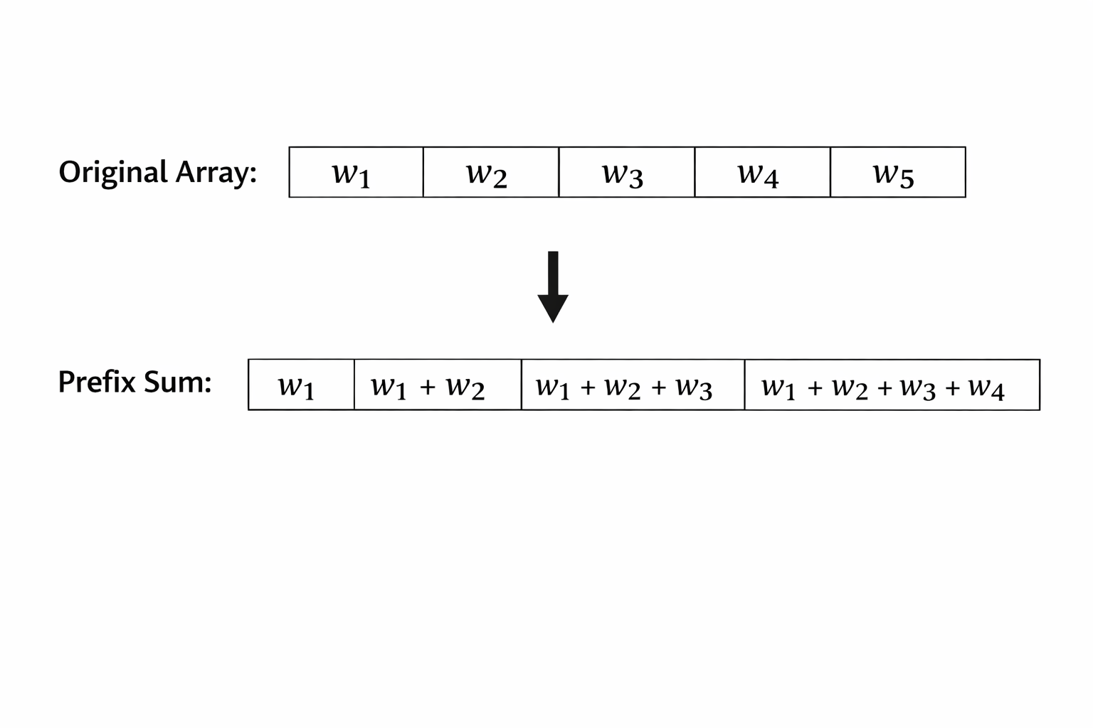
You rebuild the prefix sums only when widths actually change (resize, hide, reorder), never during scroll. And you buffer the window by a fixed pixel margin, around 200px on each side works well, so the next column is already rendered before its edge shows up. So YEAH, it's super cheap to build!
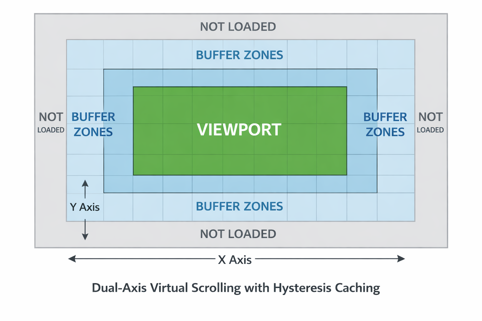
With both axes windowed, the rendered surface is constant: roughly forty rows by twelve columns whether the collection has ten fields or five hundred. I've thrown 500-column collections at my grid and the load time doesn't move, because only a dozen of them exist at any moment.
Now the rendered surface is small, and you're recomputing it on every scroll event. Those arrive hundreds of times per second, and then... scrolling starts to feel heavy. Solving what to render turned out to be a completely separate problem from solving when.
Scroll events fire hundreds of times per second, and every microsecond on that path is stolen from a frame budget you share with style, layout, and paint.
The disciplines that actually mattered, in order of impact:
Passive listeners, registered outside the framework. A passive listener tells the browser you'll never call preventDefault, so the compositor can move pixels without waiting for your JavaScript at all. Registering outside the framework's change detection means a scroll event doesn't trigger a render pass just for existing.
One coalesced update per frame. Don't handle every scroll event. Note the latest scroll position and schedule a single requestAnimationFrame callback. Twelve events in a frame become one window computation.
The fast-draw exit (an idea I picked up reading Handsontable's source). If the newly computed visible range is still inside the rendered buffer, return immediately. During steady scrolling the vast majority of ticks should cost two integer comparisons and nothing else.
Hysteresis on the buffer edges. The partner of the fast-draw exit: when DO you rebuild? Not when the view touches the edge of the rendered buffer, that's too late, and not on every pixel near it, that's thrashing. I trigger the rebuild when the visible range gets within ~40px of the buffer's edge, then recenter the whole 200px buffer around the new position. The user never sees a blank edge because new content is ready before it's visible, and the next rebuild is a full buffer away instead of one pixel away. Without this, sitting right on a boundary would rebuild back and forth forever.
The velocity tracker. Track pixels per millisecond between scroll events. When it crosses a threshold (mine is 10px/ms) the user flicked, so stop rendering entirely. Let native scrolling fly over the phantom and fill the slab back in when the velocity settles. A blank beat during a violent flick is imperceptible. A dropped frame is not.
I was honestly stuck at a plateau at this point in time, the code "looked" clean but ... why wasn't it smoother? And it took months after that to finally find a solution towards making my table smoother. In theory the JavaScript goes nearly silent during scrolling and frames still dropped hard,so what was the issue?? The issue... was the styling, the zebra coloring patterns, THE ICONS TOO. THE ENTIRE layout, paint, and css to make my table look pretty was my next bottleneck so that's what the next levels are going to be about.
Level 6. Layout properties are a tax
Honestly, I was never a fan of CSS and I thought that it wouldn't make a difference before working on this. This level completely changed how I see CSS. The browser has two workers: the main thread (style, layout, paint) and the compositor, which moves already-painted layers around on the GPU. Exactly two properties animate on the compositor, transform and opacity. Everything else (top, left, width, height, background-color) wakes up the main thread.
Here's how that bit me. My frozen panels (row numbers and pinned columns) were synced to scrolling by updating top every frame. That's a forced layout, sixty times a second, forever, while the grid body right next to them scrolled for free on the compositor. Switching the sync to translate3d made the visual identical and the main-thread cost zero.
I started applying the same lens everywhere and it kept paying out.
Zebra striping stopped being a per-row background and became one repeating-linear-gradient on the body, sized by a CSS variable holding the row height. The browser rasterizes a single two-row tile and blits it from GPU texture memory forever. Hundreds of per-row class bindings deleted. As a bonus, the main grid and both frozen panels can never disagree about stripe colors, because they share the same tile.
Column separator lines used to span the full phantom height: one-pixel-wide, forty-million-pixel-tall paint targets, and during column drags they'd get promoted to their own compositor layers. Clamp those to the rendered slab.
Steady scrolling was now compositor-smooth, right up until the window shifted and new cells had to materialize. Those rebuild moments were still heavy, and when I looked closely at why, it was honestly a little embarrassing: every single cell was carrying more DOM than it needed, and that extra weight gets multiplied by rows, by columns, and by every rebuild.
Level 7. The icons: THE MOST Surprising optimization here...
Every cell in a database grid wants a type indicator. Is this an ObjectId, a string, an int, a JSONB blob? In a database tool that's not decoration; "123" the string and 123 the int are different queries. My first version did the obvious thing: an icon element in every cell, styled with a font-icon class.
That obvious thing turned out to be one of the most expensive decisions in the entire grid. An extra element per cell means thousands of extra DOM nodes to create, lay out, paint, and re-check, and font glyphs run through the full text rendering pipeline per cell. So...I did a little experiment for the fun of it. What happens if I removed all my icons, how much faster would my table be... Turns out... it made my table feel SO MUCH smoother. So I asked myself...how were ICONS THE ISSUE!?
The fix became my favorite trick in the whole codebase. Icons became the cell's own background-image, encoded as an SVG data URI. The key detail is the sharing: every cell of the same type points at the identical URI string, so the browser rasterizes each icon exactly once and blits it from a cached GPU texture for every cell, every frame, forever. Zero additional DOM nodes. The type indicators are now essentially free. If you take one trick from this post, take this one. It applies to any repeated decoration in any list UI.
The same philosophy produced hybrid rendering: a cell is plain text, one span, until the moment you double-click it. Only then does the heavyweight type-aware editor component mount, into that one cell, positioned over it like a portal. A framework component per cell is death by a thousand instantiations; a component per editing cell is one. (This is also why the same grid library can feel fast on its own demo page and sluggish inside some well-known database GUIs. Embed it with framework components as cell renderers and you've silently opted into its slowest path.)
Each cell was now feather-light, but rebuilds were still doing something wasteful: rewriting cells whose content didn't change. Scroll one column into view and the framework re-stamps the whole grid, with no idea that the other 95 percent of cells represent exactly what they represented a frame ago. The waste wasn't in the cells anymore. It was in how the framework decides what a cell is.
Level 8. Recycling versus identity: The Importance of Pooling
For me this was one of the more technical changes that really made a difference, honestly the final key to optimizing the entire table. Recycling the used DOM turned out to be extremely important.
Frameworks let you control DOM identity with tracking functions (trackBy in Angular, key in React and Vue), and that choice decides what happens when the scroll window shifts: either the same forty row elements stay put and just get rebound with new content, or old rows get destroyed and new ones created from scratch (components, nodes, event listeners, all of it). View creation is one of the most expensive things a framework does, and a scrolling window would be doing it constantly.
So I track by position, on both axes. The grid works like an object pool: scrolling never allocates anything, the same warm DOM nodes just get new values written into them, no matter how far or how fast you scroll.
With that, the architecture was done. Scrolling was smooth on both axes, rebuilds were cheap, and users could still feel something. A one-frame glitch when a dragged column drops. A half-pixel wobble in the row numbers. None of it is architecture anymore; it's the difference between a fast grid and a finished one.
Level 9. The little things
Past level 8, performance stops being architecture and becomes craftsmanship. A few of the dozens of small decisions:
The atomic reorder drop. During a column drag, transforms shift the columns so the old order looks like the new order. On drop, the reorder and the transform reset have to land in the same render pass. Done right, the last dragged frame and the first reordered frame are pixel-identical and the swap is invisible.
Lazy tooltips. A tooltip binding per cell builds tooltip strings for every cell on every render pass, for hovers that mostly never happen. It's even worse in SQL land, where a tooltip might be pretty-printing a JSONB value. One delegated hover listener on the container resolves the tooltip for exactly the cell under the cursor, and the render loop never thinks about tooltips again.
Sub-pixel archaeology. A one-pixel border on my row-number column shifted its text baseline half a pixel against the data rows, and sub-pixel rounding turned that into a visible wobble while scrolling. The fix was making both columns share a box model. Nobody will ever notice it's fixed. Everybody would notice if it wasn't.
Zebra parity that survives virtualization. Stripes keyed to the absolute row index, not DOM position, so the colors never flicker as the window shifts.
And the features that justify building your own grid at all: nested documents that expand into real child columns instead of dead JSON strings, search that highlights matched substrings inside cells across nested paths, dragging a typed value out of the grid straight into a query builder. General-purpose libraries don't do these, and bolting them on costs more than owning the renderer.
During this past year, I fell into a constant loop of iteration of shipping a fix, being satisfied with it, and then 1 month later implementing another optimization out of the blue... I've been working on this forever and I feel like there's always something to polish or improve on. But at some point the question stops being "what else can I fix?" and becomes "what's actually left, what's even possible, and when do I stop?". And the answer didn't come from my own codebase.
Level 10. Reading the giants
The final level came from reading other people's source code, which I now recommend as the single highest-value study habit in frontend performance. Almost none of what follows is documented anywhere. It's just sitting in public repos, free to anyone willing to read it.
The best DOM grid I studied time-slices its DOM work through priority task queues with an explicit per-frame time budget. It hashes its column viewport so a no-op scroll costs one string comparison. It builds rows in the direction you're scrolling so content appears where you're headed, and it defers destruction until after creation so new cells paint before old ones disappear. There's even a comment in there noting that cells registering their own event listeners was a measured bottleneck, which is why events are delegated at the container. None of this is in the docs. (AG-Grid)
And then there are the canvas grids, the ones quietly powering some of the smoothest data tools you've used. They really do hold 60fps under any abuse, because they skip the DOM entirely: no layout, no style recalculation, just redrawing a few hundred text runs per frame. That ceiling is genuinely higher than any DOM grid's. But the drawback is definitely how it looks. Text that's slightly blurry because it rasterized off the pixel grid. Selection that only works cell-at-a-time. Truncation without an ellipsis because nobody drew one. And every future cell feature costs draw code plus hit-testing code instead of a template edit.
But yeah, that's why I chose the DOM anyway. I wanted nice text, real selections, real accessibility, and development speed. Even though I spent a year optimizing the rendering of a table that won't get as smooth as a canvas table, I'm at peace with that trade.
If you made it this far, feel free to try VisuaLeaf. I spent close to a year optimizing this dumb table just to get a good view for visualizing SQL and NoSQL data, but the app does a lot more than the table! It has a visual query builder (SQL and NoSQL), ER diagram maker, table/collection management, and a bunch more. All the SQL features are free, so give it a shot. Thanks for reading!