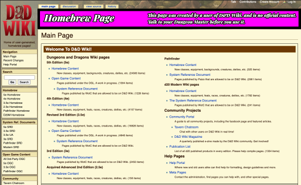
Beyond the technical and perceptive data analyzed in each of the answers, the page has a very serious drawback regarding color perception and it is precisely the color choice.
Each color has, in addition to its optical and psychological characteristics, a type of affectation to the perception that is quite difficult to avoid or counteract.
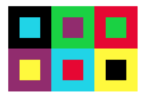
Regarding the colors of the web and taking them to the maximum purity from where they come, perceptually they are characterized by:
- Yellow = better color recall, little or no shape recall
- Purple = Better memory of shape, poor color memory

The intensity of yellow or any color within the same range never goes unnoticed and perceptually it has the ability to devour any other color and shape. While low tonal value colors like purple, brown, or blue tend to look like backgrounds.
Explained in another way, referring to the previous image, if we could see it in perspective, the result would be yellow placed ALWAYS on top:
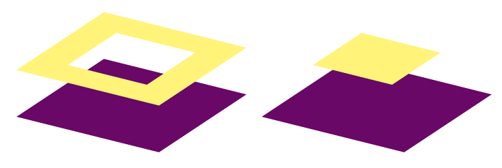
There is no way to shine more than yellow, we can only contain its strength by using a neutralizing color like gray, but never shine more than it. Even using pure RGB colors, yellow always prevails:
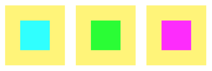
In fact, in the color memory exercise, all of them tend to blend in, except for yellow:
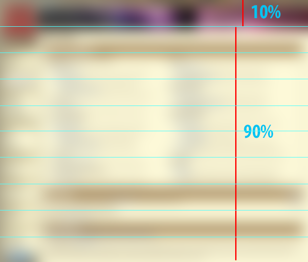
In the case of the web example, the proportion doesn't help either. The light color similar to yellow occupies 90% of the page in a desktop window with maximum magnification, favoring the already null presence of the banner.
Solutions
Knowing this color combination complexity and that one element has to stand out above another, I would recommend experimenting with another contrast type, within the possible ones, for which it can be helpful to use basic shapes respecting the percentages
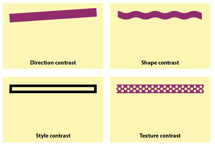
Some contrast examples (not final solutions)
Strengthen the current Color contrast:

Or use another type of contrast or combination within the possible depending on the element to represent the banner.
Style contrast
Texture contrast
Shape contrast
The timeline contrast (animation or video) would be the best option and always outstanding, but this depends on the technical possibilities of the web construction.