In addition to the film-specific typographic deconstructions on this site, I’m keeping track of all the times I spot classic sci-fi fonts in movies. What better way to start than with perennial sci-fi favorite, Eurostile?
Eurostile, and in particular its Bold Extended variant, has appeared in countless sci-fi settings over the years. It’s got to the point where the very presence of Eurostile Bold Extended in an opening title card says FUTURE far more effectively than an expensive effects shot:
Indeed, Eurostile is such a quick way to establish a timeframe that whenever I see it in real life – which happens quite a lot in my adopted home of California – I assume I’ve been transported to some futuristic dystopia, where a local care center feels more like a sinister government facility for scientific experimentation:
Eurostile is most commonly seen in its Bold Extended form, but Regular, Bold, and Regular Extended sometimes crop up as well. I’ve captured (and tried to clarify) as many as possible below.
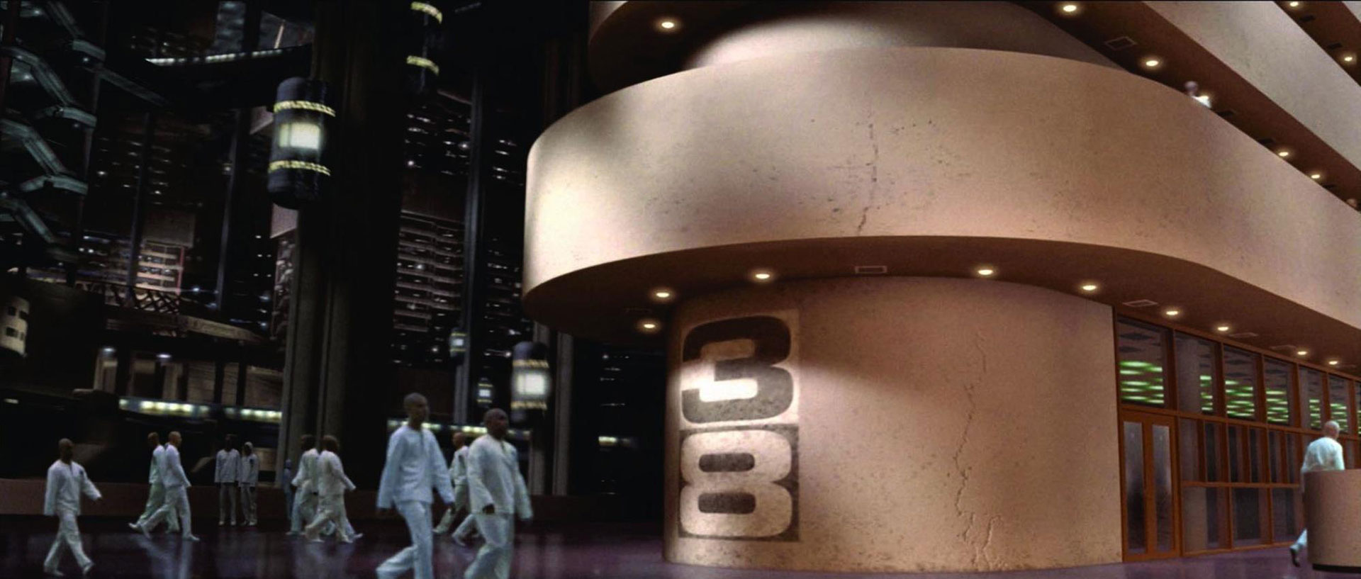
Date / Location Positioning
When and where are we? If it’s set in Eurostile, we are in the FUTURE, and we are in the FUTURE.
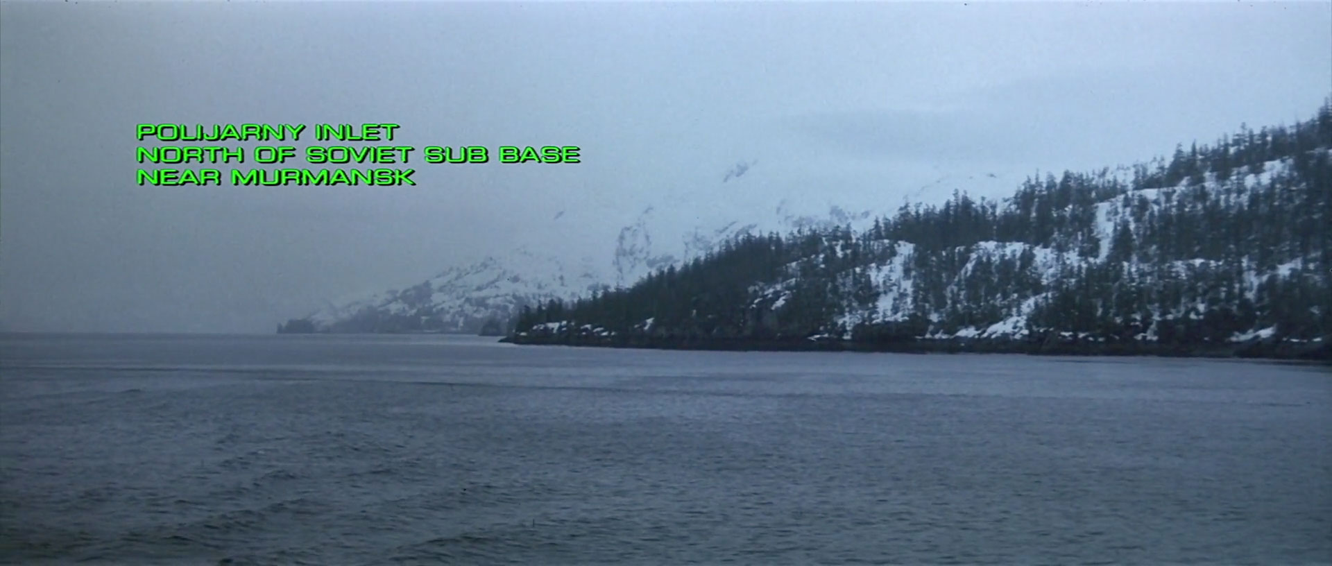
Captain America: The Winter Soldier (Eurostile Regular and Eurostile Condensed, although it looks like someone forgot to set the first “3” digit to be Condensed – it’s still Regular, unlike all of the other glyphs on that line.)Elysium (Eurostile Regular Extended)The Hunt For Red October (Eurostile Regular Extended)Iron Man 3 (Eurostile Regular Extended, plus a special guest appearance by Bank Gothic)
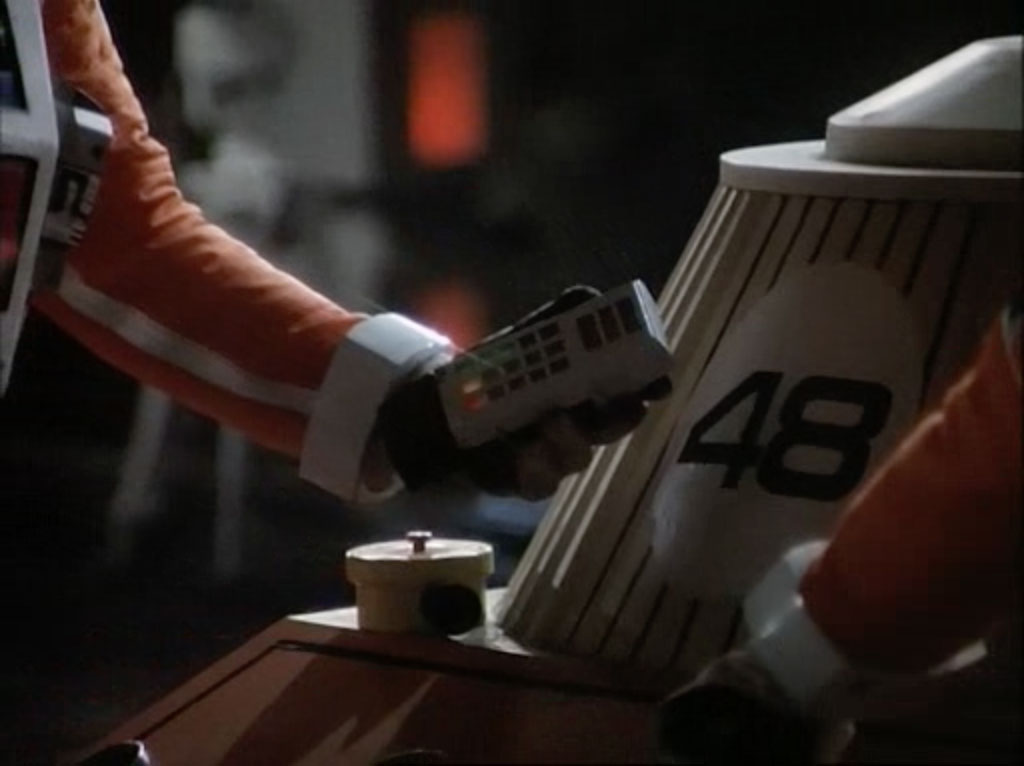
Computers and Screens
If your computer system or TV show needs some futuristic-looking text that’s easy to read in a long-shot, there’s no better choice than Eurostile Bold Extended.
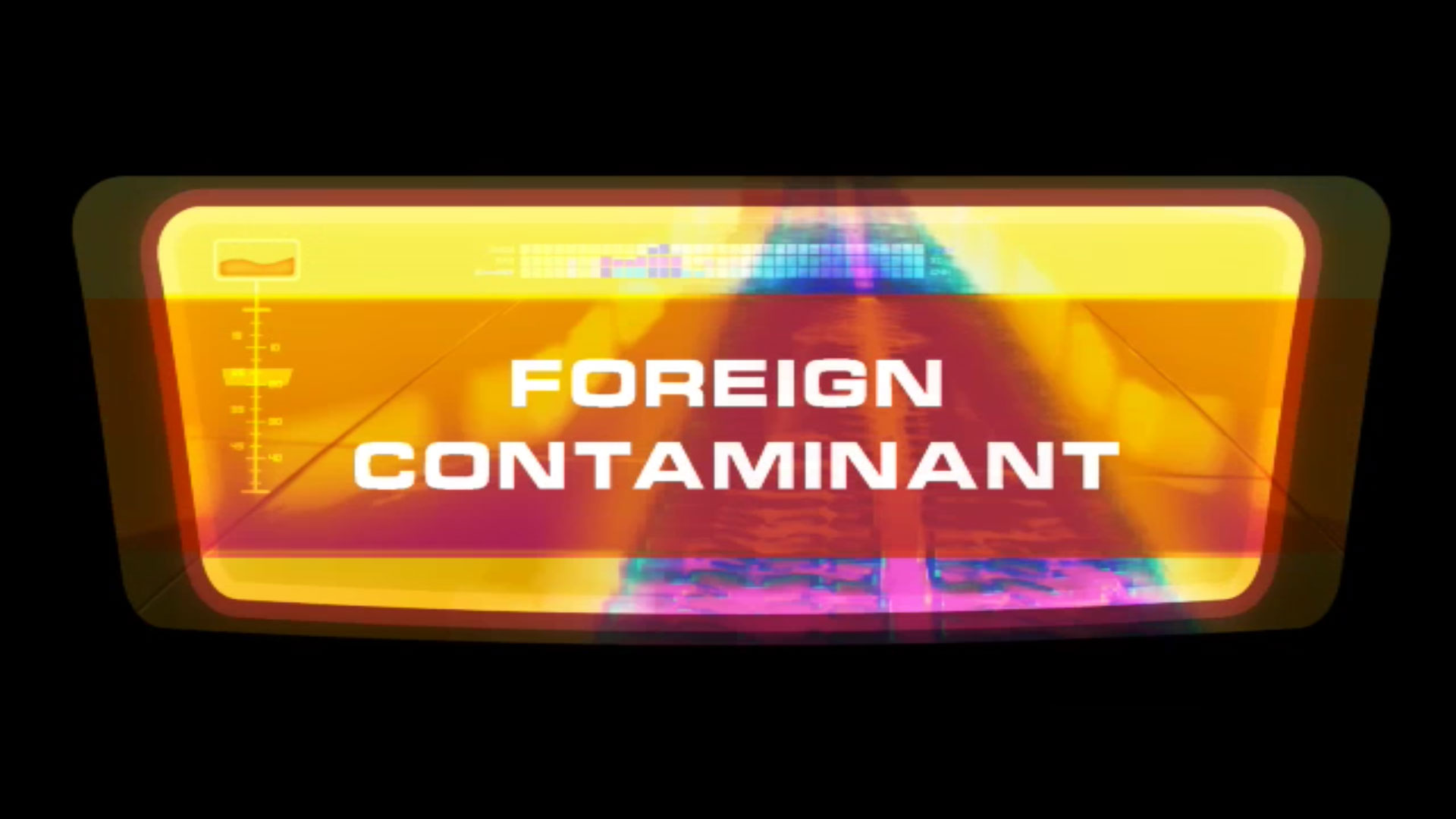
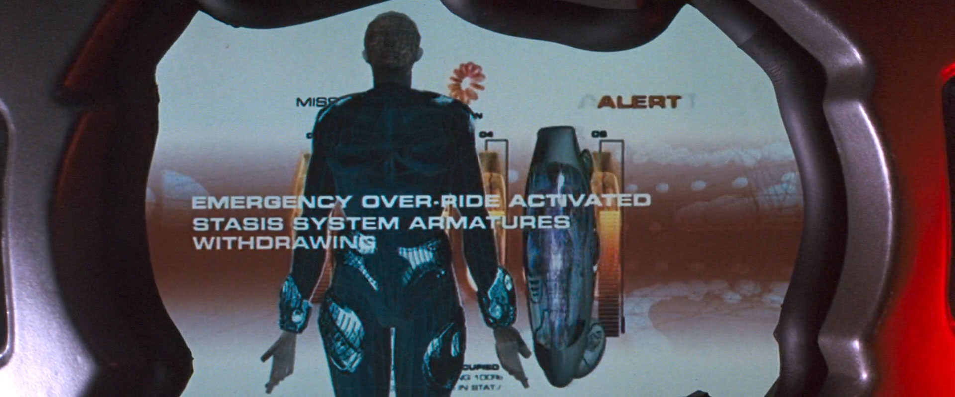
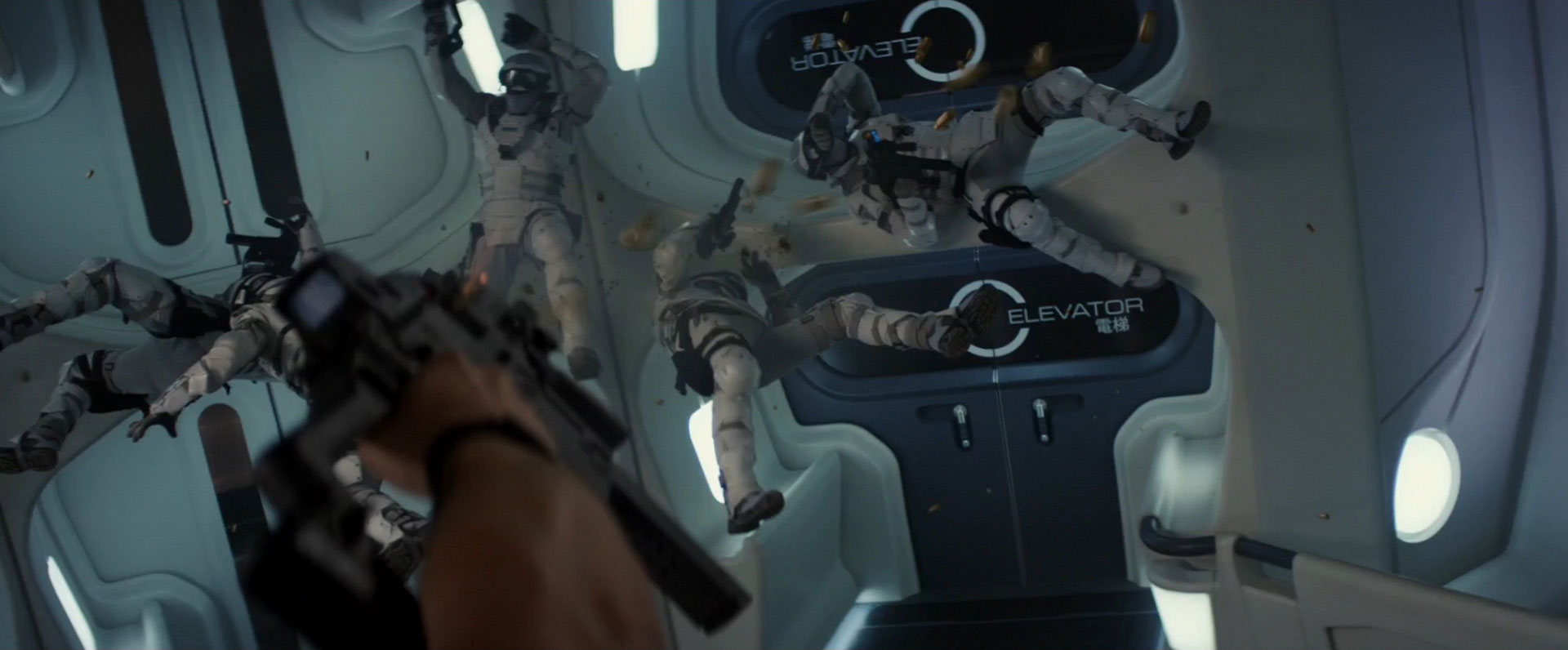
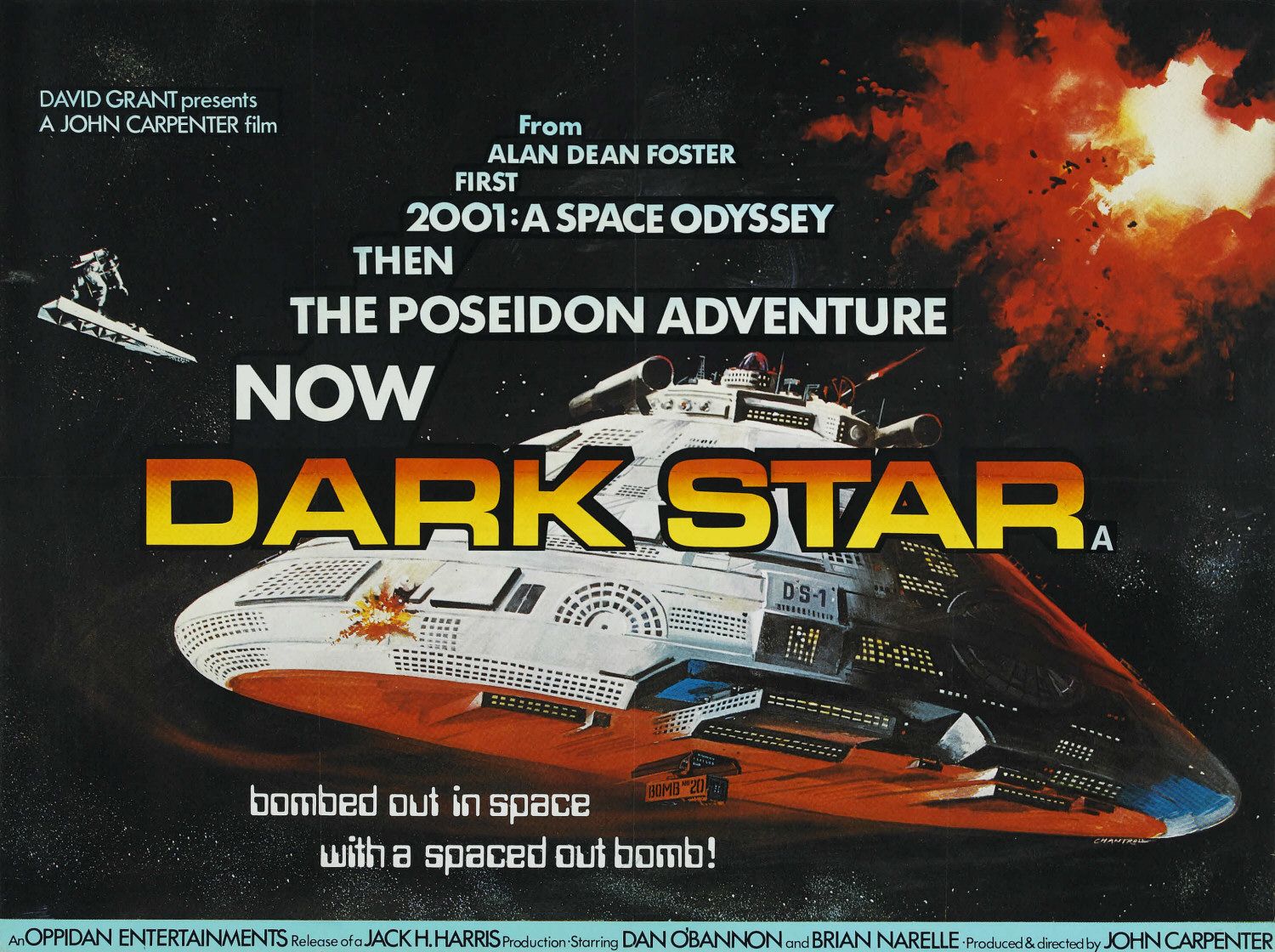
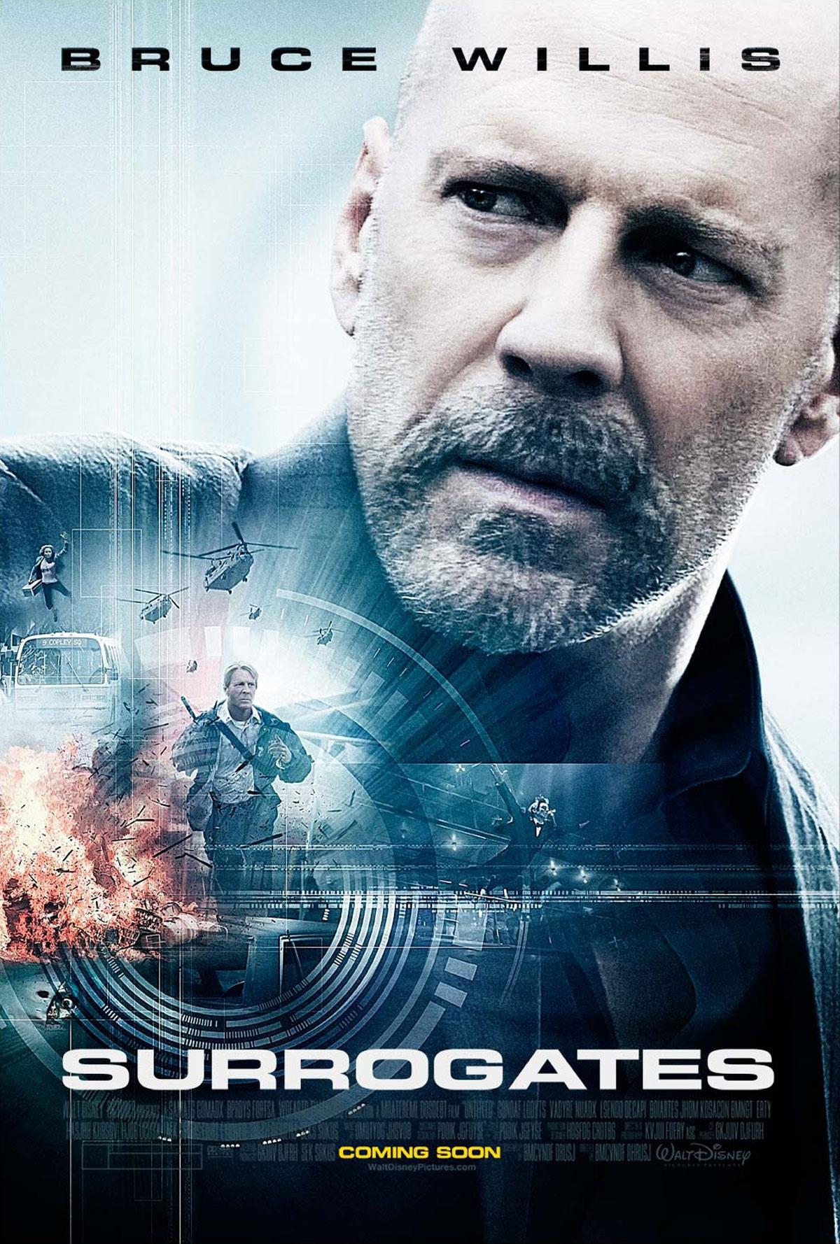
Dark Star (Eurostile Bold Extended, plus a bonus bit of Data 70)G-Force (Eurostile Bold Extended)Red Planet (Eurostile Bold Extended, horizontally stretched, and with a bit snicked out of the “A” for effect)Surrogates (Eurostile Bold Extended, also horizontally stretched, and badly kerned if the G and the A are anything to go by)
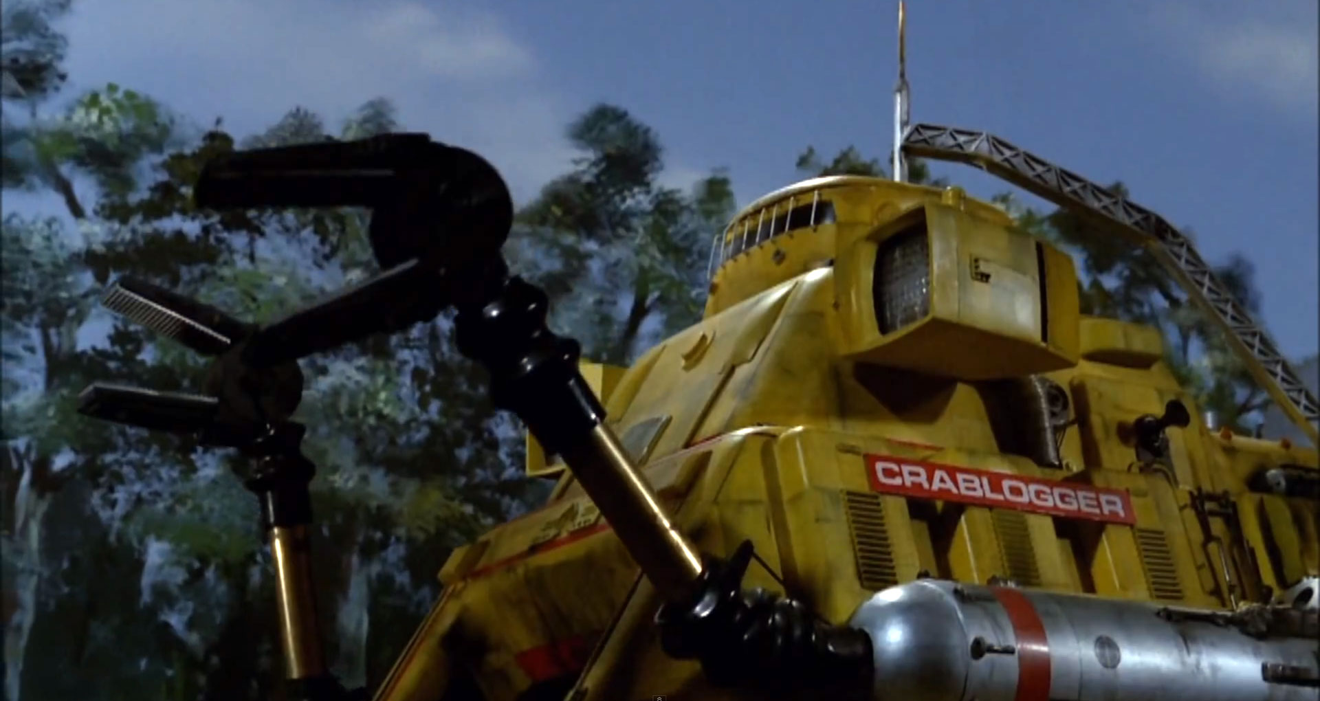
Titles and Credit Sequences
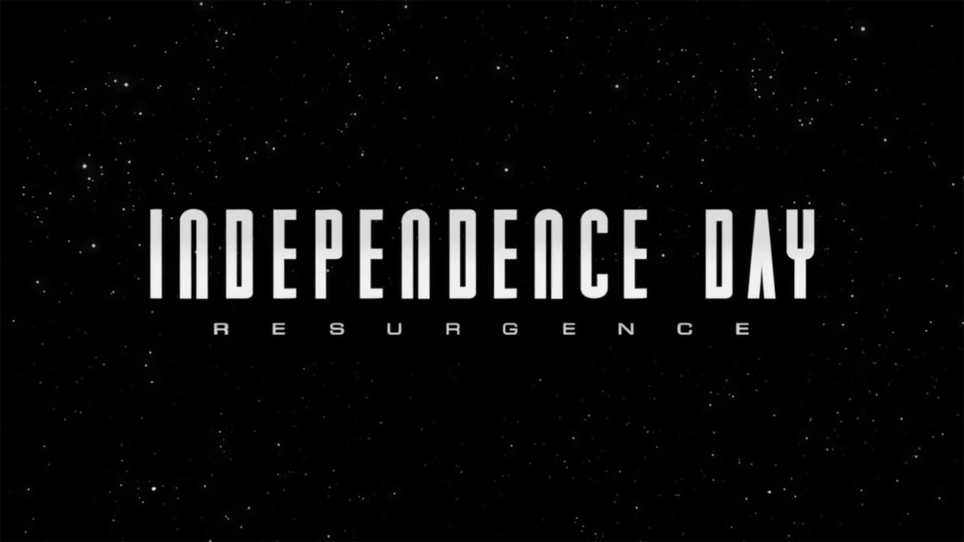
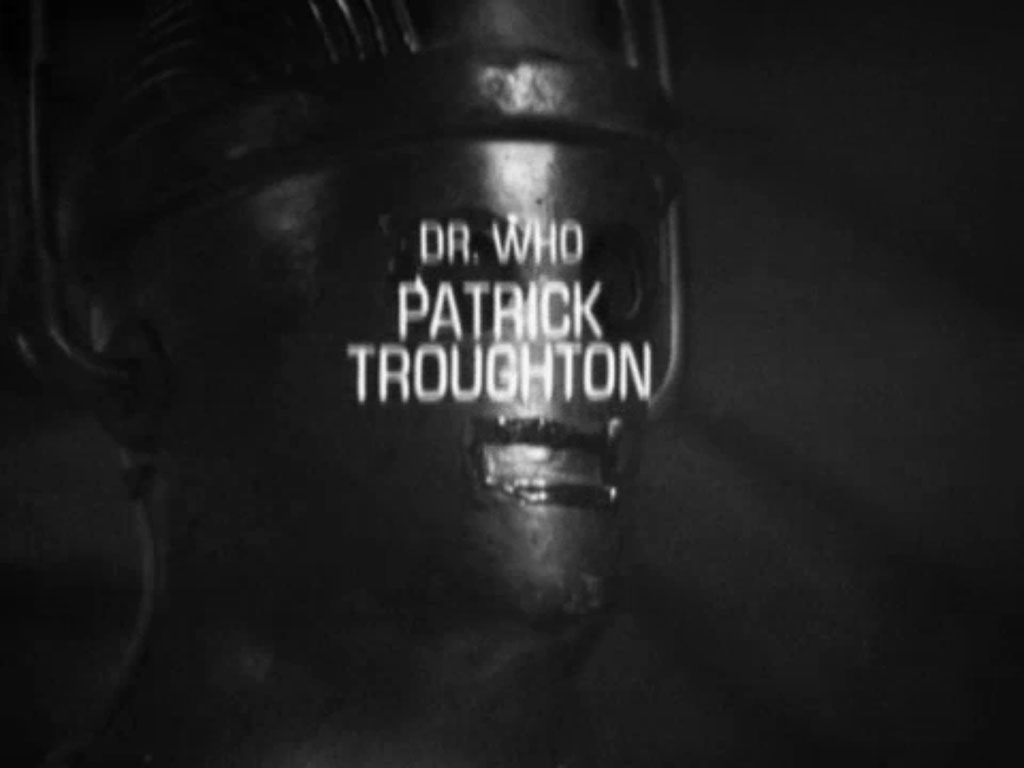
Alan Partridge: Alpha Papa teaser trailer (Eurostile Bold Extended and Regular Extended)Apollo 13 (Eurostile Bold Extended)Battlestar Galactica (Eurostile Bold Extended, and a font I don’t recognize)The Bourne Identity (Not actually Eurostile Bold Extended. I think it’s Eurostile DemiBold, horizontally stretched to about 140%. Why would you do that, when there’s already a perfectly good Eurostile Bold Extended? I despair sometimes.)The Bourne Supremacy (Eurostile Regular and Bold, with sufficiently bad kerning that I read it as “SuperMac-Y”)Captain Scarlet and the Mysterons (Eurostile Regular Extended)District 9 (Eurostile Bold Extended)Pacific Rim (Eurostile Bold Extended)Independence Day: Resurgence (Eurostile Extended, at least for the “RESURGENCE” text)Red Dwarf (Eurostile Bold Extended, disastrously kerned)The Incredible Hulk (Eurostile Bold Extended for “THE INCREDIBLE”, stretched to 125% horizontal width)The trailer for Grimsby (two indeterminate weights of some kind of Eurostile, somewhere between non-extended and extended)Doctor Who: The Tomb of the Cybermen (and other Patrick Troughton-era episodes of Doctor Who, which use Eurostile Condensed in their closing credits, as spotted by Graham Lee)
Wannabes
These are not the Eurostiles you are looking for.
Doctor Who: Into The Dalek (not quite Eurostile Bold Extended, but clearly inspired by it)Star Trek: Enterprise (also not quite Eurostile Bold Extended – the bar in the R is way too high – but very similar in overall style)Terminator Salvation (too curvy to be actual Eurostile Bold Extended, but clearly inspired by it)
Any More?
I’ll keep adding to this page as I spot more examples. If you know of any I’ve missed or got wrong, please do mention them in the comments, together with a link to an image if possible.