Riley Cran (@rileycran) on X

X (formerly Twitter) ·

5 min read Original article ↗

Post

Post

Riley Cran on X: "NEW 🧵: Did you know we only started mixing Sans and Serif typefaces in the last 200 years? One genre is much older than the other. Let’s discuss the birth of sans serif typefaces. I’ll use @lettermatic_abc fonts for some visuals: Parclo Sans & Serif. https://t.co/B5qMa8lic6"

  • user avatar

    NEW 🧵: Did you know we only started mixing Sans and Serif typefaces in the last 200 years? One genre is much older than the other. Let’s discuss the birth of sans serif typefaces. I’ll use

    @lettermatic_abc

    fonts for some visuals: Parclo Sans & Serif. lettermatic.com/fonts

  • user avatar

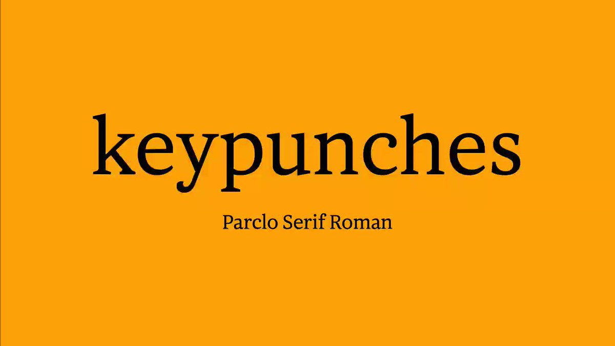
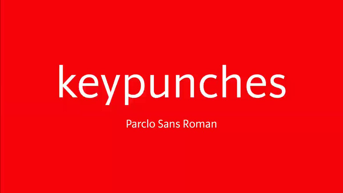
    Put simply: serifs are these little barb things on the ends of strokes. A ‘sans serif’ typeface means a typeface in which these are omitted, usually resulting in a blunt ending like this.

    user avatar

    Serif letterforms are VERY old. A great example is the inscription on Trajan’s Column. People have been drawing inspiration from this inscription for over 1,900 years (and counting).

    A casting of the inscription carved into Trajan's Column.

    user avatar

    For most of that time, people theorized these letters were the direct result of the motion of a chisel during carving. It wasn’t until the 1950s/60s (over 1,800 years after they were carved) that we learned more about how these letters were really drawn.

    user avatar

    An American priest named Ed Catich went to Rome, got on a ladder, took a rubbing of the inscription, and realized it was drawn with a brush. He spent a good chunk of the rest of his life touring around showing people how it was done, and his theory is widely accepted now.

    user avatar

    He even wrote a book about it, and he called it ‘The Origin of the Serif.’ I’d also recommend ‘The Eternal Letter,’ edited by Paul Shaw.

    user avatar

    All of this to say… sometimes it takes us a while, as a culture, to grasp our own ideas, typographically speaking. Sometimes the origin of… VERY important things can seem kind of muddy in retrospect. The origin of sans serif letters could be described this same way.

    user avatar

    To put a fine point on terminology here: type is a set of letters designed to be re-arranged in various orders. Typically the earliest typefaces were cast from metal.

    user avatar

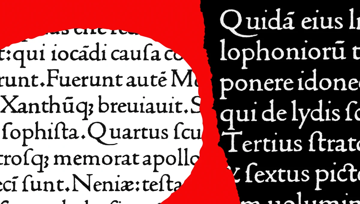
    Nicolas Jenson is commonly credited with making the first serif typeface (in a form we would recognize today) about 550 years ago. He cut it by hand, and cast it in metal. It looked like this.

    A specimen of Jenson's typeface.

    user avatar

    In comparison, the first sans serif typeface is MUCH more recent, with the first samples arriving about 200 years ago. In 1816, William Caslon IV designed these letters, without serifs, for the showing of his own name in a type specimen.

    A specimen of Caslon's sans serif letters, with the label 'two-line english egyptian'.

    user avatar

    Fun fact: see how that type is labeled ‘Egyptian’? Evidently that is because ‘Egyptomania’ was very popular at the time, and using a term related to Egypt in the 19th century was like using ‘space-age’ in the 20th century.

    Various historical type specimens listed using the genre name 'Egyptian'.

    user avatar

    So, to recap the dates: approximately 350 years separate the earliest serif typefaces from the earliest sans typefaces.

    user avatar

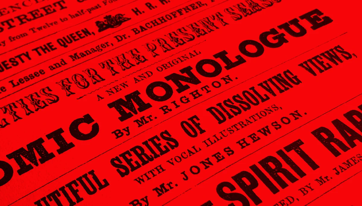
    The 19th century saw an EXPLOSION of creativity in typeface design. Commercial art and poster design had created a need for eye-catching typefaces that did something new. Many styles that are common today, originated around this time.

    A 19th century poster design featuring many typefaces.

    user avatar

    People started drawing really BOLD letters. People started drawing really CONDENSED letters.

    Bold, condensed letters from the 19th century.

    user avatar

    We even got beautifully ornate designs like these. All cut in metal! Many samples in this thread are from Nicolete Gray’s book, Nineteenth Century Ornamented Typefaces.

    19th Century Ornamented Type

    19th Century Ornamented Type

    user avatar

    One genre to emerge around this time was the ‘slab serif.’ In these designs the difference between ‘thick and thin’ is reduced, and you end up with these chunky serifs.

    A 19th century Slab Serif design.

    user avatar

    The exact methodology of how we arrived at sans serif letters is debated. But the most practical backstory that makes sense to me, is that the serifs were removed from a slab serif design. Let's try it here. The results look like Mr. Caslon’s Egyptian, don’t they?

    user avatar

    Even the peculiar ‘S’ drawing we ended up with (above), looks much like this one from 1830 by Vincent Figgins (below), right?

    user avatar

    At the time that sans serif typefaces were introduced, some thought their departure from historical drawing practices was ‘grotesque.’ The name stuck, and this genre name is still used today! Helvetica is classified as a ‘Neo-Grotesque’ sans serif.

    Various type specimens with the name 'Grotesque' or 'Grotesk'.

    user avatar

    The idea of the ‘type family,’ with a system of weights and/or widths, is an even MORE recent idea. Adrian Frutiger is often credited with solidifying this concept with the introduction of his 1957 typeface, Univers. He even made this chart to demonstrate his systematic approach.

    user avatar

    What Adrian proposed, essentially, was… you know all those thin fonts, bold fonts, and narrow fonts? What if those were all designed to intentionally work together from the start?

    user avatar

    Today there are many traditional ways in which serif and sans serif typefaces differ, or relate.

    user avatar

    For example, a serif typeface will typically have a ‘true italic,’ meaning the italic is essentially its own design. Here’s a comparison between roman (upright) and italic fonts in Parclo Serif.

    user avatar

    Because sans serif typefaces were created much more recently, at a time when industrialization was creating more mechanized means of typeface production, sans serif designs tend to have ‘obliques’ instead. The roman letters here are leaned over to create the italic.

    user avatar

    Many serif typefaces have a strong differentiation between thick and thin. We call this ‘contrast.’ Parclo Serif has high contrast, for instance.

    Age-restricted adult content. This content might not be appropriate for people under 18 years old. To view this media, you’ll need to log in to X. Learn more

    user avatar

    Serif typefaces often have a variety of ‘termination shapes’ that are systematically distributed across the letterforms. Here are some of the ‘hook’ shapes used in Parclo Serif.

    A specimen of Parclo Serif

    user avatar

    Sans serif typefaces often use variations of the same blunt ending for their terminations. Here’s how I handled those shapes in Parclo Sans.

    A specimen of Parclo Sans

    user avatar

    I will have more to say soon about the design of the Parclo fonts. But researching this historical relationship between serif fonts and sans serif fonts was a big part of the process.

    user avatar

    You can try Parclo Serif for yourself here:

    user avatar

    And compare it to Parclo Sans, here:

    user avatar