Claude Design dropped last week, in case you’re not already aware (though that is deeply implausible given that every single one of the ten thousand AI-related Substack writers got a post out about it immediately).
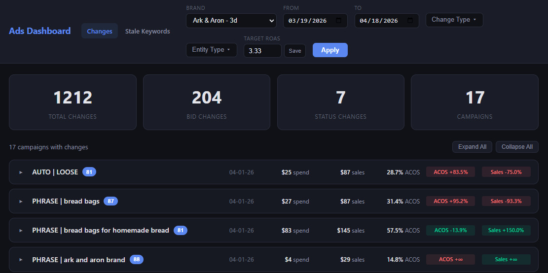
While most of my work is not especially UI-heavy, I do sometimes have occasion to ask Claude to create dashboards when the terminal isn’t sufficient for everything I need to see. These tend to be more functional than aesthetically pleasing — here’s one that I use to view historical changes to ad campaigns:
Right before Claude Design came out, I was beginning to give Claude access to my supplier conversations with the eventual goal of having it work directly with them to get inventory ordered and shipped. Even I’m not AI-forward enough to let it do that today, though, so in the interim I was planning to have it create a dashboard to track the status of all of my orders.
I’m going to test Claude Design by having it design the order dashboard. I will be writing this as I go, so I have no idea how it’ll turn out. Follow along and find out!
Claude has access to all of my supplier conversations that happen over Gmail and WhatsApp, and it checks them once a day. If there have been any updates, it notes them to help me keep tabs on what’s in flight, when it’s expected to be done and whether I need to follow up on anything (or chase a supplier who owes me a follow-up).
I always like to start new projects by just throwing some half-baked context at AI and seeing what it comes back with. Here, I gave Claude Design access to the directory where Claude Code has been building out the infrastructure to access my supplier conversations. Since I had already explained the ultimate goal to CC, I asked it to draft a prompt for CD to design the dashboard. Result:
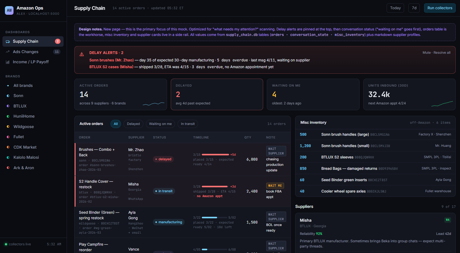
This is not great, and I’m honestly a bit surprised. It’s the kind of thing I’d expect from an amateur designer who’s more focused on cramming everything in than making thoughtful decisions about how best to direct the user’s attention.
A few specific notes:
In the bottom right, there’s a list of suppliers. I know who my suppliers are! This is not a good use of space.
The Misc Inventory box does not need prominent placement. This shows non-product inventory (e.g. extra product boxes that a supplier is storing for me), and it’s something that’s nice to be able to reference when needed but absolutely does not require this sort of top billing.
The Active orders section (which I will pedantically note does not have the second word capitalized, where the Misc Inventory section does… c’mon now, Claude, where’s the attention to detail?) is just kind of all over the place. There’s a bunch of extraneous stuff like which platform I use to communicate. The little bars showing timelines aren’t especially useful. The placed/shipped dates are duplicated on the line with the bar and then immediately below.
The aggregate numbers at the top aren’t useful. I care about individual orders, especially those that are late or require some action on my part, but the total number of units inbound across all brands has zero value.
I’ll take some responsibility here, since I was lazy and had Claude Code write the prompt for Claude Design, plus I just yeeted the full project directory at it, and there’s a bunch of extra context there.
On the other hand, not even the worst designer I’ve worked with would just take all this and go start mocking stuff up. Half the job is making sure that you understand the fundamental problem the user is trying to solve. All of which is to say: Claude Design really needs to interview the user.
So, next prompt:
Do you have access to skills like Claude Code? This design really missed the mark, and I think it would help us both if you did an in-depth interview of me to understand the problem I'm trying to solve here before taking another shot. Can you use the AskUserQuestions tool or something similar? If not I will do that with Claude Code and then give you the output it gives me.
Result:
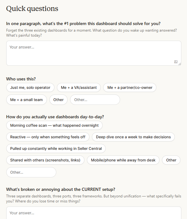
The form had a solid, if fairly standard, set of questions. This strikes me as pretty suboptimal when you have an LLM that is capable of conducting an actual user interview, but maybe it’d just end up asking roughly the same things so there’s no practical difference.
After I filled it out, the next set of designs was a lot better. One major improvement was that this time I got three versions. The form asked if I wanted to see different options, and when there is effectively zero cost, who wouldn’t?
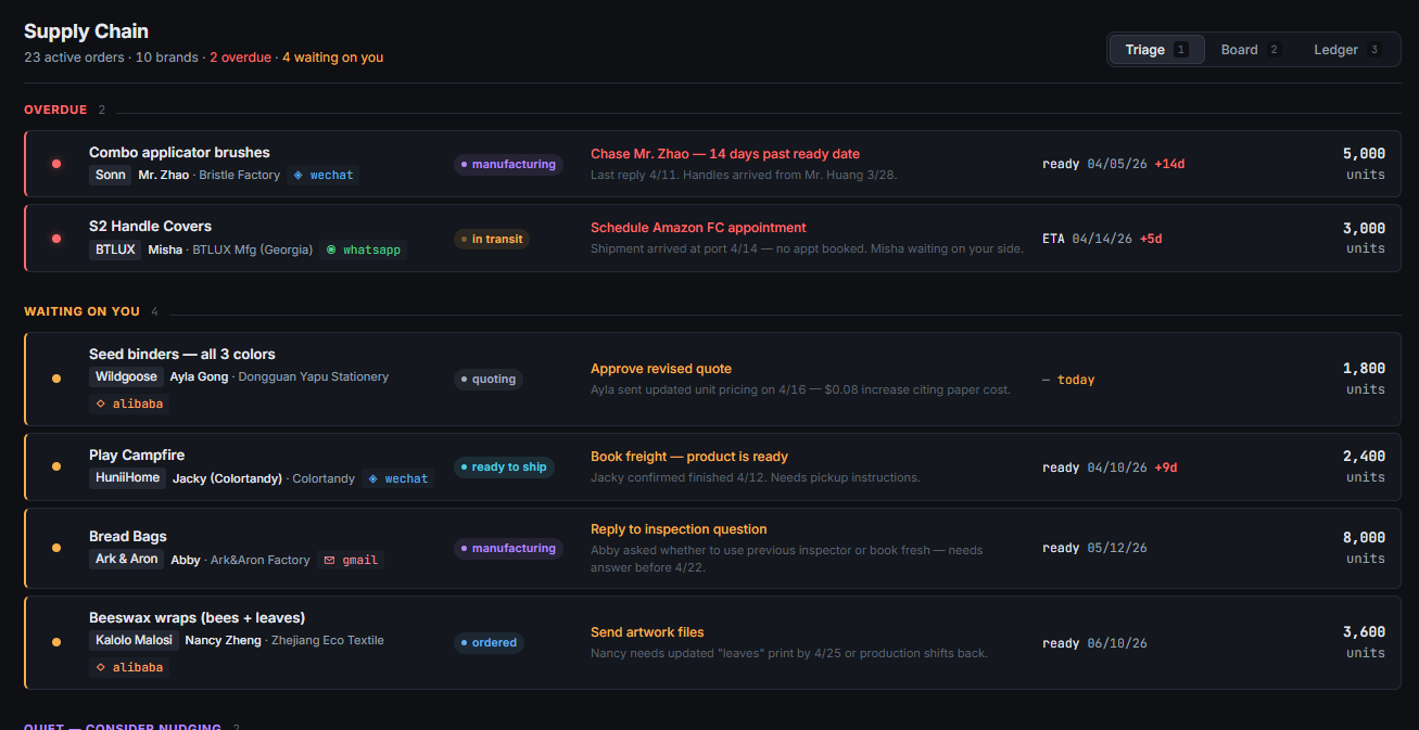
Two of the three it gave me were solid. First was a triage-style board, ordering things based on my need to take action on them. It handles the task well, making sure that I know exactly what I need to do while providing all the relevant context.
Second was basically a Kanban board, displaying orders by where they are in the process. This solves my problem of constantly wondering if I’ve forgotten something, then going to my operations docs to remind myself how I communicate with the supplier before actually finding the conversation. It also does a decent job of highlighting where I need to take action, but I really prefer the triage view for that, to make sure I don’t miss anything.
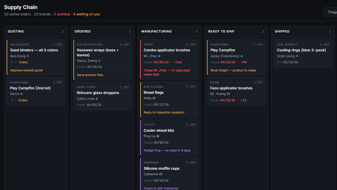
The triage view is perfect for checking each morning to make sure I’m not missing anything, and the Kanban board gives me the ability to see everything at once. I’m tempted to just have Claude build both, but might as well see what our new designer can do. Next prompt:
I like the triage and board views. Triage solves my problem of needing to make sure I don’t miss anything, and board is great for giving me the status of everything in flight at a glance. I might just build both of those, so go ahead and save whatever information Claude Code would need for that. But then let’s see if you can give me a single screen that provides the best of both — alerts to make sure I know what needs my input, and the comprehensive view that I get from the current board.
The initial result was just a single page with the triage view above the board view, so I gave it a hard time and told it to do better.
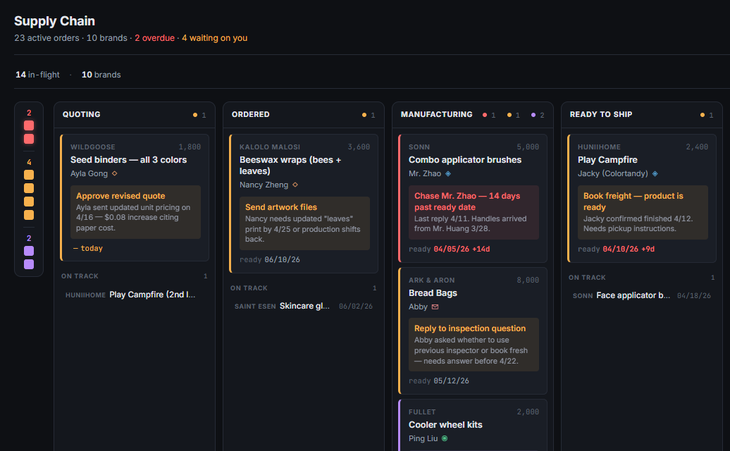
Something a bit more interesting this time, but I still feel like the separate triage and Kanban board views work better. They really serve two different use cases for me, and combining them just puts too much in one place. I’d be curious if some of the better designers I know could make a combined view that really works, but it’s fully possible that it was just a bad idea to start with.
I had Claude Design output the files needed to implement both views, and Claude Code nailed the dashboard on the first try. Gotta love when design and engineering work well together!
I was going to follow this up by having Claude Design redesign the existing, very ugly dashboard in the first screenshot of this post, but I hit my usage limit after I got started. Apparently this thing has its own limits, and I don’t get to play with it again until Saturday (I am writing this on Tuesday). Someone get Dario more GPUs posthaste!
Claude is, at least for this task, a solid if unimaginative designer. This largely parallels my experience with Claude Code — it’s really good at building what you want when given clear instructions, but if you start giving it latitude to make choices, it’ll frequently just do the obvious/lazy thing. You can get it to do better, often by just telling it to do better, but it remains strange to me that there’s value in just sort of prodding the model. Perhaps even more so when we’re talking about basic functionality that could trivially be handled via the harness, like making sure the first task is to interview the user.
That said, it still behooves us all not to forget that it is an astonishing feat of technology that I’ve got a very competent junior designer at my fingertips. There is a tremendous amount of work done by junior designers today, after all. And in fact, in my perhaps-too-frequent browsing of X, I’ve come across a number of posts that say Claude Design is excellent at taking a company’s style guide and applying that to new screens or products, which is traditionally the remit of junior designers.
This leads to the sort of thorny questions that are becoming increasingly common with AI — if your head of design can create a style guide and Claude can faithfully implement it, what happens to all the junior designers? Nothing good, I fear. My guess is that top-notch, senior design talent will shoot up in value, but junior folks will have a hard time.
When I was a PM, one of my favorite parts of the job was working through UX with my designers. They’d show me some options, I’d give feedback, and we’d repeat until we had an elegant design that solved the core problem. At this point, Claude Design certainly can’t fully substitute for that, but if I were still a PM, I would absolutely go through a few rounds of iteration to prepare to meet with design.
The crux here is that design is basically free now (strict usage limits aside, at least). Not great design or deep creativity, but the ability to get ten versions of something while brainstorming or to apply your style to a new page. At basically every place I worked, the design team was the biggest bottleneck, so it’s a meaningful change. Hopefully the tools we use get a bit more beautiful and usable as a result.
For more tips on using Claude Design, check out Karo’s Claude Design Review.