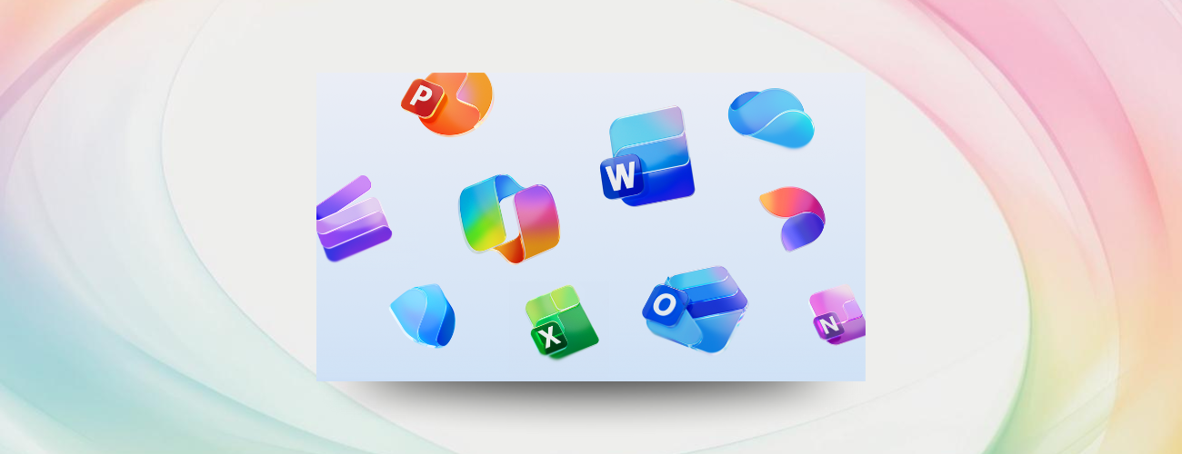
New Microsoft 365 icons for the AI era

· TECHCOMMUNITY.MICROSOFT.COM ·

4 min read Original article ↗

Blog Post

Microsoft 365 Insider Blog

2 MIN READ

JessicaHu's avatar

Hi, Insiders! We are Jessica Hu and Priya Mehta, Product Managers on the Apple Ecosystem team. We are excited to share new, modern icons of Microsoft 365 apps, now available for Windows, Mac, Android, iOS, and the web.

New Microsoft 365 icons for the AI era

Microsoft Word, Excel, PowerPoint, and the rest of your trusted productivity tools have new life with Copilot in Microsoft 365 – and now their icons will show it! The newly designed app icons reflect a strategic shift in Microsoft 365: unified, intuitive, and designed for flow across every canvas. As Copilot connects Microsoft 365 apps into a single, intelligent experience, the icons embody that transformation with cleaner shapes, vibrant colors, and a connected design system nodding to Copilot’s influence.

How it works

  • Download or update Microsoft 365 Copilot, Word, Excel, PowerPoint, OneNote, Outlook, Designer, Clipchamp, OneDrive, Teams, SharePoint, Forms, Access, and Defender, and you’ll notice that these apps have a new, unique look!

Availability

The icons are rolling out in the coming weeks across desktop, web, and mobile for both individuals and organizations running:

  • Windows: Version 2509 (Build 19231.20200) or later.
  • Mac: Version 16.102 (Build 25100710) or later.
  • Android: Build 16.0.19328.20000 or later.
  • Word, PowerPoint, and Excel for iOS: Version 2.102 (Build 25100611) or later.
  • Office Mobile for iOS: Version 2.102 (Build 25100730) or later.
  • OneNote for iOS: Version 16.102 (Build 25100611) or later.

Learn more about our new icons.

Feedback

Let us know what you think of Microsoft 365’s new icons! To share your thoughts, select Help > Feedback in your preferred app.

Learn about the Microsoft 365 Insider program and sign up for the Microsoft 365 Insider newsletter to get the latest information about Insider features in your inbox once a month!

Updated Oct 16, 2025

Version 1.0

JessicaHu's avatar

50 Comments

  • RubenSebastian's avatar

    Does anyone have a good source for high quality icons for manuals, quick reference cards etc? My wish is to have them in the same size, filetype etc.

  • Xardos's avatar

    I don't like these Icons and they decrease the accessability and readability of apps and files by a lot.

  • Karen_Flick's avatar

    Are we able to use the icons in documentation? Is there a link to download them?

  • AB2's avatar

    The new icons are in line with the strategy of MS... make things worse. I hope that you did not pay money to get them desigend. really ugly and hard to see for people who use their laptop for work. At least make them optional so users can change then back. My laptop looks like a toodler toy now. Thanks.

  • bglevine's avatar

    This is real value-add (sarc)! A total waste of time. Now maybe Microsoft can add some real value, like adding track changes to PowerPoint.

    • rnenamrod's avatar

      Did you mean “psych” or “sike”?…

  • Hopkins-web-comms's avatar

    Wow. The new Teams logo is giving CatDog

  • vihargadhesariya's avatar

    Great update! The new Microsoft 365 icons look clean and consistent with the Copilot visual language.
    Really like how the design now matches the more unified AI workflow across apps.

    On a related note, for anyone working with AI agents or LLM-based automation, here is an open-source SDK for evaluating AI model outputs in a structured way (text, image, and audio supported):

    AI-Evaluation SDK
    https://github.com/future-agi/ai-evaluation

    I found it useful when comparing different prompt variations and model responses.
    Would be interested to hear if others here are using any evaluation frameworks.

    Thank you!

    • crisorlandob's avatar

      **bleep** **bleep** sucker cuck 

  • OliverCutiCuti's avatar

  • bnawrocki's avatar

    As someone whose eyesight isn't the best, I don't like these. The letters within the icon, such as W and X in the Word and Excel icons, have shrunk so much compared to their original version, it's becoming more difficult to distinguish. And why do the Outlook and Word icons share the same color?

    • shawngg's avatar

      Love the new icons! They look so modern and clean. It reminds me how important good icons are for branding. I recently used a <a href="https://squarefaceicongenerator.net">square face icon generator</a> for my app and it made everything look so professional.

  • Broomy72's avatar

    The new icons are crap, they should at least make them optional.

    Ever heard the expression "if it ain't broke, don't try to fix it" definitely applies in this instance and to most of the wacked out things they do.

    I'm still hoping for the original colour palette, the current one with washed out sickly dull colours is frankly sickening, bring back the bright & bold