Writing good CSS is all about restraint. As an example, I used to over-specify too many things in my stylesheets. It was a bad habit picked up from BEM, OOCSS, and from developers who flattened everything with classes to dodge specificity. Now I think of my CSS selector strategy as a “progressive narrowing of scope.”
I start broad, letting global rules and element selectors do most of the work, and I get more specific only when I need to. This approach keeps my stylesheets smaller, faster, and hopefully much easier to understand. Here’s what I do:
- Keep styles as global as possible
- Use element selectors
- Identify things
- Classify things
- Vary things
To give you an insight into my strategy, I’ll use examples from the Academy of Scoring Arts project I finished most recently.

Element selectors keep styles as global as possible
When I begin a new stylesheet, I start with the broad strokes, typically colour, typography, and spacing. These global styles are the foundation for the rest of my CSS. Element selectors already describe what they are, so I rely on them to do as much as possible. Let’s say I’m styling headlines. I apply styles which will affect how every headline looks:
:is(h1, h2, h3, h4, h5, h6) {
font-family: "Bankside Sans VF";
font-style: normal;
font-variation-settings: "wght" 500, "wdth" 40;
font-weight: normal;
line-height: 1.3;
margin-block: 0 clamp(0.5625rem, 0.5408rem + 0.1087vi, 0.625rem);
text-transform: uppercase;
text-wrap: balance; }
By styling elements first, I get a consistent baseline across my entire stylesheet and avoid repeating styles in multiple selectors. Only when I have element selector styles for the HTML elements I’m using do I progressively narrow the scope by identifying, classifying, and varying their styles.
1) ID selectors identify things
Despite what you might’ve picked up, there’s absolutely nothing wrong with using ID selectors in the correct context, for example, when I know there’ll be only one of something on a page. This might be an introduction section, banner component, or site-wide footer.

On the Academy of Scoring Arts’ sign-up page, I know there’ll only ever be one block of pricing options, so I used an ID selector:
#options { […] }There’ll be only one banner component:
#banner { […] }And one banner logo:
#banner-logo { […] }Using ID selectors makes an element’s identity obvious at a glance. They’re also handy for linking to those page fragments later.
2) Class selectors classify things
Narrowing the scope further, I start to classify things. For instance, the videos component contains multiple items. Quite often, I’ll style those child elements using a descendant selector:
#videos > * { […] }Otherwise, I add class attribute values and use class selectors:
.item-video { […] }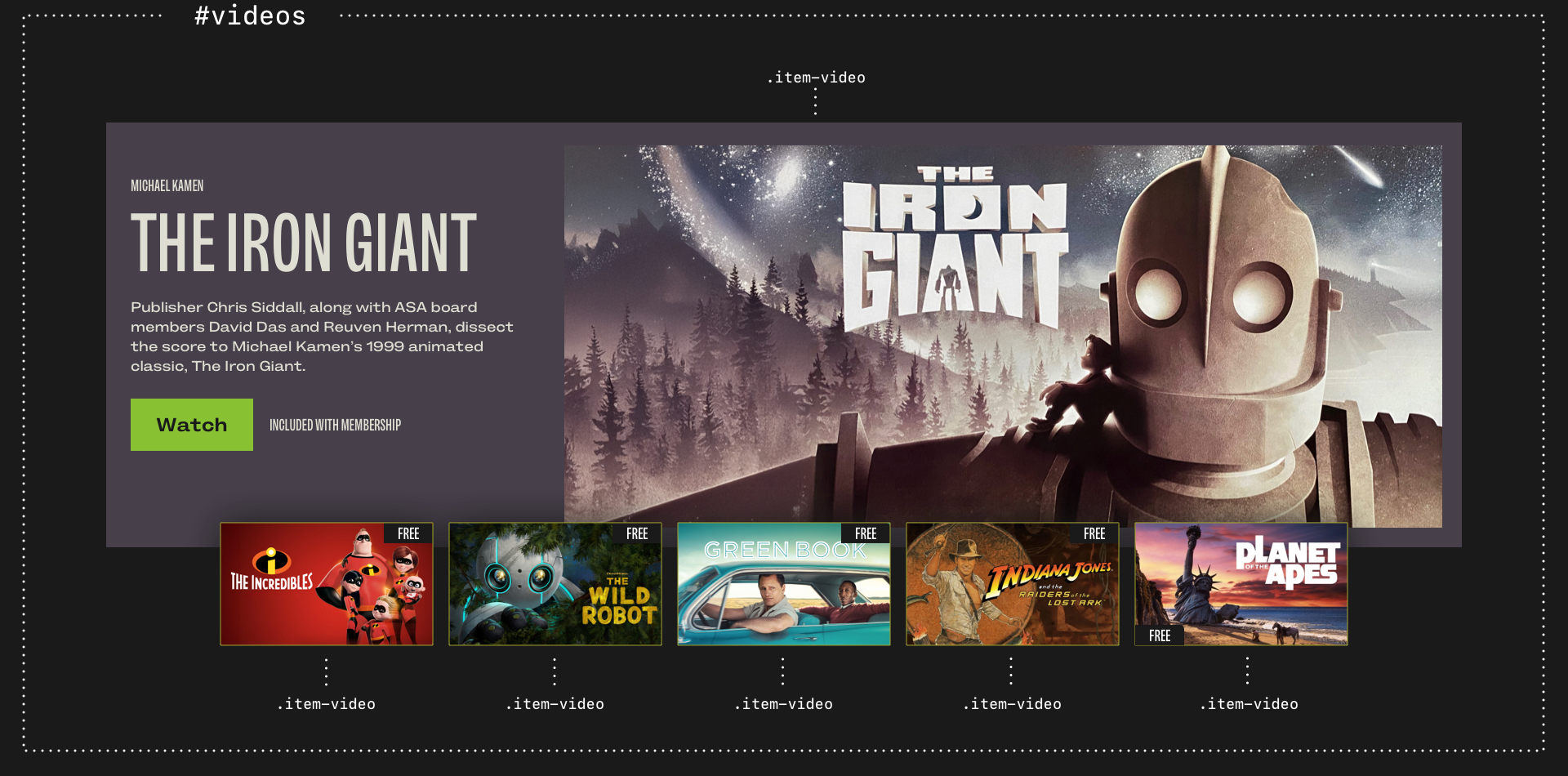
Using class selectors defines repeating patterns of styling. Articles in a feed, members of a team, or videos in a collection:
.item-article { […] }
.item-member { […] }
.item-video { […] }
I use class selectors to apply typographic styles:
.alt-lede { […] } /* Lede paragraphs */
.alt-uppercase { […] } /* Uppercase text */
And other classifications of elements, including badges, buttons, and specific form elements:
.alt-btn { […] } /* Styled buttons and links */
.alt-pill { […] } /* Pill-shaped badges */
.alt-checkbox { […] } /* Styled checkboxes */
I also use a class selector to define all my various layouts, which are based on the same underlying grid:
.layout {
display: grid;
gap: 1.5rem;
grid-template-columns: repeat(12, 1fr); }
Once I’ve identified and classified the key elements, my next step is to vary them.
3) Attribute selectors vary things
Staying with layout styles, in the past, I might’ve used a single class attribute to bind a style to an element, like this:
.layout-bartok { […] }But this meant duplicating styles whenever I added a new layout. I could’ve (and did) use BEM’s multiple class attributes:
.layout .layout_bartok { […] }But this always felt clumsy, so now I separate my layout concerns into the underlying grid styles using a class selector and define the specific layout as data using an attribute selector:
.layout { […] }

[data-layout="bartok"] { […] }

[data-layout="beethoven"] { […] }

[data-layout="bizet"] { […] }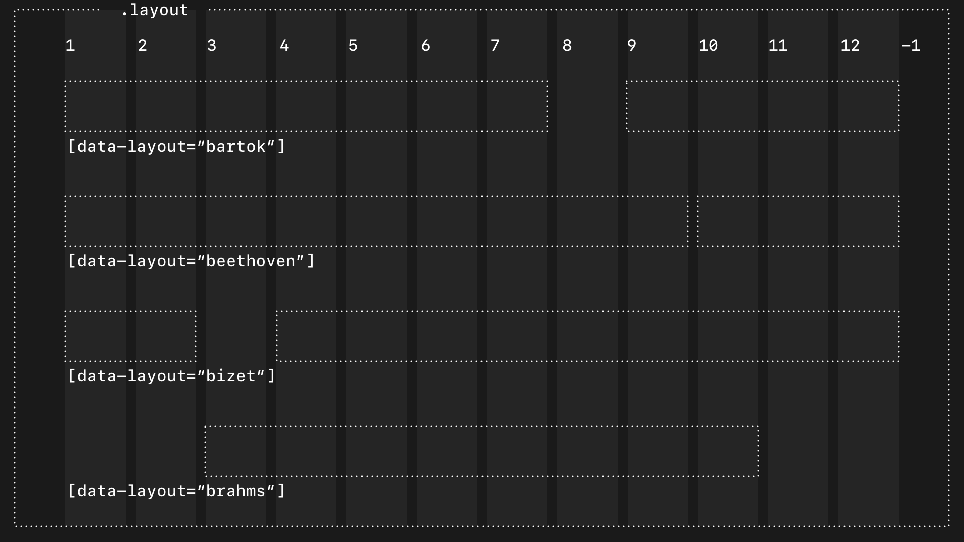
(Why I named my layout components after famous composers is a topic for another day.)
With data attributes, I’m not just styling layout components differently; I’m making it explicit that one layout is different from another in a way which is semantically richer than using class selectors.
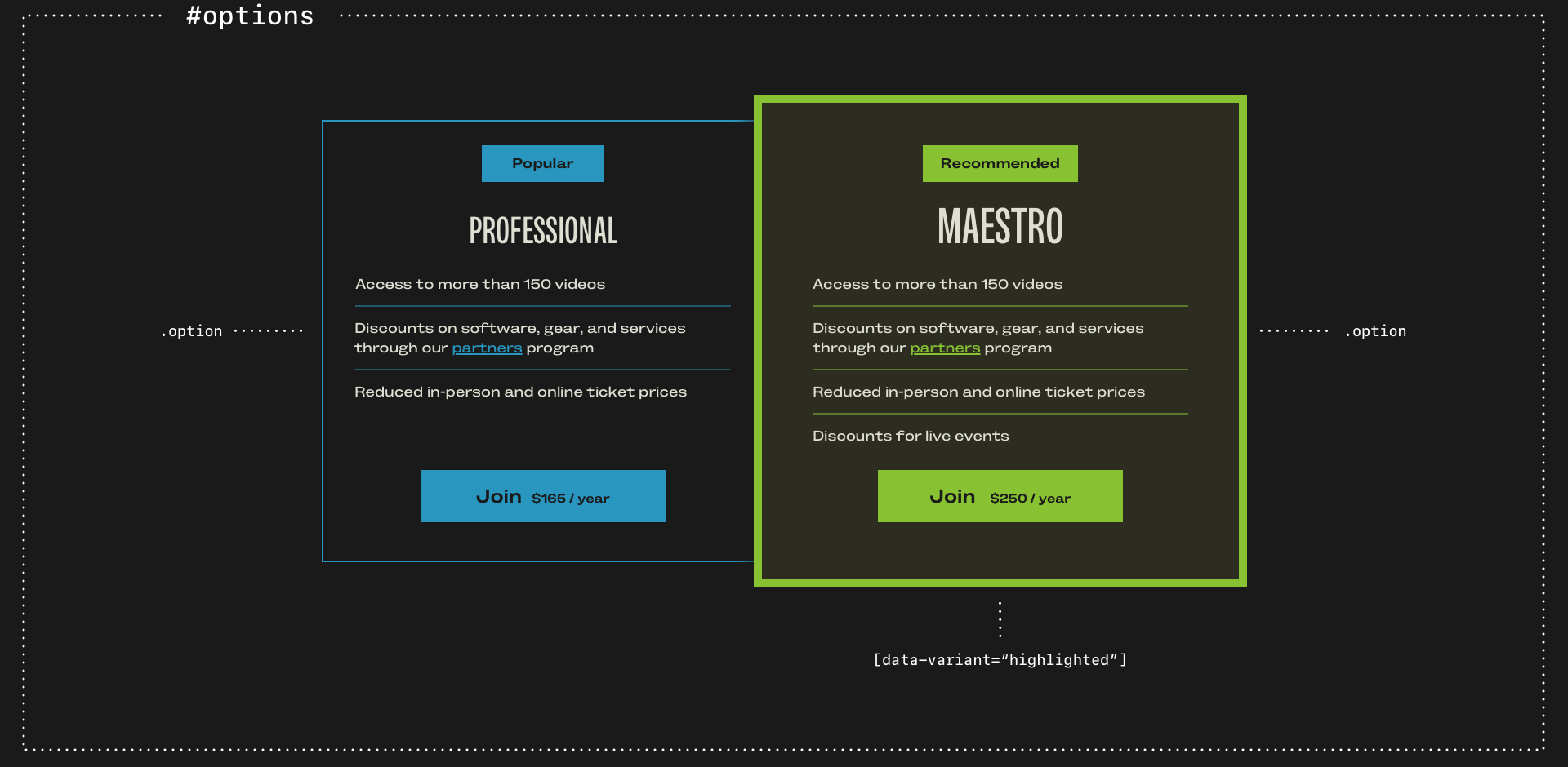
Let’s say I have several price options in a group and I want to highlight one. Semantically, I want to state the identity of the element (#options,) classify the options (.option,) then vary how one of them looks:
<div class="option" data-variant="highlighted">And in my CSS:
.option {
border: 2px solid ##2896be; }

.option[data-variant="highlighted"] {
background-color: #212121;
border: 3px solid #7ec339;
animation: triple-pulse-simple 3s ease-in-out 2s;
transform-origin: center; }
In my mind, there’s an important distinction between classifying elements which form part of a group and varying the styles. For example, I might have multiple standard blockquotes and other larger pullquotes. I use an element selector to style a standard blockquote. But although larger pullquotes have the same styling, they don’t form a semantic classification. Instead, they’re variations, so I use a data-attribute:
blockquote p { font-size: 1rem; }
blockquote[data-variant="m"] p { font-size: 1.2rem; }
blockquote[data-variant="l"] p { font-size: 1.5rem; }
All my horizontal rules share styles, which I apply using an element selector. But when I need to vary thickness, I use a data-attribute:
hr {
border-block-start: 1px solid #2896be;
margin-block: 1.5rem; }

hr[data-width="l"] {
border-width: 3px; }
My horizontal rules frequently act as section dividers, which require more space in the block direction, so I use a different data-attribute:
[data-function="divider"] {
margin-block: 3rem; }
And in my design for the Academy of Scoring Arts, some horizontal rules are decorative devices:
[data-device="stripe"] {
border-block-start: 40px solid #7ec339; }
Styled buttons can have several variants, from different sizes to various widths:
.alt-btn {
padding: .75em 1em; }

.alt-btn[data-variant="s"] {
padding: .5em .7em; }

.alt-btn[data-variant="block"] {
box-sizing: border-box;
width: 100%; }
And some buttons might animate when someone interacts with them:
.alt-btn[data-animation="shakeX"] { […] }I often need to vary how some elements look, even when they’re built on the same blocks as others. For example, I might have an unordered list with items aligned to the left, and a list of social media links where they’re centred:
[data-content="social"] li { […] }Or modular grid layouts which contain team members ([data-content="team"]) vs layouts which contain photos ([data-content="photos"]):
[data-content="team"] > * { […] }
[data-content="photos"] > * { […] }
Once I started thinking this way, I began to see every element in terms of its identity, classification, and variation. Each level builds on the last, intentionally narrowing the scope of my styles.
How I think about elements is my strategy
My selector strategy isn’t a framework or a naming convention. It’s how I think about what elements in my markup are, how they relate to each other, their role, and what content they contain. Progressively narrowing the scope keeps my stylesheets fast, small, and as well-organised as I can make them. And it avoids over-engineering to override how CSS was designed to work, including the cascade and specificity.