We’ve been writing a bit about some odd tail behavior in the Fivethirtyeight election forecast, for example that it was giving Joe Biden a 3% chance of winning Alabama (which seemed high), it was displaying Trump winning California as in “the range of scenarios our model thinks is possible” (which didn’t seem right), and it allowed the possibility that Biden could win every state except New Jersey (?), and that, in the scenarios where Trump won California, he only had a 60% chance of winning the election overall (which seems way too low).
My conjecture was that these wacky marginal and conditional probabilities came from the Fivethirtyeight team adding independent wide-tailed errors to the state-level forecasts: this would be consistent with Fivethirtyeight leader Nate Silver’s statement, “We think it’s appropriate to make fairly conservative choices especially when it comes to the tails of your distributions.” The wide tails allow the weird predictions such as Trump winning California. And independence of these extra error terms would yield the conditional probabilities such as the New Jersey and California things above. I’d think that if Trump were to win New Jersey or, even more so, California, that this would most likely happen only as part of a national landslide of the sort envisioned by Scott Adams or whatever. But with independent errors, Trump winning New Jersey or California would just be one of those things, a fluke that provides very little information about a national swing.
You can really only see this behavior in the tails of the forecasts if you go looking there. For example, if you compute the correlation matrix of the state predictors, this is mostly estimated from the mass of the distribution, as the extreme tails only contribute a small amount of the probability. Remember, the correlation depends on where you are in the distribution.
Anyway, that’s where we were until a couple days ago, when commenter Rui pointed to a file on the Fivethirtyeight website with the 40,000 simulations of the vector of forecast vote margins in the 50 states (and also D.C. and the congressional districts of Maine and Nebraska).
Now we’re in business.
I downloaded the file, read it into R, and created the variables that I needed:
library("rjson")
sims_538 <- fromJSON(file="simmed-maps.json")
states <- sims_538$states
n_sims <- length(sims_538$maps)
sims <- array(NA, c(n_sims, 59), dimnames=list(NULL, c("", "Trump", "Biden", states)))
for (i in 1:n_sims){
  sims[i,] <- sims_538$maps[[i]]
}
state_sims <- sims[,4:59]/100
trump_share <- (state_sims + 1)/2
biden_wins <- state_sims < 0
trump_wins <- state_sims > 0
As a quick check, let’s compute Biden’s win probability by state:
> round(apply(biden_wins, 2, mean), 2)
  AK   AL   AR   AZ   CA   CO   CT   DC   DE   FL   GA   HI   IA   ID   IL   IN   KS   KY   LA   M1   M2   MA   MD   ME   MI
0.20 0.02 0.02 0.68 1.00 0.96 1.00 1.00 1.00 0.72 0.50 0.99 0.48 0.01 1.00 0.05 0.05 0.01 0.06 0.98 0.51 1.00 1.00 0.90 0.92
  MN   MO   MS   MT   N1   N2   N3   NC   ND   NE   NH   NJ   NM   NV   NY   OH   OK   OR   PA   RI   SC   SD   TN   TX   UT
0.91 0.08 0.10 0.09 0.05 0.78 0.00 0.67 0.01 0.01 0.87 0.99 0.97 0.90 1.00 0.44 0.01 0.97 0.87 1.00 0.11 0.04 0.03 0.36 0.04
  VA   VT   WA   WI   WV   WY
0.99 0.99 0.99 0.86 0.01 0.00
That looks about right. Not perfect—I don’t think Biden’s chances of winning Alabama are really as high as 2%—but this is what the Fivethirtyeight is giving us, rounded to the nearest percent.
And now for the fun stuff.
What happens if Trump wins New Jersey?
> condition <- trump_wins[,"NJ"]
> round(apply(trump_wins[condition,], 2, mean), 2)
  AK   AL   AR   AZ   CA   CO   CT   DC   DE   FL   GA   HI   IA   ID   IL   IN   KS   KY   LA   M1   M2   MA   MD   ME
0.58 0.87 0.89 0.77 0.05 0.25 0.10 0.00 0.00 0.79 0.75 0.11 0.78 0.97 0.05 0.87 0.89 0.83 0.87 0.13 0.28 0.03 0.03 0.18
  MI   MN   MO   MS   MT   N1   N2   N3   NC   ND   NE   NH   NJ   NM   NV   NY   OH   OK   OR   PA   RI   SC   SD   TN
0.25 0.38 0.84 0.76 0.76 0.90 0.62 1.00 0.42 0.96 0.97 0.40 1.00 0.16 0.47 0.01 0.53 0.94 0.08 0.39 0.08 0.86 0.90 0.85
  TX   UT   VA   VT   WA   WI   WV   WY
0.84 0.91 0.16 0.07 0.07 0.50 0.78 0.97
So, if Trump wins New Jersey, his chance of winning Alaska is . . . 58%??? That’s less than his chance of winning Alaska conditional on losing New Jersey.
Huh?
Let’s check:
> round(mean(trump_wins[,"AK"] [trump_wins[,"NJ"]]), 2)
[1] 0.58
> round(mean(trump_wins[,"AK"] [biden_wins[,"NJ"]]), 2)
[1] 0.80
Yup.
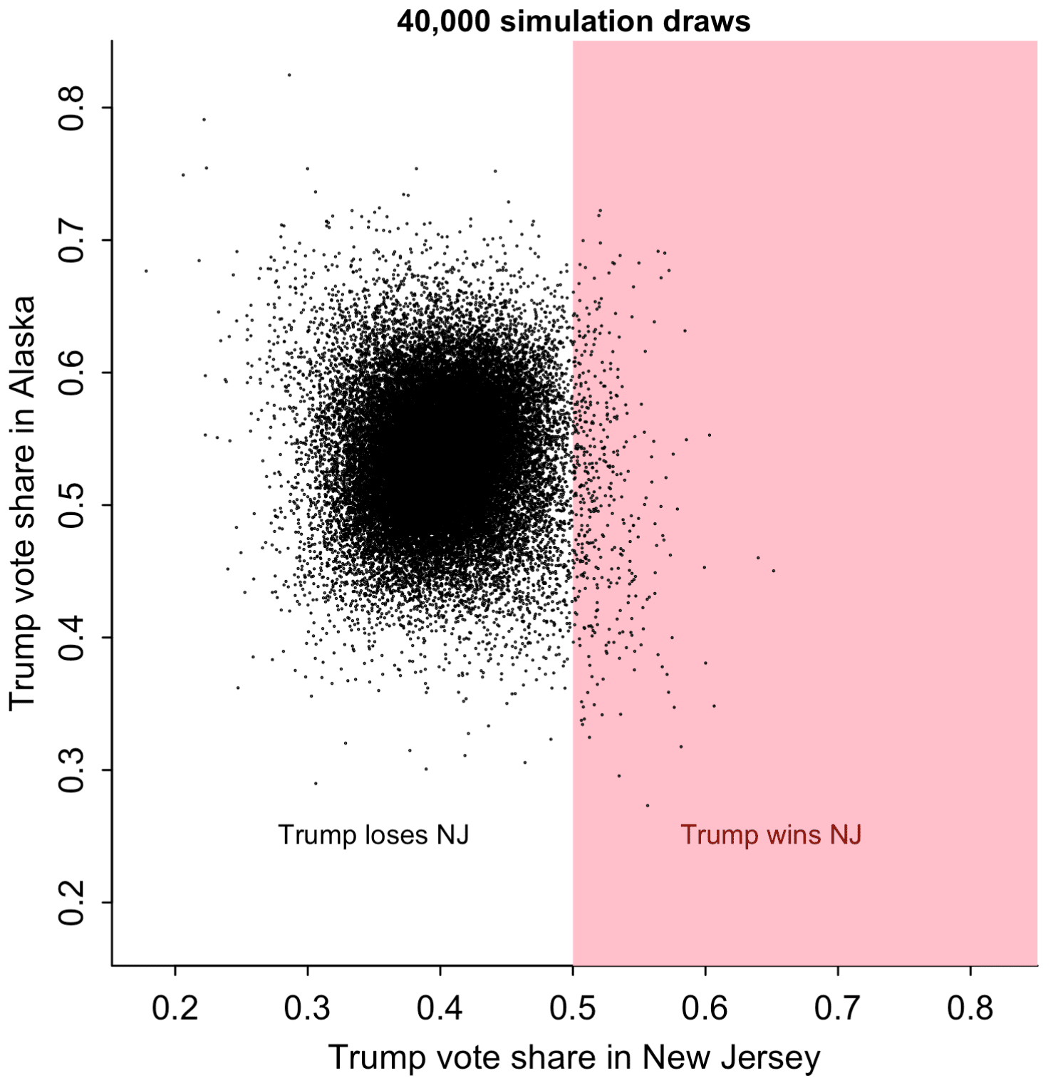
Whassup with that? How could that be? Let’s plot the simulations of Trump’s vote share in the two states:
par(mar=c(3,3,1,1), mgp=c(1.7, .5, 0), tck=-.01)
par(pty="s")
rng <- range(trump_share[,c("NJ", "AK")])
plot(rng, rng, xlab="Trump vote share in New Jersey", ylab="Trump vote share in Alaska", main="40,000 simulation draws", cex.main=0.9, bty="l", type="n")
polygon(c(0.5,0.5,1,1), c(0,1,1,0), border=NA, col="pink")
points(trump_share[,"NJ"], trump_share[,"AK"], pch=20, cex=0.1)
text(0.65, 0.25, "Trump wins NJ", col="darkred", cex=0.8)
text(0.35, 0.25, "Trump loses NJ", col="black", cex=0.8)
The scatterplot is too dense to read at its center, so I'll just pick 1000 of the simulations at random and graph them:
subset <- sample(n_sims, 1000)
rng <- range(trump_share[,c("NJ", "AK")])
plot(rng, rng, xlab="Trump vote share in New Jersey", ylab="Trump vote share in Alaska", main="Only 1000 simulation draws", cex.main=0.9, bty="l", type="n")
polygon(c(0.5,0.5,1,1), c(0,1,1,0), border=NA, col="pink")
points(trump_share[subset,"NJ"], trump_share[subset,"AK"], pch=20, cex=0.1)
text(0.65, 0.25, "Trump wins NJ", col="darkred", cex=0.8)
text(0.35, 0.25, "Trump loses NJ", col="black", cex=0.8)

Here's the correlation:
> round(cor(trump_share[,"AK"], trump_share[,"NJ"]), 2)
[1] 0.03
But from the graph with 40,000 simulations above, it appears that the correlation is negative in the tails. Go figure.
OK, fine. I only happened to look at Alaska because it was first on the list. Let's look at a state right next to New Jersey, a swing state . . . Pennsylvania.
> round(mean(trump_wins[,"PA"] [trump_wins[,"NJ"]]), 2)
[1] 0.39
> round(mean(trump_wins[,"PA"] [biden_wins[,"NJ"]]), 2)
[1] 0.13
OK, so in the (highly unlikely) event that Trump wins in New Jersey, his win probability in Pennsylvania goes up from 13% to 39%. A factor of 3! But . . . it's not enough. Not nearly enough. Currently the Fivethirtyeight model gives Trump a 13% chance to win in PA. Pennsylvania's a swing state. If Trump wins in NJ, then something special's going on, and Pennsylvania should be a slam dunk for the Republicans.
OK, time to look at the scatterplot:

The simulations for Pennsylvania and New Jersey are correlated. Just not enough. At lest, this still doesn't look quite right. I think that if Trump were to do 10 points better than expected in New Jersey, that he'd be the clear favorite in Pennsylvania.
Here's the correlation:
> round(cor(trump_share[,"PA"], trump_share[,"NJ"]), 2)
[1] 0.43
So, sure, if the correlation is only 0.43, it almost kinda makes sense. Shift Trump from 40% to 50% in New Jersey, then the expected shift in Pennsylvania from these simulations would be only 0.43 * 10%, or 4.3%. But Fivethirtyeight is predicting Trump to get 47% in Pennsylvania, so adding 4.3% would take him over the top, at least in expectation. Why, then, is the conditional probability, Pr(Trump wins PA | Trump wins NJ) only 43%, and not over 50%? Again, there's something weird going on in the tails. Look again at the plot just above: in the center of the range, x and y are strongly correlated, but in the tails, the correlation goes away. Some sort of artifact of the model.
What about Pennsylvania and Wisconsin?
> round(mean(trump_wins[,"PA"] [trump_wins[,"WI"]]), 2)
[1] 0.61
> round(mean(trump_wins[,"PA"] [biden_wins[,"WI"]]), 2)
[1] 0.06
These make more sense. The correlation of the simulations between these two states is a healthy 0.81, and here's the scatterplot:

Alabama and Mississippi also have a strong dependence and give similar results.
At this point I graphed the correlation matrix of all 50 states. But that was too much to read, so I picked a few states:
some_states <- c("AK","WA","WI","OH","PA","NJ","VA","GA","FL","AL","MS")
I ordered them roughly from west to east and north to south and then plotted them:
cor_mat <- cor(trump_share[,some_states])
image(cor_mat[,rev(1:nrow(cor_mat))], xaxt="n", yaxt="n")
axis(1, seq(0, 1, length=length(some_states)), some_states, tck=0, cex.axis=0.8)
axis(2, seq(0, 1, length=length(some_states)), rev(some_states), tck=0, cex.axis=0.8, las=1)
And here's what we see:

Correlations are higher for nearby states. That makes sense. New Jersey and Alaska are far away from each other.
But . . . hey, what's up with Washington and Mississippi? If NJ and AK have a correlation that's essentially zero, does that mean that the forecast correlation for Washington and Mississippi is . . . negative?
Indeed:
> round(cor(trump_share[,"WA"], trump_share[,"MS"]), 2)
[1] -0.42
And:
> round(mean(trump_wins[,"MS"] [trump_wins[,"WA"]]), 2)
[1] 0.31
> round(mean(trump_wins[,"MS"] [biden_wins[,"WA"]]), 2)
[1] 0.9
If Trump were to pull off the upset of the century and win Washington, it seems that his prospects in Mississippi wouldn't be so great.
For reals? Let's try the scatterplot:
rng <- range(trump_share[,c("WA", "MS")])
plot(rng, rng, xlab="Trump vote share in Washington", ylab="Trump vote share in Mississippi", main="40,000 simulation draws", cex.main=0.9, bty="l", type="n")
polygon(c(0.5,0.5,1,1), c(0,1,1,0), border=NA, col="pink")
points(trump_share[,"WA"], trump_share[,"MS"], pch=20, cex=0.1)
text(0.65, 0.3, "Trump wins WA", col="darkred", cex=0.8)
text(0.35, 0.3, "Trump loses WA", col="black", cex=0.8)
What the hell???

So . . . what's happening?
My original conjecture was that the Fivethirtyeight team was adding independent long-tailed errors to the states, and the independence was why you could get artifacts such as the claim that Trump could win California but still lose the national election.
But, after looking more carefully, I think that's part of the story---see the NJ/PA graph above---but not the whole thing. Also, lots of the between-state correlations in the simulations are low, even sometimes negative. And these low correlations, in turn, explain why the tails are so wide (leading to high estimates of Biden winning Alabama etc.): If the Fivethirtyeight team was tuning the variance of the state-level simulations to get an uncertainty that seemed reasonable to them at the national level, then they'd need to crank up those state-level uncertainties, as these low correlations would cause them to mostly cancel out in the national averaging. Increase the between-state correlations and you can decrease the variance for each state's forecast and still get what you want at the national level.
But what about those correlations? Why do I say that it's unreasonable to have a correlation of -0.42 between the election outcomes of Mississippi and Washington? It's because the uncertainty doesn't work that way. Sure, Mississippi's nothing like Washington. That's not the point. The point is, where's the uncertainty in the forecast coming from? It's coming from the possibility that the polls might be way off, and the possibility that there could be a big swing during the final weeks of the campaign. We'd expect a positive correlation for each of these, especially if we're talking about big shifts. If we were really told that Trump won Washington, then, no, I don't think that should be a sign that he's in trouble in Mississippi. I wouldn't assign a zero correlation to the vote outcomes in New Jersey and Pennsylvania either.
Thinking about it more . . . I guess the polling errors in the states could be negatively correlated. After all, in 2016 the polling errors were positive in some states and negative in others; see Figure 2 of our "19 things" article. But I'd expect shifts in opinion to be largely national, not statewide, and thus with high correlations across states. And big errors . . . I'd expect them to show some correlation, even between New Jersey and Alaska. Again, I'd think the knowledge that Trump won New Jersey or Washington would come along with a national reassessment, not just some massive screw-up in that state's polls.
In any case, Fivethirtyeight's correlation matrix seems to be full of artifacts. Where did the weird correlations come from? I have no idea. Maybe there was a bug in the code, but more likely they just took a bunch of state-level variables and computed their correlation matrix, without thinking carefully about how this related to the goals of the forecast and without looking too carefully at what was going on. In the past few months, we and others have pointed out various implausibilities in the Fivethirtyeight forecast (such as that notorious map where Trump wins New Jersey but loses all the other states), but I guess that once they had their forecast out there, they didn't want to hear about its problems.
Or maybe I messed up in my data wrangling somehow. My code is above, so feel free to take a look and see.
As I keep saying, these models have lots of moving parts and it's hard to keep track of all of them. Our model isn't perfect either, and even after the election is over it can be difficult to evaluate the different forecasts.
One thing exercise demonstrates is the benefit of putting your granular inferences online. If you're lucky, some blogger might analyze your data for free!
Why go to all this trouble?
Why go to all the above effort rooting around in the bowels of some forecast?
A few reasons:
1. I was curious.
2. It didn't take very long to do the analysis. But it did then take another hour or so to write it up. Sunk cost fallacy and all that. Perhaps next time, before doing this sort of analysis, I should estimate the writing time as well. Kinda like how you shouldn't buy a card on the turn if you're not prepared to stay in if you get the card you want.
3. Teaching. Yes, I know my R code is ugly. But ugly code is still much more understandable than no code. I feel that this sort of post does a service, in that it provides a model for how we can do real-time data analysis, even if in this case the data are just the output from somebody else's black box.
No rivalry
Let me emphasize that we're not competing with Fivethirtyeight. I mean, sure the Economist is competing with Fivethirtyeight, or with its parent company, ABC News---but I'm not competing. So far the Economist has paid me $0. Commercial competition aside, we all have the same aim, which is to assess uncertainty about the future given available data.
I want both organizations to do the best they can do. The Economist has a different look and feel from Fivethirtyeight---just for example, you can probably guess which of these has the lead story, "Who Won The Last Presidential Debate? We partnered with Ipsos to poll voters before and after the candidates took the stage.", and which has a story titled, "Donald Trump and Joe Biden press their mute buttons. But with 49m people having voted already, creditable performances in the final debate probably won’t change much." But, within the constraints of their resources and incentives, there are always possibilities for improvement.
P.S. There's been a lot of discussion in the comments about Mississippi and Washington, which is fine, but the issue is not just with those two states. It's with lots of states with weird behavior in the joint distribution, such as New Jersey and Alaska, which was where we started. According to the Fivethirtyeight model, Trump is expected to lose big in New Jersey and is strong favorite, with a 80% chance of winning, in Alaska. But the model also says that if Trump were to win in New Jersey, that his chance of winning in Alaska would drop to 58%! That can't be right. At least, it doesn't seem right.
And, again, when things don't seem right, we should examine our model carefully. Statistical forecasts are imperfect human products. It's no surprise that they can go wrong. The world is complicated. When a small group of people puts together a complicated model in a hurry, I'd be stunned if it didn't have problems. The models that my collaborators and I build all have problems, and I appreciate when people point these problems out to us. I don't consider it an insult to the Fivethirtyeight team to point out problems in their model. As always: we learn from our mistakes. But only when we're willing to do so.
P.P.S. Someone pointed out this response from Nate Silver:
Our [Fivethirtyeight's] correlations actually are based on microdata. The Economist guys continually make weird assumptions about our model that they might realize were incorrect if they bothered to read the methodology.
I did try to read the methodology but it was hard to follow. That's not Nate's fault; it's just hard to follow any writeup. Lots of people have problems following my writeups too. That's why it's good to share code and results. One reason we had to keep guessing about what they were doing at Fivethirtyeight is that the code is secret and, until recently, I wasn't aware of simulations of the state results. I wrote the above post because once I had those simulations I could explore more.
In that same thread, Nate also writes:
I do think it's important to look at one's edge cases! But the Economist guys tend to bring up stuff that's more debatable than wrong, and which I'm pretty sure is directionally the right approach in terms of our model's takeaways, even if you can quibble with the implementation.
I don't really know what he means by "more debatable than wrong." I just think that (a) some of the predictions from their model don't make sense, and (b) it's not a shock that some of the predictions don't make sense, as that's how modeling goes in the real world.
Also, I don't know what he means by "directionally the right approach in terms of our model's takeaways." His model says that, if Trump wins New Jersey, that he only has a 58% chance of winning Alaska. Now he's saying that this is directionally the right approach. Does that mean that he thinks that, if Trump wins New Jersey, that his chance of winning in Alaska goes down, but maybe not to 58%? Maybe it goes down from 80% to 65%? Or from 80% to 40%? The thing is, I don't think it should go down at all. I think that if things actually happen so that Trump wins in New Jersey, that his chance of winning Alaska should go up.
What seems bizarre to me is that Nate is so sure about this counterintuitive result, that he's so sure it's "directionally the right approach." Again, his model is complicated. Lots of moving parts! Why is it so hard to believe that it might be messing up somewhere? So frustrating.
P.P.P.S. Let me say it again: I see no rivalry here. Nate's doing his best, he has lots of time and resource constraints, he's managing a whole team of people and also needs to be concerned with public communication, media outreach, etc.
My guess is that Nate doesn't really think that, a NJ win for Trump would make it less likely for him to win Alaska; it's just that he's really busy right now and he's rather reassure himself that his forecast is directionally the right approach than worry about where it's wrong. As I well know, it can be really hard to tinker with a model without making it worse. For example, he could increase the between-state correlations by adding a national error term, or by adding national and regional error terms, but then he'd have to decrease the variance within each state to compensate, and then there are lots of things to check, lots of new ways for things to go wrong---not to mention the challenge of explaining to the world that you've changed your forecasting method. Simpler, really, to just firmly shut that Pandora's box and pretend it had never been opened.
I expect that sometime after the election's over, Nate and his team will think about these issues more carefully and fix their model in some way. I really hope they go open source, but even if they keep it secret, as long as they release their predictive simulations we can look at the correlations and try to help out.
Similarly, they can help out with us. If there are any particular predictions from our model that Nate thinks don't make sense, he should feel free to let us know, or post it somewhere that we will find it. A few months ago he commented that our probability of Biden winning the popular vote seemed too high. We looked into it and decided that Nate and other people who'd made that criticism were correct, and we used that criticism to improve our model; see the "Updated August 5th, 2020" section at the bottom of this page. And our model remains improvable.
Let me say this again: the appropriate response to someone pointing out a problem with your forecasts is not to label the criticism as a "quibble" that is "more debatable than wrong" or to say that you're "directionally right," whatever that means. How silly that is! Informed criticism is a blessing! You're lucky when you get it, and use that criticism as an opportunity to learn and to do better.