by Katie McDermott , CEO & Founder
The Trump administration just mandated Times New Roman across all State Department communications to "restore decorum." Secretary Rubio called Calibri "another wasteful DEIA program." A sans-serif. Wasteful. The font wars have arrived—uninvited, unnecessary, and paid for by the people least able to afford them. This isn't about typefaces. It's about who gets considered—and who will squint in silence. So while the State Department cosplays 1931, this blog pays homage to a font actually built for this century. Here's a deep dive on Atkinson Hyperlegible—the design decisions, the beautiful weirdness, the typographic rule-breaking. One for the type nerds.
Typography has become policy...and politics
The Trump administration just mandated Times New Roman across all State Department communications to "restore decorum and professionalism." Secretary Rubio called Calibri; a functional sans-serif designed this century, "another wasteful DEIA program." Too informal, apparently.
Times New Roman is free, sure. The consequences aren't. Rework across government documentation, accessibility regression, increased user friction pushing citizens toward higher-cost service channels, and a reputational cleanup that'll cost more than whatever "savings" anyone imagined. All to restore the aesthetic gravitas of... 1931 newspaper typesetting.
Typeface choices quietly encode values, priorities, and trade-offs; between tradition and progress, compliance and usability, symbolism and lived experience. The absence of strong public opinion doesn’t mean neutrality; it just means the signals are subtle.
The Trump Administration’s decision isn't really about typefaces. It's about who gets considered when policy decisions are made; and who doesn't. Type is the excuse. The message is who matters; and apparently, accessibility, oldies, people with older devices aren’t on that list.
So, in light of this backwards-facing nonsense, we wanted to celebrate a font that actually gives a damn; by sharing some of the awesome design principles behind Atkinson Hyperlegible
A font that gives a damn: the details
Atkinson is often misunderstood as a general “accessibility font”. It isn’t. It was designed specifically for people with low vision, not blind screen reader users; a distinction repeatedly emphasised by the Braille Institute itself [3]. This makes it particularly relevant in mainstream government and banking services, where many users don’t identify as disabled but still struggle quietly for example older users.
Grotesque...not ugly. Atkinson Hyperlegible first released in 2019 (and significantly expanded in 2025), is a grotesque sans-serif, a category that traces back to the earliest sans-serifs of the 19th and early 20th centuries. Despite the unfortunate name, “grotesque” never meant ugly; it simply meant non-classical. These fonts were practical, utilitarian, and slightly awkward by design…qualities that make them a surprisingly good foundation for accessibility.
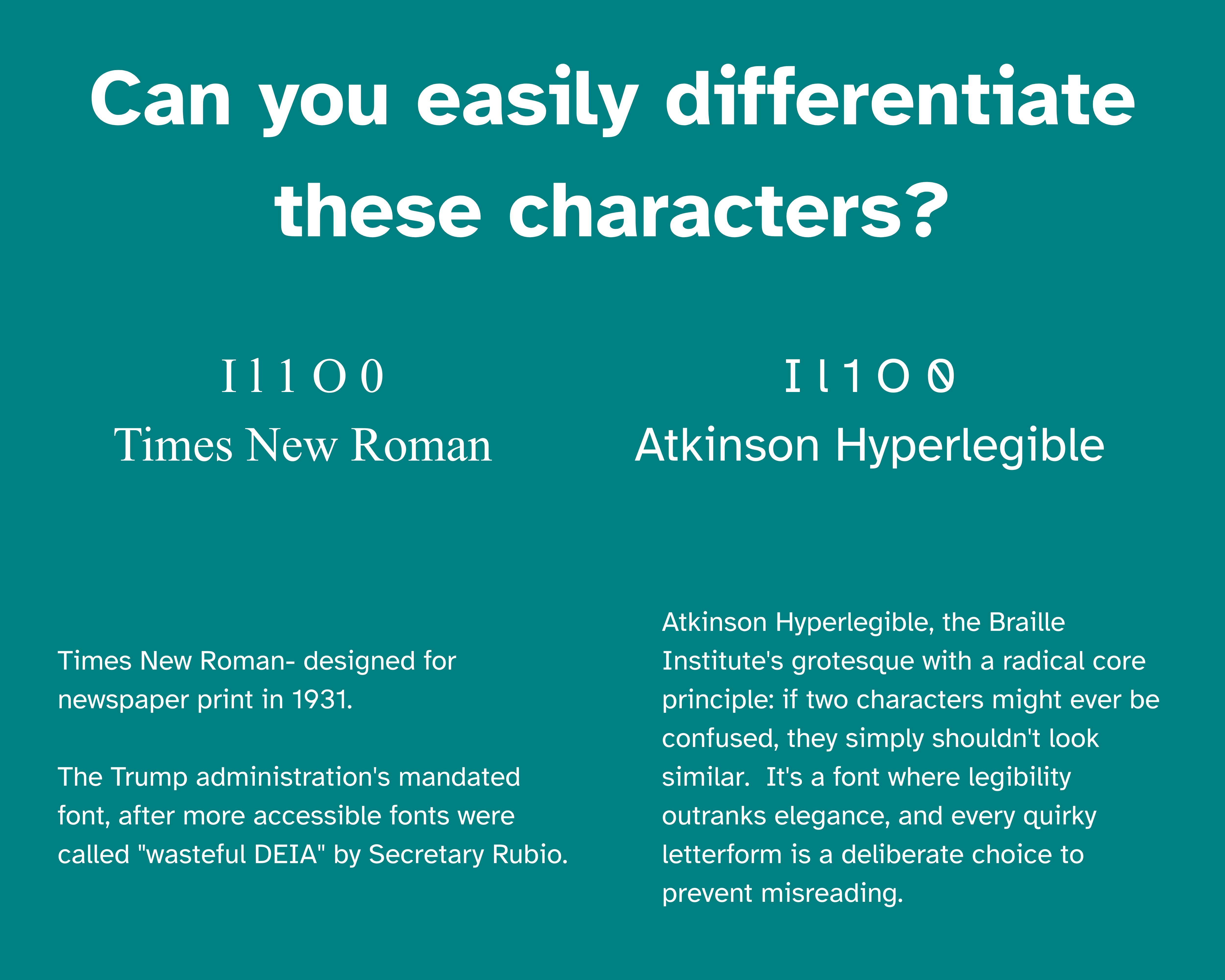
The backslash zero. Most slashed zeros run their diagonal forward, like normal fonts with normal lives. Atkinson runs it backward; a typographic contrarian. The reason: a forward slash visually collides with Nordic characters Ø, ø, Đ, đ, and the null symbol. One glyph, five potential international incidents. The backslash fix is so elegant it's almost annoying.
The tailed "l". Height disappears first. Blur it, zoom it, view it through cataracts or glare; tall things become short things become "wait, what was that?" So the lowercase "l" carries a tail. A tiny, defiant hook that says "I'm not a capital I.
The capital "I" that won't shut up. Proper grotesques keep their capital I thin and composed. Atkinson's I has wide serifs and takes up space like it's paying rent. It violates every elegant proportion rule in the book. It also never gets confused for a 1, l, or |, which is the whole point. Dignity over beauty. Function over form.
Italics without the drama. Atkinson's italics are almost suspiciously upright. No cursive flourishes, no calligraphic ambitions, no "I studied penmanship in Florence" energy. Just a gentle slant that says emphasis without asking low-vision readers to context-switch into a second writing system mid-paragraph.
The stubborn double-storey "a". The accessible font playbook says: simplify. Use the single-storey "a." Atkinson ignores this. The double-storey "a" is more cognitively familiar in body text, and familiar means less work for struggling readers. Sometimes "simple" just means "unfamiliar," which is the opposite of helpful. The "a" stays weird.
The asymmetrical "g". Symmetry is beautiful until your vision degrades, at which point symmetrical things blur into ambiguous blobs. Atkinson's "g" is lopsided on purpose…uneven bowls, exaggerated joints, a refusal to mirror itself. It's not broken, it's strategic. The "g" holds its identity when tidier letterforms have turned to soup.
Terminals that cheat death. Perfect horizontal endings are the first to vanish under blur. Atkinson's stroke terminals are subtly angled, slightly irregular; imperfections that register perceptually when "correct" geometry has already ghosted. The font is literally designed to fail gracefully.
Numerals that lift. The numbers are optically heavier than the letters. Same stroke weight on paper, more visual mass in practice. They sit in tables like they mean it. Financial figures, verification codes, reference numbers; no wobble, no ambiguity, no "was that a 6 or an 8" anxiety spiral.
Spacing that expects the worst. Users will override your line height. They'll crank the letter spacing. They'll do unspeakable things via browser settings. Atkinson assumes all of this and remains legible anyway. Most fonts are designed for ideal conditions. Atkinson is designed for the user’s need not the designers.
Rendering-agnostic chunky bits. Modern fonts often rely on sub-pixel rendering so they dont look terrible. Atkinson doesn't trust your display. The letterforms are robust enough to survive old monitors, bad remoting, cheap hardware, and whatever cursed display pipeline your IT department has sanctioned.
Contrast-agnostic geometry. Most fonts quietly assume high contrast and fall apart without it. Atkinson's internal shapes carry meaning even when contrast ratios are scraping by at WCAG minimum. Inverted colours, low-contrast themes, dark mode nightmares; doesn't matter. The geometry does the work.
Counters that survive being eaten. The open spaces inside letters aren't just big…they're shaped so that partial occlusion (glare, bloom, dead pixels, smudged screens) still leaves enough information to identify the letter. The "e," "a," and "g" can lose chunks of themselves and keep working. Typography as graceful degradation.
Punctuation with a presence. Periods, commas, colons, and decimals are larger than convention allows. Because in URLs, financial data, and dense references, punctuation isn't decorative; it's semantic. Atkinson treats the full stop like it matters, because in some contexts, missing it is a $10,000 mistake.
The font that chose sides. Contemporary type design worships neutrality. The goal is to disappear, to not be noticed, to serve the content invisibly. Atkinson rejects this entirely. It'd rather be useful than elegant. It accepts quirks, breaks uniformity, and sacrifices refinement for clarity. It's not trying to win a type design award. It's trying to stop someone's grandmother from misreading her prescription.
Last Updated on:
December 15, 2025