I’ve used these five fonts on my website and in other projects for the past few years. I chose them after a lot of testing and expect to keep using them for a long time.
Source Serif 4
Source Serif 4 was the main font on my website when I wrote this. I still use it when I want readable, well-balanced serif text. The site’s body text now uses Geist.
JetBrains Mono
I use JetBrains Mono anywhere code appears: terminals, editors, this site’s code blocks, and even the status bar in my NixOS setup.
// JetBrains Mono in action
function greet(name) {
  return `Hello, ${name}!`;
}
console.log(greet('world'));
It also supports ligatures, which I love.
I’ve tried alternatives such as Fira Code and Iosevka, but I still find JetBrains Mono the cleanest and easiest to read.
Bangers
It’s a fun font. I use it sparingly for large, bold titles that need more personality and energy.


It works especially well for thumbnails.
Bricolage Grotesque
Bricolage Grotesque is my main sans serif for interfaces and marketing. It is friendly, slightly unusual, and works well in both.
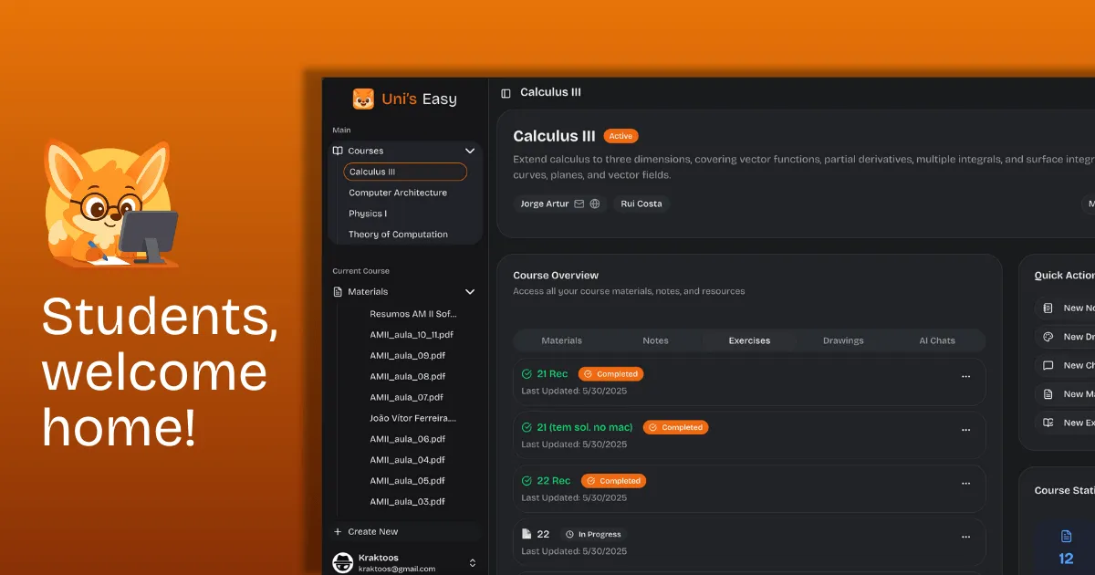
I used it throughout Uni’s Easy.
Inter
Inter is my clean, minimal sans serif. I use it for neutral, modern interfaces that need high readability.
I use it less now because it is common in product design, and I prefer Bricolage Grotesque’s character for most projects.
Links
That’s the list. All five fonts are free on Google Fonts, so you can try any that are new to you.