What finally posting Rails UI to Hacker News taught me

For a long time, I kept putting off posting Rails UI to Hacker News. I checked the thread, stared at the website and product, revised copy, tweaked screenshots, and basically procrastinated until I convinced myself it was “ready enough.”
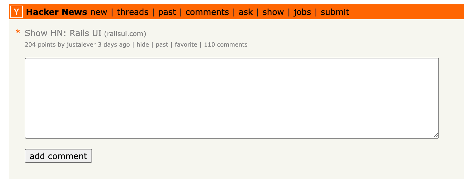
Then one day, I hit submit on SHOW HN. The result was a mix of encouragement, confusion, critique, and real product insight, which is exactly the kind of unfiltered feedback you can’t get anywhere else.
Hacker News, of course, is like tossing a steak into a lion's den. You might get beaten up if you're not careful or ready. It’s not for the faint of heart.
To my surprise, it took off for the day and hovered around the top 10. As I'm writing this, the post has gotten 204 votes with 110 comments. Not bad!
Rails UI isn’t new; I’ve been iterating for a while (since early 2023), with updates, new themes, and constant refinement. But posting it publicly to the biggest programming community on the internet helped surface perspectives I wouldn’t have otherwise heard.
This post is a breakdown of what stood out.
Developers think hard about tradeoffs when it comes to pricing and value
One of the first discussion points in the Hacker News thread was pricing. Specifically around the $299/year Solo tier and the $799/year Team tier. I, of course, knew this would spark some discussion, given that many UI libraries are one-time payments and cheaper on top of that. Rails UI isn’t just a component library, of course. I’ve been trying to find the best way to summarize what it is for a while, and it still doesn't completely register with some folks at first glance. I need to work on this.
A lot of readers compared Rails UI’s pricing to inexpensive design themes they could grab elsewhere for $20–$30 and then modify or convert with tools. A common argument was, “I can buy a theme and get something visually fine for much less.”
This wasn’t hostility so much as a reminder that pricing isn’t just about numbers, it’s about perceived alternative value. A Rails gem that integrates deeply with your stack does have value — but if a theme + conversion tool can get you “good enough” for a fraction of the price, some developers will default to that first. I knew this from the get-go. It's not going to be for every dev, and that makes sense.
🧠 Learning lesson
Be clear about who this is for. Rails UI isn’t a generic theme; it’s a Rails-native UI system that works with Tailwind, Hotwire, and Stimulus. I believe the main value add is time-saving integration with Ruby on Rails, along with prebuilt theme templates you can roll with quickly.
Explicitly communicate the value of integration and time saved relative to alternatives. I recently added comparison pages to the website, and I believe this helps illustrate differences to others in the wild. (Tailwind UI, Bootstrap, Daisy UI, shadcn/ui, Flowbite, custom CSS)
“Isn’t AI doing this now?”
A surprising thread theme was how quickly folks pointed to AI workflows that can generate UI assets and even code with minimal prompting. Some commenters said they could prompt an LLM with a link and get something similar in minutes.
On the flip side, developers said they hate UI generated purely by AI and would rather use something crafted by a human designer because it fits a workflow better or feels more intentional.
This felt like a broader debate: tools vs. craft. Rails UI sits somewhere in that space, and it’s not about replacing AI, but about offering something human-designed and Rails-native that still saves hours of effort. I believe human-driven design and frontends can still serve a purpose long term.
🧠 Learning lesson
There’s a real audience that values designer intent and Rails-oriented UI patterns. The product positioning shouldn’t shy away from acknowledging AI tools, but should clearly state why someone might prefer this approach. Having a hybrid approach seems promising. I kind of believe human-first products might be sought after in a world of AI-slop that’s on the horizon.
Messaging & landing page clarity
Several commenters said they weren’t immediately sure what Rails UI is or who it’s for from the site alone. For example, some thought the login UI on the demo page was actually where they’d “sign in,” or felt the carousel made the site feel cluttered or unintuitive.
Some specific areas cited:
- Pricing not immediately visible.
- Target audience (Rails 7+/Tailwind/Hotwire) is not clear up front.
- Some demo interactions (e.g., rotating carousel) were confusing. (I recently removed this functionality and agree it's much better without)
🧠 Learning lesson
Documentation and site content need to answer:
- “Is this right for my stack?” before anything else.
- Simplify the entry experience. Especially for first-time visitors who might not be familiar with Rails UI.
Compatibility is a big deal
A few seasoned developers chimed in that they:
- Don’t use Tailwind,
- Aren’t using Hotwire,
- Work with older workflows.
Those folks immediately said, “This isn’t for me.” That’s valuable! Rails UI is opinionated (Tailwind + Rails + Stimulus stack), and the more explicit we are about that stack fit, the fewer confused visitors I’ll have.
🧠 Learning lesson
Stack compatibility should be a headline, not fine print. Calling out requirements (Rails version, CSS framework, JS approach) helps focus the audience so those who identify with Rails UI fit right in.
UX & bug feedback is product feedback
Show HN gave us far more than opinions. It delivered actionable product bugs, such as odd behavior in Safari, dropdowns not opening, and rotating UI elements that felt unintuitive. These weren’t rants; they were specific pain points to fix, which are much appreciated.
🧠 Learning lesson
A public demo serves both as marketing and as product validation. Real people with real browsers find real problems you overlook.
There’s real appreciation for Rails-native tools
Amid the critiques, there was a steady stream of developers saying things like “It’s nice to see something Rails-native for UI,” and “As a solo dev who hates front-end styling, this looks useful.”
That was an encouraging signal. Not everyone has a design system or UI background, and they want something that feels like it belongs in the Rails ecosystem rather than a patchwork of Tailwind UI or a React component library. That’s been my main thesis for Rails UI from the start. We Rails devs don’t want to deconstruct React components all day…
Engaging on HN matters
One of the stronger themes in the thread was the value of actual dialogue. Answers that:
- Clarified what Rails UI is vs what it’s not
- Acknowledged feedback on bugs and UX
- Explained architectural decisions
All of these helped shape the discussion in positive ways. This is less a product insight and more a community insight. When you post something like this publicly, expect to engage and hear all the imperfections. The responses shape perception, trust, and ultimately adoption. Being humbled helps you dial things in and zero in on what matters.
Final Thoughts
Having finally posted to Hacker News, I was surprised by how much traction it received. Similar libraries I searched for in this space didn’t get nearly as much attention as those in other niches. It’s neat to know there are people out there willing to help spot bugs, offer suggestions, and chime in on what to focus on and what not to.
Overall, I learned that:
- Pricing and value perception are different things.
- Clear messaging rises above polish.
- Compatibility positioning matters. Going niche-heavy into a space can be a winning strategy if the value is there.
- Actionable bugs surface fast
- A Rails-centric audience does care about craftsmanship.
- Engagement beats one-way announcements. If you decide to post on similar sites, be ready to spend some time commenting with intent.
- Generic-looking themes and components are getting "tired" in the eyes of some devs. More organic UI (human-driven) is being craved.
I’m taking all of this into product and site improvements. Being open to critiques makes the product better. I'm glad I finally put the product out there.
If you’re curious to see what’s next — from docs to demos to design polish — stay tuned on the blog or via the Rails UI newsletter. I have a new theme, Boxer, dropping very soon.