Posterlet - Free AI Poster Maker for Creative Graphics

· Posterlet

1 min read Original article ↗

Generate

Create images with AI

Image will be shown in the public gallery.

Create amazing posters, flyers, thumbnails & social media images

Unlimited free generations Top AI image model
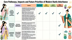
The infographic titled "Core Pathways, Impacts and Future Priorities of Modern Hanfu Inheritance" presents a structured, visually engaging analysis of the contemporary Hanfu revival movement. The layout is organized as a grid with three main horizontal sections, each representing a major theme: "4 Core Pathways of Modern Hanfu Inheritance," "Measurable Social Impacts of the Hanfu Revival," and "Sustainable Inheritance: Future Priorities." These sections are arranged vertically along the left side, with corresponding content distributed across seven columns labeled: Statistics, Quotes, Key Terms, Style Preferences, Layout Preferences, and Other Requirements. The overall design employs a soft pastel color palette with geometric illustrations of stylized figures in vibrant, patterned Hanfu attire. Decorative elements include potted plants, abstract shapes, and small icons, contributing to a modern, accessible aesthetic. The chart type is a tabular matrix where each row corresponds to a thematic section and each column represents a category of information, allowing for comparative analysis. Each cell within the matrix contains either textual content or a checkmark (✓) indicating relevance or applicability. The top row of the table features headers with distinct background colors: Statistics (lavender), Quotes (peach), Key Terms (teal), Style Preferences (yellow), Layout Preferences (light green), and Other Requirements (light coral). **Section 1: 4 Core Pathways of Modern Hanfu Inheritance** - **Statistics**: A checkmark indicates this category is relevant. - **Quotes**: A checkmark indicates relevance. - **Key Terms**: A checkmark indicates relevance. - **Style Preferences**: A checkmark indicates relevance. - **Layout Preferences**: A checkmark indicates relevance. - **Other Requirements**: A checkmark indicates relevance. - **Content under "Quotes" column**: - *Community Events*: "Hanfu festivals, traditional ritual reenactments like coming-of-age ceremonies and Lantern Festival gatherings hosted by local Hanfu associations. Over 4,000 registered Hanfu clubs in mainland China as of 2024." - *Digital Content*: "Short videos, historical style tutorials, and cultural commentary on video platforms. #Hanfu content accumulating over 1.8 trillion views on Douyin alone by 2023." - *Formal Education*: "Optional Hanfu and traditional etiquette courses offered in K-12 schools and university cultural clubs, plus postgraduate research programs focusing on Hanfu textile conservation." - *Commercial Operation*: "Independent Hanfu design brands and experiential stores offering custom tailoring, rental services, and styling workshops for daily wear and special occasions." **Section 2: Measurable Social Impacts of the Hanfu Revival** - **Statistics**: Text reads "Key Social Impacts of the Hanfu Revival". - **Quotes**: - *Cultural Identity*: "78% of Hanfu enthusiasts surveyed in 2023 reported that wearing Hanfu increased their sense of connection to Chinese traditional culture." - *Economic Growth*: "The global Hanfu market exceeded 12.5 billion RMB (approx. 1.7 billion USD) in 2023, supporting over 20,000 small independent designers, textile artisans, and tailors." - *Cross-Cultural Exchange*: "Hanfu is regularly featured in international cultural exchange events, Lunar New Year parades, and global fashion shows. 32% of overseas Hanfu community members identifying as non-Chinese as of 2024." - **Key Terms**, **Style Preferences**, **Layout Preferences**: All empty. - **Other Requirements**: Contains a checkmark. **Section 3: Sustainable Inheritance: Future Priorities** - **Statistics**: Text reads "3 Future Priorities for Sustainable Hanfu Inheritance" followed by "Building an inclusive, historically accurate future for Hanfu culture". - **Quotes**: - *Historical Design Standardization*: "Establishing public open-source databases of Hanfu patterns, cut styles, and textile techniques from different dynasties to reduce inaccurate fast-fashion Hanfu products." - *Inclusive Design Expansion*: "Expanding accessible size ranges, adaptive Hanfu designs for people with disabilities, and gender-neutral styles to make Hanfu welcoming for all demographic groups." - *ICH Artisan Partnerships*: "Collaborating with traditional weavers, embroidery artists, and natural dyeing craftspeople to preserve dying techniques while providing stable income for ICH practitioners." - **Key Terms**, **Style Preferences**, **Layout Preferences**: All empty. - **Other Requirements**: Contains a checkmark. The infographic uses consistent typography, with bold headings and clear, legible body text. Illustrations appear in the margins—on the left side for the first and third sections, and on the right side for the second section—adding visual interest without distracting from the data. The structure enables readers to easily trace the evolution from current pathways to social outcomes and then to strategic future directions for Hanfu heritage preservation.[Format] Landscape 16:9 gig cover, credentials-first composite with a photo cut-out and certification badges. Clean professional finish. No watermark, no personal names.
[Layout] The background splits vertically: a smooth teal-to-green gradient panel occupies the left 55 percent, and a softly blurred garden photograph with purple and blue blooms fills the right 45 percent. A woman stands on the right, waist-up, layered over the garden photo, her body reaching the bottom edge and her head near the top. The left panel carries the entire text stack. A row of three small certification badges sits along the bottom centre-right, straddling the boundary between the gradient panel and the photo and slightly overlapping the woman in front.
[Subject] A woman in her thirties with long dark brown hair over one shoulder, wearing a royal-blue sleeveless top, smiling warmly at the camera with her arms relaxed at her sides. Bright natural light from the front right, matching the garden backdrop.
[Headline] Top-left: Double-certified in medium white sans. Below it, in very large bold white sans across three lines: White House / Former Attorney / & Hiring Manager. Beneath, a short checklist in white sans with thin white check marks: Resume, Cover Letter, LinkedIn Profile.
[Badges] Three badges along the bottom: a navy rounded square with CPRW in white caps; a white rectangular badge with a small blue monogram and the words Professional Association of Resume Writers & Career Coaches; a blue rounded square reading CDCS with CERTIFIED DIGITAL CAREER STRATEGIST beneath it.
[Mood] Assured and premium: teal gradient, white type, royal blue and garden purples. The three-line white credential headline dominates at thumbnail size, with the badge row lending trust along the bottom.[Format]
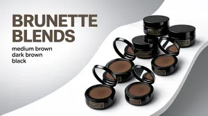
Landscape 16:9 gig cover, premium studio still-life on a seamless grey sweep. High-end retouch with glossy highlights, no watermark, no personal names.

[Layout]
A soft grey-to-white gradient background with a bright white curved pedestal sweeping diagonally from the lower left up toward the upper right, like a rolled sheet of paper. A cascade of black cosmetic tubs travels down that diagonal: some closed with flat lids stacked, others hinged open showing a round mirror in the lid and a dish of brown powder inside. The pile sits centre-right, with the lowest tubs resting on the sweep and casting soft grey contact shadows. The left third of the frame is left as clean empty gradient for the headline block.

[Subject]
A cluster of six or seven round black cosmetic jars, glossy black with dark brown powder, some lid-stacked and some open at an angle, arranged in a loose falling stack on the white curved plinth. Their side walls carry small gold or bronze lettering in a thin serif; describe the label generically as a thin metallic gold text block on black, with no legible words.

[Headline]
Upper-left, on an invisible grid: BRUNETTE on one line and BLENDS on the next, in a very large heavy grotesque sans, all caps, in a desaturated taupe-brown, left-aligned, filling roughly a third of the frame width. Below and indented under the second line, a small list in light lowercase grey sans, one shade per line: medium brown, dark brown, black. No other copy.

[Badges]
None.

[Mood]
Neutral premium palette: charcoal black, warm taupe, white and a soft grey gradient. Calm and high-end, cosmetic-counter feeling; the big taupe headline against the pale sweep reads as a shade-range advertisement even at thumbnail size.[Format]
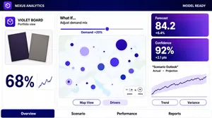
Landscape 16:9 gig cover, flat application-UI screenshot. Corporate software look with an indigo top ribbon and a white canvas. No watermark, no personal names.

[Layout]
Edge-to-edge application window, no device bezel. A deep indigo gradient ribbon runs across the top with a product label at the left, dashed separators, and a status line at the right. Below it the canvas is a three-column mosaic: a narrow left panel holds a product image block above a large percentage figure with a small column sparkline; a wide middle column holds a scenario control row with a slider above a large map panel with size-scaled circles and a small zoom control cluster, plus two pill tabs at the panel's foot; the right column holds two stacked gradient KPI cards at the top and a wide line-chart panel beneath with a shaded uncertainty band and a legend, plus two more pill tabs. A bottom tab strip runs the full width under the three columns.

[Subject]
None — UI only. Photographed product items (two boards) appear inside the left panel as product shots, not people.

[Headline]
The top ribbon carries a short product label at the left and a small status string at the right (render both as neutral placeholder text). The left panel title is a short product-style name with a small subtitle; a large percentage figure sits under the product shots. The middle panel label reads "What If..." in black with a small explanatory caption and a slider tick label. The right-hand KPI cards carry short labels with large indigo figures and small sub-values. A chart title sits in quotes over a two-entry legend. The bottom tabs read as short report names. Keep every string neutral; no real product or brand names.

[Badges]
The left panel's app icon is a small flat rounded-square in solid violet with a white glyph — describe as pure geometry and colour only. Ignore the tiny attribution strip and the map vendor line; do not render them.

[Mood]
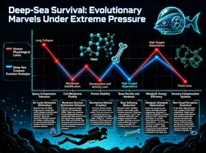
Deep indigo-to-midnight-blue ribbon over a clean white canvas with violet accent cards. Enterprise-analytics polish; the dark ribbon anchors the thumbnail and the KPI cards give it colour.A flat, straight-on YouTube thumbnail. A food vlogger mid-reaction on the left third, delighted and holding chopsticks lifting a glistening piece of salmon nigiri toward her mouth. On the right two-thirds, stacked thumbnail text in chunky bold white letters with a thick dark outline: a large top line "THE BEST BITE" and a smaller sub text line beneath it "IN TOKYO." Clean bright palette — fresh oranges, greens, white and cream with soft natural light. High-contrast food-vlogger thumbnail style, crisp detail, no tilt, no 3D perspective.This infographic is titled "Deep-Sea Survival: Evolutionary Marvels Under Extreme Pressure," presented in a deep-blue palette with a high-tech design. The background simulates a deep-sea environment, with rock silhouettes and a diver outline at the bottom and a fish-like creature wearing an astronaut helmet drawn in the upper right, symbolizing deep-sea exploration and life's adaptation. The overall layout uses a horizontal-axis chart structure, combining line charts, text boxes, icons, and molecular-structure motifs to visually contrast, across six key dimensions, the differences between human physiological limits and deep-sea creatures' evolutionary strategies.

A legend sits on the left side of the chart: the red line represents "Human Physiological Limits" and the blue line represents "Deep-Sea Creature Evolution Strategies." The horizontal axis is labeled left to right with six evaluation dimensions: Space-Compression Tolerance, Cell-Membrane Fluidity, Protein Stability, Bone Density and Hardness, Metabolic Energy Efficiency, and Sensory Compensation Systems. The vertical axis has no explicit numeric scale; instead, the height of each line intuitively indicates the degree of adaptive capability or physiological condition.

Two lines in the chart each connect six data points, and each data point corresponds to a themed module containing a title, an English term in parentheses, detailed explanatory text, and decorative icons. The module contents are as follows:

1. **Space-Compression Tolerance** (first item on the horizontal axis):
   - Humans: the red data point sits high, labeled "Lung Collapse," corresponding to the text box "Air-Cavity Elimination (Elimination)."
     - Text: "Humans have air-filled lungs and ear canals that would collapse instantly under a thousand atmospheres of pressure. Deep-sea creatures eliminate internal air cavities, making body tissues filled with incompressible fluid to achieve internal-external pressure balance."
   - Deep-sea creatures: the blue data point sits low, with a "Membrane Solidification" label but no independent text box; the strategy is detailed in the next module.

2. **Cell-Membrane Fluidity** (second item on the horizontal axis):
   - Humans: the red data point sits low, labeled "Membrane Solidification."
   - Deep-sea creatures: the blue data point sits high, corresponding to the text box "Membrane Structure Optimization (Enhance)."
     - Text: "Extreme pressure makes ordinary cell membranes stiffen. Deep-sea creatures increase the proportion of unsaturated fatty acids in their cell membranes, keeping them fluid and ensuring that material exchange and signal transmission remain smooth even under extreme pressure."

3. **Protein Stability** (third item on the horizontal axis):
   - Humans: the red data point sits low, labeled "Denaturation and Activity Loss."
   - Deep-sea creatures: the blue data point sits at the highest position, corresponding to the text box "Biochemical Defense (Creation)."
     - Text: "Pressure distorts protein shapes and renders them useless. Deep-sea creatures create high concentrations of trimethylamine N-oxide (TMAO) as a 'chemical chaperone,' offsetting pressure's damage to protein folding and sustaining life functions."

4. **Bone Density and Hardness** (fourth item on the horizontal axis):
   - Humans: the red data point sits high, corresponding to the text box "Bone Softening (Reduction)."
     - Text: "Humans' hard, calcified bones crack easily under extreme pressure. Deep-sea creatures reduce skeletal calcification and instead evolved more resilient cartilage or porous structures, using softness to neutralize the crushing force."
   - Deep-sea creatures: the blue data point sits low, labeled "High Oxygen Dependence."

5. **Metabolic Energy Efficiency** (fifth item on the horizontal axis):
   - Humans: the red data point sits high, labeled "High Oxygen Dependence."
   - Deep-sea creatures: the blue data point sits high, corresponding to the text box "Metabolic Slowdown (Optimization)."
     - Text: "Deep-sea resources are scarce and high pressure suppresses enzyme activity. Deep-sea creatures optimize their metabolic pathways to survive on extremely low energy expenditure — as if switching on an 'ultra-long standby mode' — while humans' high-consumption metabolism cannot be sustained in the deep sea."

6. **Sensory Compensation Systems** (sixth item on the horizontal axis):
   - Humans: the red data point sits low, labeled "Vision Loss."
   - Deep-sea creatures: the blue data point sits high, corresponding to the text box "Non-Visual Perception (Evolution)."
     - Text: "In the dark, high-pressure zone, human vision fails completely. Deep-sea creatures evolved extremely sensitive lateral-line systems and bioluminescent luring mechanisms, shifting their perceptual dimensions from light signals to pressure waves and chemical signals."

The chart also intersperses several molecular-structure diagrams (such as the TMAO structure), glowing rings, ECG-style symbols, and other decorative elements that enhance the scientific atmosphere. Through the dynamic contrast between the red and blue lines, the overall design clearly conveys the scientific fact that deep-sea creatures successfully overcome human physiological weaknesses in extreme environments via multiple evolutionary mechanisms, giving it strong science-education value.[Format]
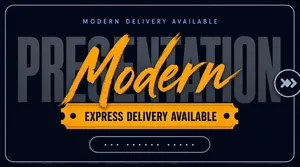
Landscape 16:9 gig cover, minimal dark typographic title card with a thin inset keyline. Completely flat, no photography, no devices, no mockups, no gradients beyond a whisper of vignette. No watermark, no personal names.

[Layout]
A solid dark slate-navy field fills the frame. A thin light-grey rounded-rectangle keyline is inset evenly on all four sides, roughly a few percent in from each edge, framing everything like a bordered card. All content sits in a single centred vertical column: a small letterspaced eyebrow line in the upper quarter, the ghost word across the middle, a horizontal banner immediately below it, and a small outlined pill near the lower quarter. On the right-hand edge, overlapping the keyline by half, a small circular outline holds two small chevron arrows. No imagery, no grid, no panels and no photographic element anywhere in the frame.

[Subject]
None - typographic only. There is no human figure, product, device or mockup in the frame.

[Headline]
Centre of the frame: the word PRESENTATION set extremely large in a heavy condensed grotesque sans, all caps, in a dark grey only one or two shades lighter than the background so it reads as a ghost word spanning most of the frame width. Overlapping that word in the middle, and rising slightly above its cap height, the word Modern is written in a thick warm-amber brush script with a dry, slightly rough edge. Above both, a small letterspaced sans line in muted blue-grey acts as an eyebrow. Below the ghost word, on an amber ticket-shaped banner with notched left and right ends and a single tiny round bullet dot near each notch, an all-caps letterspaced dark-navy line reads EXPRESS DELIVERY AVAILABLE. Near the bottom, a small rounded outline pill in muted grey holds a short lowercase placeholder handle - render it as unreadable placeholder text with no real name.

[Badges]
The only shapes beyond the type are the amber notched ticket banner, the small grey outline pill near the bottom, and the circular outline with two chevron arrows clipped onto the right edge of the keyline.

[Mood]
Charcoal-navy monochrome with a single hot amber accent; restrained, premium, poster-like and quiet. At thumbnail size the amber script word and the amber ticket banner are the only saturated elements, so the eye lands on them immediately and the ghost word stays as texture.[Format]
Landscape 16:9 gig cover, single logo presentation photographed on dark cardstock. Realistic print-on-texture finish, soft top light. No watermark, no personal names.

[Layout]
A near-black textured paper sheet fills most of the frame, tilted in perspective with its top-right corner receding; a grey stone desk surface shows in the upper-left and lower-right corners. The lockup sits centre-left, slightly below the middle: on the left a crimson-red rocket mark whose body doubles as a bold angular letterform with a cut-away fin and three small red speed dashes trailing below; on the right, two stacked word lines — a heavy white sans caps word on top and a wide-spaced light-weight sans caps word beneath it, left-aligned to each other. Generous empty black margins surround the lockup.

[Subject]
None — mark and typography only.

[Headline]
Placeholder wordmark: top line heavy sans caps in white (placeholder copy), bottom line widely letter-spaced light sans caps in pale grey, both left-aligned beside the red rocket mark.

[Badges]
None.

[Mood]
Charcoal black and crimson red with white type; sleek, aerospace-tech energy. One red mark on dark paper keeps the thumbnail punchy and legible.[Format]
Landscape 16:9 gig cover, bold photo composite on a saturated blue field with angular yellow shapes and stacked colour plates. Graphic, editorial, no watermark, no personal names.

[Layout]
The left half is built from three stacked rectangular plates that step across each other: a dark navy plate at the top, an oversized bright yellow plate in the middle protruding furthest right, and a second dark navy plate below, inset back to the left. Under the plate stack sits a two-line supporting sentence at the same left margin, then a thin rule, then a three-column footer strip divided by short vertical rules. The person is a cut-out on the right, cropped by the right and bottom edges from the hip upward, overlapping the yellow plate and rising above the stack. The background is a deep blue gradient with large flat yellow polygons fanning out behind his shoulders and a faint blurred blue silhouette far behind.

[Subject]
A man in his early thirties with short dark styled hair and a clean-shaven olive complexion, wearing a white button-up shirt with the collar open, no jacket. Framed from the hip up, body angled toward the viewer, arms folded across the chest with one index finger lifted, pointing to his left toward the headline. A confident, slightly amused look straight at camera. The cut-out is desaturated and cool-toned, while the white shirt stays the brightest object.

[Headline]
Inside the top navy plate, “ADVANCED” in bold white caps, letterspaced. Inside the big yellow plate, “SEO” in huge ultra-heavy navy caps with a navy circle abutting the O containing a white arrow-like mark — a generic compass or speed glyph. Inside the bottom navy plate, “AUDIT” in heavy white caps. Below, two flush-left lines in heavy white sans: “DISCOVER WHAT IS HOLDING” and “YOU BACK FROM PAGE ONE.”, with “HOLDING” and “YOU BACK” on small bright green highlight blocks. Along the bottom, three flush-left columns of two-line white and yellow caps text separated by thin vertical rules.

[Badges]
No rating seals or platform logos. The only mark-like element is the small navy circle with a white glyph inside the yellow plate, treated as decoration.

[Mood]
Deep blue with two navy plates and one big yellow plate, plus green highlight blocks in the sentence. Bold and consultative; at thumbnail size the yellow SEO plate is the single strongest shape.[Format]
Landscape 16:9 gig cover, split photographic-and-panel composite. Dark, cool, slightly moody finish. No watermark, no personal names.

[Layout]
The frame is split on a steep diagonal. The left ~45% is a close-up photograph of an open Apple MacBook Air shot from above at a strong angle: a silver aluminium keyboard deck with black keycaps in the Apple layout in the lower-left foreground, its "MacBook Air" bezel text visible, and a dark screen lid receding at the top-left, both resting on a warm wooden desk surface, with shallow depth of field. The right ~55% is a near-black translucent panel laid over a blurred, faintly visible repetition of the same keyboard, tilted to follow the diagonal. All the type sits on that dark panel, left-aligned. A small 3x3 grid of white dots sits in the top-right corner, and a few thin white outlined squares and diamonds are scattered near the lower edges of the panel.

[Subject]
None — this is a laptop and keyboard product photograph only, with no people in the frame.

[Headline]
On the dark right panel, left-aligned: "SEO OPTIMIZED" in white uppercase sans-serif, then "BLOG/ARTICLES" directly beneath in the same heavy white uppercase grotesque, the two lines forming the dominant block with each roughly a sixth of frame height. Below them, three short left-aligned lines in a lighter white regular sans-serif with even leading: "Unique content", "Errors free", "Well researched".

[Badges]
A small 3x3 grid of round white dots in the top-right corner, and a few thin white outlined square and diamond shapes scattered near the lower edges of the dark panel; the open laptop is an Apple MacBook Air, photographed deck-on so its lid carries no visible Apple logo.

[Mood]
Cool, technical and understated. Palette: black and dark grey with white type, plus warm wood and silver from the keyboard photograph. At thumbnail size the white two-line headline on the black panel dominates the right side, while the angled keyboard shot gives the cover a real working-desk texture.[Format]
Landscape 16:9 gig cover, slick tech-gradient banner with a photographic cut-out. Glossy, high contrast, subtle circuit linework. No watermark, no personal names.

[Layout]
Vertical split roughly 55/45. The left portion is a dark blue gradient with faint diagonal circuit traces and light streaks. The right portion is anchored by a tall bright cyan rectangle running from the top to the bottom edge, sitting behind the person like a colour panel; the person's cut-out overlaps its left edge. On the left the content stacks downward: headline, an outlined pill row, three green-check bullet lines, a row of four small white rounded tiles with captions, a two-part strapline with thin flanking rules, and a yellow call-to-action button with an arrow glyph at the bottom.

[Subject]
A man in his early thirties, dark hair and short beard, navy blue suit with a light blue patterned tie and white shirt, chest-up, looking directly at camera with a neutral confident expression; occupies the right side, cleanly cut out and layered over the bright cyan panel.

[Headline]
Large heavy uppercase in a bright cyan-to-white gradient: "DATA SCIENCE" over "& ANALYSIS". Below, a white-outlined pill with cyan uppercase text reading "POWER BI • TABLEAU • EXCEL", three tool names separated by bullet dots. Then three small green circular check icons each beside a white bold line of feature copy. Bottom-left a two-part strapline: white uppercase text, then a cyan highlight phrase, with thin horizontal rules on both sides. Finally a yellow rounded-pill button with dark bold uppercase call-to-action copy and a small arrow.

[Badges]
The four small white rounded tiles each carry a flat brand mark: the Power BI logo (a yellow rounded-square with a white stacked-bar glyph), the Tableau mark (a pale multicolour dot-cluster), the Microsoft Excel icon (a green rounded-square with a white cross glyph), and the Python mark (a blue-and-yellow two-tone interlocking-snake glyph). Small grey caption labels under each read "Power BI", "Tableau", "Excel" and "Python".

[Mood]
Deep navy with electric cyan and a single yellow accent, plus green check ticks. Sharp, tech-forward, sales-page energy; the cyan panel and the gradient headline dominate the thumbnail.[Format]
Landscape 16:9 gig cover, a three-column photo triptych with a spanning overlay title. Soft pastel studio still-life, no watermark, no personal names.

[Layout]
The frame divides into three equal vertical panels split by thin white seams, left, centre and right, each a separate styled shot of the same skincare range on a speckled pale terrazzo disc against a light-blue tiled backdrop. The left panel is a mid-shot with a dropper bottle and a tube lying at an angle, the pipette resting in the foreground. The centre panel is split again horizontally into two stacked frames: above, a top-down arrangement of sachet cards with copy, a small dropper bottle and a tube on a grey stone slab; below, a closer top-down of the open dropper bottle with its pipette lying beside it. The right panel is a vertical shot of a single upright tube standing on the terrazzo disc. A large title is centred across the whole cover at mid-height, overlapping the seams of all three panels.

[Subject]
No human subject, objects only: a peach-coral skincare set with a tall squeeze tube, an amber pipette dropper bottle, printed sachet cards and a white pump bottle, all in consistent matte peach dressing. Describe any printed label as a generic light-peach block with small white sans text and a thin rule, no brand words.

[Headline]
Centred overlay at mid-height, spanning all panels: studio in a large white flowing brush-script, immediately followed by PRODUCT PHOTOS in a tall condensed white sans, all caps, slightly wider tracking; the phrase shares one baseline and carries a soft shadow so it stays legible over both the pale and the peach areas.

[Badges]
Small in-image marks only: tiny circular stamps and a small product-sheet icon printed on the sachet cards; treat them as generic fine-line icons.

[Mood]
Soft pastel palette: light sky blue, off-white terrazzo grey, peach-coral and a hint of pale mint. Gentle, feminine and airy; the white script-over-condensed title floats above the pastel triptych and stays readable at thumbnail size.[Format]
Landscape 16:9 gig cover, playful flat vector illustration on saturated flat yellow. Chunky organic blobs with thick white outlines, high-contrast serif display type. Bright, poster-flat, no gradients and no photo. No watermark, no personal names.

[Layout]
The whole field is a strong flat yellow, edge to edge. Left column, upper two-thirds: a stack of six colour-coded uppercase subject words, left-aligned, with a thin black hand-drawn underline swash above the first word and a second swash below the last. Above that stack sits a neat four-by-four grid of small solid black dots; the identical dot grid repeats at the bottom-right. Centre-right: the main title sits inside a large teal-green rounded organic blob that is deliberately irregular — squared off on its left flank and stepped or notched on the right — with the title set as four stacked lines inside it. A second, flatter green blob with a white outline floats at top-centre and is partially overlapped by the title blob. A magenta-pink blob with a thick white outline bleeds off the bottom-left corner. Two small black open rings sit one at mid-left under the word stack and one at bottom-centre. Top-right: a small tight cluster of four overlapping rounded-square tiles.

[Subject]
None — no human figure and no product shot. Typography and flat organic shapes only.

[Headline]
Six subject words in bold condensed uppercase sans, each a different accent colour: 'ADDITION' in magenta, 'SUBTRACTION' in orange, 'MULTIPLICATION' in teal-green, 'DIVISION' in magenta, 'GEOMETRY' in orange, 'FRACTIONS' in teal-green. The title inside the teal blob is a heavy dark navy serif, title case, four lines: 'Book', 'Elementary', 'Mathematics', 'Sessions', with 'Mathematics' the widest line and slightly overhanging the blob edge.

[Badges]
Top-right, a cluster of four small flat rounded-square tiles, each carrying a single thin white arithmetic glyph (plus, minus, multiply, divide) on a lilac, green, blue and pink tile. Also the two thin black ring circles and the two four-by-four dot-grid textures described above.

[Mood]
High-sugar primary palette: yellow, magenta, orange, teal-green. Friendly and child-facing. The dark navy serif block on the teal blob gives the cover one solid, instantly readable mass at thumbnail size.[Format]
Landscape 16:9 gig cover, one hero photographic band over two flat variant tiles. Elegant beauty-brand presentation, soft matte finish. No watermark, no personal names.

[Layout]
Horizontal split: the top two-thirds is a moody photographic band of dark jungle leaves with the white primary lockup centred slightly left of middle, tagline directly beneath it. The bottom third splits into two equal flat tiles: the left tile pale sage-grey with the same lockup in deep green; the right tile deep forest green with the lockup in off-white. A faint oversized ghost copy of the bird mark in near-white opacity spans the seam between the two bottom tiles, tying them together.

[Subject]
None — foliage and typography only.

[Headline]
Placeholder wordmark: a high-contrast fashion-serif word of six letters whose capital letter merges into a line-art bird with a swept wing; below it, a letter-spaced sans caps tagline of three generic words (placeholder copy).

[Badges]
None.

[Mood]
Deep forest green, black-leaf shadow and bone white; botanical, serene, premium-skincare energy. The white-on-dark hero band carries the thumbnail while the two variant tiles demonstrate colour flexibility.[Format]
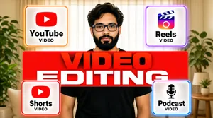
Landscape 16:9 gig cover, a man centered among four frosted-glass format cards, with a bold red-to-white headline across his chest. Soft modern UI-photo hybrid finish. No watermark, no personal names.

[Layout]
The background is a bright softly blurred living-room set — sheer curtains, plants, a side table — in warm neutral tones. A man stands dead center from the waist up. Four frosted-glass rounded-rectangle cards float around him in a 2x2 arrangement, two upper-left and upper-right, two lower-left and lower-right, each card glowing with a faint neon edge tint (orange, purple, red, blue) and carrying one centred icon above one bold label word and a small sub-label. Across the man's chest, overlapping his black t-shirt, runs the two-line headline: giant caps with a red-to-white vertical gradient fill on red plates, the second line wider than the first and cropped near the frame edges.

[Subject]
A young man in his late twenties, thick wavy dark hair, full black beard, rectangular navy glasses, wearing a plain black crew-neck t-shirt, calm neutral expression looking straight at the camera, soft even lighting.

[Headline]
(1) On the cards, each an icon over a bold dark label with a tiny caps sub-label "VIDEO": top-left the red rounded YouTube play-button mark labelled "YouTube"; top-right the Instagram Reels gradient clapperboard icon labelled "Reels"; bottom-left the red YouTube Shorts mark labelled "Shorts"; bottom-right a retro microphone icon labelled "Podcast". (2) Across the chest: "VIDEO" then "EDITING" in enormous extra-bold caps with a red-to-white gradient on red plate backgrounds.

[Badges]
The four frosted cards with neon edge glows hold the YouTube, Instagram Reels, YouTube Shorts and Podcast marks, and are the only brand marks on the cover.

[Mood]
Warm airy room with glassy pastel cards and a hot red gradient headline — friendly, product-like clarity. At thumbnail size the four floating cards and the red headline block read first.[Format]
Professional Fiverr gig cover, landscape 16:9 banner. Dark premium e-commerce advertising style with glowing green accents. Sleek, modern and conversion-focused. No watermark, no personal names.

[Layout]
A near-black background with a soft green radial glow blooming behind the right-hand mockups and a faint green dotted-grid texture across the upper left. The left column is a typography and feature stack; the right side is dominated by a large desktop monitor with a phone overlapping its lower right. A round speedometer badge floats at the top right and a large app glyph at the bottom centre.

[Subject]
No people. A pure product and interface composition.

[Headline]
Stacked on the left: the "shopify" lockup at the top - the green shopping-bag glyph beside the white wordmark; then "PROFESSIONAL" in heavy white caps; "SHOPIFY" in very heavy bright-green caps; "STORE DESIGN" in very heavy white caps; and beneath, a green slab containing "DESIGN • DEVELOP • OPTIMIZE" in bold black caps. At the very bottom left, a rounded dark panel with a gold trophy icon beside "PROFESSIONAL DESIGN" over "STRATEGIC RESULTS" in white, then a line reading "LET'S BUILD A STORE THAT ATTRACTS, CONVERTS & GROWS" with the closing words picked out in green.

[Badges]
Under the headline slab, three left-aligned rows each led by a green-outlined circular icon with white caps text: a shopping-cart icon for "HIGH-CONVERTING STORE DESIGN", a rising bar-chart icon for "SHOPIFY SEO OPTIMIZED" and a phone icon for "RESPONSIVE & MOBILE-FIRST". At the top right, a round green speedometer badge reading "BUILT TO CONVERT".

[Devices]
Centre-right: a large silver-framed desktop monitor and, overlapping its lower right, a standing smartphone, both running the same light e-commerce store branded "LUXORA". The monitor shows a "NEW COLLECTION" hero reading "Elevate Your Everyday" with a "SHOP NOW" button over a photograph of a woman in a cream trench coat carrying a black handbag, a trust strip for "Free Shipping", "Secure Payment" and "Premium Quality", and a "SHOP BY COLLECTION" grid of four product tiles labelled "Bags", "Shoes", "Accessories" and "Watches". The phone repeats the store on a mobile layout with a "PREMIUM HANDBAG $89.00" product card, a colour swatch row and blue "ADD TO CART" and "BUY IT NOW" buttons.

[Mood]
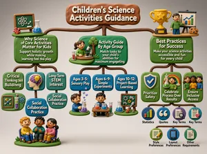
Premium, sales-focused and technical; near-black with a green glow, a bright platform lockup and a polished store mockup that signals conversion.竖版3D立体电商海报,C4D渲染风格,清新明亮粉紫渐变主调;浅白网格背景叠加柔光晕染,顶部“618狂欢购物节·来啦!”置于圆角粉紫渐变矩形底上,配白色圆体字;中央蓝粉渐变金属质感Q版购物车载着零食、礼盒、美妆等卡通商品,周围点缀黄色星星、红色红包、白色星光粒子;标题“618福利购”,“618”为粉色,“福利购”为黑色,整体白色描边粗无衬线体;下方白色圆角卡片区含红色加粗标题“618大额优惠券免费领”,辅以小字说明及三枚¥10/¥20/¥30渐变按钮,底部黑字“活动期间进店消费【享八折优惠】”,“享八折优惠”粉色加粗,末尾小字“福利名额有限 先到先得”;整体排版层次分明,信息清晰,活泼可爱,电商促销风,细节丰富,光影柔和,高分辨率The infographic, titled **"Children's Science Activities Guidance"**, is designed in a playful, three-dimensional clay or modeling dough aesthetic, with rounded brown branches connecting various sections against a light gray background. The overall layout is hierarchical and tree-like, branching out from the main title into three primary categories: **Core Benefits of Children's Science Activities**, **Age-Appropriate Science Activity Types**, and **Best Practices for Implementing Science Activities**. Each section features colorful, textured green and blue rectangular nodes with white text, accompanied by small 3D figurines and icons that visually represent the content.

---

### **Main Title:**
- **Children's Science Activities Guidance** — displayed in raised white letters on a large, irregularly shaped brown clay plaque at the top center.

---

### **Section 1: Core Benefits of Children's Science Activities**
This branch extends to the left and includes four sub-nodes:

1. **Why Science Activities Matter for Kids**
- Text: *Support holistic growth while making learning feel like play*
- Visuals: A chalkboard with an atom symbol, a beaker with blue liquid, and small red coral-like shapes on a green base.

2. **Critical Thinking Skill Building**
- Visuals: A side-profile human head with a purple brain containing a yellow lightbulb.

3. **Long-Term STEM Interest**
- Visuals: A framed molecular structure, test tubes with colored liquids, and a blue atom icon.

4. **Social Collaboration Practice**
- Visuals: Three children sitting together on chairs, smiling and interacting.

---

### **Section 2: Age-Appropriate Science Activity Types**
This central branch contains an overarching node and three age-specific sub-nodes:

- **Activity Guide By Age Group**
- Text: *Match tasks to your child's abilities for maximum engagement*
- Visuals: A girl at a table with a microscope and beakers, a tree, and grass.

- **Ages 3–5: Sensory Play**
- Visuals: A boy holding a beaker with purple liquid; bubbles float above him.

- **Ages 6–9: Simple Experiments**
- Visuals: A boy sitting at a table with two beakers (one red, one blue) and a test tube.

- **Ages 10–12: Project-Based Learning**
- Visuals: A board with gears and a wrench, a beaker, and tools like a hammer and screwdriver.

---

### **Section 3: Best Practices for Implementing Science Activities**
This right-hand branch begins with a main node:

- **Best Practices for Success**
- Text: *Make your science activities accessible and fun for every child*
- Visuals: A golden trophy with a star, a person presenting a graph on a whiteboard, and a cookie.

Below this are three key principles:

1. **Prioritize Safety**
- Visual: A shield with a checkmark.

2. **Celebrate Process Over Results**
- Visual: A child holding a beaker with green liquid, standing in front of a rainbow.

3. **Ensure Inclusive Access**
- Visual: Three children of diverse appearances standing together.

Beneath these principles, six smaller circular icons represent additional content categories or requirements:

- **Statistics** — Bar chart icon.
- **Quotes** — Quotation marks icon.
- **Key Terms** — Document with magnifying glass icon.
- **Style Preferences** — Notepad with pencil and heart icon.
- **Layout Preferences** — Smartphone/tablet screen icon.
- **Other Requirements** — Plain document icon.

---

### **Overall Style and Design Elements:**
- The entire infographic uses a tactile, handcrafted clay aesthetic with soft shadows and rounded edges.
- All text is rendered in a clean, sans-serif font, embossed in white for contrast against the brown, green, and blue backgrounds.
- Color palette includes earthy browns, vibrant greens, blues, and pops of color (red, yellow, purple) in icons and figures.
- The connections between nodes are thick, brown, branch-like lines that mimic organic growth, reinforcing the “tree” metaphor.

This infographic serves as a comprehensive, visually engaging guide for educators and parents, emphasizing the importance of science education for children through developmentally appropriate, safe, and inclusive practices.[Format]
Landscape 16:9 gig cover, flat vector illustration of oversized letters filled with a collage of small objects, on a graded blue field. Playful and clean, no photographic elements, no watermark, no personal names.

[Layout]
The frame is dominated by three enormous letterforms — an S, an E and an O — sitting side by side across the middle of the frame, together spanning about 85% of the width and standing roughly half the frame height. The letters are solid shapes whose surfaces are entirely filled with a dense, evenly distributed mosaic of small flat-illustration objects, so the letterforms read as textured silhouettes rather than plain type. Behind them the background is a smooth blue gradient, darker at the edges, overlaid with a few wide diagonal stripes in pink, green and yellow that pass behind the letters at a shallow angle and act as a colour wash. A thin white rule and a solid black bar run across the bottom quarter, and the top-right corner carries a small logo lockup with a tiny abstract mark.

[Subject]
None — no people. Instead the letterform interiors contain a flat-illustration collage: in the S, gears, clouds, a magnifier, a folder of charts, a laptop, a clipboard, a speech bubble and a stack of coins; in the E, a dartboard with an arrow, a folder, an envelope, a rocket, a laptop and small cards; in the O, a magnifier, a laptop, a shopping basket, a coffee cup, a calendar, a pencil, a map and an anchor. All drawn in the same flat style with a single consistent light direction.

[Headline]
Along the bottom, inside a solid black bar that spans most of the width, “ON SITE SEO AUDIT” is set in a light geometric sans, all caps, widely letterspaced, in white — the only plain type on the cover. A very small wordmark and mark sit in the top-right corner; render as a neutral placeholder lockup.

[Badges]
No rating seals. The top-right placeholder lockup is the only brand-like element; the rest of the iconography lives inside the letterforms as illustration.

[Mood]
Deep blue ground with pastel diagonal stripes peeking through, and a rainbow of small flat objects packed inside three giant letters. Friendly and energetic; the three chunky letter shapes are instantly legible at thumbnail size even though the interior detail disappears.[Format]
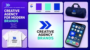
Landscape 16:9 gig cover, staggered tile wall of brand mockups on a violet gradient page. Flat vector marks beside soft studio photographs. No watermark, no personal names.

[Layout]
A rounded-tile mosaic filling the frame on a violet-to-indigo gradient, with an even gutter throughout. A tall narrow tile runs down the left edge and another tall narrow tile runs down the right edge; between them the centre splits into a top strip of three small tiles and one large tile beneath. Reading order: the top-left tile is flat violet, carrying a small mark and one-line wordmark at the top, a four-line headline in the middle with the last word in mint, and a faint outlined geometric mark in the lower left. The top-centre tile is pale lavender with a white rounded-square app tile inset, holding the blue arrow-like mark. The next tile to the right holds three vertical colour swatches — purple, mint and royal blue — with tiny hex labels. The far-right top tile is a photograph of a navy duffel bag printed with the lockup. Beneath the left tile sits a photograph of a white T-shirt printed with the mark and a two-line wordmark. The large centre tile holds a soft mint-to-lavender radial gradient with the mark and a two-line black wordmark centred. The bottom-right tile is a tilted phone showing an Apple iOS home screen.

[Subject]
None — no people. The duffel and the T-shirt are flat-lay garment mockups on lavender grounds.

[Headline]
The top-left tile carries a small one-line wordmark, then a four-line headline in bold white caps reading CREATIVE AGENCY FOR MODERN BRANDS with the final word in mint. The centre tile sets a two-line black wordmark beside the blue mark. The colour tile carries tiny hex labels reading #7B4DFF, #55F0E6 and #0554ED. The phone shows Apple iOS icons including the brand's own blue app tile, Calendar marked MON 6, and Mail.

[Badges]
An Apple iOS home screen in the bottom-right tile, showing the brand's app icon among Apple system icons. No ratings or trust seals.

[Mood]
Electric violet and royal blue with mint highlights on a soft lilac ground; youthful, digital, energetic. At thumbnail size the big gradient centre tile with its black wordmark and the violet margin give an easy brand-sheet read.