For those on my email list: this might be too long to read in full in email format. If so, you are able to read the full article on the Substack app/desktop.
Is it just me, or is the world getting…grayer?
Even though I deleted TikTok over a year ago, I’ll still watch the occasional YouTube short. I can’t help it; I see a short little video about something I might find interesting and I click. This one really caught my attention:
I recommend you watch this before continuing reading, but the gist is that there are photos comparing what places and things used to look like versus now. In each example, the past was more colorful while the present is gray, dark, and muted in neutrals. Comments on the video state things like “the world is so gray and depressing now” and “I hope we can make the world colorful again.”
I’m not gonna lie: this got me. I admit it! I fell for the nostalgia trap! I saw this video and thought, “They’re right: the world is grayer now.” Was it simply this video feeding into my nostalgia for the past that made me think this way? Was this something purely in my imagination, or was the world actually different visually?
So, as I drove to work the next day, I paid special attention at the cars that surrounded me on the road. I was affirmed: the cars passing by were primarily gray, black, and white. It suddenly struck me that I also drive a black car. I literally had never noticed before that I was in a sea of colorless automobiles. Seeing a maroon car was, like, the highlight of my drive that day.
That got me thinking: has the world truly started to lose color? If so, how can we get color back?
In a study done in 2020 by the Science Museum Group Collection, they took over 7,000 pictures of archived items from a number of museums in the UK. The study states, “These categories range from photographic technology to time measurement, lighting to printing and writing, and domestic appliances to navigation.”1 Among all the objects, the most common color was charcoal gray. This is a graphic made for the study compositing the photos and displaying change in color over time:
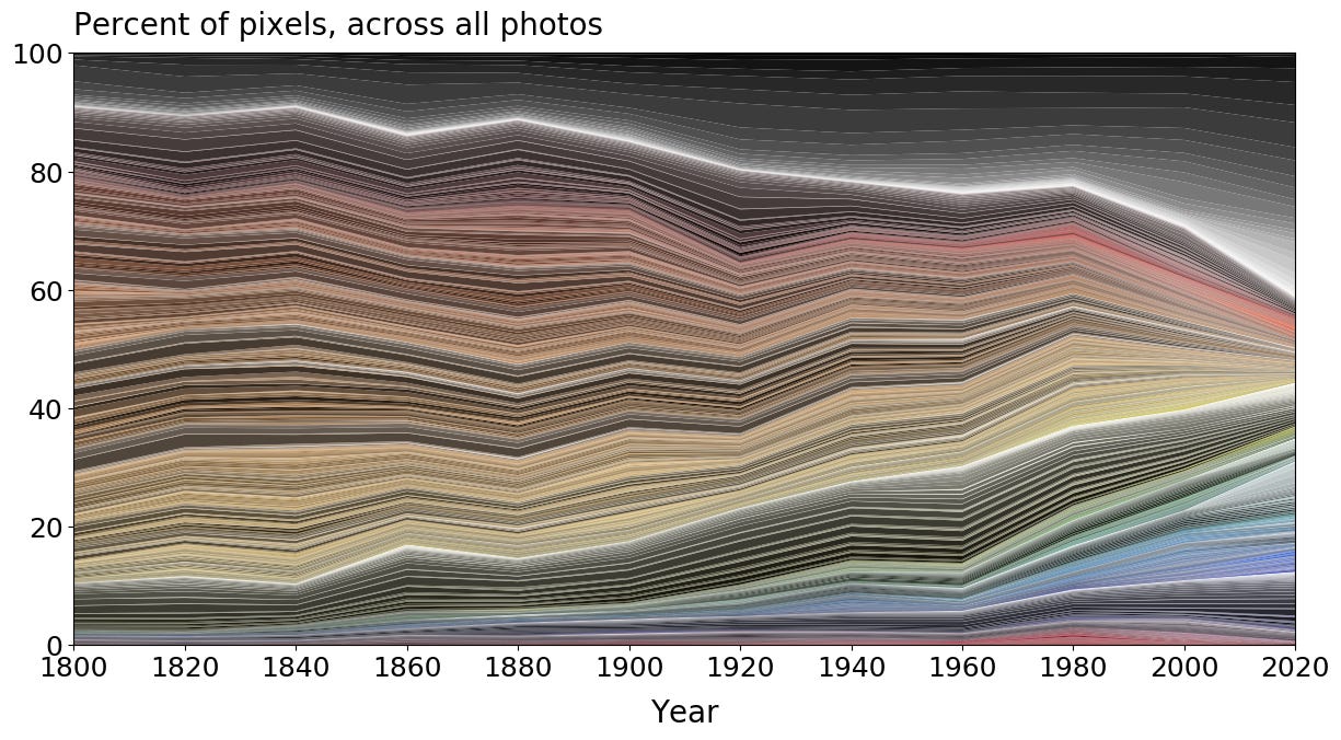
There is a clear bottleneck forming in the image as we speed into the 21st century. Color is gradually declining. I will say, I love how you can see pink cropping up in the 20th century and staying relevant into the 2000s; that tracks. Plus, the study points out how certain decades like the 1960s were wilder and bolder in color choices (unsurprising), which is why the shape on the graph doesn’t narrow in straight lines. But still: color is starting to appear less and less as we enter the 2020s.
There are certain things that can attribute to this, including the lack of using natural materials and the introduction of plastic and steel. For example, these graphics of a telegraph from 1844 and a phone from 2008 clearly illustrate this idea.
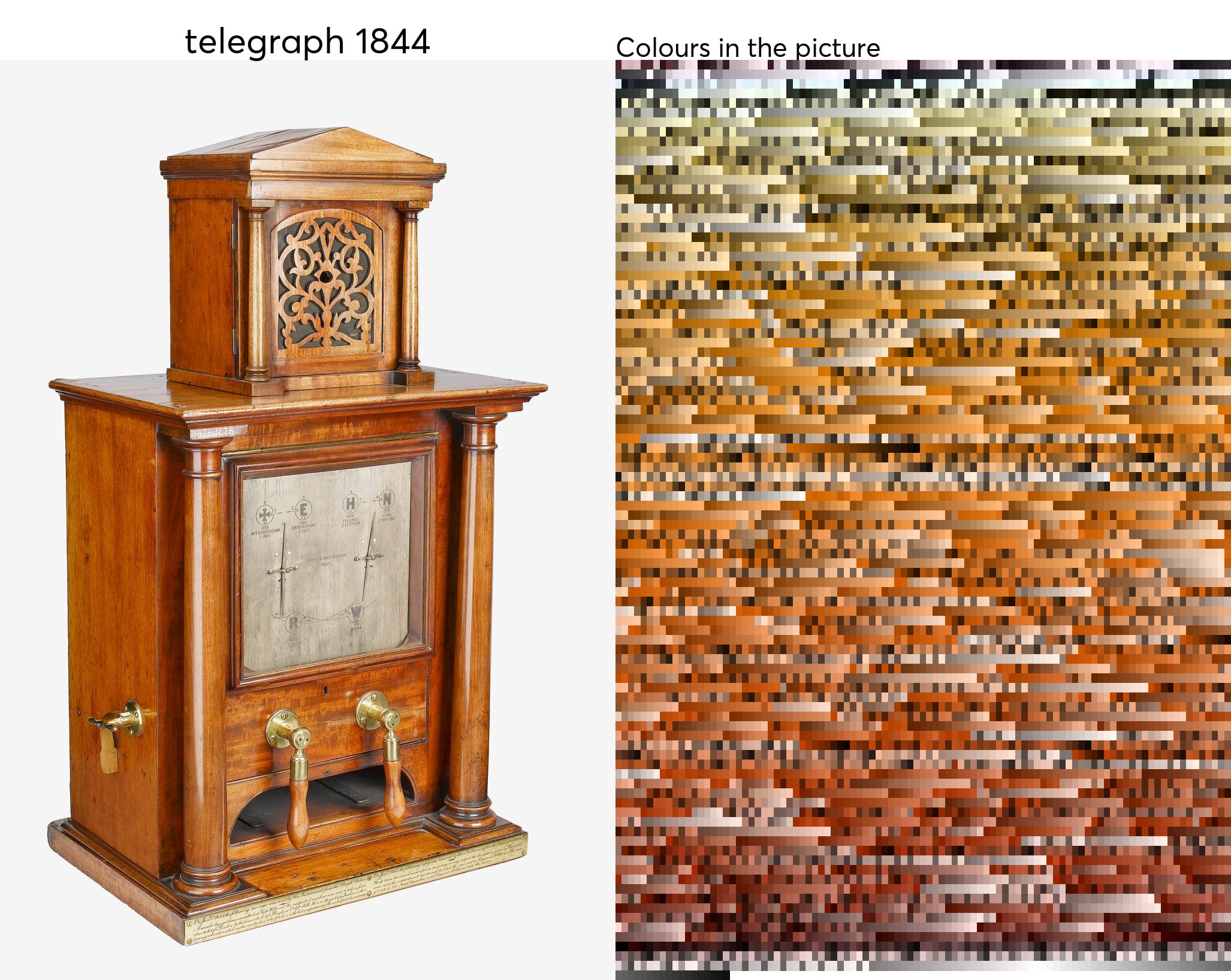
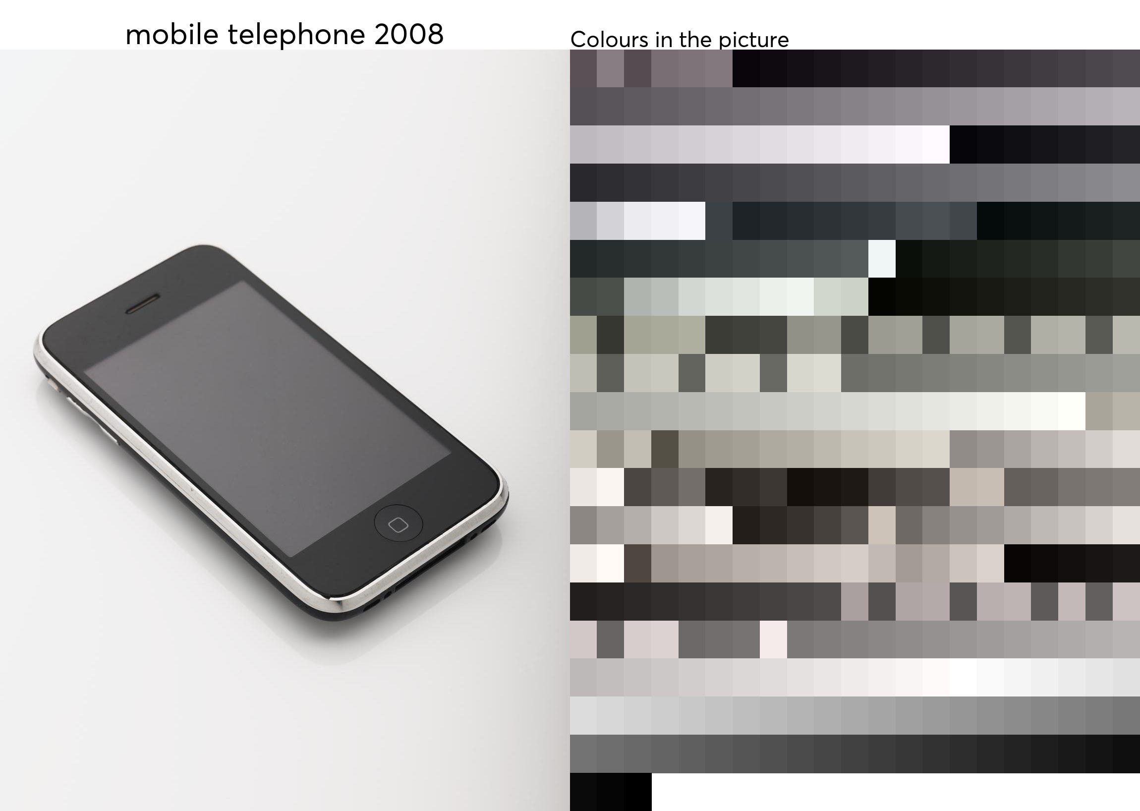
One is clearly streamlined for the modern day. The other is far from the term “streamlined.”
There’s also been a massive boost in minimalist culture the past decade. The rise of the “sad beige moms” on TikTok forcing their kids to play with toys that fit the color scheme of their living room is a definite tell.
Still, minimalist design aesthetics and a lack of using materials like wood don’t directly contribute to the fact that “70% of cars are now gray, black, or white, compared with under 40% just 25 years ago.”2 There is a shift happening where neutrals are taking over, and we’re slowly adapting without realizing. And it’s not just about the lack of color. It’s a lack of design, intricacy, beauty, art for art’s sake. We deemed something like minimalism “efficient” and “less time consuming,” but in the process, we lost craftsmanship.
Something we didn’t lose? Nature. If we go to a national park, or see a beautiful skyscape, or even just go to our local green space, we can find color in abundance. The rich greens of a field, bright turquoise of a pond, or striking lilacs and tangerines of sunrises and sunsets affect our brain in incredible ways. Colors, or the lack thereof, are so important, as they stimulate us and even affect our overall mood. In “How Colors Affect Brain Function,” Dr. Barbara Koltuska-Haskin writes:
“Warm colors, such as yellow, orange, pink, and red can motivate and energize us. However, if they’re too intense, they can also be irritating. Cool colors, such as green, blue, and violet can have a calming effect on us. Gray, which is commonly used in professional settings or formal events, can be more depressing than black.”
(Read that last sentence again.)
She describes further how gray can be especially depressing during the winter months when the sun isn’t out, and defines color as our “emotional vitamins”3 that get us through the day. This (among other things like fresh air and Vitamin C) is often why we feel so rejuvenated going outside. Nature, without having to try too hard, is feeding us our emotional vitamins by being incredibly colorful. It also explains why we often feel depressed in our workspaces (which often uses gray and brown), our schools (which often paint walls white), or on technology.
Which, sure, I often have a bone to pick with technology. Being annoyed with technology is not a new phenomenon on this Substack! But seriously: have you started to notice how later editions of iPhone camera qualities have gotten kind of…worse? I’m speaking from experience as a person who has an iPhone 14 while my dad, who has a Google Pixel, is sending me incredibly sharp, vibrant photos he’s taken on his phone. Meanwhile, a picture I recently took of decorations for my Valentine’s get-together looked like this:
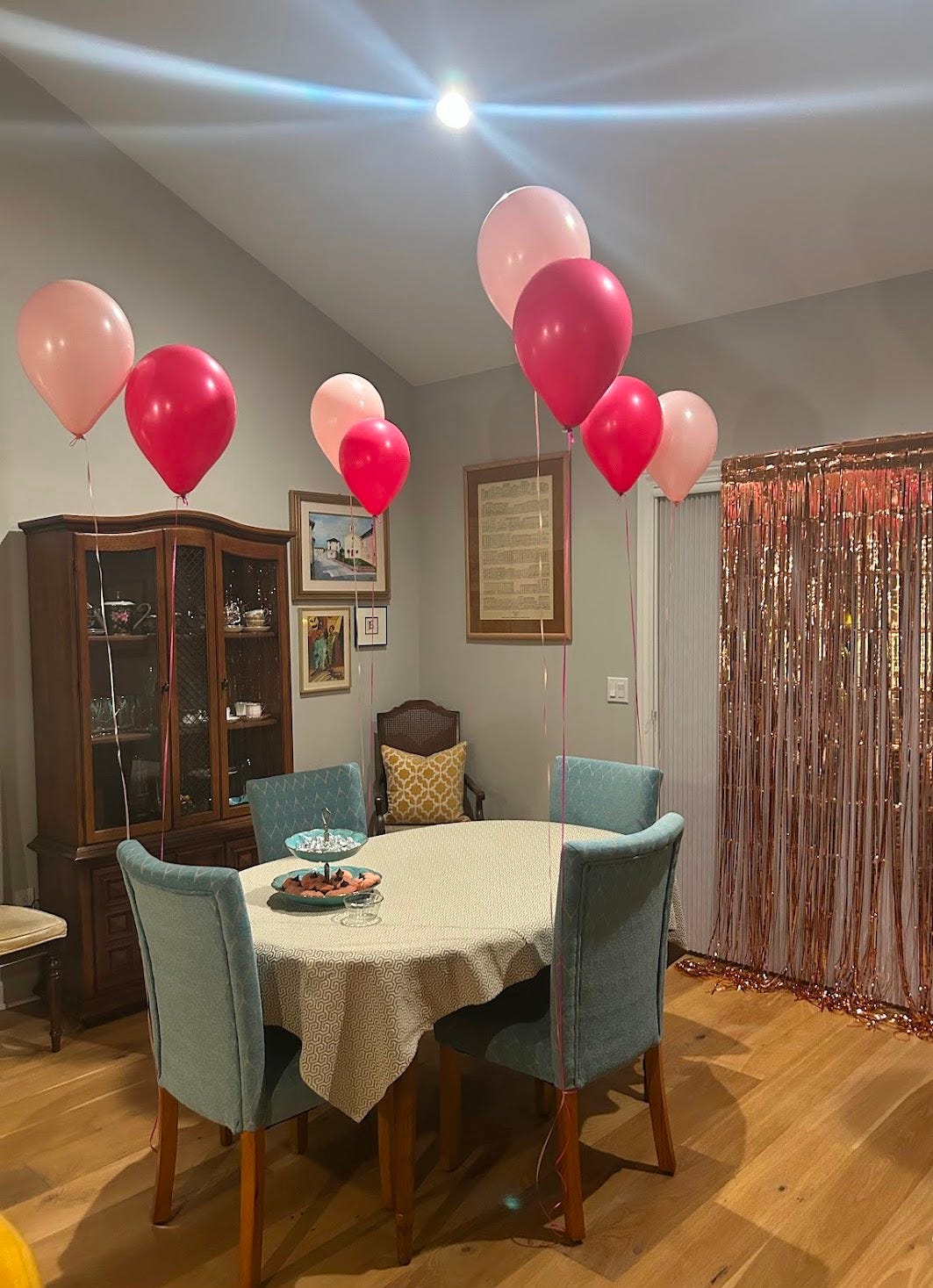
Sure, there’s nothing inherently wrong with this photo, but I can guarantee that if my dad’s phone took this same picture, it would be brighter, the pinks of the balloons and streamers would be popping, and overall the picture wouldn’t look so *blah.* Online, people’s guesses as to why the camera quality has gone down is due to intense photo processing called Smart HDR. This technology aims to balance highlights and shadows, but it often results in flatter, washed-out photos with less contrast. I’ve gotten used to not taking pictures with my phone anymore and relying on my film and digital camera, because even my phone wants to process the world in a shade of gray! Without fail, the pictures taken on my cameras have better color, lighting, and texture.
What’s most ironic to me now is that the new solution for getting everyone off their phone and reducing screen time is by putting your phone in grayscale.
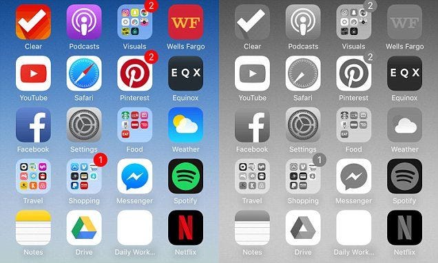
Clearly one of these images is more visually stimulating than the other. Studies in the past couple of years have shown that putting your phone on a grayscale setting reduces screen anxiety and results in better mental heath.4 Here’s me playing devil’s advocate: where else does this extend? Sure, this might be a simple fix for your phone, but what about your laptop? Your television? Should you only watch films in black and white?
I don’t want to diminish the fact that grayscale works for people, but I know it wouldn’t work for me, because I’m always able to pivot. When I got rid of Instagram, I just looked at TikTok. When I got rid of TikTok, I watched more YouTube. In a similar vein, if I put my phone on grayscale, I’d turn to my laptop. If I then set my laptop on grayscale, I’d just watch more TV. It’s a vicious cycle of our brains needing stimulation (and, in turn, color). And if I could put my tin hat on for just two seconds *puts it on my head,* isn’t it interesting that we are losing color everywhere else except the graphics on our phones? No wonder we always turn to our screens for dopamine hits if our world is slowly turning gray. *takes hat off*
Once you start noticing it, it truly is everywhere. The neutral gray-white wash is taking over our kitchens, schools, workplaces, cars, and building exteriors. Movies and television shows can’t escape the bright lighting and ultra-focused cameras. (We all remember how weird the color grading was on the Wicked movies, right?) Everything is a little too smooth and clean.
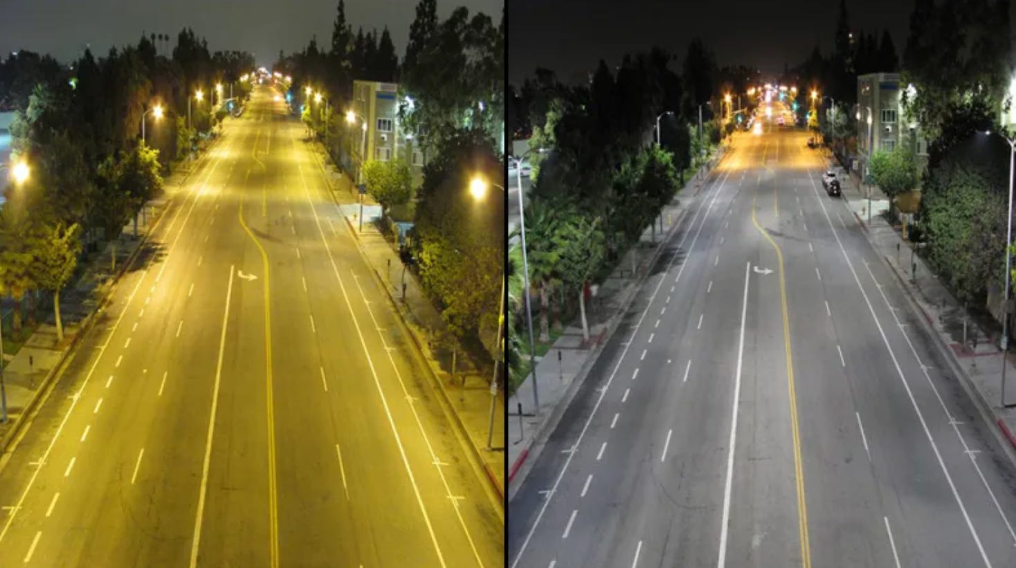
The gray-white wash is even affecting our real world, let alone the imaginary ones in movies or television. It isn’t just your nostalgia making you think that the streetlights cast a warm glow on your block when you were a kid. Many of our once amber sodium vapor lights have been replaced over time with LEDs for higher energy efficiency and lower maintenance costs.5 But when you put the picture of the same street side by side, it’s clear that one is offering at least some color, while the other washes the street out.
The gray-white wash even touches food and store chains! Have you noticed how minimalism has taken over the exteriors of the likes of McDonald’s, Panera, Taco Bell, and Starbucks? Everything is flat, everything streamlined in the name of modernity. Where did the artwork go? Where is the warm lighting? Why does it feel like every single chain is the same when you walk in? There were three Starbucks locations near my house, and I remember what they each looked like when I was a kid, because each was uniquely distinct. Now, they all look exactly the same.
(I’ve written about this in another Substack which I’ll link below!)
OKAY okay, you’re saying to me. You’ve piled on the doom and gloom. Will we ever get out of this permanent grayscale?
The truth is, I’m not entirely sure. Our modern, corporate world loves expediency and talking about “streamlining” and “optimizing” our day, so I don’t see us leaving the clean minimalism of the present in the dust anytime soon. What I do know is that we can make changes in our life to combat this. Little acts of defiance, if you will. Here’s a concrete list that I came up with to fight the grayscale:
Fill your space with plants or flowers
Use an actual camera to take pictures
Make art with your hands!
Visit local green spaces like parks, or try to seek out and actively watch nature near you
Try to catch sunsets. Like, literally step out of your house to see them, don’t just look through a window.
Watch movies made with Technicolor
Appreciate graffiti as an art form
Cook a lot of food! It’s amazing how many colors our food makes while we’re cooking. When it was soup season the past couple of months, the pots of soup I made were so colorful and vibrant!
Don’t put the “big lights” on in your home at night. Prioritize lamps and candles to help give warmth and shadow to your space.
This is the least practical bullet on this list, but if you have a chance to visit a country outside of the U.S., look at their architecture. The color of houses on a street in Mexico, the murals of Nubian Villages in Egypt, the windows and window boxes on a house in Austria, the stones that make up churches in Italy; if you put any of that next to a picture of an office building in the U.S. you will sob.
Support small businesses! Your local coffee shop is going to have way more charm than any Bigby that’s nearby, I guarantee! I can attest to this, as the one near my house has a Christmas tree up all year in their front window that they decorate for each holiday! I mean, c’mon, that’s amazing.
And lastly, maybe the most obvious one: actively pick things that aren’t gray, black, or white! Sure, those colors have their time and place, but don’t be afraid to wear bold colors or decorate your house with textiles. Don’t skip on buying antiques or mugs with silly patterns on them because they seem frivolous. Don’t put the iridescent combat boots in the back corner of your closet: wear them out and don’t worry about them being too flashy! (I’m screaming at my eighteen year old self who sold them on Depop because they were “impractical.”)
You may be wondering after reading all this why I would even care. Why should any of us care? It’s not a huge deal, right? I would enthusiastically yell, “WRONG.” Color is an essential part of the human experience. Not only do our brains use it to identify and process information, signal safety and danger, and influence cognitive function, but on a deeper level, color impacts us daily. It affects our mood and sets a tone for the day. It colors in our memories. It is a form of communication that doesn’t need speaking. It’s how we choose to express ourselves as people. And from the last time I checked, we’re colorful people with colorful lives who aren’t living in an “optimized” and “streamlined” simulation.
At least, I hope not.
Thank you for reading this week. I hope you’re taking care of yourself! I appreciate you <3
Lillian
* * *
Some other posts you might enjoy if you enjoyed this one:
I'm Not Buying Into Pantone's "Quiet Luxury"

In case you’ve missed it, Pantone named their color of the year for 2026 last December. I’m just getting to writing about this now because most of my posts last month centered on the holidays and then the holidays actually happened and my life was busy. All of that aside: I needed to write about this because this color choice is actually dumb!
The Future We Were Promised

For those on my email list: this might be too long to read in full in email format. If so, you are able to read the full article on Substack.