Hello everyone, and welcome to Niji 7!!!
It’s been a year and a half since we released our last Niji version. To say that we’re excited is an understatement.
To make sure you are using Niji 7, type --niji 7 after your prompt in discord.
or select “Niji 7” from the “Version” dropdown in the web interface.

The biggest improvement of this version is our advancement in coherency.
I know that life’s greatest joy is staring into a waifu’s eyes. And now we can draw every reflected detail oh so, so, so clearly.
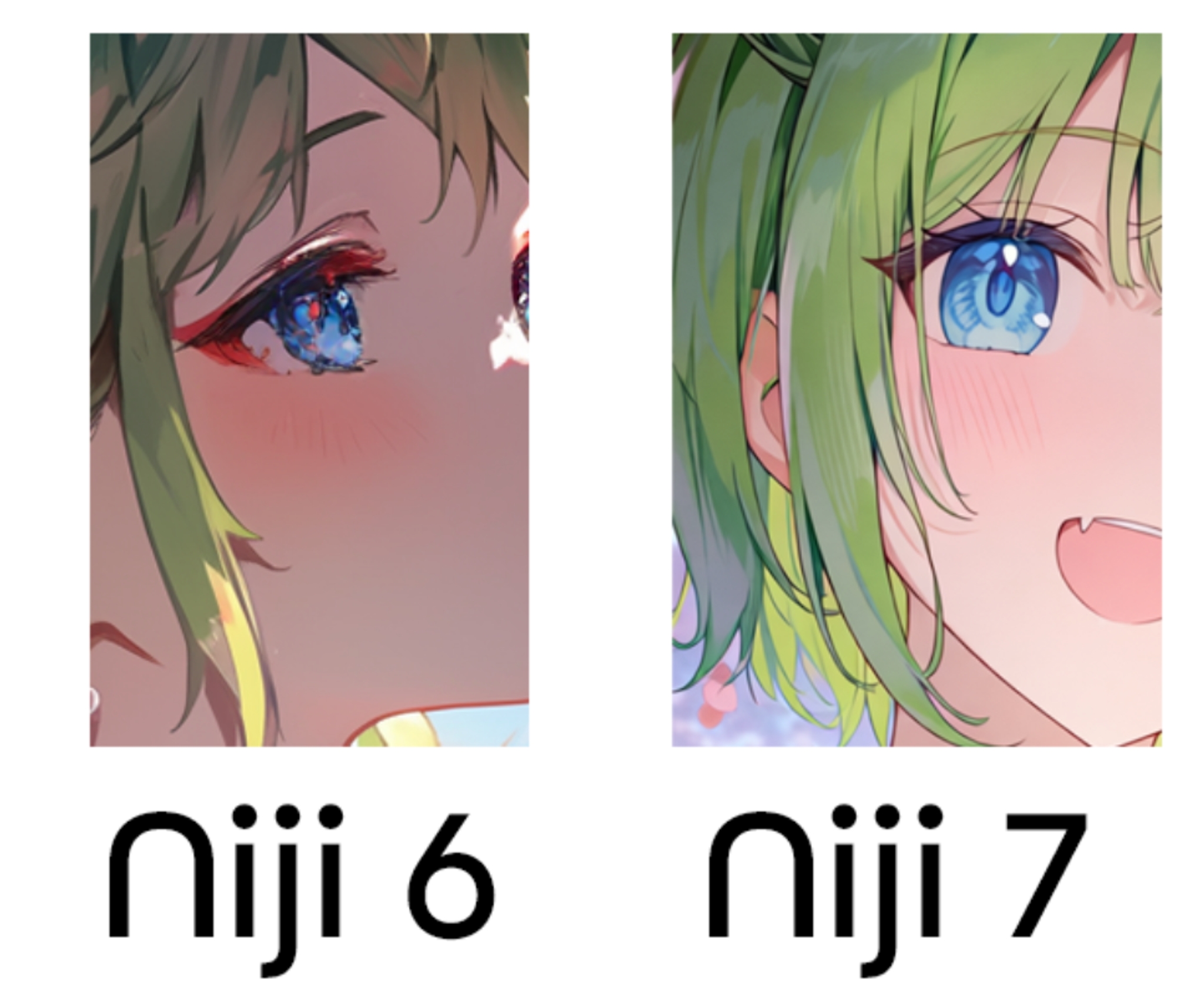
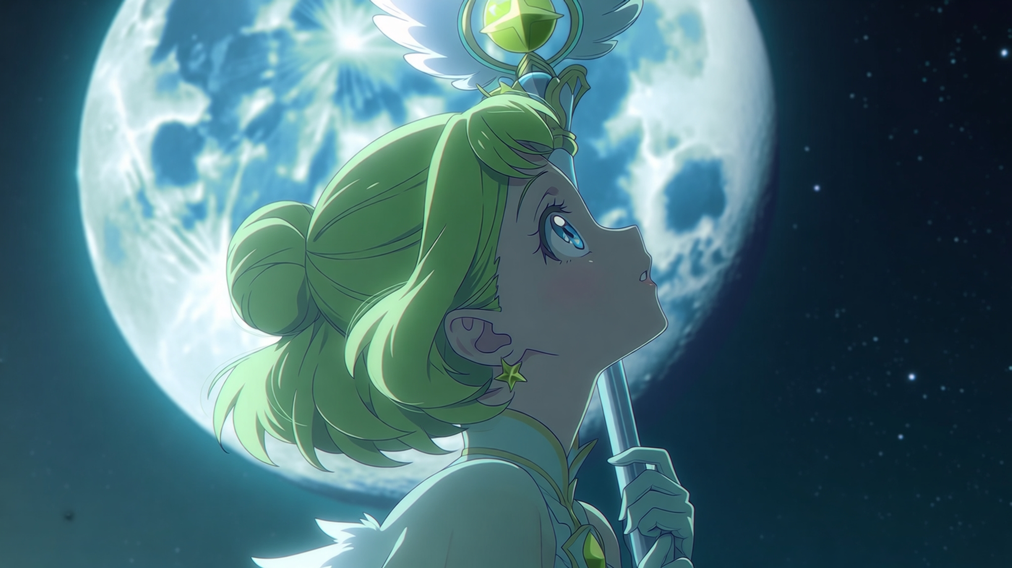
From beautiful eyes to individual floating flower petal in a dreamy background, enjoy this HD upgrade!
Each niji version, we continue to improve on how well the model responds to your highly specific, very reasonable requests.
You can see the tangible increase in Saika content in our blog posts as it gets easier and easier to make her unique design.
A word of warning, this model is more literal. This one gave us a chuckle in testing.
(Presumably, the user is looking for a “secluded source of water”, though I have to admire the creativity of “a remote control in springtime”)
Since the new model gives you more of exactly what you want, you’ll find that your vibes-y prompts may not work as well as they used to. To that end, we’ll be releasing a full tutorial on Niji 7 prompting soon.
Every model drives a bit differently! Your new favorite prompt is waiting!
We’ve added backwards-compatibility for most of the features in this release. (Yes, even the weirdly, specifically requested --sv 4 flag)
Of each and every feature ported, my favorite this time around is most definitely sref. Look at these interpretations of Saika!

You must give it a try!
You’ll notice one important feature missing from the lineup: cref. That one won’t be supported by niji 7: we have a super special secret surprise in the works that we think you will love more than the old cref.
Coming Soon: Personalization and Moodboards
We’ll be releasing Niji 7’s rating task soon, and then launching the personalization and moodboards features shortly after. If you want to get a head start on getting your personal niji 7 style, hit those ratings as soon as they come out, and you’ll be the first to get it once we ship personalization.
Designing aesthetics is always one of the best parts of the model-making process. With every model, we pick an unexplored boundary to push. Niji 7 is no exception.
One of the most dominant aspects of anime is its overwhelming emphasize on line. But even for human artists, mastery of line remains one of the most elusive topics. To show you what I mean, consider the two examples:

The one on the left is clearly cleaner, but the one on the right is clearly a better drawing.
Historically, the overwhelming dominance of line in anime was initially designed as a format to produce drawings quickly: you can’t make moving pictures if you have to draw every detail into every frame, so you must simplify form with lines.
Nowadays, anime linework has blossomed into one of the world’s most sophisticated line languages. It’s difficult to capture it, for the reason I showed above: A good line doesn’t merely indicate the boundaries of an object, it stylizes it: it conveys information about form, texture, and lighting. There’s nothing in nature which defines how to do it: lines only exist in the minds of people. That makes it one of the most difficult challenges we have tackled thus far.
To try out niji 7’s beautiful linework, use the prompt “anime screenshot.”
The paradox of AI art is that this is easy:
But this is very very difficult:
The reason is simple: AI elements probabilistically fail, but simple drawings have very few elements.
If the drawing has only 4 elements, and one is a failure, then it’s a bad drawing. So to make up for this probability, it is always easier to make a drawing with 1000 elements. If one fails, then the other 999 are still good, and you still have a good drawing.
Simple drawings require large areas of emptiness. And emptiness is scary: less elements overall means less elements to hide mistakes behind. We consciously tuned for simplicity, despite knowing this risk.
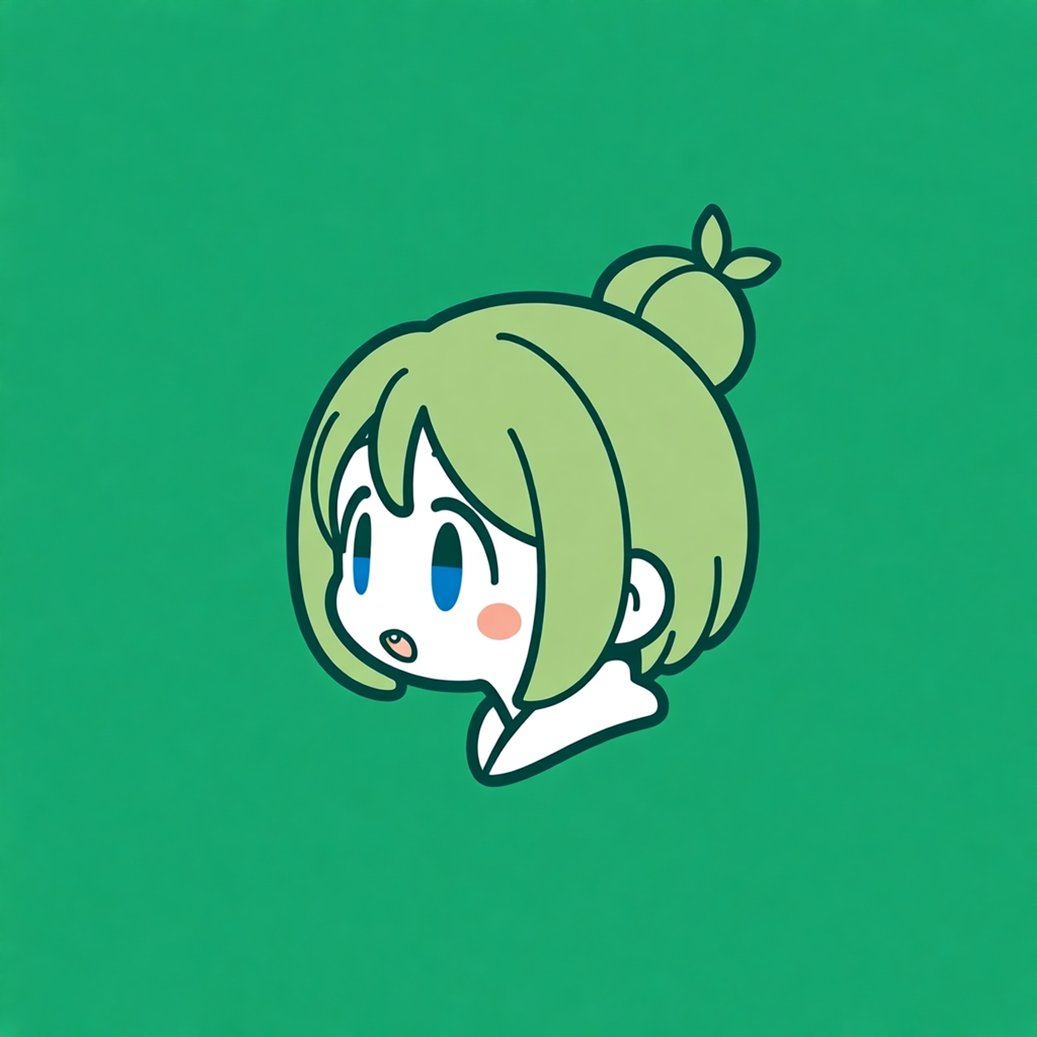
To see this in action, give the prompt “minimalist graphic logo” a try!
When we combine precise line and large, flat areas, it leads us to good drawing! It leads to drawings so good on a scale that is gooder than we’ve ever gooded before!
We toned down the amount of rendering in the default style (you can think of it as 3D-ness) so you can feel the fidelity of these improvements.
Our default style will now show you options like this, hitherto impossible, due to the overall lack of line and space coherency.
The default style also features a flatter look when it’s rendering, to show off the coherency of the drawing underneath.
We pushed these 2 tenets as far as we could for the unique niji 7 aesthetic: a flatter, more ambitious drawing!
Each model follows a unique road to completion. This one has had a particularly long and difficult journey coming to fruition, but it is well worth the wait.
We sincerely hope you’ll love it.
As always, thank you for your support on this journey!