So many projects took forever to launch because we wanted an impressive website. There’s never enough time to develop it from scratch, but with themes, you end up wasting even more time hacking the code to fix their quirks. Neutrino was made to end that nonsense once and for all.
Origin story
It all started in 2019 as a design portfolio website redesign without any bigger ambitions. Its first implementation was a primitive index.html proof-of-concept exploring a full-screen hero section idea that could accommodate any kind of image.
The thinking was: all books, publications, albums, films, TV shows, and even physical product packages have covers. Why are websites an exception to this?
Especially when so much of the hypertext content also exists in the form of video or PowerPoint presentations and tends to have an OpenGraph link preview image that already functions as a cover just externally on social media and messaging apps.
It’s 2026, and some are still cramming as much as possible into the web page "fold". Do people still believe in the old myth that users all of a sudden forget they can scroll if the top of the page is a full-screen section? Or did nobody figure out how to make any image aspect ratio work for all devices yet?


Magazine, albums, and movie covers

CMS for an optimal workflow
Anyone who has been making websites and publishing online should be intimately familiar with the pains that come with WordPress and other CMSs that require you to copy-paste chunks of text into structured data content fields.
Instead of selecting a source markdown file and pressing publish, the process of authoring an article needlessly takes hours.
The workflow simplification requirement pointed the initial versions of Neutrino towards static site generators and Kirby. However, the publishing process involving GitHub versioning and deployment was too technical, and the system could not be used on mobile devices.
Then along came Ghost, which ticked all the boxes. Including being open source and easy to migrate from.
Inspiration
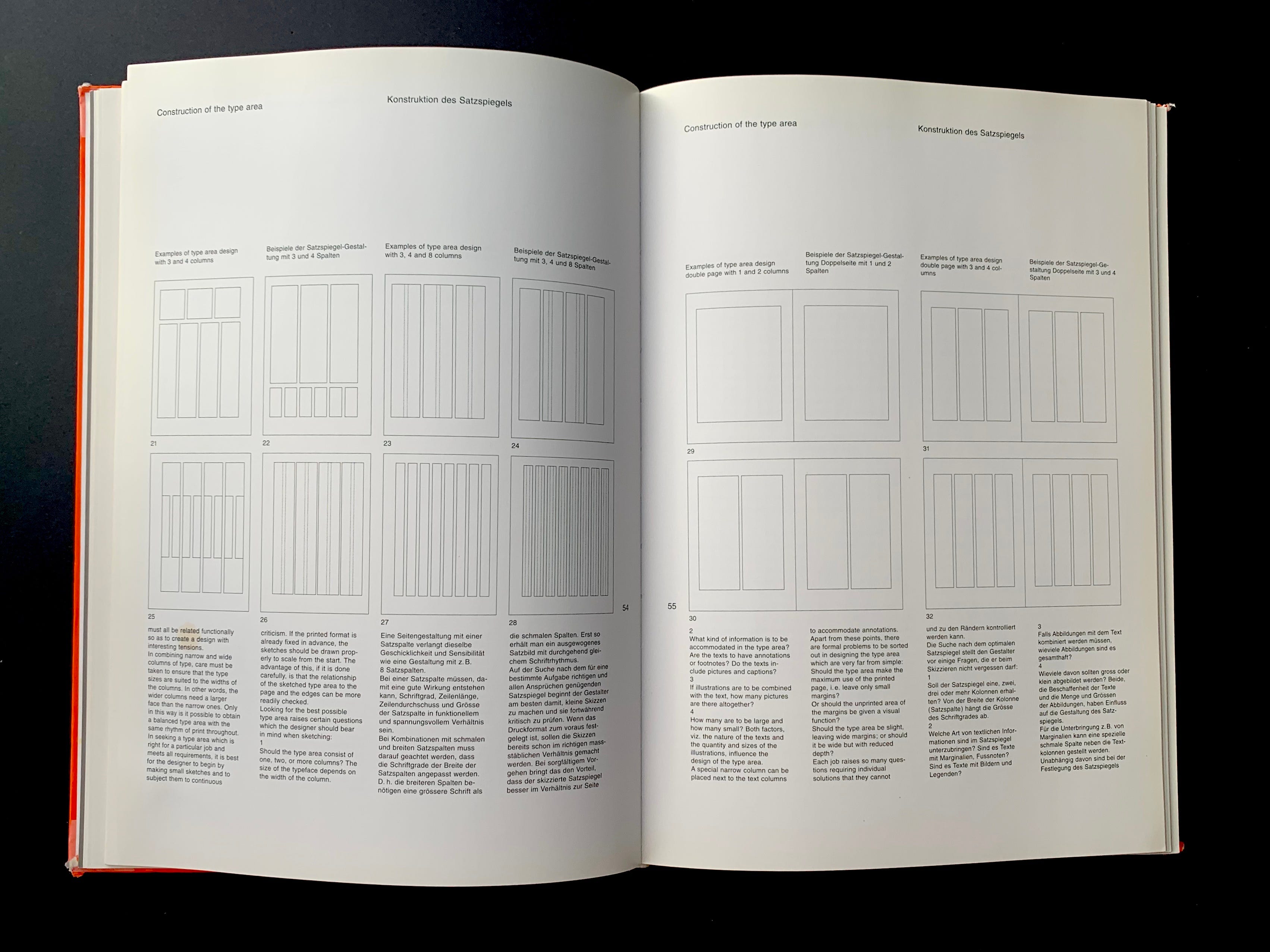
Neutrino draws its methods from the spacious layouts of traditional books and the long history of editorial design.
Its layout engine was designed by thinking in terms of proportions, not absolute widths or heights. Proportions that originate from:
- A page as a baseline presentational unit, the dimensions of which the theme sets based on the device’s screen resolution and orientation
- Standard content formats (e.g., 16/9 media and 16x16 px icons), which dictate the input and presentational needs
- Standard typographic scale values and 8px digital grid systems, which dictate the output and its optimal construction methods
It combines the best elements of traditional and digital to deliver a premium user experience with a look and feel that appears both familiar and innovative.

Unbreakable layout system
Its design is rooted in the rejection of the idea that every website needs a custom layout and UI to look unique. Or at least on-brand.
Ghost's native 3-width column approach lent itself perfectly to the theme’s design philosophy. The theme elevates it into an intelligent layout engine that can deal with any kind of content input, block configuration, and combination of elements. This enables a consistent and visually appealing presentation across various devices and screen sizes while maintaining the flexibility needed to handle edge cases such as extremely long or short content, text/background contrast issues due to CMS customization options, etc.

16:9 as a universal format
A standout feature of Neutrino is its adoption of a 16:9 format, chosen for its universal applicability. This aspect ratio aligns with the most common formats across various media platforms, from videos to presentation slides and website hero images to social media preview cards. This "create once, use everywhere" approach significantly reduces the time and resources needed for content adaptation.
Modularity
Underneath the tremendous amount of complexity is a deceivingly simple 8-pixel grid. Every measurement of Neutrino is based on a set of standardized tokens that translate into different values per screen resolution breakpoint. All multiples or fractions of a single unit.
The number of tokens multiplied by the number of modules, settings, user input possibilities, and runtime variables produces a seemingly unmanageable amount of combinations. Yet the design never dissolves into chaos.
Underneath all the complexity is a sturdy, yet flexible, geometrical skeleton that arranges everything into coherence and harmony.

From a project to product
During the development of a personal website, Ghost released v5, which extended its capabilities with a big batch of advanced content blocks. Among them, a header content block with call-to-action buttons and a split layout that resembles classic left-right-left feature blocks found on any modern landing page.
This led to a realization that with a few extra custom blocks and the help of third-party embeds, Neutrino could power any kind of website.

The invisible user interface
Neutrino uses minimalism not so much as an aesthetic ideology as a visual HACCP system, ensuring cleanliness and preventing cross-contamination.
In the theoretical plane, it’s a mental framework, symbolic permission, and a mantra to ruthlessly remove everything that can be removed without compromising utility.
In practice, it’s a method for achieving maximal versatility. To work with any kind of visual language of branding and content, the theme needs to be invisible. But that’s impossible. Any preset values the product ships with impose themselves, regardless of customization options. Therefore, the next best solution is visual neutrality. Like a chameleon that shape-shifts its own appearance by adopting its context.
A silent frame that lets the painting do all the talking.

The inconspicuous achievement
The best thing about this system is that nobody thinks about it. Thousands of micro-decisions happen automatically, hidden in plain sight. You publish content without worrying about technicalities. Visitors get a polished result. End of story.
The exhaustive amount of work that went into handling edge cases by accounting for every permutation and combination on every breakpoint isn't technical masturbation intended to impress. It serves only one purpose: to achieve a near-perfect user experience that drives business results.