For thirty years, the central obsession of product design has been a single question: how do we make it easier for a human to click the right button? We built funnels. We A/B tested button colors. We agonized over empty states and loading spinners.
That era is ending — not gradually, but structurally.
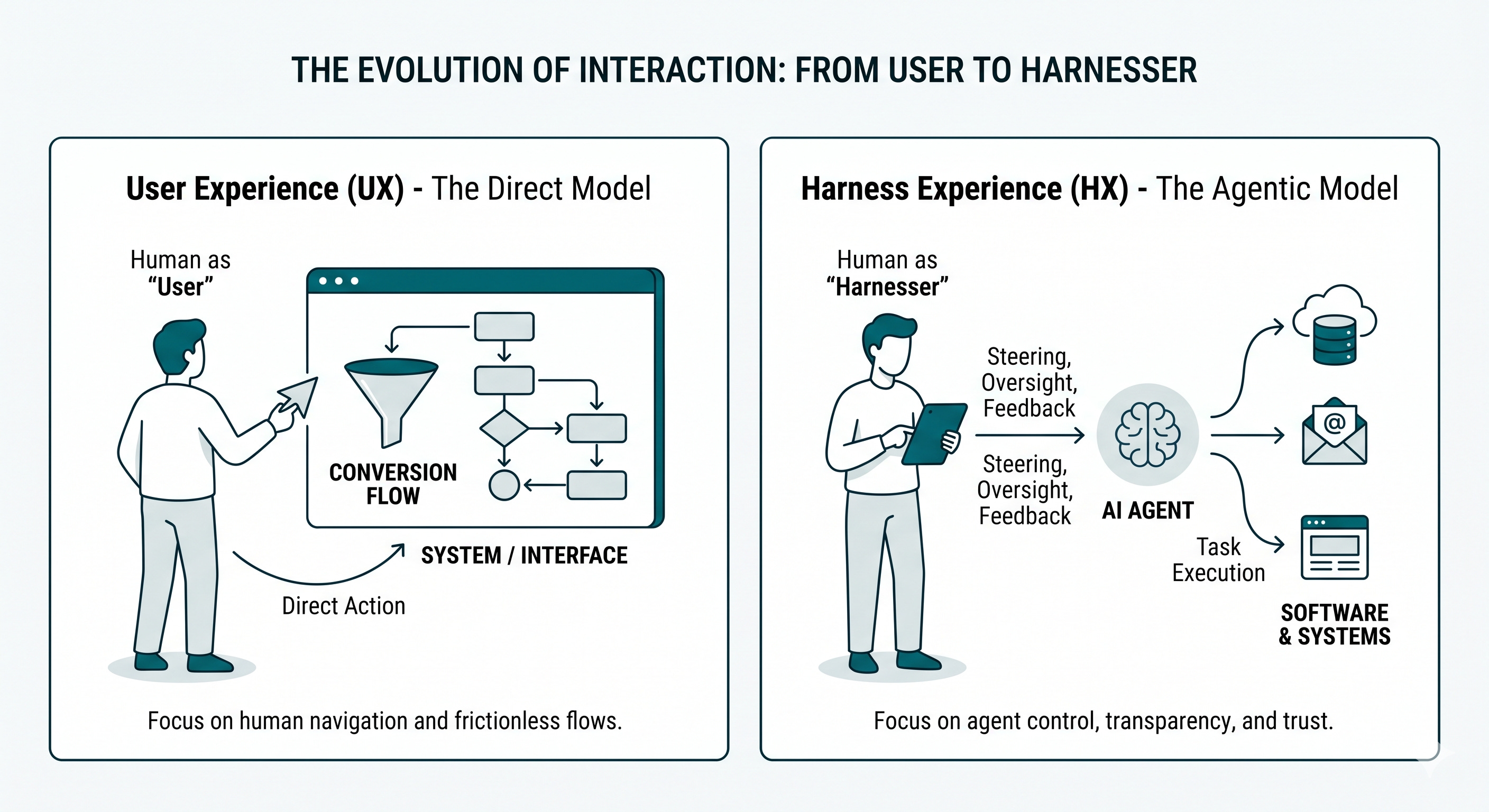
Consider a traditional travel booking site. Its UX is a masterpiece of guided constraint: search bar, filter panel, calendar picker, seat map, confirmation modal. Every screen funnels the human toward a single, monetizable action. The design is the product.
Now consider what happens when an AI agent books your travel. It doesn’t load the homepage. It doesn’t hover over the “flexible dates” toggle. It hits an API, cross-references your calendar, checks your preference history, and surfaces a ranked shortlist — bypassing every carefully crafted screen entirely.
The funnel isn’t just broken. It’s irrelevant.
Agents don’t navigate UIs. They negotiate with systems. And when the agent is the primary “user” of software, the human behind it occupies an entirely different role — one for which we have almost no design vocabulary. Until now.
HX — Harness Experience — is the design discipline governing the interface between a human and their agentic fleet.
Where UX asks “how do I get the human from A to B?”, HX asks something more complex: how do I let a human steer, trust, and audit a system acting on their behalf, at speed, across dozens of simultaneous tasks?
The word “harness” is deliberate. A harness isn’t a cage — it doesn’t constrain. It channels energy, distributes load, and keeps you connected to something far more powerful than yourself. A well-designed harness means you stay in control without doing all the work. A poorly designed one means you get dragged.
That is the failure mode of most AI-native products being built today
.
There is a psychological shift happening that designers are not yet taking seriously.
A user takes action. They click, type, swipe. Engagement is transactional and immediate — the button changes color; the form submits.
A director evaluates outcomes. They set intent, observe execution, and make judgment calls about whether the agent’s behavior actually reflects their goals. It requires a fundamentally different kind of trust.
Think about the difference between driving a car and managing a driver. As a driver, you feel every turn. As a manager of a driver, you need a map, an ETA, and a reason to believe they know the route.
HX must be built for directors, not drivers.
Steerability is the first. Beyond a simple prompt, how do you express nuance? A great travel agent doesn’t just hear “I want a beach vacation.” They remember you hate crowds and ask whether this trip is romantic or family. Steerability means designing systems where human intent can be expressed in layers — with context, constraints, and corrections — not just a one-line instruction.
Transparency and Auditability is the second. An agent that acts like a black box will eventually fail in ways that feel inexplicable, and therefore unforgivable. But flooding the director with raw logs is its own design failure. The challenge is legibility at the right altitude — letting a human understand why a decision was made without requiring them to become an engineer. Think of it like a flight manifest versus cockpit telemetry — same journey, entirely different information needs.
Intervention Points are the third and most underrated. The moment a human most needs control is often the moment automation is least prepared to hand it back. Designing intervention points means thinking carefully about when to surface a pause, how to hand off context cleanly, and how to let a human step in — and back out — without shattering what the agent was doing. This is not a button. It is an architecture.
So what replaces Figma?
Not a single tool, but a new set of design primitives. Designing for latency — because agents operate over seconds or minutes, not milliseconds, and unexplained silence breeds distrust faster than failure does. Designing for uncertainty — because an agent operating at 78% confidence needs to surface that honestly, not paper over it with false precision. Designing for verification — because the human’s core job is now quality control, and the interface must make that fast, clear, and low-friction.
The new craft lives in feedback loops, not flows. In state communication, not screen transitions. In systems honest about the edges of their own competence.
The best UX designers of the last decade built elegant cages — beautiful, invisible paths that guided users exactly where the product needed them to go. It was a form of benevolent choreography.
That skill, applied to agentic systems, produces something genuinely dangerous: automation that feels smooth right up until it catastrophically diverges from what you actually wanted.
The call to action is urgent. Stop designing for obedience. Start designing for collaboration. The agent is your most powerful colleague — capable, fast, and tireless. HX is how you ensure it is actually working for you, not just working.
The funnel is over. Build the harness.