When I looked at the blog post, I first assumed I was looking at some placeholder logos with an intentionally weird color scheme. It took me a bit to realize that color scheme seems to be meant seriously. The proposed color schemes are terrible. Reminds me a bit of the Windows 3.1 Hot Dog Stand scheme.

I can't make sense of the rest you're showing. It does not seem connected to the sites at all or the current identity. It's just too different and I can't translate these images to how this would change the actual designs.
![]()
199k77 gold badges381 silver badges703 bronze badges
9
Yes. I think I will help with a suggestion.
Please, go through any article you may find about color blindness. Even the Wikipedia page is enough. Going through some articles about UI accessibility would be the next step.
A black font on a dark red background is a very poor choice for accessibility, yet both options go for this "sin".
I get that when I told to the company that a certain April Fool's prank caused real pain to real users many laughed it off but please... Try to not give people who are already living with some serious issues another way to get a migraine.
23
One gets a feeling what we have here is... a complete failure to communicate. One even feels a little like this is even hostile to the rest of the network.
I've been an active user of the network for 15 years. I moderate one tech and one non-tech website. I've never been a Stack Overflow user. Least for me, it's very clear that my feedback was read, then completely ignored. A significant amount of the feedback given does seem to want to maintain the Stack Exchange branding for smaller sites too.
Is the intention here to alienate the rest of the network, with their own distinct identities, and get them to go away? Cause this very much feels like a potential end result. I'd expected better but it's pretty clear that marketing's dug in on the Stack Overflow branding despite smaller sites preferring the Stack Exchange branding.
And right now - does Stack Overflow Inc. really feel a redesign that alienates a significant part of small site user-bases is the best option?
This is digging into and reinforcing the feeling that our opinions don't really matter. The smaller sites are unimportant enough that we need to be assimilated into the Stack Overflow "Borg collective" despite - well, it being not what we want.
I guess this isn't new but it feels like another example where the company pays lip service to community feedback, minimises it, and does as they like.
As for the options given - I voted for neither. We have BRIGHT COLOURS and LOUD IMAGERY. It's... terrible. The colours are loud and discordant and obviously designed by people who don't deal with a large amount of text.
What's twoface {''} even mean? Why all the clashing colours? Do the people who design these things spend any amount of time using Stack Exchange and other social software? It's the visual equivalent of a noise marine concert.
Brands tell a story. At least with Stack Exchange and its community, the somewhat quiet, orderly brand image is soothing. I'm not quite sure what the story here is.
![]()
19.6k5 gold badges43 silver badges114 bronze badges
![]()
11
Let me add my voice to the chorus saying that "Stack Overflow" is the wrong brand to standardise on for other products.
As a case study, I would refer you to Mozilla, whose most recent rebrand announcement discusses why they are moving in completely the opposite direction:
Our past experiments with a combination of brands across a variety of products demonstrated that positioning these offerings under Firefox often created confusion, as Firefox was so closely associated with browsing. By aligning these initiatives directly with Mozilla, we’re simplifying the message. This approach also gives us more flexibility: Each product can better communicate its unique value without the baggage of misaligned expectations.
I think we can translate that directly to your brands:
Positioning Q&A sites for topics such as Photography, Cooking, and Interpersonal Skills under Stack Overflow will create confusion, as Stack Overflow is so closely associated with programming.
Simultaneously, you're proposing to move some services slightly away from the "Stack Overflow" branding - "Stack Overflow for Teams" is to become "Stack Internal". This seems like a good move, and a better model to follow across the board.
I frequently see people referring to each site as "a stack" (e.g. "the photography stack"), so maybe just make that usage official? Adding the word "overflow" to that doesn't really help anyone - it means nothing to a photographer.
PS: You might also learn from this retrospective of Mozilla's previous rebranding exercise.
![]()
1,8471 gold badge11 silver badges13 bronze badges
5
Stack Exchange sites will continue to exist, but under the Stack Overflow name & brand
Sorry, what does this mean?
Is Super User getting a new name? Arqade? Will Pets.SE now be Pets.SO?
"Stack Overflow" is distinctly a programming term; I don't really understand the logic in applying it across the network.
4,3393 gold badges9 silver badges43 bronze badges
9
I would love to help you build our new visual identity! I have, in fact, been begging for you to let me help. You haven't been.
You require heavy babysitting to not break things. You follow hyped-up design trends, despite the clear and obvious failures of those trends, and you ignore what we try to teach you. You don't understand the purpose of the things you cut away. (I find this confusing: the designers I've interacted with are all at least basically competent, but these decisions are blatantly wrong, over and over again.)
Do not use either of these designs. Do not implement any of these proposals. You should know why you cannot use these ideas: we've told you enough times already; and frankly, I'm getting sick of it.
Or if you're not going to involve us, at least do us the dignity of not pretending like you are.
![]()
35.1k8 gold badges74 silver badges126 bronze badges
9
A lot of answers on here oppose the idea of “brand identity” and want to emphasize instead the site’s purpose, how accessible it is, how well it functions, and so on. But I would like to make a few comments in terms of the brand.
It’s hard to put into words, but both of these designs evoke someone trying to be Stack Exchange. It feels like one of the clones, or like a site for a company that doesn’t exist yet beyond VC funding and a website: that wants to pass itself off as older and more authoritative than it is.
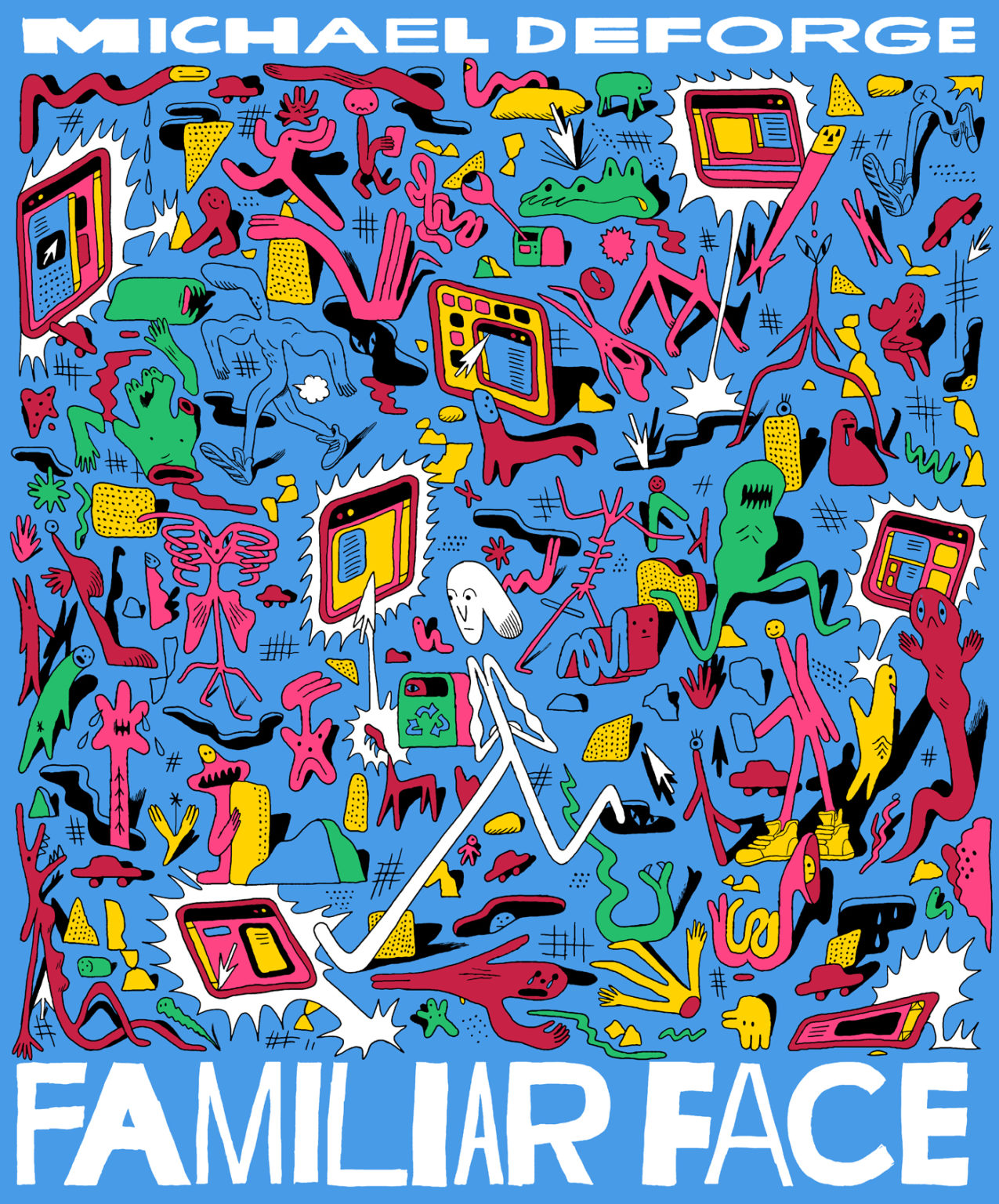
And I do really like some things about these designs. I see the appeal of Cyberbougie and Nu-Brutalism. The colors evoke Michael DeForge and programming color schemes; the text reminds me of Compact Mag; the style suggests a similar intended user base to Canva. They’re absolutely on-trend—but that’s the problem here!
Something feels wrong about making it follow trends of web design: following is for followers. It suggests that Stack Exchange is imitating or trying to be something else. But it isn’t.
Stack Exchange already has an incredibly powerful brand.
Stack Exchange in the same category as Wikipedia: it’s infrastructure. As you say in the blog post, it’s a spine and backbone for the rest of the internet.1
Stack Exchange is the real thing.
By analogy, consider soda pop.
Poppi is Paperback Chic, which is appropriate for its brand identity. Poppi is fashionable, it’s of the present day, and its product is a nod to soda. Its brand is about the brand of soda: it says, “what if we took soda, but put a new twist on it?”

Now imagine if Coca-Cola wanted to go Paperback Chic:

Awful, right? The power of Coca-Cola’s brand comes from the fact that it is foundational to the idea of soda. You understand Poppi in terms of soda, and you understand soda in terms of Coca-Cola. They can afford to have a logo from the 19th century painted in loopy cursive.

Coca-Cola’s power is in its legacy, not in its youth. A soda brand looks like Coca-Cola or doesn’t, but Coca-Cola shouldn’t try to look like a soda brand.
Well, Stack Exchange shouldn’t try to look like programming, because programming already looks like Stack Exchange.
The more “design” there appears to be, the less “real” it looks.
Of course everything has a design; the point is that some designs announce themselves more than others. Consider Wikipedia’s (in my opinion excellent) redesign. They added features, they tweaked the look a little bit, but mostly they just reorganized the layout of the page to make it easier to navigate. It’s still very much a classic website: a nice, clean, sturdy thing with useful information all over it.
Wikipedia feels like it will always be there. Wikipedia feels like it will still work at the bottom of the ocean. Wikipedia feels real. They should keep it that way, and so should we.
Because this site is actually pretty great as-is.
1 By the way, I’m a little bothered by the stack connected into a spine.

The once disparate stacks now connect to form a spine or backbone — representing our ambition to reprise our role as a vital source of knowledge for technologists.
I get the metaphor, but recall that “stack” is already a metaphor: a stack is a data structure that stores and retrieves individual units of information, like a Pez dispenser holding a stack of candy. You push things onto it and pop things off one at a time. But now we can’t? The candy is fused together into a cluster of homogeneous content?
![]()
9811 silver badge6 bronze badges
6
Expand the definition of Stack Overflow from programmers & developers, to all technology enthusiasts.
This covers the technology sites and perhaps the science sites, but what about the culture and recreation, life and arts, professional, and business sites? Maybe some of the other sites fit under "technology enthusiasts", like Ask Patents or Aviation or Open Source. But I don't see how Writing or Personal Finance & Money or Seasoned Advice fit into this expanded definition.
Capture the variety of thought & expression across the network today, but be forward-facing for an expanding role.
I don't know what you mean by "variety of thought & expression". With the exception of Stack Overflow, which has Discussions and Articles, every other site is just Q&A and Chat. The idea of Discussions and Articles could be good, but there are still details with how they are implemented that make them...not quite ready for prime time. Are you planning on addressing the quality and moderation issues with Discussions and Articles and rolling them out network-wide?
Be welcoming to a new & wider enthusiast audience, while still appealing to our core audience of subject matter experts.
Not all site communities want an enthusiast audience. Software Engineering - where I'm a mod - caters toward people working in professional settings, although there could be a good question from someone working alone. Sites like MathOverflow and Theoretical Computer Science also cater to people with deep expertise and experience in specific fields. How are you going to address these communities who don't want enthusiasts?
![]()
64.6k20 gold badges120 silver badges217 bronze badges
6
It looks like it must have been fun to come up with all those new pallettes and graphics. Please keep them away from the web pages I use daily.
![]()
4,1701 gold badge15 silver badges18 bronze badges
2
Eliminate confusion caused by two distinct but related brand names
Do you have a plan for how you want people to refer to the Stack Overflow Q&A site specifically, once the brand is also used for the network? Could phrases like "on Stack Overflow" become a new point of confusion, or will the branding of the sites avoid this somehow?
![]()
3,36819 silver badges28 bronze badges
4
I've been reading several of your posts about the site in general, although I don't usually participate much. I sense a somewhat exaggerated emphasis on suddenly involving all users, as an imperative democratic necessity, which, for me personally, generates some suspicion, especially after having received some rather tyrannical and somewhat capricious "scares" from some of the platforms.
Likewise, I'd like to offer an "assessment" about what is stated in this question. As I said before, I read the posts that follow about the general change to the site. From this May 8th question, I extract three paragraphs:
– It is no longer serving the use cases or audiences that we need it to. As a result, it’s causing daily confusion, inconsistency, and inefficiency both inside and outside the business.–
– Awareness and the user experience around our paid products makes them feel like ads, rather than obvious and useful parts of our ecosystem.–
– We lack a consistent tone when speaking to our different audiences, which is often off-putting and confusing.–
From which I in turn extract relevant concepts towards a possible brainstorming, some to avoid (A) and others to consider (C):
- confusion (A)
- inconsistency (A)
- inefficiency (A)
- useful (C)
- ecosystem (C)
- consistency (C)
It's not useful to start from negative premises, so I'll transform the first three into positive ones:
- clarity
- consistency
- effectiveness
Summarizing, and going to the essence of these concepts, is this the solution you have arrived at?
Clarity, consistency, effectiveness, useful, ecosystem =

Without meaning to criticize, I'd like to add a couple of conceptual/formal considerations at the construction level.
Regarding option 1, I don't know if the concept of "démodé" is universal. It doesn't mean "outdated," which would lead us to interpret something from twenty years ago; rather, worse, it's something that has only recently become fashionable and is already on the verge of obsolescence. This is what is happening with neo-brutalism, which is the aesthetic basis of this option.
As for option 2, there are several test tools designers use when creating branding. One of them is Google Images. Here are some results:


![]()
1,8531 gold badge10 silver badges18 bronze badges
2
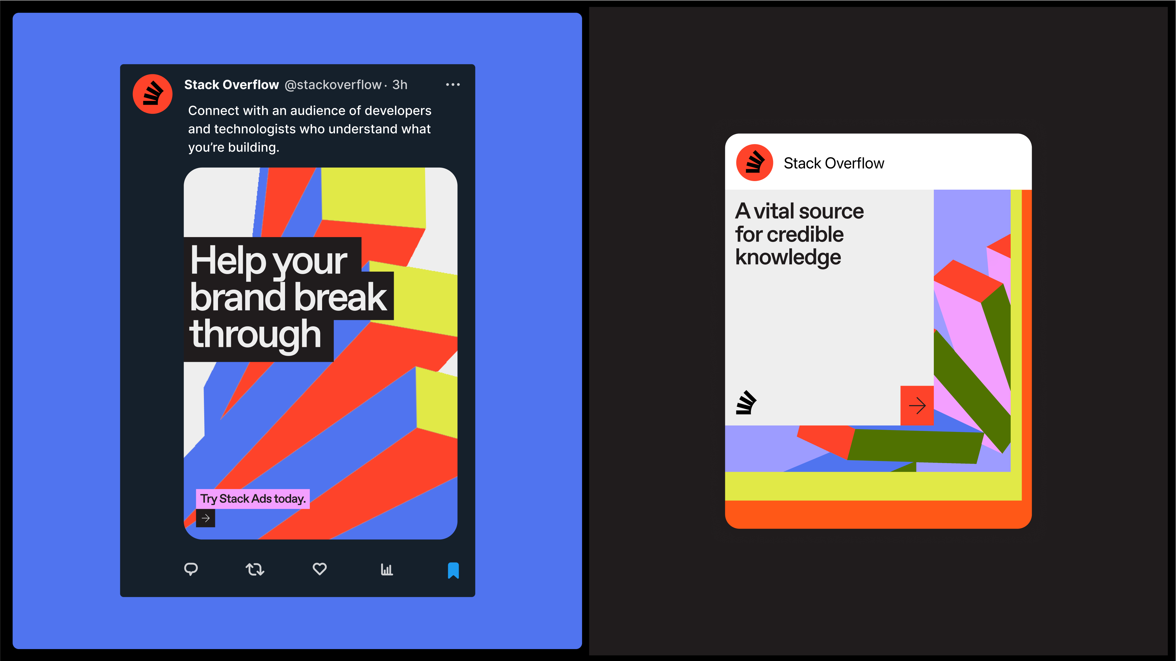
I'm pretty confused by the images and very short descriptions chosen to share in this post when there is a lot more and a lot more important info from the blog post that you didn't include. It's completely unclear what we're expected to provide feedback on here: the logo changes? the color schemes? the general design aesthetic? Something else?
Primarily, in the blog post you mention the two design options to choose from are:
Adding a "spine" to the Stack Overflow logo so that all the pieces of the stack are now connected
Replacing the Stack Overflow logo with something similar to the Superuser logo, which is based on braces/brackets
Yet those two choices/designs don't appear anywhere in the post above. Why not?
Furthermore, as has been thoroughly covered by others already, the color schemes here are... not quite ready for prime time. You mention that color schemes which pass accessibility and color blindness tests are top-of-mind, but you didn't bother to do the actual work for that when throwing these color palettes together for us to "vote" on?
I recommend y'all just delete this question and post a new one that highlights the actual logo changes you've demonstrated in the blog post (that's really the biggest change we're talking about here in terms of "identity", and it's a super important one), and that uses better color palettes... ones which actually pass contrast tests/requirements put forth by WCAG, et al. Bonus points if they aren't garish, Halloween palettes.
![]()
24.5k5 gold badges63 silver badges94 bronze badges
1
Not going to sugar-coat it. Please treat this post as business to business correspondence, as if I'm an SO employee, who was was prompted to give feedback on this professionally. There is really just one feedback item to give:
- You need to hire a professional graphics designer with proper training from a recognized school or agency. Period.
Having interacted with such professionals a lot both through work and in private, I quickly learnt that complete laymen such as myself should just keep their hands off things like this.
Then there are those who have worked with diverse UX stuff in a professional context and might have some amount of more relevant input, far more so than laymen. They might keep up to date with various trends set by graphics designers but not really understand why the graphics designer picked one specific design for product x and why that is not necessarily an universally suitable design, let alone one for product y.
But even still, they are still far from a professional graphics designer, which is an actual degree you get after years of training at a relevant university specializing at such. Then of course on top of that, professional work experience as well.
All the remarks already posted here about aesthetics, common disabilities related to color blindness etc are well-known to professionals, that's just another day at work for them. Heck, even I know the basics of it. Even as a layman, I know enough to tell that what was proposed here is not the result coming from a professional graphics designer.
Some of the other specific feedback you are getting here is probably from such professionals, regarding how to pick palettes and corporate graphic profiles etc etc - that stuff is beyond me. But whenever I have hired professional graphics designers for various diverse things from corporate branding to industrial design, I have always been pleased and often also impressed with the result.
One of the core things I keep hearing from such professionals is: it shouldn't just boil down to just subjective a matter of taste. Things are designed the way they are with an actual plan in mind. Sure there are artistic aspects of it too - but a professional will reason like "if you want to send out message x, then we will do it like this-..."
Some market benchmarking was apparently made for this, but maybe therein lies the problem: as a programmer I don't want to interact with something retro that looks as those godawful programming books from the early 1990s. It is retro and nostalgia sure, but not in a good way. It's from a time before the Internet when programming was awful - all you had as source were all these poorly written books with strange fonts and questionable value. Bad memories of low quality products. And the icons gathering on your Windows 95 desktop did soon look as if some My Little Pony has barfed rainbows all over it. Luckily, things have evolved since then! Good riddance.
![]()
9,5251 gold badge34 silver badges41 bronze badges
4
You say a goal is to:
Expand the definition of Stack Overflow from programmers & developers, to all technology enthusiasts.
But what about those who are not technology enthusiasts and who use Stack Exchange for non-technology topics? Will non-technology sites remain under the Stack Exchange branding?
![]()
4262 gold badges10 silver badges24 bronze badges
1
When I saw this post, I decided to take a couple of days to think before posting my opinion, as I sincerely had no idea where this might be coming from (what problem can be solved by this, why this is done by the design/rebranding, why THIS design, etc.). Today, I found an explanation that I see as plausible.
There’s an urban legend - possibly even a true story - that Paul Verhoeven deliberately included excessive gore in RoboCop (1987) so that the MPAA would focus on cutting those scenes, while leaving the rest of the film’s violence largely intact. The idea was to offer up some extreme moments as sacrificial material, drawing the censors' attention and making them feel satisfied when those scenes were removed, while the broader tone and violent content of the film remained mostly unchanged. (A similar story happened with the soviet comedy "The Diamond Arm", I was looking for the best analogue in Western culture.)
If this is the case, I understand exactly what those designs represent. And I can only wonder, if the Company wants to distract people's attention from mostly unsuccessful and unneeded introduced AI functionality - OR there is something else coming (<insert the second/third/... dropped shoe joke here>). Truly sad times.
![]()
4
Amazingly you want to take a logo that is an illustration of a STACK OVERFLOW & make it not a stack.
But that's consistent with the rest of the blog--which DOESN'T EVEN KNOW IT'S A STACK:
The once disparate stacks
THE STACK IS THE WHOLE LOGO.
representing
IT ALREADY REPRESENTS ... A STACK OVERFLOW.
P.S.
In this image riffing off the logo and incorporating text
Knowledge doesn't loop, it stacks.

the stack elements connect beyond the "book spine" of the new logo and wrap around into what unavoidably evokes a PADDLE WHEEL.
So IT LOOPS, and IT DOESN'T STACK.
(Or, forgiving the slab thickness, it evokes a ROLODEX--literally, KNOWLEDGE LOOPING.)
1,5683 gold badges13 silver badges19 bronze badges
In this new brand vision, all Stack Exchange sites will continue to exist, but under the Stack Overflow name & brand.
For years, SE sites have established themselves in terms of topicality – both what is on-topic and off-topic. What is on-topic on one SE site usually isn’t on another. Critically, there are several topics that were broken off from SO to form sibling sites such as Code Review, Super User, or Software Engineering.
If the distinction between SO the site and SE the network is going to be removed, how are people supposed to understand that this topical divide still exists? How are they supposed to understand whether something belongs on SO-the-network but not SO-the-site?
3
If we're going to be pushed in any direction of what you've already laid out, I'd go with Option 1. The thinner font choice on Option 2 immediately makes it a "no" from me. It's like I'm reading a newspaper, and I'm not really thinking "newspaper" when I think "programming". I might think of it if I think of "technology" but... Probably not. I'm also not really a fan of the {''} fella. Stick to your brand icon, even if it's the slightly changed one without the "base" for the stack. It works and it's obviously a "stack".
Option 1, while I do prefer it, reeks of the modern day need to make things big, bulky, and with a large smattering of colors that don't seem to coincide with each other. These images in particular don't really make sense to me. I don't feel like these colors scream "programming", "technology", or "knowledge" to me. Cooler colors like blues, and greys might suit the idea better. The font also allows the "f" and "l" in "Overflow" to be too close together such that they're touching (which is called a "ligature" I guess, TIL) which feels odd.
To round out the critique with a compliment, the line "Knowledge doesn't loop, it stacks" is really neat. I like that a lot.
I'm also going to echo a bit of what Journeyman Geek said in his answer. I'm really concerned about putting everything under the "Stack Overflow" umbrella. I think it can work, but you have to do it right. A big part of that is ensuring that the non-tech sites have their identity intact. For a long time the non-tech sites have felt like their concerns have gone by the wayside in favor of Stack Overflow's needs. Some of that makes sense, SO is massive by comparison, but that feeling will be exacerbated if you don't take the time to ensure they make sense and feel at home under the new umbrella.
I think we're in agreement that it's a bit difficult for a newcomer to understand that there is "Stack Overflow" and then there is "Stack Exchange", and that the former lives under the umbrella of the latter, except the company's name is Stack Overflow, Inc. and not Stack Exchange, Inc. Did you get a headache reading that explanation? Was it even correct? Who knows anymore. Resolving that makes sense, it's just super important that you do it right, and not haphazardly.
![]()
SpevacusStaffMod
37k11 gold badges85 silver badges187 bronze badges
6
What I don't understand is the purpose of the visual redesign. (Agree with @mdfst13)
This post has a score of -148 (currently). In spite of that, the question is "which option will be selected", not "should any option be selected"... Does Stack Overflow, Inc. listen to the community?
![]()
3811 silver badge10 bronze badges
6
I have major concerns with the way this is all being framed.
A big tell is that multiple changes are being lumped together, with a suspicious focus on the less significant one.
- Collapsing Stack Exchange and the whole network into Stack Overflow
- Changing the visual identity
Guess which one the community was asked to vote on? It gives the impression that a controversial decision is being laced with candy to make it easier to align with the community.
The poll
The poll itself has major issues. Most importantly, people don't really know what they're voting for. It was not described how SE intends to even use the results. If you intend to be guided by votes, say how.
There are really two major changes being discussed at the same time and I think that's a problem. It obfuscates discussion, and opens a ton of questions that need to be addressed before visual identity can even be evaluated. The visual vote is being asked to carry a much more fundamental decision. To me this invalidates the entire point of the poll.
The "empty" vote is also confusing, hiding or diluting oppose/abstain votes. I believe this was intentional, to make sure a minimum number of people actually vote "empty", ensuring either option 1 or 2 will be the winner. The fact that over a quarter of the votes were "empty" despite it being totally undefined should be the main takeaway. Clarify what is meant by the "empty" option, and how you'll account for this.
The design proposals themselves
The first mystery is how you want to leverage the familiarity & success of a brand at the same time you totally replace it. These proposals don't retain any of the familiarity or recognition that help justify the change in the first place. Just no. IMO the new brand needs to feel like a refinement or iteration on the existing design, not a total revamp. If it doesn't feel familiar, you have failed.
You are asking "core users" to give their impressions of a rebrand by showing them social media mockups, corporate keynote backgrounds... and not once showing a mockup of the product as it's actually used. I would expect to see mockups of at least 3 network sites to understand if any of this makes sense at all.
If you value your product, the product should drive its brand identity, not social media.
I mean, a social media-first identity can work, but are you ready to tell this community that's your intent?
You've borrowed motifs from IDEs and old programming texts, but in a way that misses the point. As a programmer, this misplaced borrowing of color scheme and motifs is like getting a tattoo with cool-looking Japanese characters. Well we "speak Japanese" and this is gibberish. I guess the intent was to throw in some copy-pasted elements to connect to the real engineers; this just screams "graphic designer googled 90's programming motifs".
For core users, I would guess that the following are important elements of the site's design:
- Quiet, high-contrast text reading surface
- Minimal chrome interference to facilitate distinguishing things like
- tags, usernames, votes
- distinction between title & content text
- code blocks
- many authors don't have an eye for layout so posts need to be as easily parsable as possible.
How do the proposed visual designs serve these needs? The proposed designs don't seem to express anything important to anyone actually using the site.
Conclusion
So what are we voting on? In my opinion, nothing. Prove me wrong.
You asked for help "building" the new identity. Building here means co‑designing with the people who built this network.
8635 silver badges11 bronze badges
1
Looking through both designs - as per this post

I noticed this in the first option and... it looks like the kerning is all over the place. It might also be the angle but... the letters don't look like they're on the same 'line', the a and e look tilted too.
![]()
5
Expand the definition of Stack Overflow from programmers and developers to all technology enthusiasts.
Is this specifically about SO? Or about SE? If it's about SO, you're changing more than visual identity- that would be a scope change. SO is not about "all technology". the diagram helped clarify this.
How far are you going to go with the rebrand of Stack Exchange to Stack Overflow? Are you changing site domain names as well? Going part way will be just as confusing, or maybe even more confusing. Even if you go all the way you can, and change all the references to "Stack Exchange" within the network, there will be references outside of the network that you don't have direct control over. I don't think the current state of "SO"/"SE" is that confusing.
Be welcoming to a new and wider enthusiast audience, while still appealing to our core audience of subject matter experts.
It's been for professionals and enthusiasts from the beginning, no? Didn't the tour page used to say so?
![]()
starballMod
37.7k9 gold badges66 silver badges184 bronze badges
8
There's some colour scheme palletes and extra contextual information in the blog post missing in the question here.
For example, I had no clue that the {¨} was meant to represent two people collaborating until I checked the blog post.
Could those be added so the Meta post gives a more complete overview of the proposed designs?
![]()
4,4093 gold badges15 silver badges25 bronze badges
4
You've found something that wasn't quite a problem as you described it, and are trying to fix it in a manner that neither helps what the problem really is nor the problem as you've described it:
"One network, one name
During the process we realized we needed to radically simplify our offerings; we have too many confusing elements, some which have not been touched in a long time. This is creating needless friction, particularly for people who haven’t heard of us, for newbies and for our business audience. In this new brand vision, all Stack Exchange sites will continue to exist, but under the Stack Overflow name & brand.".
Caution: This answer may need to be read more than once, before writing a bunch of comments; not to suggest such people read this far.
As user MT1 pointed out, in the Tour for Stack Overflow it says:
"Stack Overflow is part of the Stack Exchange network".
Now you want to reverse that to:
"Stack Exchange is part of the Stack Overflow network".
I think it's more helpful to present them as separate things, even if they have the same owner. People usually think of "Stack Overflow" for programming, even if there are a number of "Stack Exchange" sites that answer programming questions competently.
On most "Stack Exchange" sites they don't think of "Stack Overflow", or even the other Stack Exchange sites; and that's certainly a problem when a different site is a better choice, often a migration proves that.
Even so, I think you are better off neither reversing nor merging.
- Leave "Stack Overflow" as "Stack Overflow", don't mess with brand success; even if it has suffered a decline recently, that wasn't because of its association with "Stack Exchange".
Similarly,
- Leave "Stack Exchange" as "Stack Exchange", a bunch of sites in the same domain (with a few exceptions, because the sites have a name outside the domain, example: askubuntu.com, serverfault.com, superuser.com), which answer questions on a variety of topics - with a not too confusing way (Area 51) to add new sites.
The bonus for the company, if you really want / like rebranding, now you have two chances; and can differentiate between the two.
As an example:
Stack Overflow could be branded (using a reasonable palette color choice) as a laptop computer on a desk with a cellphone next to it. Stack Exchange could be branded as a filing cabinet, next to that desk.
A quick search does turn up such images: 1, 2, but not 3, and especially not 4.
![]()
19.2k7 gold badges44 silver badges96 bronze badges
8
In my opinion, you are doing the exact opposite of what you should do. Numbers show, that the role of the SO is strongly decreased among your sites. Now you should see it as it is only one of your site portfolio, and instead of giving to it a special role, you should take from it away, what it now has.
In the last 1.5 decades, it could be always felt, that contrary your site network, you still consider yourself only as the SO, with some extra appendages.
It is hard to say from here, why you did it, but the most likely reasons, what I have seen, were the profitability and your personal taste. Now profitability is out, personal taste remains.
In my opinion, you are working on what you would like to do, and not on what is the best for the business.
This is clearly not the key of the long-term survival in a profit-oriented world.
![]()
6,4472 gold badges19 silver badges47 bronze badges
13
If the phrase "Stack Exchange" is being deprecated, then how will we reconcile the two meta sites Meta.SE and Meta.SO?
![]()
1
So... effectively the only positive I was looking for out of a rebranding is the one thing that's actually instead getting worse; "Stack Overflow" is being expanded to not only be the company in addition to "Stack Overflow" the community, but now it's going to refer to literally the entire community... including many that aren't even remotely programming related. I was hoping for the opposite, that the company was moving away from abusing the community's name for marketing, but no, it's only getting worse.
These color schemes are pretty bad, but as long as they aren't affecting Q&A communities I guess I don't care.
19.9k8 gold badges49 silver badges76 bronze badges
In the detailed blog post you have this sentence under both options:
Our palette builds on our signature Stack Overflow Orange with a new range of vibrant secondary colors — all inspired by the pops and hues seen in different coding environments.
But the "signature Stack Overflow Orange" is different in the two palettes:
Option 1 is a reddish-orange:

Option 2 is more of a mid-orange:

Neither of them match the current brand palette, where the orange is a less saturated, slightly muddy orange:

The orange in the current logo is very slightly more saturated, but nowhere near the new suggestions - #F58025:

The blog post actually says option 2 builds on "our signature Stack Overflow Orange and Lilac" - I can't see lilac anywhere on the current brand palette, so I've no idea where this came from.
So it seems that you're proposing a completely new primary brand colour, and have decided that this should be brighter and more saturated, while staying in roughly the same section of the colour wheel. The reasoning behind this, and the relationship between the two options, is never explained.
![]()
1,8471 gold badge11 silver badges13 bronze badges
2
Let's start from the beginning.
What problem needs solving? From the solution you're offering, you seem to think that there's something wrong with the Stack Exchange "brand". What makes you think that?
I mean, I posted that questions are less than 10% of peak and dropping. I'm not sure that I agree that the Stack Exchange "brand" has anything to do with that. Is that the problem that you're trying to solve?
Basically, I've seen two problems that are causing a reduction in questions:
- There's a large number of people who find many of the questions posted to be substandard. As a result, they react negatively to them.
- The people asking the questions find the site unwelcoming and unhelpful in terms of solving their problems. In part because of 1.
Does changing the "brand" solve either of those problems? No? Then what problem does it solve? Where you'd get this idea? It sounds like a typical AI hallucination.
Be welcoming to a new & wider enthusiast audience, while still appealing to our core audience of subject matter experts.
OK. This sounds something like the problems I described. I mean you want to still appeal to the core audience of SMEs. However, I have not once heard the core audience ask for a more colorful design. Nor have I seen people outside that "core audience" requesting a more colorful design.
This sounds like the old joke about the guy who's searching the ground under a streetlight. Someone comes up and asks for what he's looking. He says his keys. Where were you when you dropped them? Over there in the dark patch. Then why are you looking over here? It's too dark to look there!
I'm sorry, but if it's hard to solve your real problem, throwing solutions to other problems at the wall is unlikely to appeal to your core audience of SMEs. Your problem isn't the site design nor the "brand". Your problem is that the SMEs aren't excited about answering the questions of the people that post here. That's bad both for the SMEs and the askers. How do you fix that problem?
My suggestion for that is not well received, but scarier is the reason why. This answer has thirteen net upvotes (as I post this) and basically says that we still have too many bad questions being asked. We need fewer questions.
I still think that the basic problem is that you need to help people ask better questions. Then the SMEs will be more interested in answering them. Questions need MREs. If they don't have them, then why bother? The SMEs will just close the question. How do you get MREs for questions. My suggestion was AI. Not well received.
OK. How about this. Instead of wasting your time on a site redesign that we don't need, how about having every employee pick a question that doesn't have net upvotes. Help the asker make the question better, so it can attract SMEs with an easy-to-run MRE.
After you do that a few times, look at the pain points. What was hard to explain. What made it hard? Start to think about how you can change the asking process to make it easier.
You're probably thinking that this sounds like a lot of work. I agree. It's a lot of work. That you've been expecting your SMEs to do for free. Try it for a while. Then make it less work so that possibly, just possibly, your SMEs can go back to answering questions. Because that's your core problem. SMEs not wanting to answer the questions that are being asked because it is a lot of work to find out what the asker really needs to know.
That's the only problem with your brand. People who would like to answer questions don't find that you are helping them find good questions. People who would like to ask questions don't find that you are helping them get their questions answered. Sound like two problems? It really isn't. If people asked better questions, more SMEs would be interested in answering them. As is, the statement that we need fewer questions so as to have fewer bad questions has thirteen net upvotes.
It's time to get a flashlight and look where you dropped your keys. You'll never find them under the streetlight.
Unless you take real steps to solve your real problems, your community is just going to keep hemorrhaging away. Your brand was once the place where people went to get their questions answered. I can't see any way you can retain your existing community without restoring that. SMEs need questions they want to answer. Askers need solutions to their problems.
1,0904 silver badges10 bronze badges
6
You must log in to answer this question.
Explore related questions
See similar questions with these tags.