Update 3 - 2022-02-01
We've rolled out another small set of changes + bugfixes. The largest change was that we removed the yellow from watched tags entirely, leaving just the new "watched" icon.
We've also added this answer where we lay out our next steps.
Update 2 - 2022-01-27
We've pushed some layout changes live. When reviewing the given feedback as a whole, we've identified a few major themes:
- Stats are too hard to pick apart, "votes" in particular
- New watched/ignored states are not bright enough/too bright (respectively) and cause too much trailing whitespace
We've made the following changes to alleviate these issues:
- Bumped up the size of stats
- Gave more visible weight to "votes"
- Gave less visible weight to "supernova" view counts by removing the :fire: icon
- Removed "watched" state label, restored the yellow background and adding highlighting/icon to the individual tags that are causing the watched status
- Removed "ignored" state label, added icon to the individual tags that are causing the ignored state
This latest set of changes also includes a number of bug fixes. We're still discussing how to better improve this component. There is still some extra whitespace at the end when there is no body excerpt and a bounty exists on the post (though, this is generally still less trailing whitespace than the current design on /questions, which has a body excerpt). Thank you for your continued feedback.
Update 1 - 2022-01-25
Most of the reported bugs have been squashed. We're currently gathering together all the discussion and feature-request feedback items to decide how we want to alter the design. Thank you everyone for your feedback.
Original Post
tl;dr
We’re starting a rollout of the new post summary design to many existing screens, starting with greatest hits. This will be a slow rollout, with only one set of related screens changing at a time.
What we’re shipping now
We’ve built a new component to replace the existing post summary implementation. We aimed for ~100% data compatibility with this implementation so that users are not losing any statistics or features. That being said, our desire to leave the existing data intact as much as possible has led to sub-optimal layouts in a few uncommon scenarios, particularly for the display of community wiki posts. Work on these experiences is ongoing and will improve over time.
For the initial announcement, we’ve migrated /questions/greatest-hits to use the new implementation. This way, users can have a tangible example they can use today, before we roll out the design to more and more screens. Why did we choose greatest hits to start with? It was an ideal screen for many reasons:
- Entirely standalone - no dependencies on other screens/processes and not depended on
- Low user impact - low traffic, infrequently referenced and not terribly well known (even among employees!)
- Uses the exact same component code and layout as /questions - users can see this as a very close preview for what will be shipping there later on
- In disrepair - the screen was already showing some signs of neglect and really needed some love <3
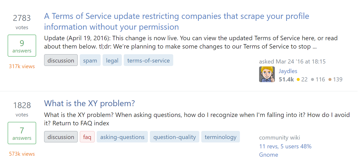
Before
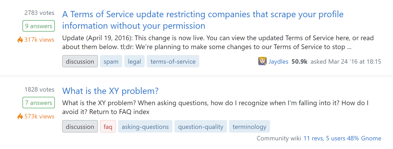
After
What we’re shipping later
In addition to greatest hits, we’re aiming to roll this new design out site-wide. The areas we’re concentrating on first are the main areas of the site that still have mobile-only layouts. As we remove our final mobile views, we need to ensure that the remaining responsive views actually look good on smaller screens. More specifically, the following high traffic views are next on our list:
Work on these screens has progressed fairly far already due to most of the necessary work being in the creation and implementation of the underlying component. However, we’ve decided to hold off on the rollout until after the community has had an opportunity for processing the design changes and to offer us feedback.
Eventually, everything will be the new post-summary design, but it may be some time before the changes reach the long tail of our many different views.
Where we are currently using this design
Despite my claims above that this is a “new” design, we’ve been using it in a number of places across the site for quite some time. A (non-inclusive) list of places that are already using the post-summary design:
- Many various places in Teams and Collectives
- Review queue tasks
- New user activity screens, such as bookmarks and questions
Why we’re making these changes
Our current designs have withstood the test of time, but they fall short in many areas:
- We generally assume 3 items of metadata: score, answers, and views. If we want to add new entries for e.g. bookmarks or revisions, it can be difficult to create a consistent layout in a list of questions.
- Inconsistencies in implementation have led to several different layouts across the site. When gathering requirements for a unified post summary component, we found at least 5 (five!) different layouts.
- Scaling the design is tricky, both in window size and adding features and functionality. We need to support all sorts of metadata on all sorts of devices.
- Our post summaries were only designed to support questions (and answers, kinda). We need to be able to display various content types in single lists. For example, in a list of notifications, we may want to present an article next to a question.
- We have no unified place to put an action menu.
Our new post-summary design solves these problems while supporting future features we’re exploring. Some features we’re looking forward to are:
- An arbitrary, scalable number of stats
- Multiple different content types
- A consistent location for post actions
- Scalable excerpts
- Responsive layouts
- A single consistent layout regardless of what data is included
How this component was designed
An early version of this component first appeared in Stack Overflow for Teams in a feature called For You. For You is a rich list of notifications that include questions, answers, and articles.
The existing designs were desirable for familiarity, but just weren’t well suited for the task. After the initial proposal and some iterations with our team of designers, the new post summary design was ready for user testing.
User testing was run with ~170 recently active users against 5 different versions of the post summary design (two of those being existing designs). The chosen design performed better than the existing designs in some metrics (including readability) and never worse on the remaining metrics (including familiarity, data absorption).
After this new design tested well, the design systems team gathered further requirements from across the organization and built it out as an official Stacks component. If you’re technically inclined, you can see some of the iterations in various open source pull requests.
If you’re familiar with the design tool Figma, feel free to check out some explorations prior to us moving into code.
FAQ
Q: What if I find a bug/regression?
A: Report it as an answer to this post - one bug per answer please. If you’re feeling charitable, add a [tag:bug] tag to the top of your post so we can more easily find it.
Q: What if I have constructive feedback, but it isn’t a bug?
A: We’d like to hear it! Add it as an answer on this post. As above, you can add a [tag:discussion] tag to the top of the post as well.
Q: When will FAVORITE_SCREEN be migrated to use this new design?
A: 6-8 weeks