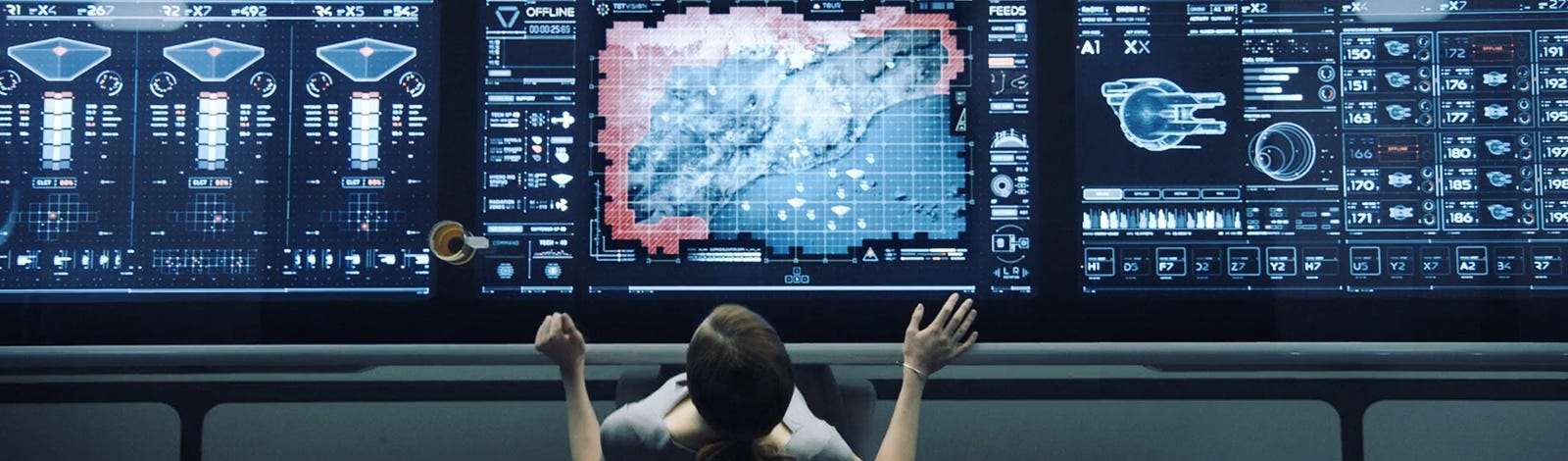
As a designer, I loooove everything related to production design in films. Well, I say “designer,” but long before I studied Applied Arts, I was already fascinated by it, I just didn’t have the vocabulary to describe what I loved so much.
I mean it. Sets, costumes, props, graphic design, and Fictional User Interfaces (FUI). Yes, even (especially?) FUIs. Those interfaces created specifically for a film’s universe, sometimes visible for only a few seconds on screen, yet enough to leave me completely mesmerized, and inspire me to write a whole series of articles celebrating production design and fictional interfaces.
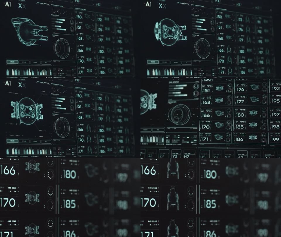
You’ll find them everywhere in science fiction and action films (especially Hollywood productions). They’ve almost become part of the scenery. After all, if you want your audience to believe they’re looking at the future, what’s more effective than a dark-mode interface covered in glowing cyan graphics?
Yet in some films, these FUIs do much more than decorate the background. They provide information, and sometimes tell an entire story in just a few seconds. The most fascinating part? We barely notice they’re doing it. The designers behind these interfaces rely on visual conventions we’ve all internalized almost universally understood.
Here’s an example:
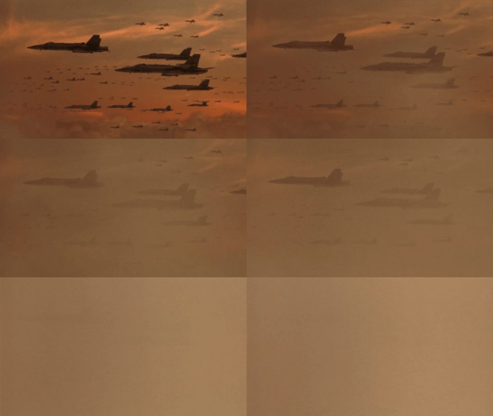
In Independence Day (1996), after the alien attacks on Los Angeles, New York, and Washington, the United States launches its first counteroffensive: a massive air assault. Many fighter jets appear on screen and a command center coordinates the operation through a fleet management interface displaying a series of simplified green fighter jet icons.
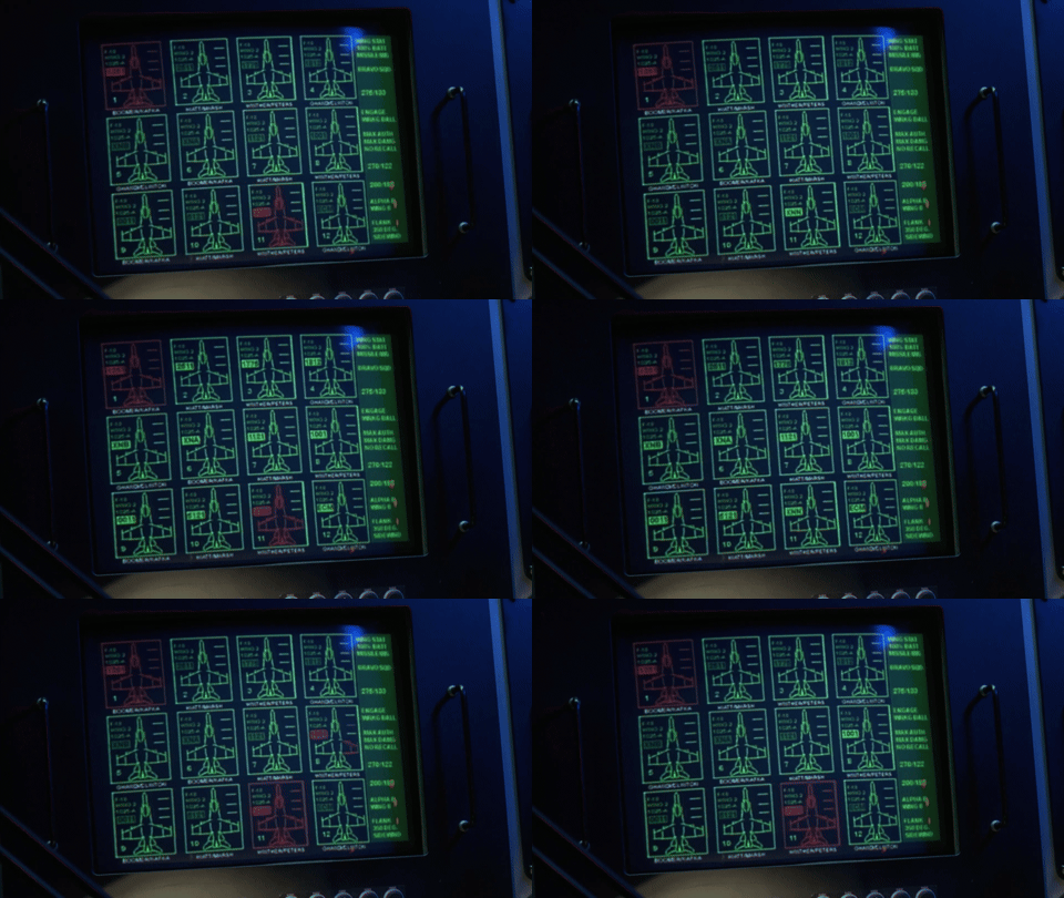
As the battle unfolds, those icons gradually turn red.
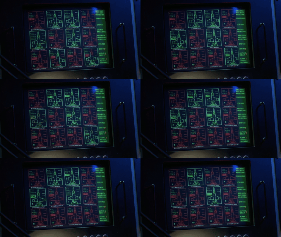
Within seconds, the audience understands that very few pilots will survive the assault, without actually watching hundreds of aircraft being destroyed.
Here, the FUI becomes an incredibly efficient tool for narrative compression… but we’ll come back to that.
This type of interface belongs to a specific family of FUIs: tracking interfaces. Their role isn’t simply to display information, they tell a story through data.
The primary purpose of a tracking interface is to make invisible information visible: telemetry, status changes, positions,… A countless data points transformed into visual storytelling in a movie.
In Jurassic World (2015), after the Indominus Rex escapes, the park’s security team is dispatched to contain it, with all the diplomacy one can reasonably expect in that kind of situation.
As the unit advances on the field, the control room monitors them on a giant display. Each team member is represented by a status card showing a portrait, name, rank, ID number, and heart rate.
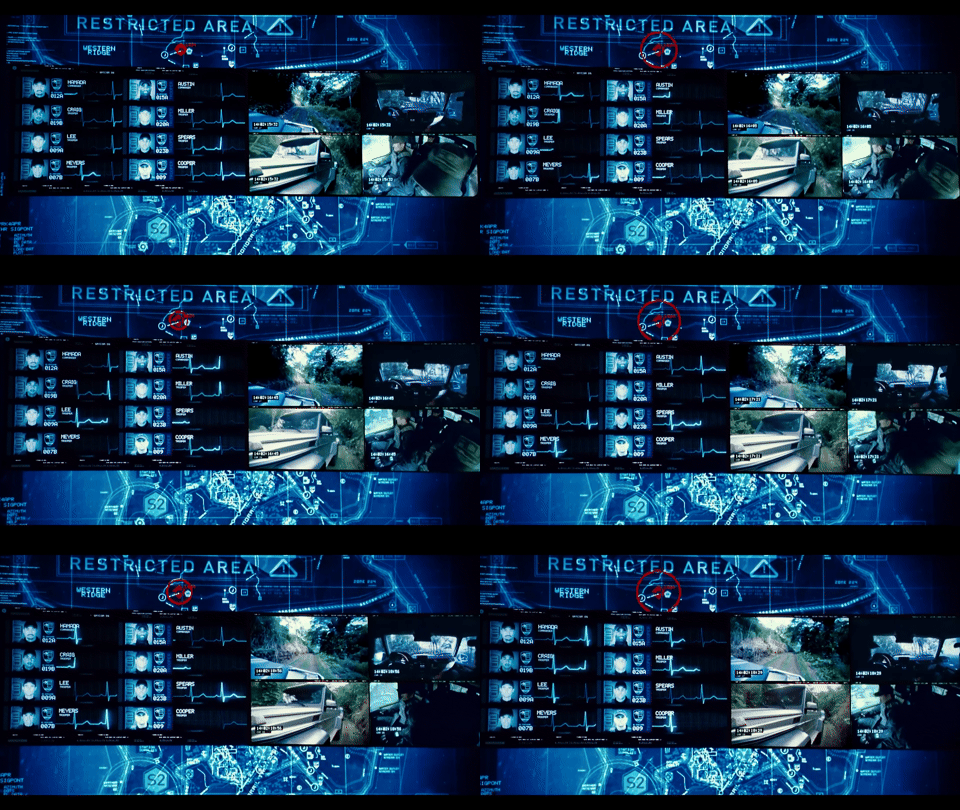
Interestingly, the interface only displays eight agents, even though more are actually deployed. Just like Independence Day, which only shows twelve fighters despite hundreds participating in the battle, the goal isn’t completeness, it’s immediate readability: there are just enough elements to suggest individual tracking without cluttering the screen.
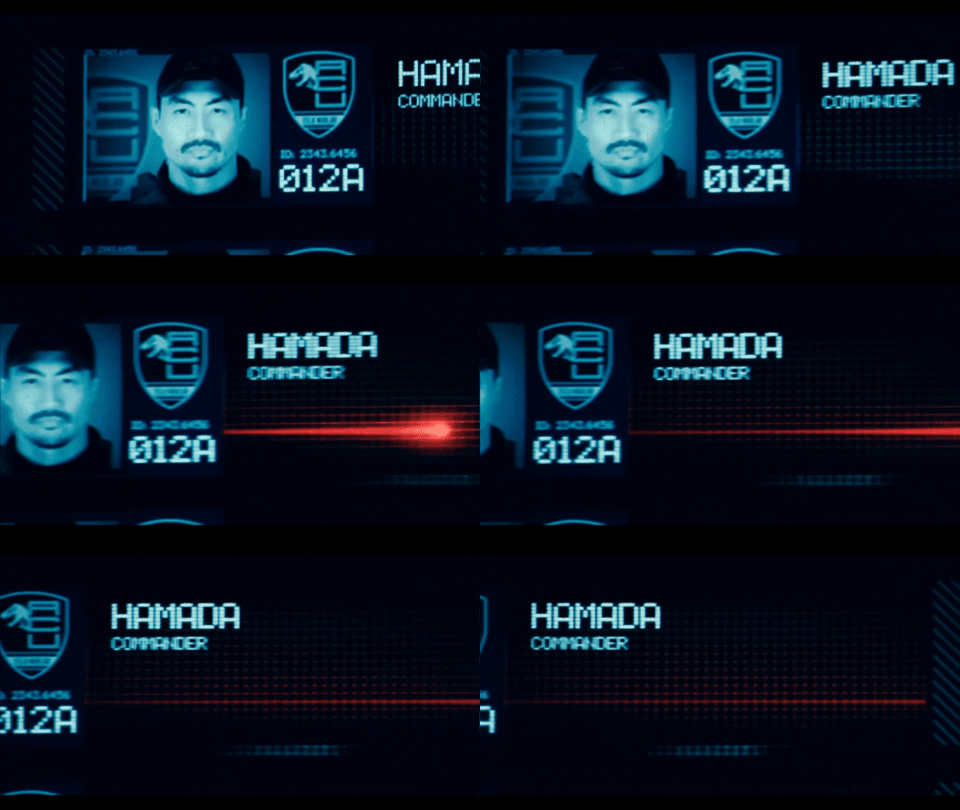
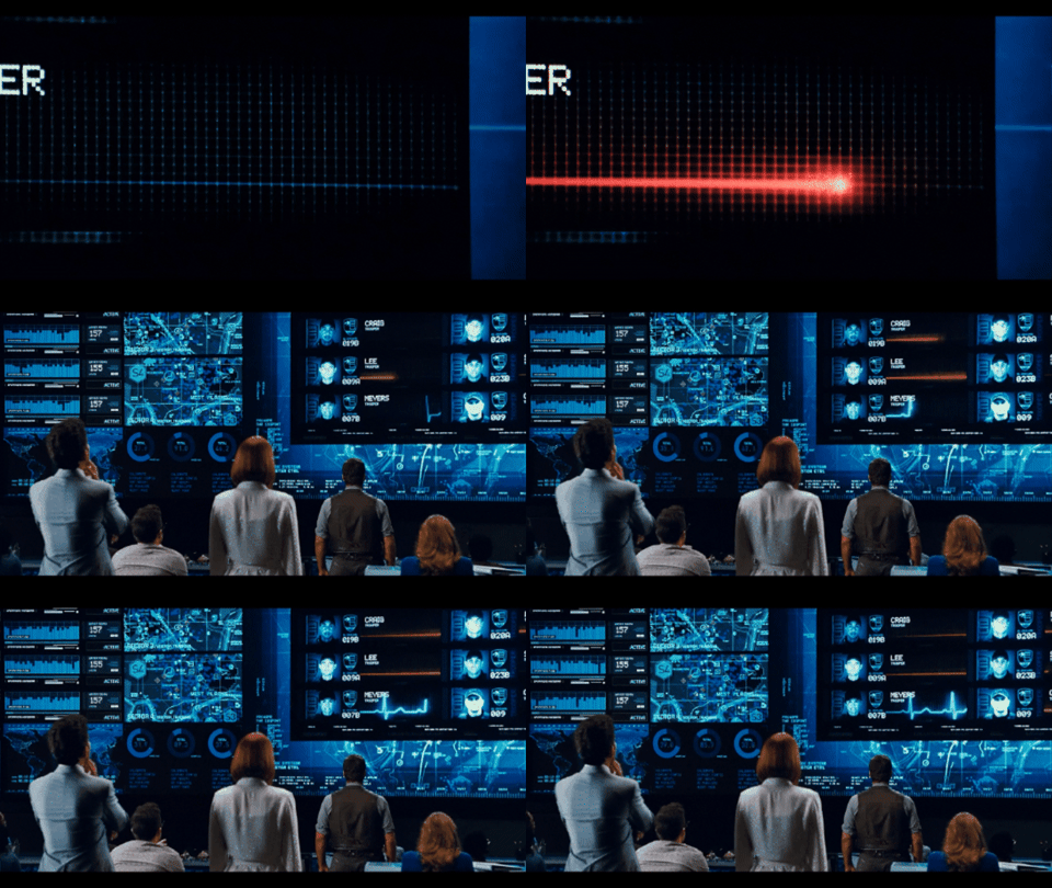
Then, events unfolded in rapid succession. And as expected… The dinosaur wasn’t very cooperative. The agents disappear one after another, beginning with Commander Hamada. Although the film directly shows his death, the interface confirms it for both the control room operators and the audience through unmistakable visual language: his heart rate flattens into a straight red line, accompanied by the familiar continuous tone. A universal visual code that needs no explanation.
Red gradually spreads across the remaining status panels, contrasting sharply with the interface’s otherwise blue palette. Even in a one-second glimpse, the audience already understands the mission has failed.
FUIs also make complex systems instantly understandable.
Neither you nor I are engineers aboard an interstellar spacecraft, yet these interfaces allow us to grasp what’s happening almost immediately.
In Passengers (2016), a holographic schematic of the Avalon provides a real-time overview of the ship’s condition.
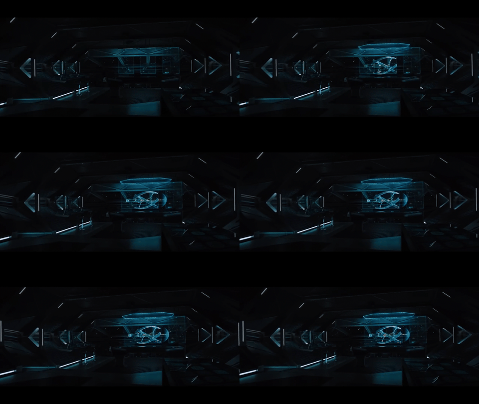
The ship enters an asteroid field. To minimize damage, power is automatically rerouted toward the forward shields. Animated arrows illustrate the energy flow, while the forward shield turns red to indicate the increasing pressure from incoming impacts.
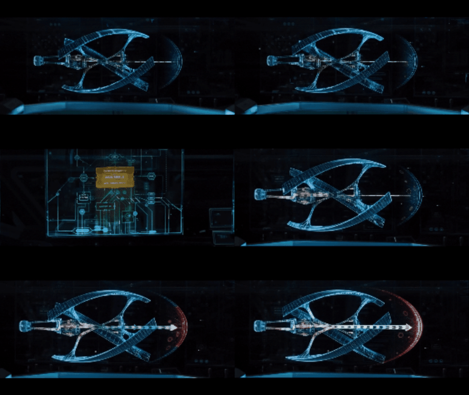
In just a few seconds, three animated arrows and a simple color change are enough to explain a highly technical process.
Unfortunately, one asteroid ignores the enhanced shield and strikes the Avalon directly. A cascade of pop-up alerts appears across the ship’s schematic: warnings, damaged sections, failing modules. Individually, the messages are barely readable, but together, they communicate everything we need to know.
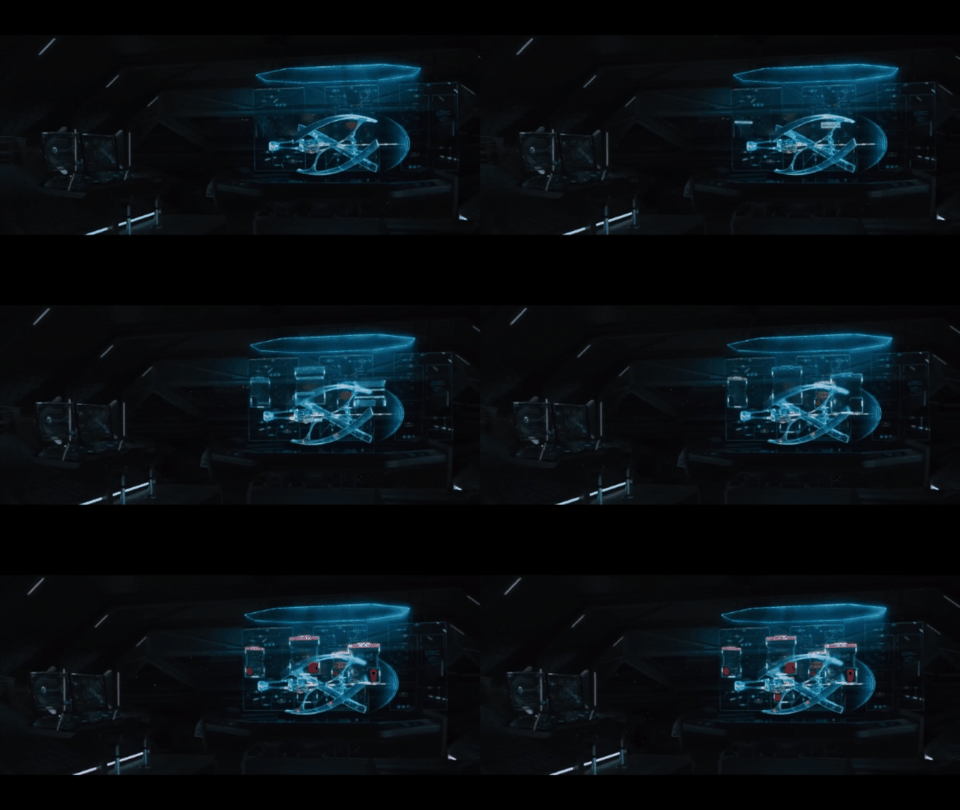
Notifications switch from red to green as systems are repaired… only for new alerts to appear elsewhere. As the film progresses, the schematic becomes increasingly covered in failures.
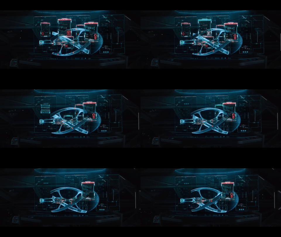
No technical explanation is necessary. Visually, the audience understands that the situation is getting worse.
These interfaces usually appear inside command centers or operations rooms.
They allow the film to shift from the perspective of those experiencing the action to those observing and analyzing it. Instead of following the soldier, the pilot, or the protagonist directly, we watch the people trying to make sense of the situation from a control room.
In Battleship (2012), five alien vessels arrive on Earth. (Again? At this point it’s practically harassment!)
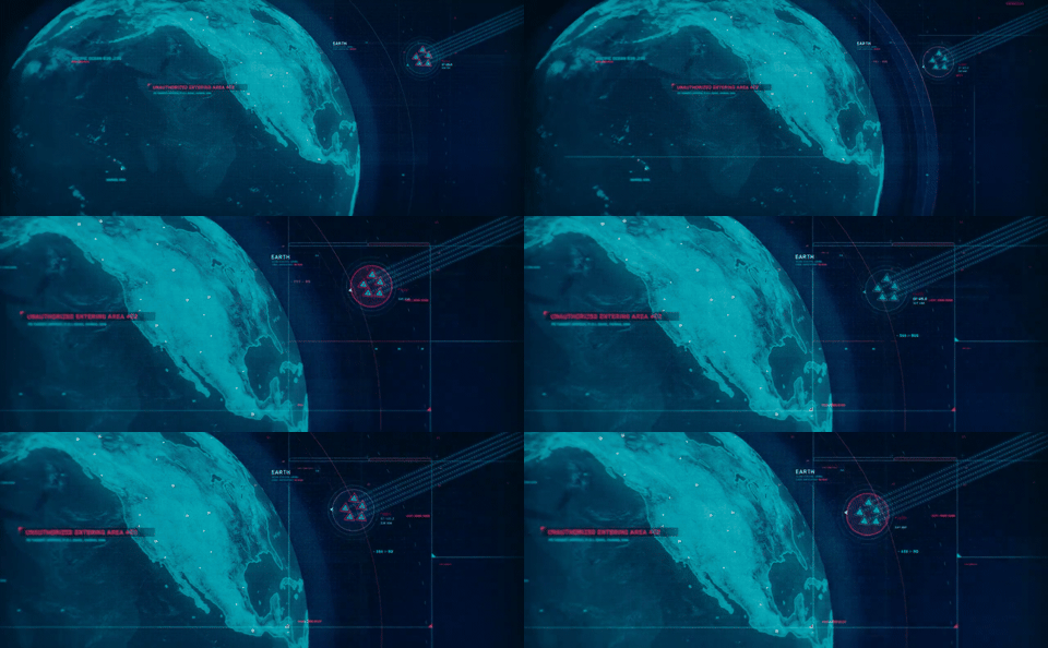
On displays at SETI, NASA, and the Air Force, five triangles appear. One collides with a satellite, immediately starts flashing red, and crashes into Hong Kong.
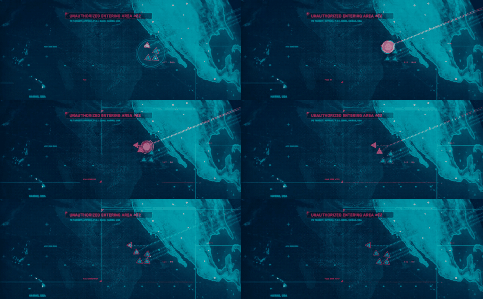
The interface traces their trajectories toward Earth and Hawaii using simplified maps that instantly contextualize the threat.
We are as interested in the data as we are in the human reactions to that data: scientists thrown off balance, military personnel calculating, operators under strain.
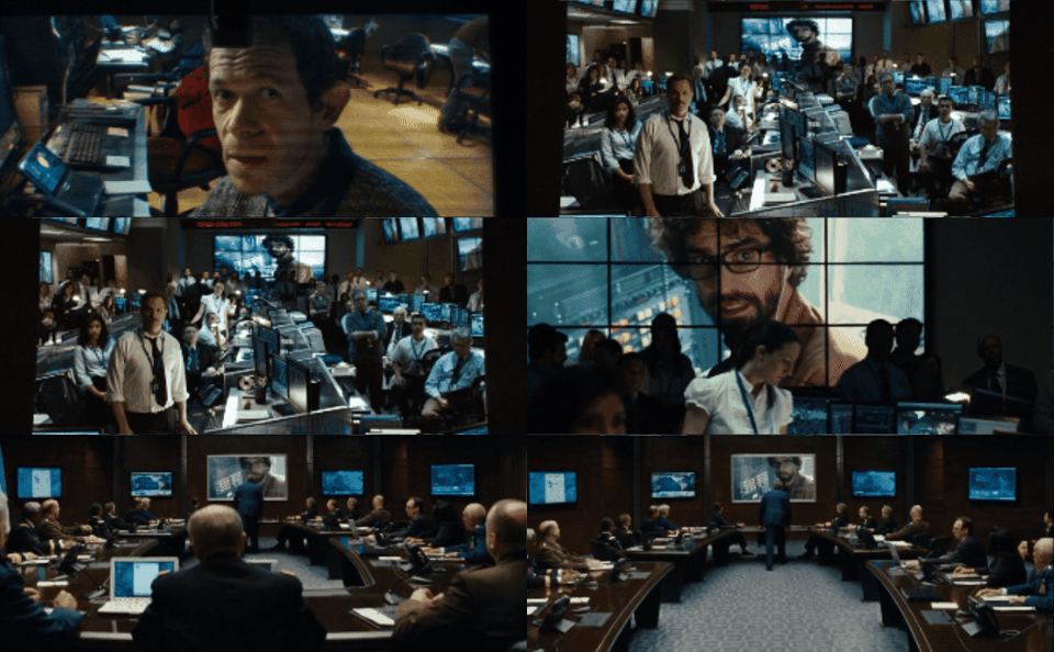
Understanding a situation is one thing. Deciding what to do about it is another.
An interface doesn’t merely inform, it drives action.
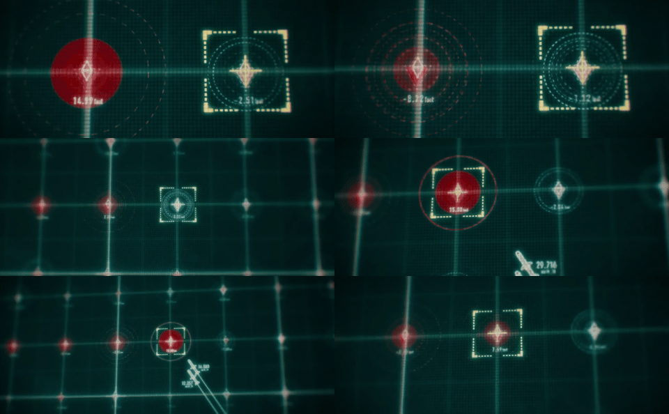
Still in Battleship, the crew aboard the USS John Paul Jones uses tsunami warning buoys to detect an otherwise invisible alien vessel.
The buoy data is displayed on a gridded interface reminiscent of the board game that inspired the film. Every activated buoy triggers visual feedback: animations, zooms, and color changes.
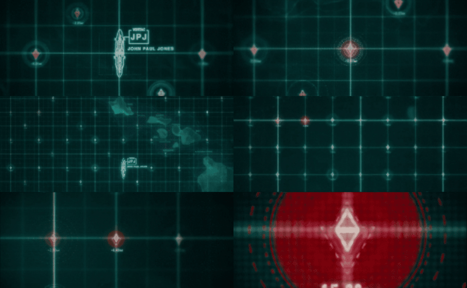
As more data is collected, the crew predicts the enemy ship’s location and feeds firing coordinates to the battleship’s artillery.
The data becomes action.
FUIs aren’t realistic. They’re readable.
In Passengers, most of the displayed systems are technically meaningless to the audience, and that’s entirely the point.
Labels are often unreadable, technologies are fictional, and processes are heavily simplified. Yet within seconds, we understand:
the ship’s current condition;
the severity of the situation;
and how it’s evolving.
As designers, we recognize these choices: color, visual hierarchy, radical simplification, purposeful animation, and schematic representation.
Everything is designed with a single objective: to make complex information instantly understandable.
Tracking interfaces are among the most effective storytelling devices in science fiction and action cinema. Far more than decorative set dressing, they can narrate entire events through visual data alone. Sometimes, just a handful of pixels is enough to tell the story of an entire battle.
That said, not every film takes full advantage of them. In many cases, FUIs remain little more than stylish eye candy, with no real narrative purpose, as though their storytelling potential were merely a decorative bonus.
Others, however, make remarkably intelligent use of these display systems… even if the films themselves aren’t exactly flawless from a screenwriting perspective.
But that’s hardly a problem for the fan in me. When in doubt, I’ll always end up pausing the movie just to admire the UI, no matter what!
This article was originally published in French on my blog.