Last Friday night in a pub in Islington, I met with three old friends - none of us English, all in our mid-to-late twenties, all LSE MSc grads, all somehow living within a few streets of each other. It felt like a coincidence when we realised. But maybe it wasn’t.
What if segregation today doesn’t look like fences or riots - but like us? What if it’s about who shares your coffee queue, your running route and your algorithm? Segregation now isn’t about walls - it’s about worlds. The trouble is, our data still look for walls. We measure diversity in ten year census snapshots, in neat census polygons, pretending people don’t cross streets or scroll feeds. The official numbers count where you sleep, not where you socialise and commute. They were designed for the Britain of 1951, not the one of Deliveroo, Zoom, and ever-rising London rents. So when the headline data tell us segregation is falling, perhaps they’re capturing the wrong kind of closeness. Let’s explore.
Collecting data
I built a dataset using the 2001, 2011, and 2021 UK censuses to track how segregated Britain has become across ethnicity, education, and class. To my knowledge, census data is the only data that reliably offers LSOA-level detail on all three. For the non ONS UK data crowd: LSOAs (Lower-Layer Super Output Areas) are tiny neighbourhoods of roughly 1,500 residents - to my knowledge the smallest units available that make social geography visible. (Btw, dear ONS: next time, please release an aggregated file. Merging three censuses with different indices, naming conventions, and column structures was, let’s say, “educational”…) Fun fact: the final merge script ran for 19 minutes.
Using this freshly cleaned dataset, I computed a Composite Segregation Index on a 0-1 scale - combining unevenness in ethnicity, education, and class into one measure of multidimensional spatial sorting. A score of 1 indicates areas that are highly homogeneous and diverge sharply from the national average, while 0 represents neighbourhoods whose social make-up closely mirrors the country as a whole. The (normalised!) results are below.
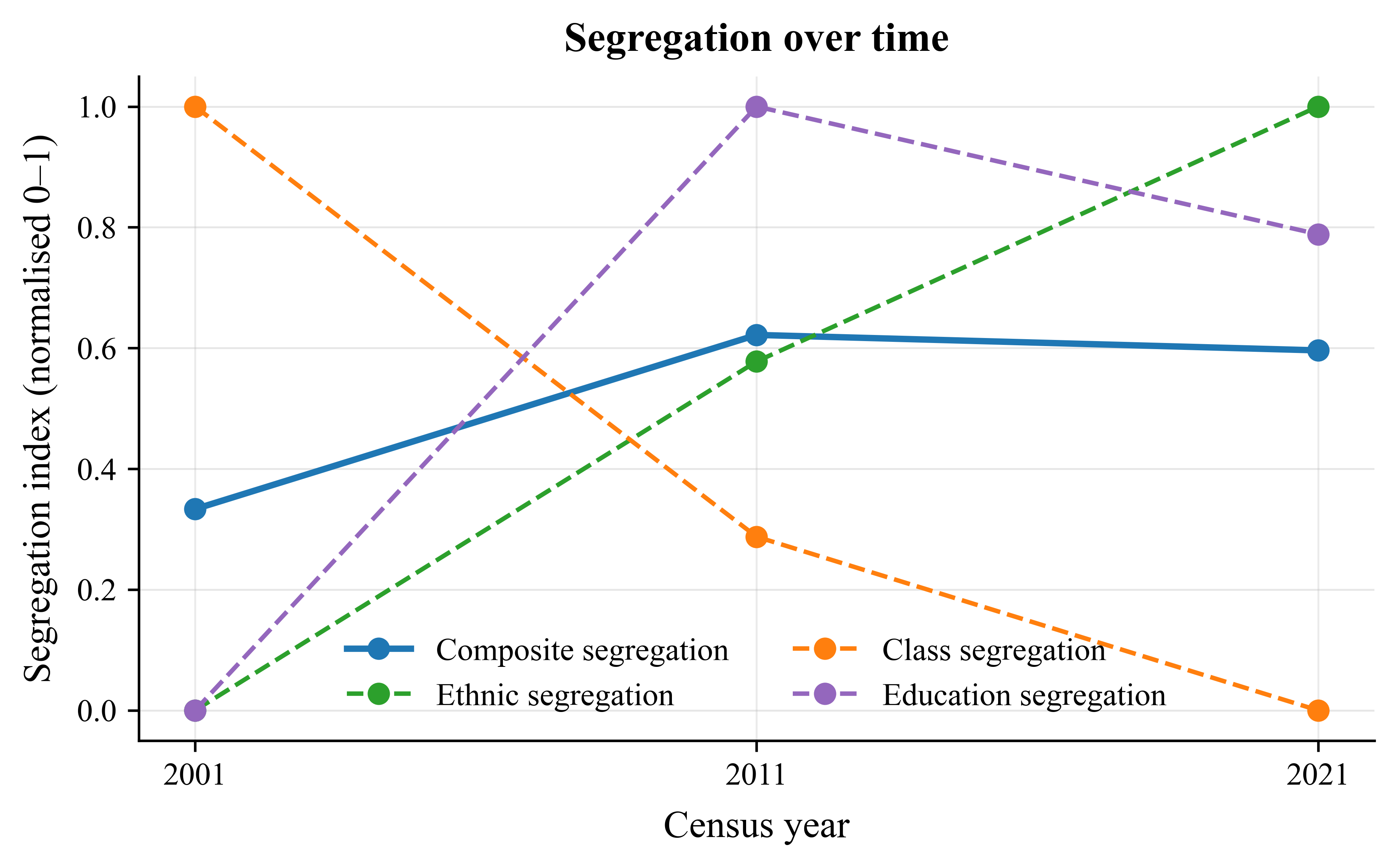
Between 2001 and 2011, segregation rose sharply and has since plateaued. Class segregation fell, ethnic segregation grew, and education-based segregation stayed high. In other words, we’ve mixed more by income, but sorted more by ethnicity and credentials.
Zooming in, the geography of segregation sharpens. For visualisation aesthetics - which, in my opinion, should count for at least 40% of every academic decision - I used quintiles.
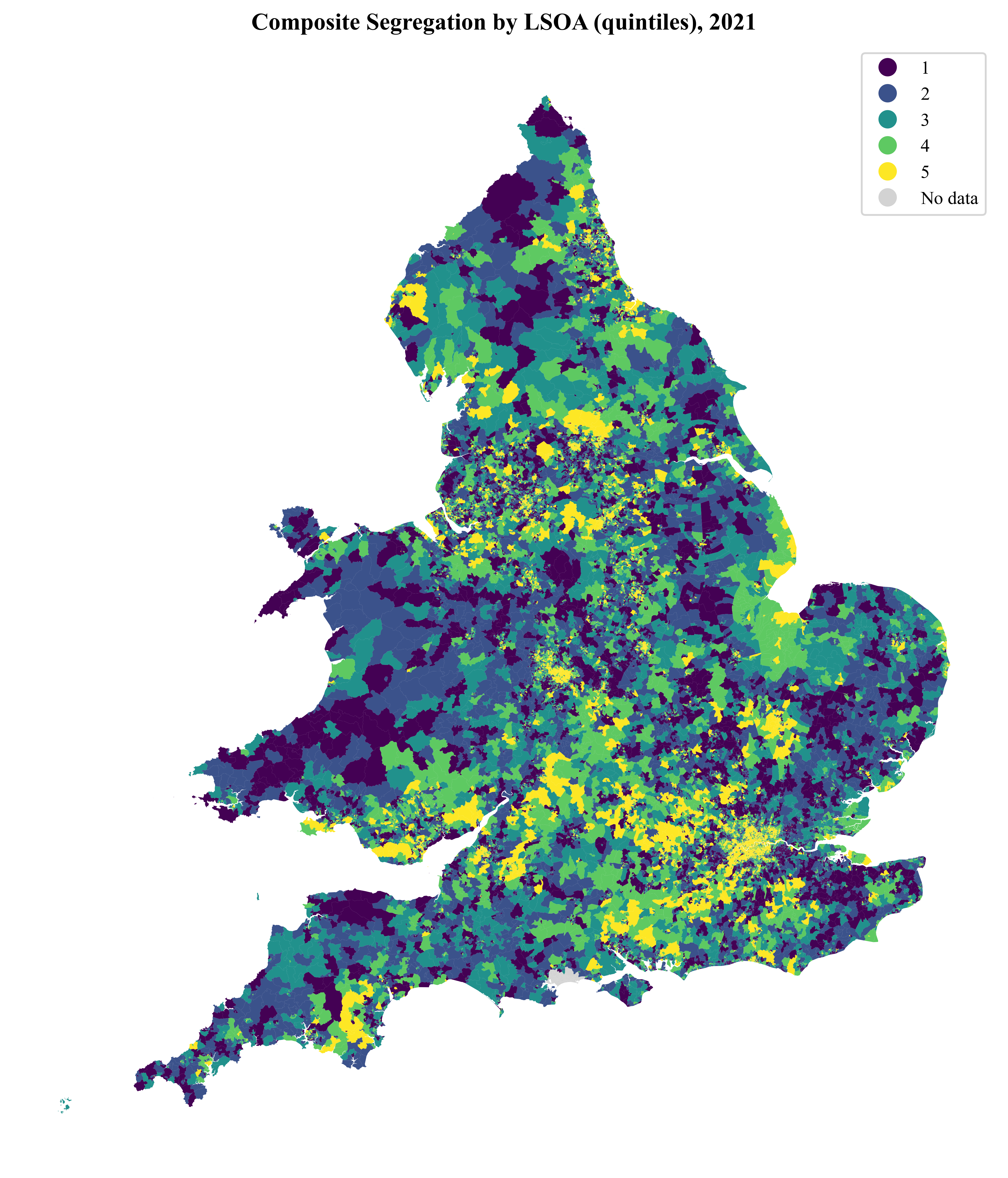
The 2021 map reveals where Britain’s social distinctiveness concentrates. Lightest areas - Islington, Southwark, parts of Manchester and Leicester - are sorted. So, the fact that me and my friends all live together in an Islington LSOA is proof that we as roughly the same class and educational group are very segregated from others (I’d add ethnicity here too, but I only discovered today that in the UK census I’d need to additionally tick “Mixed or Other - Arab” since I’m ethnically half Lebanese. The joy of growing up in the Netherlands, where nobody ever asked what box you fit into…).
But let’s take a step back and not just trust what I’ve spun up in my VS Code console at face value.
How Do You Measure Segregation?
Economists and sociologists have spent seventy years trying to quantify something inherently messy, namely, who lives with whom. The first wave of studies emerged in the U.S. during the 1950s to capture racial segregation - when it was literal and still legal. Modern Britain is more complex: multi-ethnic, multi-class, multi-credentialed(? - not sure if that’s a word). The classic formulas strain under that complexity.
But before diving into the technicalities here are two fun facts. Fun fact 1: economists largely ignored segregation until the 1980s - when they realised the math behind inequality and segregation was almost identical. Theil’s entropy index, first used to study income dispersion, quietly became one of sociology’s favourite tools. Fun fact 2: British researchers only started publishing segregation indices in the 1970s - mainly to compare council estates and post-war new towns. Until then, most “segregation” work in the UK was about class rather than race.
Let’s now walk through some core measures:
1. Dissimilarity Index (D) – The Classic Unevenness Measure
\( D = \tfrac{1}{2}\sum_i \Big|\frac{a_i}{A} - \frac{b_i}{B}\Big| \)
Intuition: the share of one group that would need to move to achieve perfect mixing.
Range: 0 = perfectly integrated, 1 = completely segregated. Thus, a high *D* means “degree islands” surrounded by degree deserts.
Most commonly used for: education, i.e., degree-holders vs. everyone else.
This early generation of segregation index treated segregation as binary and spatially static. The Dissimilarity Index can’t handle beyond binary cut-offs: for G groups, you need G(G−1)/2 pairwise D-scores, and weighting them is arbitrary. Then, in the early 2000s, two sociologists Sean Reardon and Glenn Firebaugh (2002) introduced information-theoretic measures like the Entropy and Divergence indices. These could capture multi-group segregation, treating each group’s share as a contribution to an overall diversity measure:
2. Divergence Index (Dᵣ) – The Information-Theory Upgrade
\(D_R = \sum_i \frac{t_i}{T}\sum_g p_{ig}\ln\!\left(\frac{p_{ig}}{P_g}\right)\)
Intuition: how much each area’s composition diverges from the national average - basically a Kullback–Leibler divergence.
Range: ≥ 0, often normalised to [0, 1].
Most commonly used for: ethnicity and social class (NS-SEC).
This formula, borrowed from information theory, reframed segregation as a loss of diversity - a reduction in diversity relative to the national benchmark.
However, if we want a summary measure of how much overall diversity is between vs. within areas, rather than how different it is from a a national average, we need a different measure, namely:
3. Entropy Index (H) – Segregation as Lost Diversity
\(H = \frac{E_T - \sum_i (t_i/T)E_i}{E_T}, \quad \text{where } E_i = -\sum_g p_{ig}\ln(p_{ig}) \)
Interpretation: the share of total diversity that occurs between areas rather than within them.
Fun fact: It’s mathematically the same entropy used in thermodynamics - segregation as a kind of social order.
Yet even these advances stayed one-dimensional: one index per variable (race, class, education). They rarely asked what happens when these hierarchies align.
That’s where my approach comes in.
The Composite Segregation Index I propose combines three domains - ethnicity, class, and education - each measured through its own entropy or divergence-based unevenness, and scales them to a common 0-1 range. Averaged together, they form a measure of multi-dimensional alignment.
4. My Composite Segregation Index
Each dimension operates on a different scale, so I rescaled and normalised them to [0, 1] within each year and took their simple average:
\(S_t = \tfrac{1}{3}(D^*_{eth,t} + D^*_{class,t} + D^*_{edu,t})\)
Higher values mean the same areas concentrate high education, high income, and certain ethnic groups.
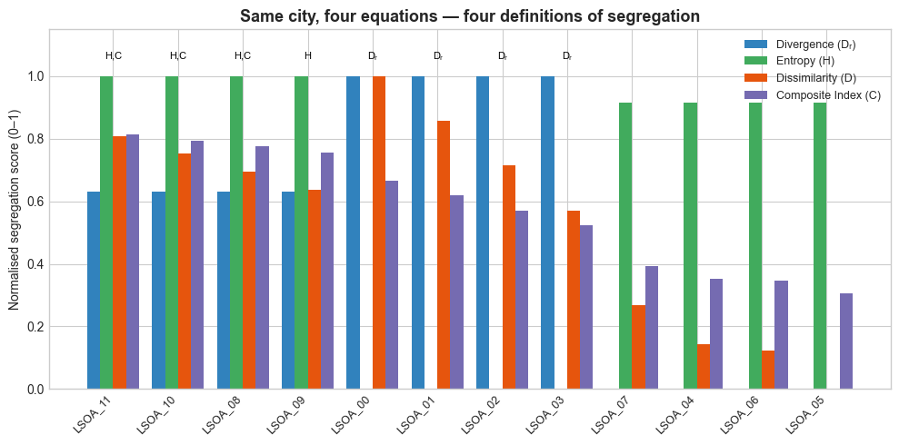
But does it really matter which index you take? Short answer: yes. Academia likes to pretend equations are objective, but every formula is a mirror. It reflects what you think matters. Or perhaps more unconventionally said: segregation indices are like horoscopes: everyone has a favourite, and they all claim to explain the world.
The figure below compares the indices. Each bar represents how “segregated” the same twelve neighbourhoods appear. The Dissimilarity Index mostly flags deprived, low-education areas; the Entropy Index highlights homogeneous, low diversity enclaves; the Divergence Index captures any area that looks “atypical” compared to the national average - including wealthy, monocultural ones. The Composite Index, in contrast, identifies places where ethnicity, class, and education all align - clusters of both privilege and disadvantage. The figure shows that the choice of index doesn’t just change the score; it changes the story.
The Field’s Big Problems
Despite all the math and using a composite index, the measurement of segregation is still not straightforward. Here’s why:
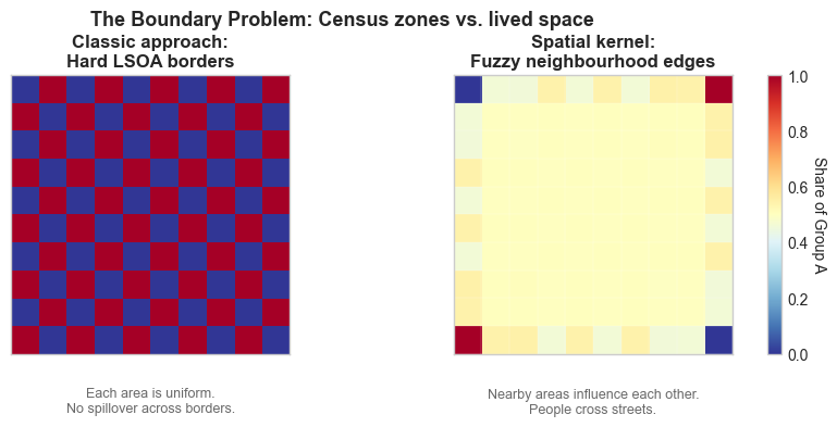
1. The Boundary Problem
Census areas are administrative, not lived. The Dissimilarity Index assumes impermeable borders: you either live in one LSOA or another, no middle ground. Yet real life is fuzzy - people cross streets, commute, and mingle. Geographers like O’Sullivan & Wong (2007) proposed spatial kernels that weight nearby neighbourhoods by distance, smoothing sharp boundaries. Economists rarely adopt this because it complicates inference - but the result is that we’re still modelling social life as a checkerboard.
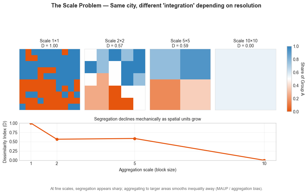
2. The Scale Problem
Segregation depends on the spatial scale you choose. A city can look integrated at the regional level and deeply segregated at the block level. Sociologists call this the modifiable areal unit problem (MAUP). Economists call it “aggregation bias.” It’s the same mathematical sin - we pretend one spatial scale fits all.
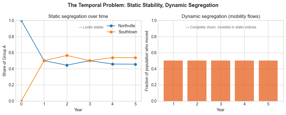
The Temporal Problem
We tend to freeze segregation as a cross-section. But neighbourhoods churn: people move, age, or are priced out. Dynamic segregation, i.e., the flows rather than stocks - remains mostly invisible. Economists have the panel tools, but not the micro-spatial data; geographers have the maps, but not the identification strategies.
Thus, even the best indices can’t capture that:
Living together doesn’t equal interaction. Walk through a “mixed” borough like Tower Hamlets or Camden and you’ll meet Bangladeshi families, French expats, and Polish professionals within the same postcode - yet rarely crossing social or economic boundaries. Indices treat that as integration; in reality, it’s proximity without interaction. Sociologists call this superficial diversity: everyone is present, but few are connected. That’s why cities like London can be both hyper-diverse and socially stratified. Our metrics conflate coexistence with cohesion.
Mobility: segregation can fall statistically while social mobility collapses. If higher-income households move into deprived areas and displace lower-income residents, the census will record more “mixing” - even as inequality deepens.
In other words, gentrification looks like integration in the data. Static indices can’t tell if neighbourhood change reflects inclusion or replacement. Economists call this the compositional fallacy: confusing a population’s makeup with its trajectory.Networks: social mixing may happen online, not offline. Current segregation metrics can’t see digital mobility or online homophily - yet both shape how ideas, norms, and opportunities circulate. Ignoring this is like studying 21st-century society with 19th-century cartography.
In sum, the composite index tells us who lives near whom - not who lives with whom. Our current data architecture - decennial censuses and coarse spatial units - is not fit for the social realities we’re trying to measure.
Instead, we need to enrich our data:
Higher-frequency microdata capturing population turnover between censuses. Administrative registers (tax, NHS, school) could be safely anonymised and linked for yearly population panels. In my previous post on Economic inequality I also make this call since this problem is even more prominent for measuring economic inequality. Even better: dynamic linkage between census, housing, and mobility datasets. We need to see how neighbourhoods evolve, not just who occupies them at one moment.
Spatially aware surveys that ask who you interact with, not just where you sleep. Imagine a redesigned “Understanding Society” at an LSOA level that records friendship networks, workplaces, and mobility patterns. Meta’s Social Connectedness Atlas is, ironically, the closest we’ve come to that vision - albeit confined to digital networks.
Open APIs for anonymised mobility data to link neighbourhoods to networks. Platforms, telecoms, and transport agencies already collect micro-mobility data at scale. Secure, aggregated access could reveal the functional geography of everyday life - the places people actually share. And yes, Strava, my one and only favourite social network, I’m looking at you - cycling and commuting data could do for mobility what census data did for residence.
Last, I’m still trying to make my mind up about agent based modelling (ABM) to predict how societies further segregate. ABM lets virtual individuals “move” through stylised cities based on income, education, or preferences. The appeal is obvious: you can watch segregation unfold in real time, test how housing markets or school catchments amplify sorting, and see whether small behavioural biases snowball into macro-level divides. It’s social physics at its most seductive. But that’s also the risk. These models can turn rich social processes into oversimplified algorithms - pretending people move like particles when, in reality, they move through stories, identities, and constraints. Perhaps ABMs are more powerful for exploring mechanisms, not predicting futures. They show what could happen, not what will. Still, in a world where our data lag behind reality, maybe simulation is the next best thing: a sandbox for testing how the invisible lines of class, ethnicity, and education might thicken - or blur - in the decades ahead. I’m not sure yet - but perhaps intrigued enough to soon open VS code and start modelling with some sketchy arbitrary priors…
For now, perhaps we’ll keep mapping a fluid world with mainly static instruments - measuring twenty-first-century segregation through the eyes of the mid-twentieth. Every dataset I build seems to end with the same conclusion: we need better data. At this point, it’s less a research finding than a personality trait.
Btw, I’m far from being a sociologist - this is my first proper venture into that field - so feedback is more than welcome. Consider this piece a learning exercise: an curious political economist wandering into sociology’s terrain.