Dean Rovang · substack.com/@deanrovang · ORCID: 0009-0006-1351-5320
In my preceding essay I argued that today’s combination of atmospheric CO₂ and global temperature is unprecedented in 66 million years. That argument rests on a single diagram placing three independent climate records on common axes. This post does two things: it strengthens that diagram by adding the actual data points behind the deep-time equilibrium curve, and it defends the choice of ice age dataset by comparing it against three independent reconstructions of the same 800,000 years.
The conclusion comes first. The methodology follows for those who want it.
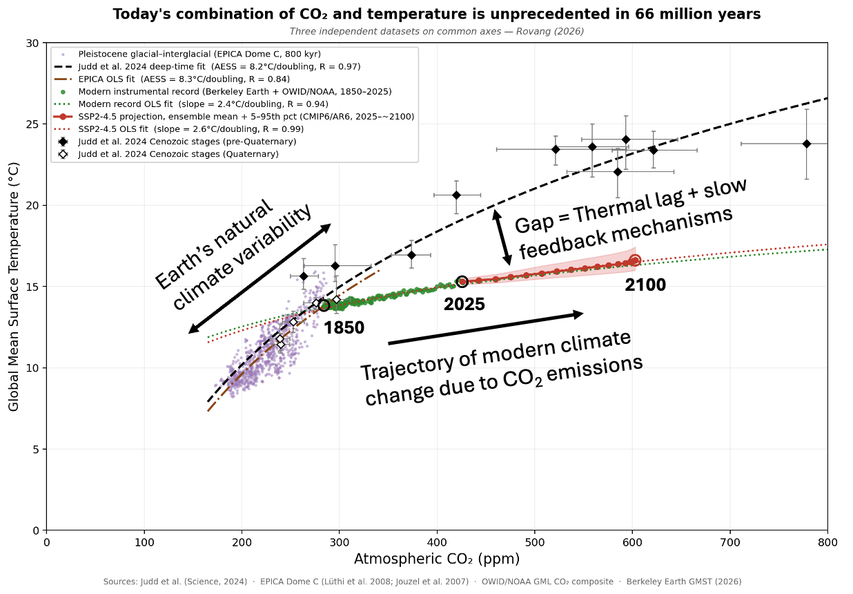
Figure 1. Four independent climate datasets on common CO₂–temperature axes. Black dashed line and solid diamonds: Judd et al. (2024) deep-time equilibrium fit and Cenozoic stage data (S = 8.2°C/doubling, R = 0.97). Open diamonds: Quaternary stages (the most recent 2.6 million years) from the same dataset. Purple cloud and brown dash-dot line: EPICA Dome C ice age record and OLS fit (S = 8.3°C/doubling, R = 0.84). Green circles: modern instrumental record 1850–2025. Red line and band: SSP2-4.5 projection 2025–2100 with 5–95th percentile range. Open circles mark 1850, 2025, and ~2100.
The diagram makes three arguments simultaneously.
First, the Judd data points land on the EPICA cloud. The black diamonds are not a theoretical construction — they are 22 actual geological time periods, each a measured estimate of past CO₂ and global temperature derived from hundreds of proxy records spanning 66 million years. The Quaternary stages (open diamonds) — the most recent ice-age epoch, covering the past 2.6 million years — overlap directly with the purple ice age cloud derived from a single Antarctic ice core. Two completely independent archives, different methods, different timescales, same relationship.
Second, the deep-time fit and the ice age fit are nearly parallel. The dashed black line (Judd, 8.2°C per CO₂ doubling) and the dash-dot brown line (EPICA, 8.3°C per doubling) are essentially the same slope. Nature’s long-run CO₂–temperature relationship, as expressed across 66 million years of geological history, is consistent with the relationship expressed across 800,000 years of Antarctic ice. Both converge on the 1850 hinge point — the moment the industrial era began.
Third, the modern trajectory has no precedent. At 1850, the green circles depart from the natural relationship and move rightward — CO₂ rising rapidly while temperature lags behind. By 2025 the system sits well below the equilibrium curve, in a region of CO₂–temperature space that has no analog in 66 million years. The red SSP2-4.5 (Shared Socioeconomic Pathway 2, intermediate emissions scenario) trajectory extends this departure through 2100: CO₂ continues climbing while temperature rises more slowly, so at any given CO₂ concentration the gap between where we are and where the equilibrium curve sits keeps growing. The system is not moving toward Earth’s natural relationship between CO₂ and temperature. It is moving further from it.
If you are satisfied with the diagram and the three arguments above, you can stop here. What follows is the methodology behind the choice of ice age dataset — a cross-check against two more recent Pleistocene reconstructions, with a note about what the comparison reveals.
The ice age cloud in Figure 1 comes from the EPICA (European Project for Ice Coring in Antarctica) Dome C ice core — a record of local Antarctic temperature (from hydrogen isotope ratios in the ice) and atmospheric CO₂ (from ancient air bubbles), scaled to global mean surface temperature using a factor of 0.55. A fair question is whether this dataset was chosen because it made the diagram look the way I wanted. The answer is no — and here is the test.
Two independent reconstructions cover the same 800,000-year period. Snyder (2016) used 61 marine sediment cores in a Bayesian global temperature stack. Clark et al. (2024) used 111 marine sediment cores in an area-weighted reconstruction — the most recent and comprehensive Pleistocene GMST dataset available. Both use a different archive (ocean sediments vs. Antarctic ice), different proxies, and different research groups. The one thing all three share is the CO₂ record: the Bereiter et al. (2015) composite of eight Antarctic ice cores, the best available for this period. Figure 2 shows the comparison, using both ordinary least squares (OLS) regression and the more rigorous York/ODR (Orthogonal Distance Regression) method, which accounts for measurement uncertainty in both variables simultaneously. Hereafter I refer to the latter simply as York.
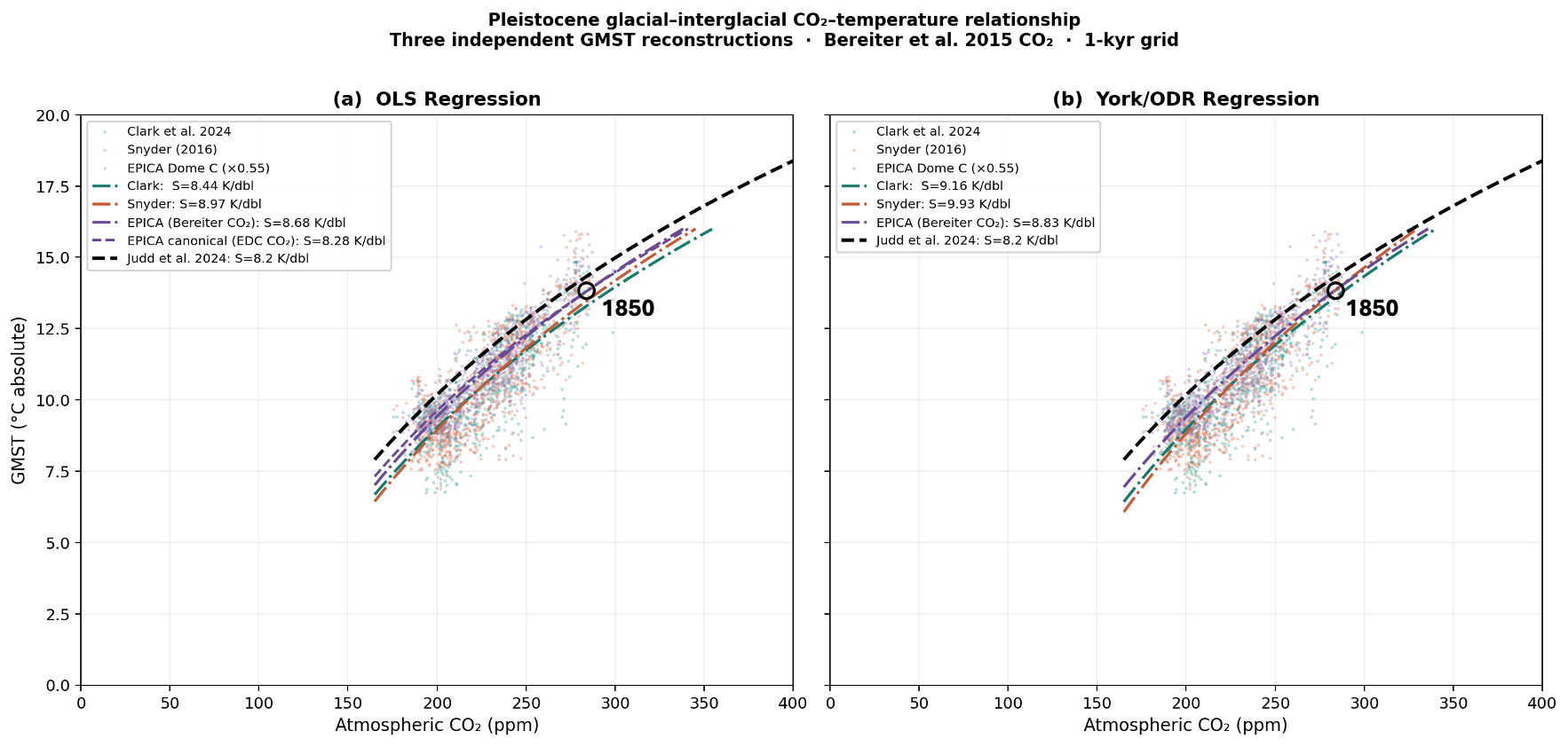
Figure 2. Three independent Pleistocene GMST reconstructions on common axes. Panel (a): OLS regression, the standard method that minimizes vertical distance from the fit line. Panel (b): York — a more rigorous method that minimizes distances perpendicular to the fit line rather than just vertical distances, properly accounting for measurement uncertainty in both CO₂ and temperature simultaneously. All datasets use Bereiter et al. (2015) CO₂, anchored to Berkeley Earth 1850 (13.83°C). The Judd deep-time curve is shown in both panels. The open circle marks 1850. In panel (a) the purple dashed line shows the canonical EPICA OLS fit using the original EPICA Dome C CO₂ source rather than the Bereiter composite; the difference illustrates the effect of CO₂ source on slope.
Across both methods, all three reconstructions sit in the same tier as the Judd deep-time curve, all slightly above it. The slopes range from 8.3 to 9.9 K/doubling depending on dataset and method. The canonical EPICA value of 8.3 K/doubling is the most conservative estimate in the set. Substituting Clark or Snyder would move the ice age slope further above Judd, not closer to the modern record. The two-tier structure is robust to every methodological choice examined here.
The slight elevation above Judd’s 8.2 K/doubling is consistent with a 2026 preprint by Cael and colleagues finding that the glacial-interglacial CO₂–temperature slope appears to have increased over the past 800,000 years. The integrated 800-kyr average therefore sits above the longer-run Cenozoic mean. Our cross-check is consistent with that finding.
In the York regression panel, the EPICA and Snyder fit lines converge near the 1850 point. This is not an artifact of anchoring. The anchor establishes the absolute temperature scale, but the slopes are determined entirely by 800,000 years of glacial data. Numerically: the EPICA York fit predicts 13.86°C at 284 ppm; Snyder predicts 13.85°C. The Berkeley Earth 1850 value is 13.83°C. Two independent reconstructions, derived from entirely different archives, converge within 0.03°C of the instrumental record at the one point where geological history meets direct measurement. The 1850 hinge point is not a construction of the diagram. The data finds it.
The claim that today’s CO₂–temperature combination is unprecedented in 66 million years is strengthened, not weakened, by scrutiny. Adding the Judd data points shows the geological stages that anchor the deep-time curve. Cross-checking the ice age record against Clark and Snyder shows all three independent reconstructions tell the same story. And the convergence of independent datasets at 1850 confirms that the hinge point — where natural climate history ends and the industrial era begins — is real.
What the diagram shows is not merely that today’s CO₂ is high. It shows that the Earth’s climate system has a well-established, physics-based response to CO₂ that has operated consistently across 66 million years and eight ice age cycles. That same mechanism is responsible for the increase in temperature due to the rapid increase in CO₂ from anthropogenic emissions. The gap between the modern trajectory and the equilibrium curve represents warming the system has yet to express in response to CO₂ already in the atmosphere. The only way to stop temperatures from continuing to rise and begin closing that gap is to reach net-zero CO₂ emissions. The longer it takes to get there, the longer temperatures will continue to climb, and the greater the cumulative consequences — sea level rise, glacier loss, ocean heat uptake, and the cascading impacts that follow (Zickfeld et al., 2023). The physics does not negotiate on timeline. It only responds to what is in the atmosphere.
Judd et al. (2024). Science, 385, eadk3705. https://doi.org/10.1126/science.adk3705
Clark et al. (2024). Science, 383, 884–890. https://doi.org/10.1126/science.adi1908
Snyder (2016). Nature, 538, 226–228. https://doi.org/10.1038/nature19798
Bereiter et al. (2015). GRL, 42, 542–549. https://doi.org/10.1002/2014GL061957
Jouzel et al. (2007). Science, 317, 793–797. https://doi.org/10.1126/science.1141038
Lüthi et al. (2008). Nature, 453, 379–382. https://doi.org/10.1038/nature06949
Zickfeld et al. (2023). Nature Climate Change, 13, 1298–1305. https://doi.org/10.1038/s41558-023-01862-7
Cael et al. (2026, preprint). ESSOAr. https://doi.org/10.22541/essoar.177075732.26984047/v1
Meinshausen et al. (2020). SSP GHG concentrations. Geosci. Model Dev., 13, 3571–3605. https://doi.org/10.5194/gmd-13-3571-2020
IPCC AR6 WGI SPM temperature data (SSP2-4.5). CEDA archive. https://data.ceda.ac.uk/badc/ar6_wg1/data/spm/spm_08/v20210809
NOAA GML global annual mean CO₂. https://gml.noaa.gov/ccgg/trends/
Berkeley Earth GMST: https://berkeleyearth.org/data/