[Disclaimer: I’m British and trying to talk about the NFL, so it’s pretty likely I’m going to sound like either an idiot or an alien while trying to describe what’s going on here, my only request is that you send abuse using the anonymous field at the bottom which goes straight to my email instead of the comment box which everyone can see]
Imagine walking down the street and someone with a clipboard and a bored expression asks you the question “How many glasses of water did you have in the last week?”. You probably don’t really know the answer, and the person asking doesn’t really give too much of a crap. Maybe you could guess at any number between 30 and 40 glasses of water with an equal amount of belief, but you have to choose a number – are you just as likely to choose 32 as 35?
Maybe not, and in the NFL when the guy with the ball gets tackled or stopped at the end of a run and the officials only get a few seconds and a compromised view to decide where it stops, Will every yard line be treated equally?
What I’ve got: A spreadsheet containing every single play run in the NFL from 2000-2014 (500,000 in all)
What I’m going to do with it: Show that the referees subconsciously change the outcome of a play based on where the painted lines are on a field, and subsequently show that it doesn’t matter.
OK let’s go, first off for the football illiterate, a walkthrough of all the words you won’t know that are important in this post. (skip to next horizontal line if you don’t need me to explain what a play is)
American Football is based on a series of plays. A play is started by the offense taking the ball and either deciding to run with it or pass it to another player down towards the opponent’s endzone. The play finishes when the player holding the ball:
- Is tackled by the defence
- Runs off of the field
- Throws the ball to someone who doesn’t catch it
- Has their motion stopped by the defence.
For 1, 2 and 4 the next play then starts where the ball was when that event happened. However 1 and 4 often look like this:
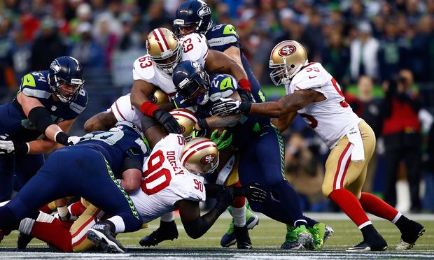
Can you see the ball? You can take some time if you’d like. The situation above usually starts and ends within a second, and the officials (referees to those who follow soccer) need to get the ball and place it down on a yard line within a few seconds. This is the spot of the next play.
Also relevant to our discussion is the gridiron. This is a colloquial way to refer to the markings (required by regulations) on an official NFL field. It look like this:

so in a play you will start at yard x, and go y yards – then on your next play you will start at the x+y yard line – in most cases you will start at a yard line such as 1,2,3,4,…,99 even though the only ones marked out by full lines are 0,5,10,15,..,100. The game of football is then essentially a slow crawl to the opponents end of the field.
Relevant later is the scoring. The two main ways to score are to walk into your opponents endzone (the darker green at the end of the gridiron) – that’s known as a touchdown and is worth 7 points. The second is to be able to kick the ball between the posts at the end of your drive, which is known as a field goal and is worth 3 points.
Okay, I can breathe now safe in the knowledge I haven’t alienated the vast majority of people who might read this. Let’s move on to the interesting part of this post.
The first thing I decided to do when I picked up the spreadsheet with these half a million plays was to ask the question where do plays start from?
So I took every single play in the 14 year dataset, took its starting position and plotted a bar graph. Here it is:

For those of you who realised that my explanation of football above was incomplete, or realise from this graph, an important point is that most of the collections of plays (known as drives) start from the 20 yard line, and the offense can lose the ball if they don’t move it upfield fast enough. This explains both the large peak at the 20 yard line and the smooth decline from 30 down to 100 (the opponents endzone) as the offense has to give the ball to the other team.
In fact, this graph is 90% completely inane and what you might expect. Drives start, some drives finish in midfield (30-60 yard line) and some drives make it all the way to the end (100) in which you have a tense goal line battle (see the peak at your opponents 1st (99th) yard line). What is less easy to explain though is the very sharp peaks which jut out above the smooth curve. I assumed these peaks were my fault and messed around for ages to get rid of them, but I just couldn’t shake them. Then I took this graph and compared it to the lines on a gridiron like so:

Every single one of those staccato sharp peaks occurs on a line which is drawn on the field. This isn’t a small effect, on the 40 yard line this deviation is around about 20%. And it isn’t due to a lack of data, the average deviation from the ‘true’ distribution for a dataset this large should be around 1%, so this is highly statistically significant.
So what could it be? The first thing that came to my mind was that perhaps football teams preferentially run plays which are based around the yard lines. Say instead of just running five yards forward, run to that next line across the field and I’ll chuck it to you. Or maybe there’s a conscious effort by a player to reach for a field line when they see one. Those two sound about reasonable until you consider that if someone was to receive the ball at the 30 yard line, they’re going to run in either direction until they get tackled, which means that a play that was based around the 30 yard line might end up at the 31 yard line, or the runner who is reaching for the 30 yard line might just miss and get the 29. The effect of this on that graph would be to spread out the peak across a few yards, but we instead see a perfectly sharp peak.
The only explanation that has stuck with me is that when a official thinks “oh damn this is a mess, there are seven separate six foot tall millionaires all piled up on top of the ball and I have 100 rules to try and remember, where did that ball stop?” their subconscious makes them grab for the safety blanket of a line drawn and place it down on there.
This is known as Statistical Heaping and is a well known effect for respondents of surveys. It is the act of choosing a number you’re more comfortable with in the range of values you think it might be, is the number between 8 and 12? Just say its 10. For example take this graph of the birth weight of babies in Tanzania taken from this link:
 You see that either you are to believe that the babies weights are being reported as round numbers to save time, or something is happening where you can only produce babies with a multiple of 500 grams.
So if it is true and we’re to believe that the referees are favouring putting the ball on the yard lines – what does it mean? We see that the peaks are far more pronounced by midfield, and when you get closer to the goal line they almost entirely disappear, this makes it seem like the referees are paying closer attention near the goal line because they know it’s more important.
Why is it more important, isn’t a one yard gain a one yard gain? Well to work this out I made a graph of the average amount of points scored based on where the team is on the field. This means that for every yard line I took all drives that had at least one play that started on that yard line, and then did an average over all their points. Shown below: (N.B. 7 points for a touchdown, 3 points for a field goal)

You can see that in the area where the peaks on the painted field lines are most pronounced (30-50 yards), the extra yard on average makes little difference to the outcome of the drive, however when you get close to the endzone between 80 and 90 the difference in one yard is quite significant – this is why the referees are being extra careful.
To sum up: are referees biased in where they place the ball? Yeah, probably. Does it make a difference to a football game? Not really. I feel like there might be something I’m missing as this hasn’t been brought up before to my knowledge, so if you know why this is wrong please hit me up below.
Further unbelievably complex reading on statistical heaping can be found at: Sex, lies and self-reported counts.
Follow me at my shiny new ‘semi-pro’ twitter @JoeyMFaulkner