Over the last couple of months on this blog, I’ve been teasing updates – in mostly academic terms – to the strategic golf course visualizer I began building back at the beginning of the year. It’s been an interesting rabbit hole for me to write my way down into, but I’ve kept it pretty vague and theoretical here out of necessity. The project has evolved from an academic model to a real, usable tool, and I’ve been waiting on a provisional patent to come through before unveiling it – which has been tough, because I think it’s really cool and all I want to do is talk about it. I’m excited now to say that the provisional patent is in effect and I can finally show you all what this visualizer can really do. More importantly, I can hear your thoughts on how the tool might help you in your work or at your clubs, or learn from those of you with feedback on how to make the visualizer more useful.
So, let’s start off with what I think may be the most useful thing about this visualizer in a real-world application: I believe it can help clubs of all sizes both create better courses and save a ton of money.
Perhaps the most serious mistake made by a golf committee is the fallacy that they will save money by neglecting to obtain expert advice in regard to fresh construction work.
Except where the course has been designed and the construction work supervised by the modem golf architect, there is hardly a golf club of any size which has not frittered away hundreds of pounds in doing bad work, all for the want of the best advice in the first instance.
There can be little doubt that the poorer the club the more important it is for it not to waste its small funds in doing the wrong kind of work, but to get the best possible advice from its inception.
– Alister MacKenzie1
As MacKenzie points out here, planning that’s penny wise and pound foolish can easily result in expensive “improvements” that don’t actually improve the course. I want to suggest here that with the right tools, some of the most obvious mistakes can be minimized, saving clubs time and budget and making courses better for players.
In my last article, Friday Pins vs Sunday Pins, I showed how the visualizer I’ve been building can illustrate the dynamic strategies created by different hole positions, and how they can change the way an entire hole plays. Here, I want to discuss the same principle, except instead of changing the hole location, we can now change the hole itself. Instead of discussing the different ways a given player could theoretically approach an existing hole, we’re going to get into the nitty-gritty of how an architect or greens committee could see how very specific changes to a hole would actually affect play.
Note: if you have not yet read the initial article in the series, I Spent the Last Month and a Half Building a Model that Visualizes Strategic Golf, it may be helpful if the visualizations here are confusing.
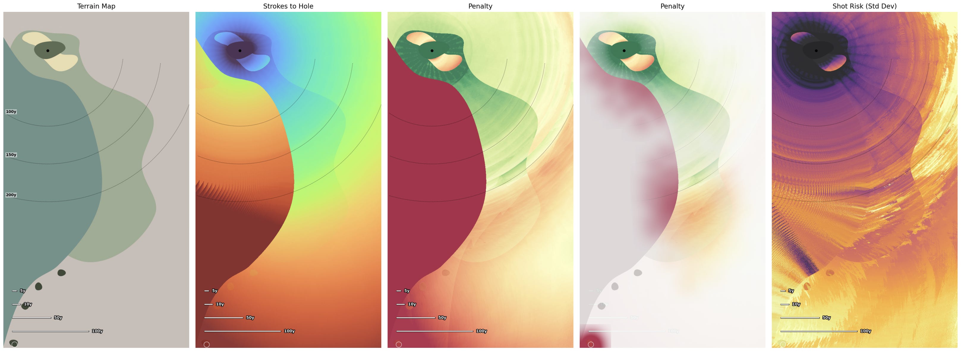
I want to explore how we can measure the effect a hazard has on a golf hole. The way we can do this, quite simply, is that we create two near-identical versions of the hole. One hole has the hazard, the other does not. For the ease of explanation, I’ll use a fairly dramatic example: what happens if we remove all the water from the 17th at TPC Sawgrass with its famous island green? The hole should become much, much easier, yes – but how much easier? Well, we can use the model to figure that out.
So, now we have two versions of the hole.2 The way we can learn how much influence the water hazard has on play is simply to determine the strokes-to-hole at every point on the golf hole for each version, then take the difference between the results. This is exactly the same process we followed in Friday Pins vs Sunday Pins, except instead of analyzing the same hole with two different hole locations, we’re looking at two different versions of the hole with the same hole location and different hazards.
The result is a heatmap where the darker the color, the more the impact is felt. For this example, we’ll run the model for a 15 HCP player. The results are as follows:
As we can see, the original version is more difficult to play from almost everywhere. This should be obvious because the fairway is always less penal than water. From the front tee, the resulting penalty from the water hazard is about 0.75 strokes. This jumps up to about 0.81 strokes from the back tee.
To recap, this map is showing us that the same 15 HCP player would play the 17th at Sawgrass almost a full stroke better on average if the water hazard were replaced with a fairway. Pretty straight forward.
Sure, yes, it’s very obvious that water makes a golf hole more difficult. However, imagine your course isn’t playing the way you want it to, and you’d like to change it so that the strategic elements make more sense. Using the same method, we can actually change a golf hole and see that influence measured.
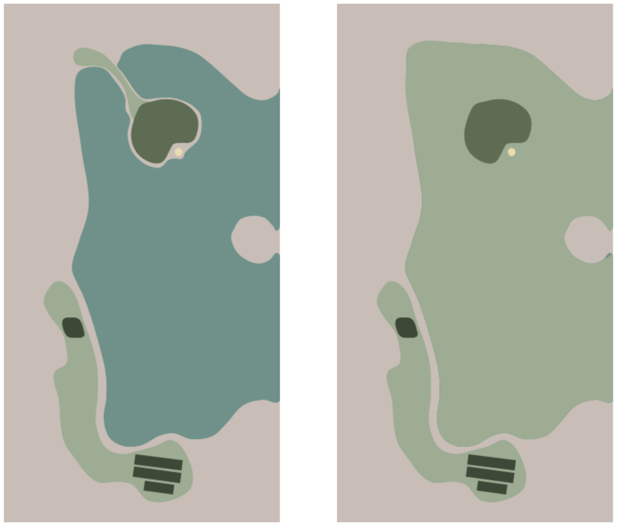
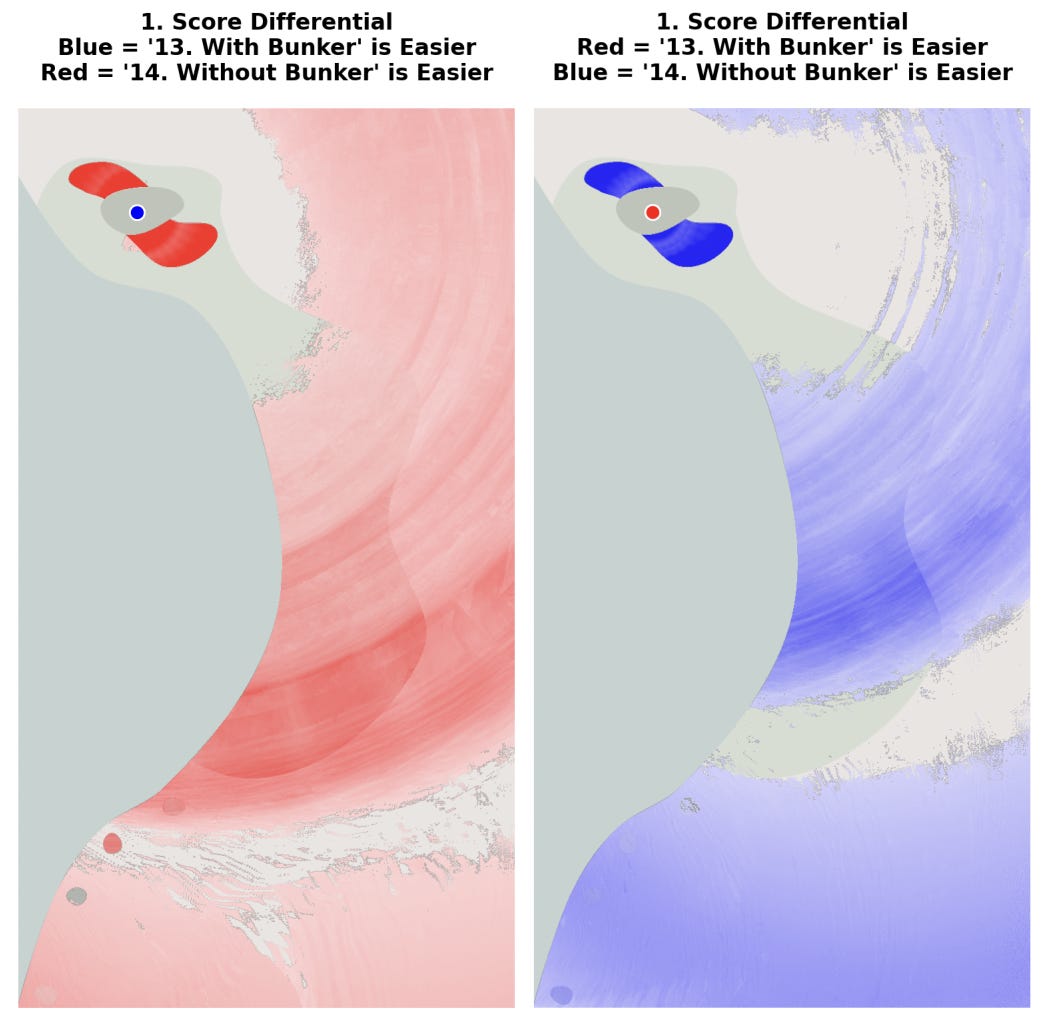
I’ve created a very simple homage to the 18th hole at TPC Harding Park. Our original version (on the left) has no bunkers at all, but suppose I’m thinking of adding some.
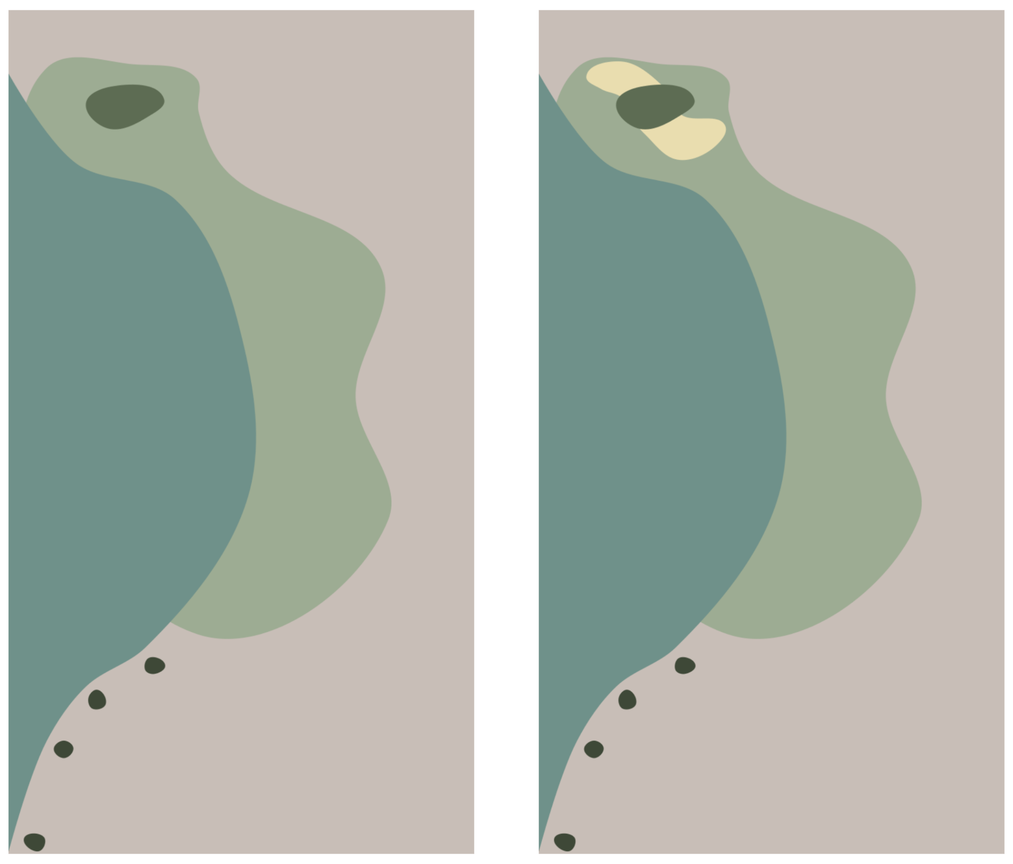
In both versions of the hole, the player can take on the water hazard to gain distances, and then play back towards the green. Taking on the water hazard is obviously risky, but can make the hole much easier. However, when playing the version without bunkers, there is little reason to try to carry the water. If, however, we add large greenside bunkers, suddenly, distance off the tee is much more rewarding, because the approach shot matters a lot more.
When we run our comparative analysis, we can see that we do, indeed, reward the player who chooses to carry the water hazard and is successful. The darker the area of blue here, the more difficult the hole is in comparison to the version without bunkers.
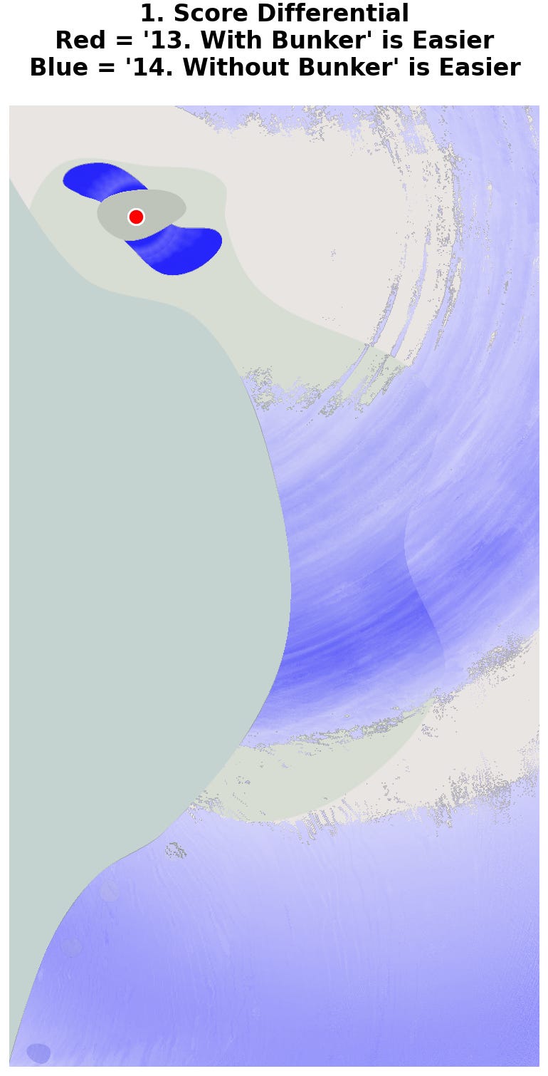
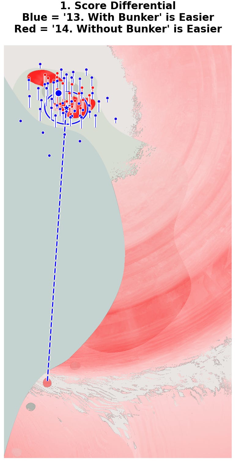
We see dark blue where the bunkers have been added, which makes sense. However, we also see a dark strip of increased trouble across the safest area of the bailout area. Bailing out now adds 0.15 strokes on average for our 15 HCP player. If we look at the more subtle “hazard tax” version of this analysis we can see this dark stripe show up.3

The source of this penalty is that long shots for the 15 HCP player will no longer run onto the green. Instead, they will end up in the bunker.
What was previously a straightforward – if inaccurate – shot is now much more dangerous. Curiously, we also see a complete gap in the blue penalty shading just beyond the bailout area. This area has effectively no difference in outcome with or without the bunkers. If we look at the optimal shots here for the 15 HCP player we can see why.
This grey area above, where the players hit their shots from, is the point at which both players will likely need to play well short of the hazard area anyway. At the same time, they will end up close enough to play over the hazard area mostly successfully.
The most significant penalty being discussed on this hole is less than two tenths of a stroke. This is effectively by design. The shapes of the green and bunkers are designed to reward players who are close to the green, and punish players farther away. I’ve done this specifically to highlight these differences, but the point is the same: we can actually measure the effect on scoring that adding a bunker in this location creates.
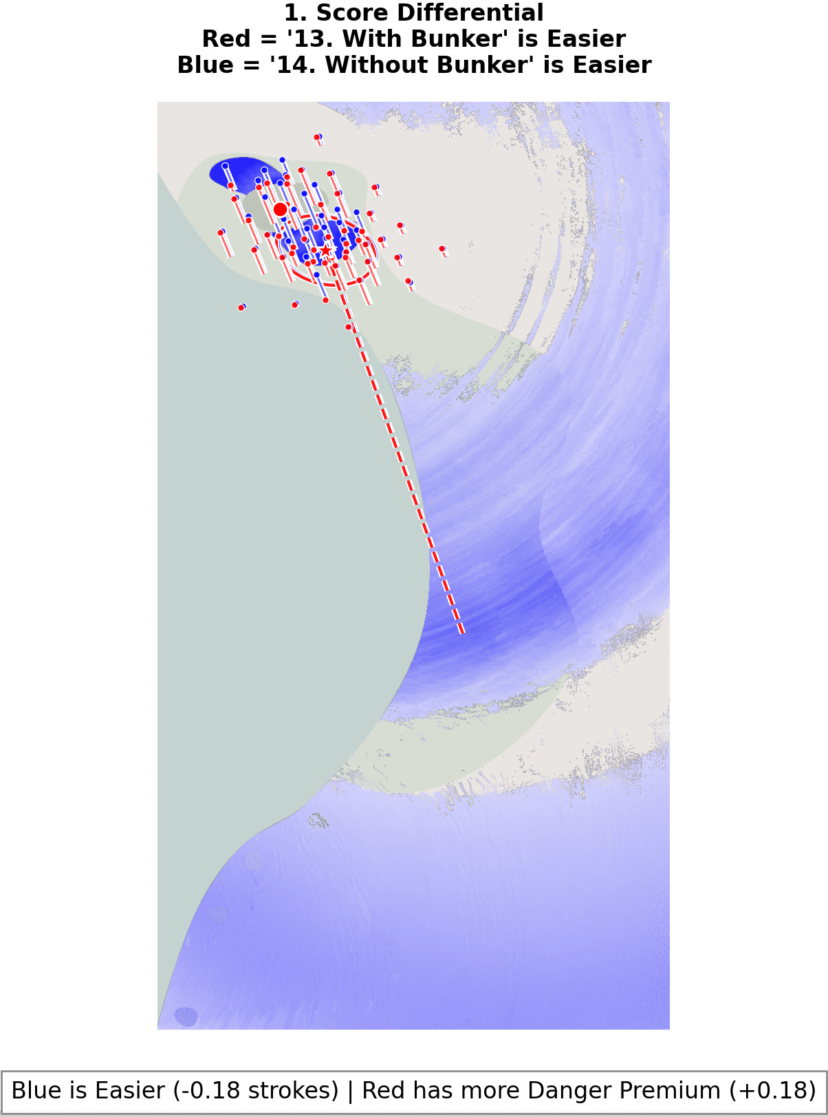
Now, the previous result is for a 15 HCP, who will represent a club member. If we run the process for a +5 HCP to represent a near-pro level player, we should expect this illustration to look significantly different – and it does:
On the left in red we can see the same analysis done for a +5 HCP player. On the right side, I’ve kept the 15 HCP player’s results in blue for comparison. The first thing we notice is that, for the pro, everything is shifted back. The stripe of dark color, which represents an area of increased difficulty, is now short of the bailout area. It is well short of the distance a +5 HCP player should be taking off the tee. Another unique quirk is that the optimal shot from the front tee is straight at the hole. That extra distance is extremely helpful.
Admittedly, the differences here aren’t very significant. The +5 HCP player can hit the ball farther and has a tighter dispersion. Still, I added this comparison for two reasons: first to show that these are not “definitive maps,” because each type of player will interact with the design differently. Second, and more importantly, because we can now compare the differences between these two maps to illustrate the effect of the added hazard on each player.
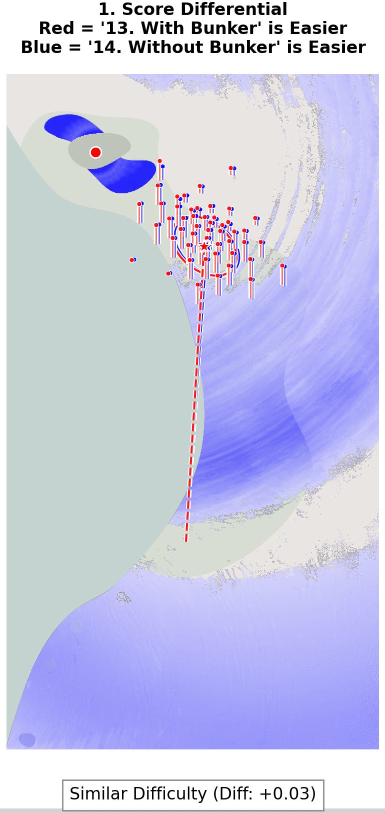
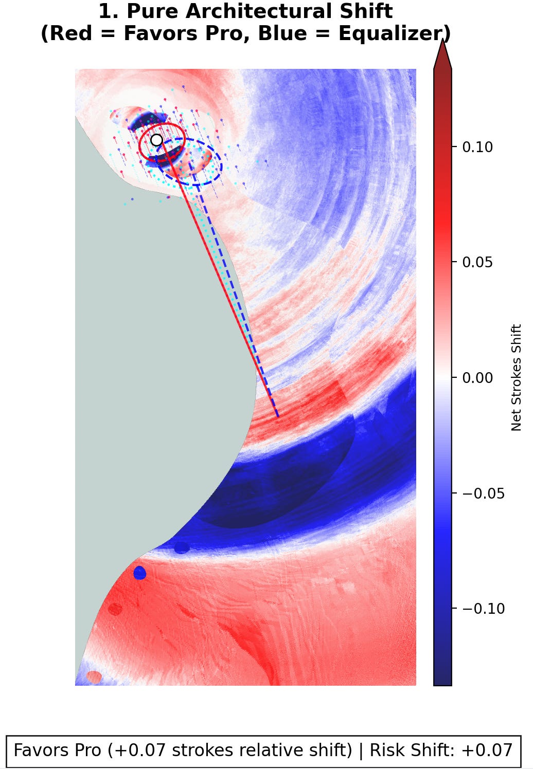
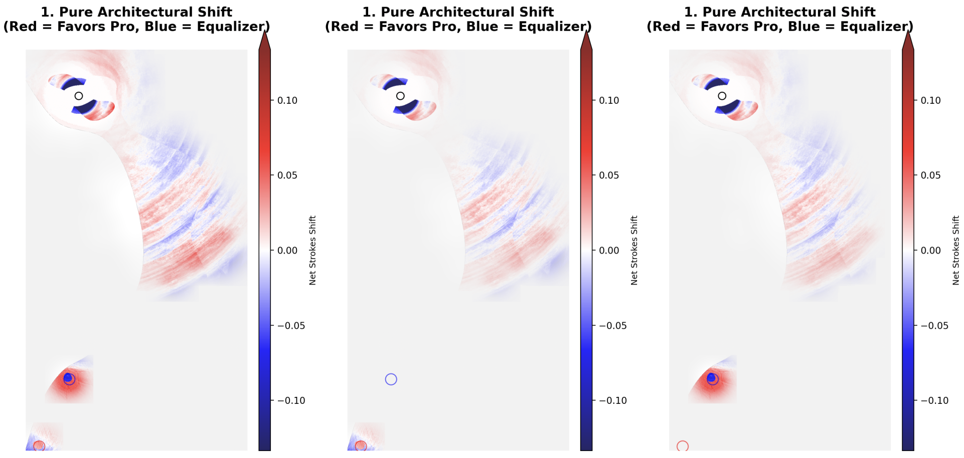
Here, things get genuinely interesting. When we look at these two sets of changes at the same time, we can net these results. This will show us which areas have more impact on which player. What we end up with looks like this:
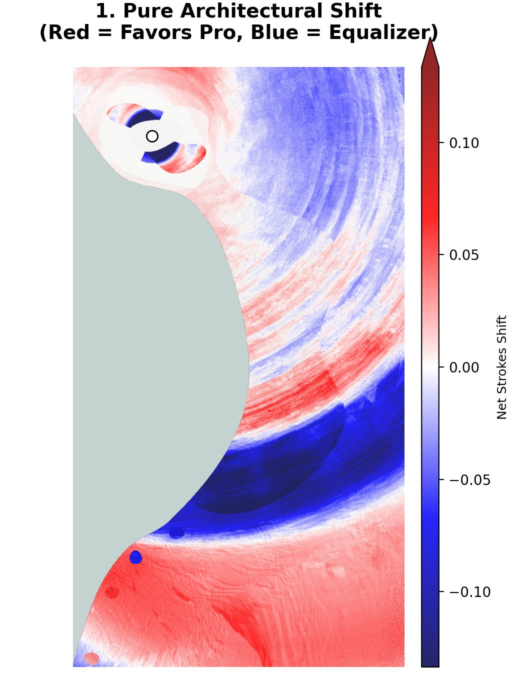
Here we can see how the changes affect the relationship between the pro and the club member. The blue areas here favor our 15 HCP player and the red areas favor the +5 HCP. What this means is that if the two players were playing a perfectly handicapped game on the original version of the hole (without greenside bunkers) – if the result would be a tie on net – then by adding the greenside bunkers, play from the blue areas should help the 15 HCP player win, but play from the red areas should help the +5 HCP player win.
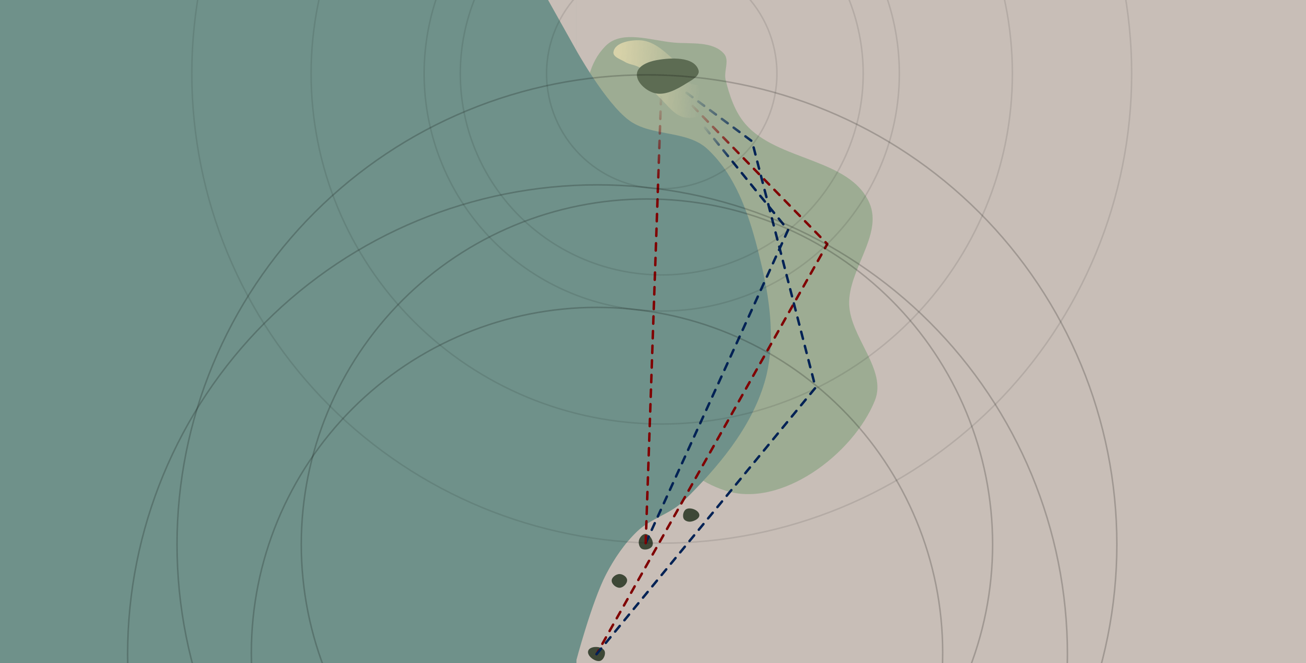
If we look at shots from the dark blue area, we can see why the adding bunkers favors the member over the pro.
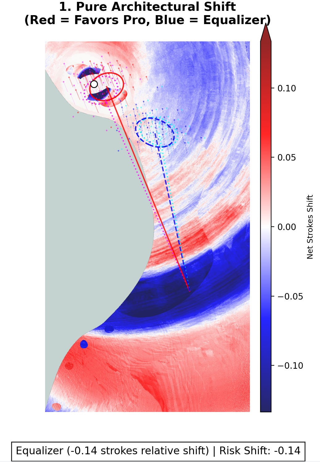
Here, there is a lot going on. For the +5 HCP, we can see their shot on the version of the hole with bunkering in red, but if you look carefully, you can also see their shot on the version with no bunkering in magenta (I know it’s hard to see, but the magenta section is directly adjacent to the red line and circle in the heatmap above). Here, since the +5 HCP is hitting it quite close to the green, the greenside bunkers really hurt the pro. It’s important to remember that this is calculated as the optimal shot for the pro. Here, having the pro bail out to the right of the green would, on average, leave the pro with a higher score.
For the 15 HCP, we can see the shot with bunkering in blue, but if you look very carefully, you can see the shot without bunkering in teal (again, it’s hard to see but the teal is directly adjacent to the blue line and circle in the heatmap above). It’s quite hard to see the teal coloring because, well, it’s effectively the exact same shot for the 15 HCP. This means the 15 HCP is hardly influenced by the greenside bunkers at all.
Since the +5 HCP player is suffering due to the addition of the bunkers, but the 15 HCP is basically uneffected, it’s pretty clear that those bunkers help the 15 HCP on net, which is exactly why the result shows such a dark blue color. Again, the +5 HCP very obviously still has a huge advantage, but adding the bunkering does help the 15 HCP on average when they are both playing the hole from exactly this position.
While we can see that adding these bunkers helps the member occasionally, for the most part, hazards help better players, especially around the green. Here we see why.
Once the 15 HCP is optimally hitting it to the green, suddenly the bunkers absolutely wreck the higher handicapper’s expected strokes-to-hole. When playing from a bunker, more of the mid-handicapper’s shots will end up back in a bunker when compared to the +5 player. This means hazards will generally be more trouble for the higher handicapper when the hazard is relevant to both players’ shots.4
All of this design analysis seems to lend itself to “half-par” holes that make reaching the green more difficult than normal. The strongest results here tend to fall exactly in the places where players struggle most. However, if we want this analysis to be useful, we need to look at the places people will actually hit shots if we want to know how adding bunkering will help or hurt players. Thankfully, we can also do this by running the model to simulate multiple playthroughs of the hole.
If we put both players on the back tee, we can see the different places where they actually end up. This isolates the places in the fairway and rough that matter most. I’ve modeled hundreds of plays of the hole, by each player, from the back tees. This shows us the footprint of each of them on the hole.
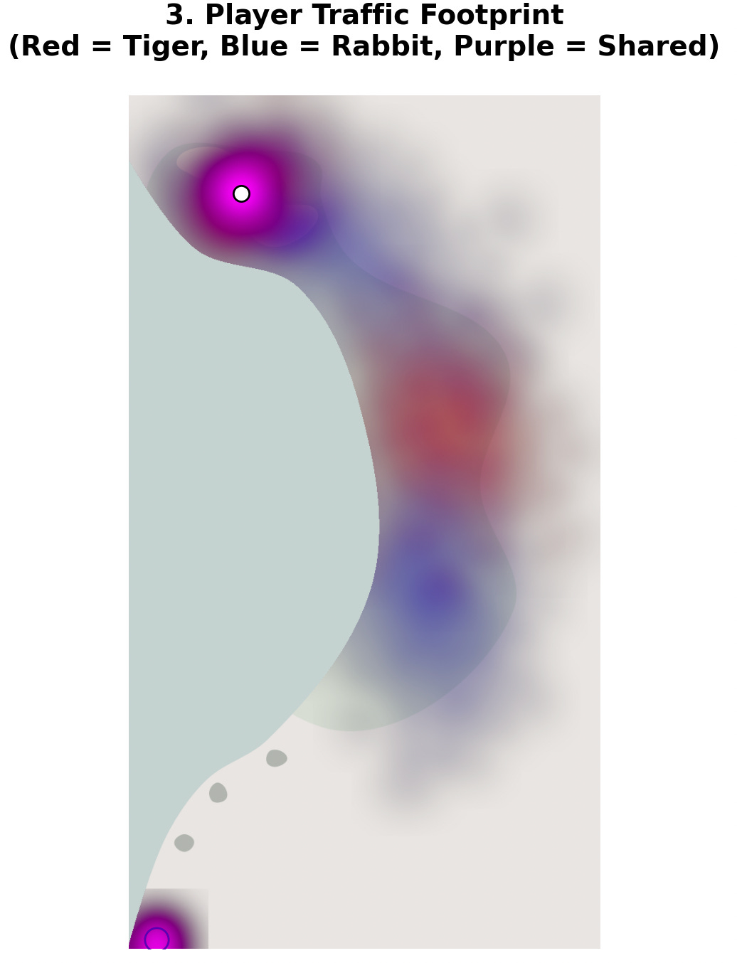
We see a significant amount of purple at the tee and at the green. This result indicates that both players must play from these locations. In the fairway, however, we see a clear blue section, followed by a tight red section, and another blue section. This suggests that the hole plays like a par 4 for the +5 HCP, but acts more like a par 5 for the 15 HCP.
Now we have our footprint. With this known area, we can look back at our map that shows the net effects of adding the greenside bunkers, but we can then isolate this footprint to zero in on the sections of this analysis that actually matter. To show this, we simply use the footprint to mask the previous map.
This is a useful visualization, but it doesn’t tell us too much more than we already knew. In isolating the +5 HCP’s footprint, we do see that the hole is a true par 4, and one that shows a mixed result in terms of net benefit/penalty from the added bunkers.
For the 15 HCP player, we see a much larger traffic pattern. We know that the dark blue area leads to the player optimally playing the hole as a par 5. The dark blue area in the bailout zone should help the 15 HCP immensely, however, we just saw from the +5 player’s footprint that they’ll never both be playing from that area, so it seems entirely wasted. In fact, the only way these two players ever share a section of the fairway is if the pro hits a terrible shot and the member hits a perfect shot.
At this point we could try to further sculpt the hole to add more trouble for the pro – a bunker exactly in the pro’s landing zone, for example – but in most cases the way we normalize the distance delta between types of players is to change the players’ tees.
At the vast majority of golf courses, both the +5 and the 15 will be expected to reach the green in two, so they’ll need to play from different tees. We can create a new footprint of play from each of these tees, which will show us where the effects of bunkering actually matter.
Here we see the results for both players. They now converge on the same area, with the higher handicapper’s footprint only slightly larger. Once again we analyze the playable area to see the effect of adding greenside bunkers.
Now we can finally see the real expected effect of adding greenside bunkers. The results are mixed, but they favor the better player in most of the expected landing zone. If this design showed up for a club that was trying to make play a bit easier for older club members, it would be fairly easy to demonstrate that it probably wouldn’t be successful. This design would be better suited for a club looking to add a bit of challenge to a hole that may be considered a push over.
Using this methodology, along with actual club data, we can actually analyze prospective changes before those changes end up in the ground.
The title of this article talks about how to save money. A bunker renovation or course redesign can cost tens of millions of dollars, and mistakes are costly. When they do happen, it can look something like this.
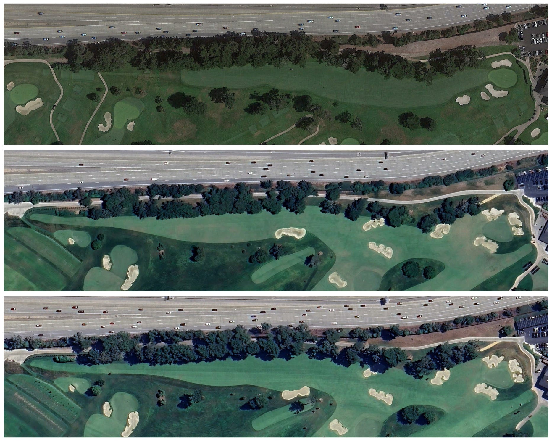
Above we can see aerial images of the same golf hole at Lake Merced Golf Club taken only a few years apart. We can see that over time, the central fairway bunker has been moved right of its original placement. I suspect this is because it severely affected play for folks with larger dispersion patterns off the tee. Moving any bunker costs money; estimates in 2022 were about $3,000 to build and line a small bunker.5 Now, that may not seem like a lot of money for a fancy golf club like Lake Merced, and I don’t know how much it actually cost them to move the bunker. But alterations like this add up. For clubs operating on a budget, getting it right the first time matters. Using computer modeling, it’s possible to look at dozens of different bunkering schemes, and the thousands of ways players might interact with them, before anyone puts a shovel in the ground.
Now that I’ve got my provisional patent, I’m excited to continue blogging here explaining the various types of analysis this model can demonstrate. I’ll be writing as much as I can about the process through the summer, but ultimately I’d like to move forward with this project as a business. So, if you’re a club, an architect, or anyone else who thinks this type of tool could be useful, I’d love to hear from you.
What I can offer clubs: with topos and member data, I can analyze a golf course to see how it plays. After that, I can do a comparative analysis of proposals that architects submit, to illustrate their ideas clearly, and to help memberships understand what each architect is attempting to do with their design. Theoretically, this should be able to help clubs hire the best architect to execute their vision. For clubs on a tight budget, this process should be able to identify the minimum amount of change that still achieves the club’s desired outcomes, potentially saving significant amounts of money on superfluous work that does not offer strategic benefits – or worse, only offers strategic benefit for one type of player to the detriment of others.
What I can offer architects and architectural firms: with topos of proposals, I can clearly illustrate how different types of players will interact with different designs. While architects likely have very clear ideas of what they are doing, and are very good at it, this type of analysis should be able to offer a bit of confirmation and might illustrate some areas that could use another look.
Clubs that hire a highly skilled architect would likely have less need for this kind of tool, though the type of analysis I’m doing could still uncover the occasional disconnect between design and play. But for courses and firms looking to maximize impact on strategic interest with the absolute minimum amount of earthmoving, I think this tool could be a game-changer.
The model is still a work in progress, and I will continue to improve it in the months ahead. During that time, I absolutely want and need feedback wherever I can get it. I need to hear from clubs or architecture firms about where this methodology could be effective and where it gets things wrong. Right now, I’d also benefit from data, feedback, model improvement, and proof of concept. If you are interested in working with me, or are curious about the tool’s applications, please reach out to me here by email.
I’m really excited to keep improving this tool, and to see it make an impact out in the real world. Most of all, I’m looking forward to talking about it with my fellow golf nerds. If that’s you, I can’t wait to hear from you.