In my previous article, I Spent the Last Month and a Half Building a Model that Visualizes Strategic Golf, I laid out the very basics of the golf model I built, the underlying reason that compelled me to work on it, and novel maps it could create. However, I barely scratched the surface of what this model can illustrate about golf course architecture.
Here, I want to talk about how we can specifically look at one kind of dynamic architectural interest. That is, features of golf architecture that appear as we change the course setup. Specifically, I want to look at how different hole locations change the architectural interest for players, how we can show that, and what it looks like.
To demonstrate the usefulness of this process that I outlined in the previous article, let’s first look at a “toy hole.” By toy hole, I mean a golf hole that is specifically designed to make a point, not to be something anyone would want to play.1 Here, I’ve mocked up a completely ridiculous hole with a crazy boomerang green that completely favors one side of the fairway over the other.
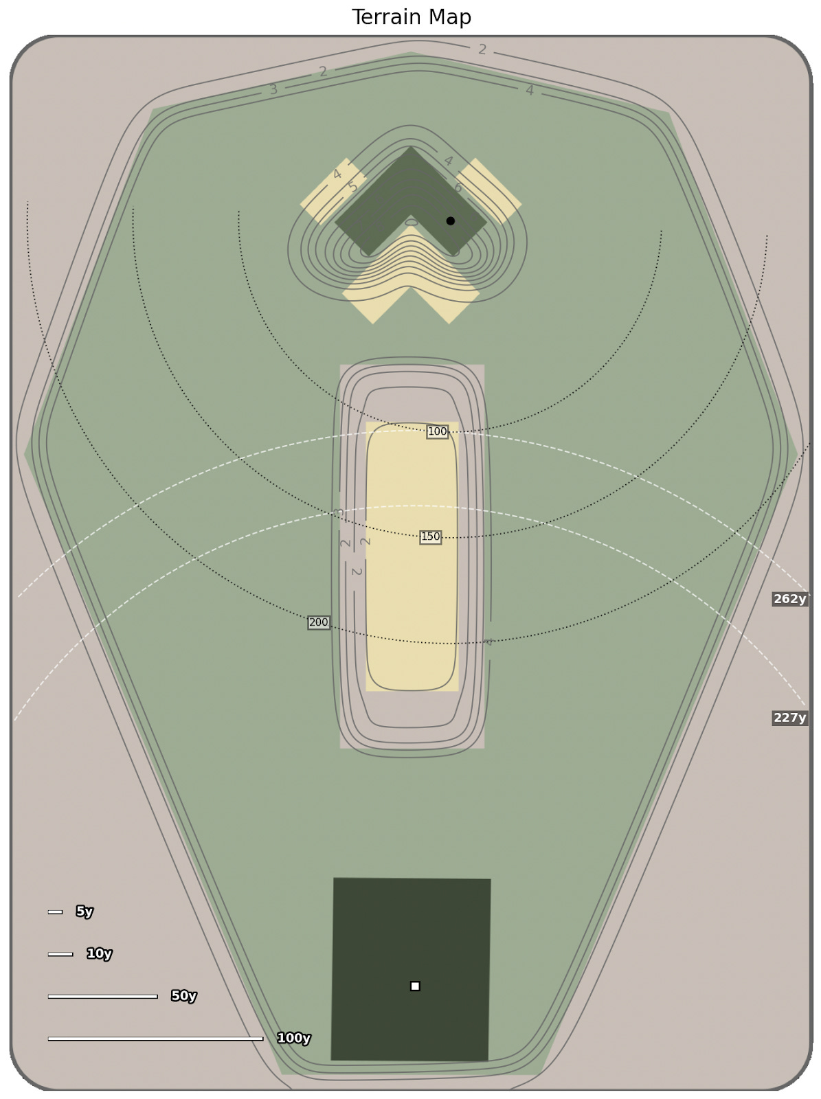
The levels of absurdity we are dealing with here are remarkable. The golf hole is about 300 yards wide. It has a bunker in the center that is close to the size of a football field. The green is pitched straight away from the tee and has nasty bunkers front and back. The entire layout effectively forces a simulated player to choose to play wide right off the tee every time.
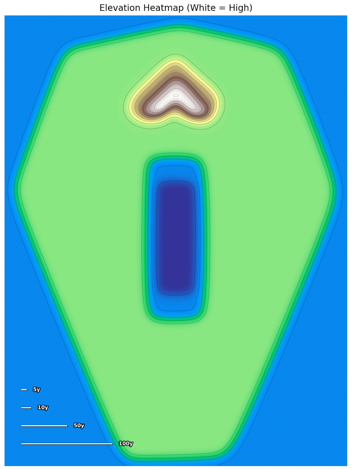
The topography is important. The boomerang green dramatically falls away, toward the bunkers behind it, so that playing from the left side puts the player in the worst position possible. From the left fairway, when the ball reaches the right side of the green, the ball wants to run straight down the hill into the back-right bunker:
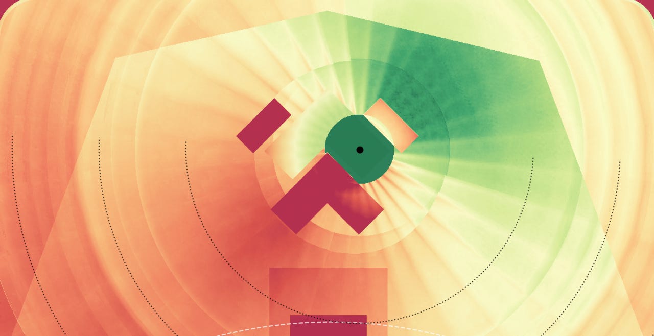
While playing directly over the boomerang from the left side will cause a significant amount of roll out, approaching the green from the right side will simply kick the ball a bit to the right. The superiority of the right fairway can be seen on the Schoolfield map (strokes-to-hole penalty map):2
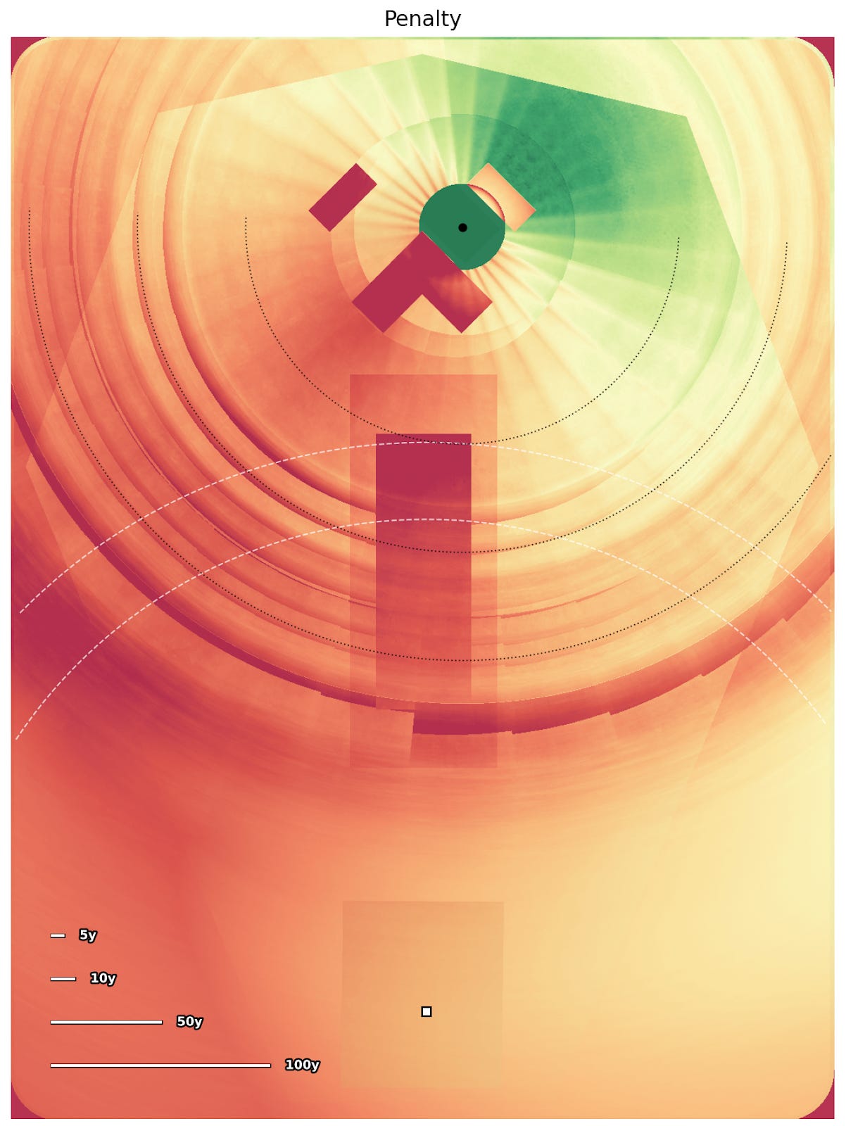
Thus, it is quite clear that, given the hole location on the right, being on the right side of the fairway is preferable to being on the left. The reasons, again, are obvious. When playing from the left side, front and back bunkers leave little room to stop the ball at the correct distance. Adding to this, the green tilts away from the player leading to much more rollout than an approach from any other direction. In contrast, when playing from the right side, we have open access to the green, and the only trouble is a left or right side miss. This effect is visible when we simulate dispersion patterns from two different approach shots to the hole:
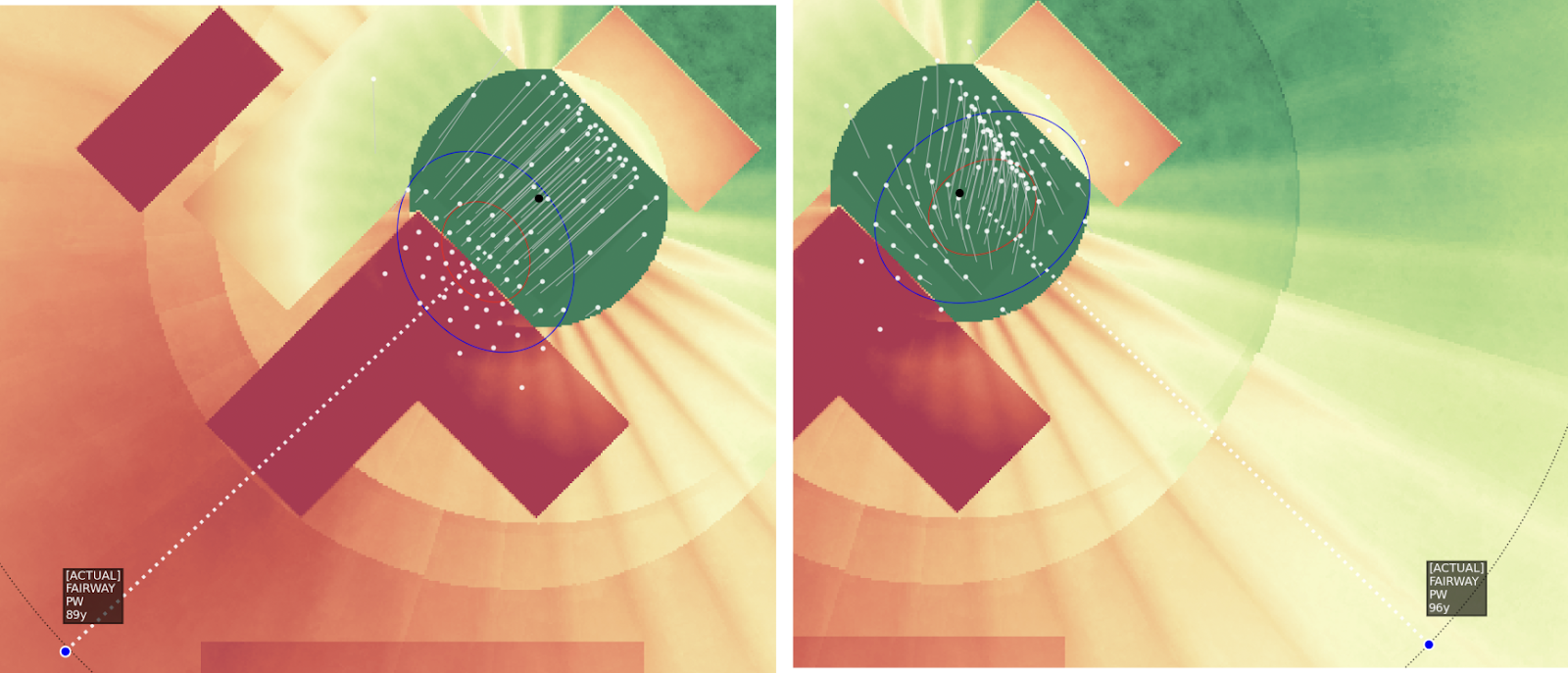
Both of these shot selections were chosen by the simulator as “optimal” because they have the lowest average strokes-to-hole of all possible angles in. So on the left, the player must try to land their shot just past the bunker in order to have a chance at a birdie putt. On the right, the player has a generous number of options for a birdie putt even with a wide dispersion pattern.
All this makes sense and is fairly obvious.
Now I show why I made this hole as wide as I did. All this width is a perfect way to illustrate that simply by changing the hole location a little bit, we can reveal significantly outsized effects in the optimal position and strategy. Since the hole is symmetric and we know the player should probably be on the right side, when we change the hole location to the opposite side of the boomerang green, we already know the player will prefer all that space on the left side.3
If we run the process discussed the previous article, and get strokes-to-hole heatmaps for both hole positions, we get two very different results:
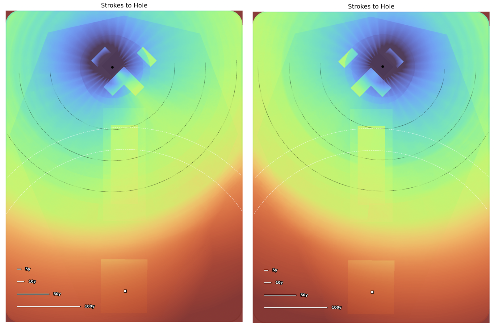
After generating these two maps, we can subtract one from the other to get the difference in strokes-to-hole from each position. When we take the difference and color code the values, what comes out is a map that shows how dynamic the golf hole is depending on hole location:4
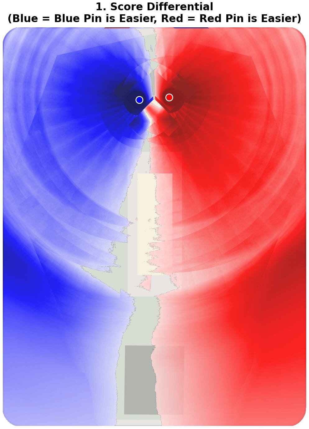
The difference is significant. One one day, players want hit their tee shots as far to the left as possible. The next day, they’re hitting it to the right, interacting with the architecture in a completely different, new way.
In this case the result is fairly obvious. However, the hole was specifically designed to make sure that the difference is easy to see. The reason this is such a useful tool is that the process works not just when we have an obvious hole. On every hole, we can actually measure the strategic change we see from a different pin position. Let’s see how this effect shows up when we look at a real-world example.
A good example of this effect can be seen on the first hole at St Andrews:
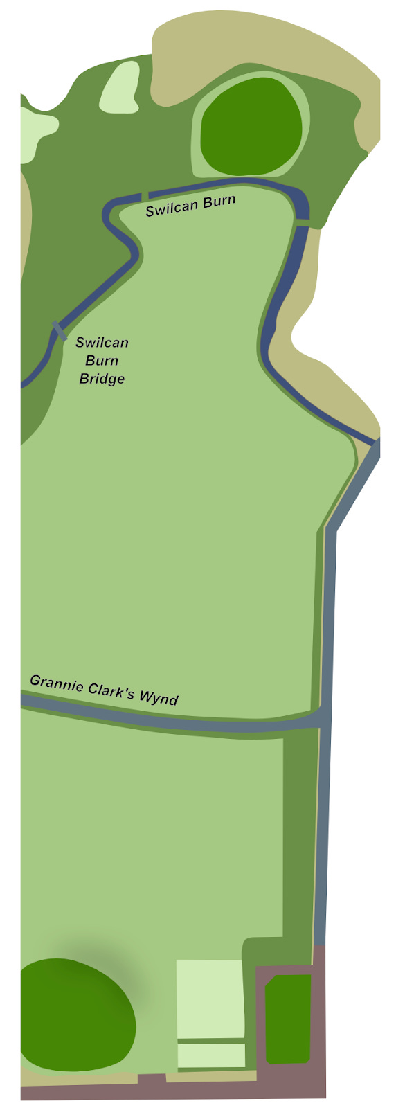
The key feature to the hole is its requirement that you cross the Swilcan Burn. The green sits directly against the burn. It’s a pretty easy opener, but the ease of making a birdie drops dramatically as the hole creeps forward toward the creek. The hole location can really be placed only a few paces from the water’s edge. It can tempt players trying to make birdie to flirt with the ending up in the water instead of playing one safely in the center of the large green. Using the process described above, we can see the difference in difficulty between an extremely safe hole location at the back of the green, and a scary one right up against the burn:
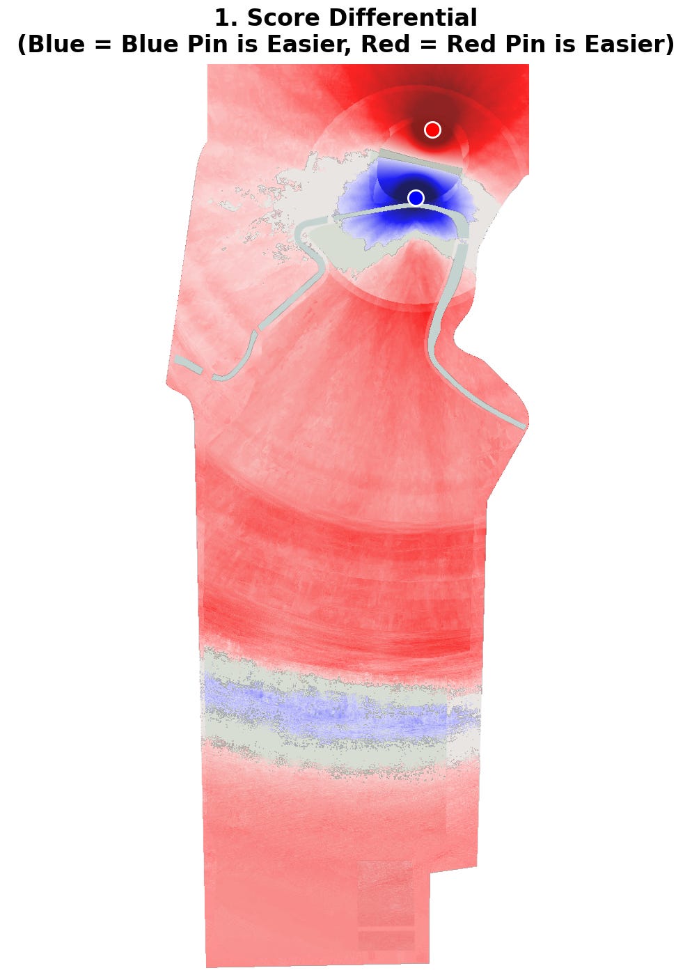
Above, we see a result that a strokes-gained analysis would not give us: the back pin is actually fewer strokes-to-hole than the closer one, from almost everywhere on the hole. This isn’t intuitive, but because strokes gained is an average of all shots, it will always suggest that the further hole should take more strokes to reach. We also see that the difference between the two hole locations is just 0.15 strokes-to-hole from an ideal approach location, but the danger increases to 0.3 strokes in the darker red areas.
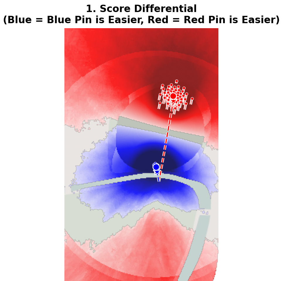
This close-up image shows us one of the few areas where it’s easier to reach the blue hole location than the red one. What’s important to note, though, is that this map still takes distance into account. We can actually filter that out though if we want to see the impact of the architecture alone. When we compare the strokes-to-hole penalty – netting the two Schoolfield maps below – then we have a similar result, but with some important differences.
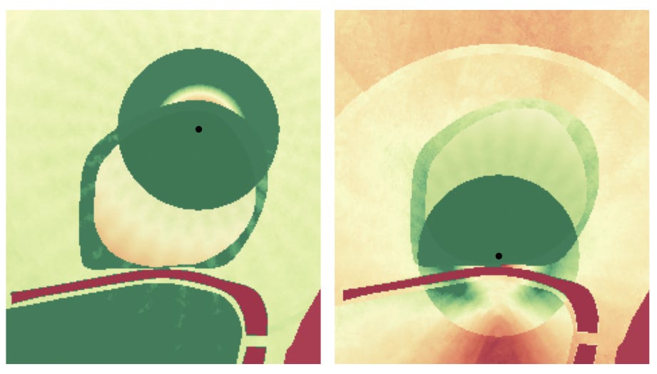
That result looks like this:
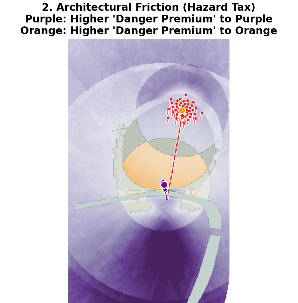
Here we still see that the back pin is relatively “safer,” even from areas where players should get a lower score. Looking at the netted “strokes-to-hole penalty” (yes, I realize how convoluted this is) shows us how much the hazards will influence the result (here the only influences are water and rough). The best way to think of this image is that it measures the “hazard tax” because it shows us how much excess danger we are in from our position. Unlike in the strokes-to-hole image above, we see that being just across from the front pin leaves the player in extreme danger because if the burn weren’t there, the player could just putt, whereas if he were playing to the back pin, the player would pitch the ball on either way.
In many different ways, this methodology helps us visualize the way the golf hole changes as we move the hole location around the green. Whether it’s how much easier the hole plays, or how much relative influence the features of the hole have on the position we are in, when we can visualize the impact of the architecture we understand it better. Ideally, this should help us design better setups for tournaments and ultimately design better golf holes altogether. In the next article, I plan to show some rather unexpected results that fall out when we start messing with the parts of a hole we’re normally not able to.