VAERS CSV to MongoDB converter with sample data aggregations
Setup
- Clone the repo
cd vaers2mongo && npm i- Download the full VAERS dataset from https://vaers.hhs.gov/data.html
mkdir data- Extract the CSVs from the downloaded .zip into the data folder
- Edit the config.json file to point to your MongoDB instance
npm run populate(The population will typically take up to two hours)
Running an aggregate
npm run aggregate [filename]
You can modify scripts/aggregate.js to output to a Highcharts-ready series or label/value pairs.
Example output
npm run aggregate thrombosis-or-stroke-by-year
Output:
{"labels":[1990,1991,1992,1993,1994,1995,1996,1997,1998,1999,2000,2001,2002,2003,2004,2005,2006,2007,2008,2009,2010,2011,2012,2013,2014,2015,2016,2017,2018,2019,2020,2021],"values":[2,6,10,13,10,10,4,10,10,16,13,11,13,27,23,16,19,18,41,45,29,23,24,25,27,29,32,29,43,58,80,6210]}
Which can be used for this Highcharts output
You can contextualize this output against all events by running:
npm run aggregate all-events-by-year
Which can be added as another series in the Highchart
Writing an aggregate
Create a new .js file in the aggregations folder and make the export one of the following:
- A valid MongoDB aggregation array (https://docs.mongodb.com/manual/aggregation)
- A function that takes the events collection as a parameter and returns a promise. If you return the result as an array of
{_id, total}objects, the application will handle formatting. Otherwise, you are responsible for output.
Examples of more complex aggregates
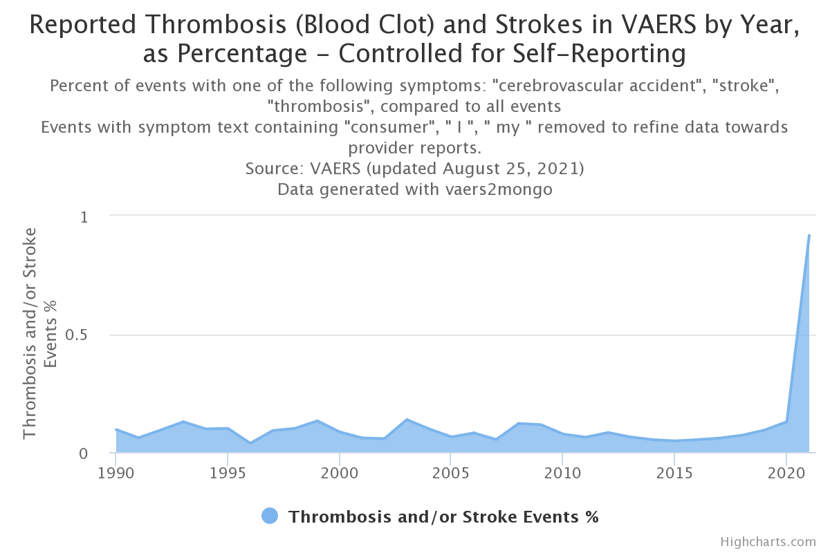
To continue the previous contextualization, the thrombosis-or-stroke-percentage-by-year aggregate performs both of the previously mentioned aggregates and derives a percentage.
Output:
{"labels":[1990,1991,1992,1993,1994,1995,1996,1997,1998,1999,2000,2001,2002,2003,2004,2005,2006,2007,2008,2009,2010,2011,2012,2013,2014,2015,2016,2017,2018,2019,2020,2021],"values":[0.09514747859181732,0.06040471156750227,0.09352787130564907,0.12811668473440427,0.09810654370646522,0.0999900009999,0.03713675610435428,0.09085953116481918,0.1005126143330988,0.13198053287140146,0.09216589861751152,0.08234149262669362,0.09236890720477477,0.1611266933221937,0.15009135995823544,0.10268917271035236,0.10974412291341767,0.06377099128463119,0.13774104683195593,0.13725370585005794,0.09182445696915964,0.09052267002518892,0.08999550022498874,0.08407317729351628,0.07862550960978451,0.06528296789878889,0.07001268980002626,0.07452905348102079,0.08751043002218288,0.11972586904467014,0.16078139759229856,1.3474691015136786]}
This produces a better visualization of the data.
Though we are already filtering many self-reported events by using medical terminology for the symptom search, we can better control (although still imperfectly) by omitting symptomText fields that contain words, such as "I", "my", and the self-reporting keyword, "consumer". The thrombosis-or-stroke-percentage-by-year-no-consumer aggregate does this, resulting in this visualization.