windowed.js is a jQuery plugin that implements Chris Norström's awesome "Windowed Slider" concept. It takes your regular checkboxes or <select> lists and transforms them into slick 'windowed sliders'.
Requirements
- jQuery: 1.7+
File size
- Uncompressed: 12.75 Kb
- Minified: 5.9 Kb
- Minified + gzipped: 2.2 Kb
Quickstart
Add the windowed.min.css and jquery.windowed.min.js files to your HTML page:
<head>
  <link rel="stylesheet" href="path/to/windowed.min.css" />
</head>
<body>
  <!-- blah blah -->
  <script src="jquery.js"></script>
  <script src="/path/to/jquery.windowed.min.js"></script>
</body>
Transform your checkbox or <select> by calling .windowed():
$('select, input:checkbox').windowed()
Usage
Checkbox
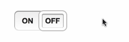
To get started, just call .windowed() on a checkbox or dropdown.
HTML:
<input type="checkbox" />
JS:
$('input:checkbox').windowed()
Result:

Select menu
HTML:
<select>
  <option>WE</option>
  <option>HAVE</option>
  <option>CHOICES!</option>
</select>
JS:
Result:

Vertical
You can make a vertical select using by setting the vertical option to true.
HTML:
<select>
  <option>If you need more room for choices</option>
  <option selected="selected"
    >Feel free to go with the vertical orientation</option
  >
  <option>It's not as elegant as using a radio button</option>
  <option>But it's an option</option></select
>
JS:
$('select').windowed({
  vertical: true
})
Result:

Custom text, width and height
Customize the label text on a checkbox with the on and off options.
JS:
$('input:checkbox').windowed({
  on: 'ENABLED',
  off: 'DISABLED'
})
You can use CSS to set the component’s width and height. Alternatively, you can pass a width or height option to the JS function.
CSS:
.window-toggle {
  width: 200px;
  height: 50px;
}

Callback
Set a callback (fires on change) using the change option.
The callback function will be passed:
- the jQuery event object for the callback
- either:
- For a checkbox, a boolean value indicating if the component’s checked (
true) or unchecked (false). - For a
<select>dropdown, the currently selected<option>element.
- For a checkbox, a boolean value indicating if the component’s checked (
Note: if the DOM element has an onchange event, that will still be fired - although using a windowed.js change callback is preferable.
Themes
The theme option can change the style of the component, by adding classes to the component’s container <div>. Included by default are 4 themes: info, success, warning and danger.
theme can be a string, or if set to true, windowed.js will use the CSS classes already present on the checkbox/dropdown.
For info on creating a custom theme, see below.
HTML:
<input id="themeDemo" type="checkbox" />

<input class="success" type="checkbox" checked="checked" />
<input class="warning" type="checkbox" />
<input class="danger" type="checkbox" checked="checked" />
JS:
$('#themeDemo').windowed({
  theme: 'info'
})

$('input:checkbox:not(#themeDemo)').windowed({
  theme: true
})
Result:

Disabled
Set disabled to true to make a disabled component. The component will also inherit the disabled state (if present) on the existing <input> or <select>.
You can also change the enabled/disabled state by calling windowed('setEnabled', boolean) or windowed('toggleEnabled').
HTML:
<input id="demoDisable" type="checkbox" />

<select id="demoDisableAlt" disabled="disabled">
  <option>Hello</option>
  <option>World</option>
</select>
JS:
$('#demoDisable').windowed({
  disabled: true
})

$('#demoDisableAlt').windowed()
$('#demoDisableAlt').windowed('setEnabled', false)
Result:

Change state
You can change a checkbox’s state using .windowed('setState', s) where s can be true (checked) or false (unchecked); or using .windowed('toggleState').
For dropdowns, use windowed('selectOption', n) where n is the (0-based) index of the option you want selected.
HTML:
<input type="checkbox" />

<button class="btn on">On</button>
<button class="btn off">Off</button>
<button class="btn toggle">Toggle</button>

<select>
  <option>ONE</option>
  <option>TWO</option>
  <option>THREE</option>
</select>

<button class="btn num">1</button>
<button class="btn num">2</button>
<button class="btn num">3</button>
JS:
$('input:checkbox, select').windowed()

$('.btn.on').click(function () {
  $('input:checkbox').windowed('setState', true)
})

$('.btn.off').click(function () {
  $('input:checkbox').windowed('setState', false)
})

$('.btn.toggle').click(function () {
  $('input:checkbox').windowed('toggleState')
})

$('.btn.num').click(function () {
  // We have to -1 because the index is 0 based
  // i.e. the first option's index is 0, 2nd is 1 etc.
  $('select').windowed('selectOption', $(this).text() - 1)
})
Animation
Set animate to false to disable animation.
You can change the speed of animation (in milliseconds), using the animateDuration option.
HTML:
<input type="checkbox" />

<select>
  <option>TAKE</option>
  <option>IT</option>
  <option>SLOW</option>
</select>
JS:
$('input:checkbox').windowed({
  animate: false
})

$('select').windowed({
  animateDuration: 1000
})
Tinted window
You can tint the window in CSS, using an RGBa background property.
CSS:
.windowed .slider {
  background: rgba(0, 0, 0, 0.1);
}
Result:

Custom themes
You can use CSS to style the windowed.js component. Some useful classes:
.windowed- The component’s container<div>, this is where your custom theme class will be applied.slider- The sliding window.checkstate- The on/off label text for a checkbox.option- A dropdown option.selected- The currently selected.optionor.checkstate.checkbox- Applied to components created from an<input type='checkbox'>.select-one- Applied to components created from a<select>
HTML:
<input type="checkbox" />

<select>
  <option>BLACK</option>
  <option>IS</option>
  <option>BEAUTIFUL</option>
</select>
JS:
$('input:checkbox, select').windowed({ theme: 'custom' })
CSS:
.windowed.custom {
  background-image: -moz-linear-gradient(center bottom, #000, #333);
}

.windowed.custom .slider {
  border-color: #6c3;
  box-shadow: 0 1px 1px 1px #363 inset, 0 0 0 2px #363;
}

.windowed.custom .checkstate,
.windowed.custom .option {
  color: #ddd;
  text-shadow: 1px 1px #000;
}

.windowed.custom .selected {
  color: #bfa;
}
Result:

Configuration options
animate
- Type:
Boolean - Default:
true
Enables jQuery animation on the slider window.
animateDuration
- Type:
NumberorString - Default:
400
Sets the duration of the animation (if enabled). As with jQuery's .animate() method, this can be a number, indicating the animation duration in milliseconds, or a predefined string (e.g. 'fast', 'slow').
disabled
- Type:
Boolean - Default:
false
Controls the disabled state of the component. Note: if the component is disabled, the original DOM element will be disabled too.
height
- Type:
Number - Default:
undefined
Sets the height of the component. Note: it's recommended that you instead use CSS to set this, if possible.
off
- Type:
String - Default:
'OFF'
Sets the label for the unchecked state of a checkbox-based component.
on
- Type:
String - Default:
'ON'
Sets the label for the checked state of a checkbox-based component.
theme
- Type:
BooleanorString - Default:
undefined
Allows theming of the component. If a string, the string will be appended to the component's container <div>'s class attribute. If set to to true, the container <div> will inherit the classes from the original DOM element.
vertical
- Type:
Boolean - Default:
false
Enables vertical mode. Can only be applied if the component was created from a <select>.
width
- Type:
Number - Default:
undefined
Sets the width of the component. Note: it's recommended that you instead use CSS to set this, if possible.
Overriding defaults
You can change the global defaults by modifying the $.fn.windowed.defaults object.
Methods
windowed.js includes a few utility methods. The methods follow the jQuery UI pattern:
$('select').windowed('methodName', [optionalParameters])
setEnabled
$('select').windowed('setEnabled', enabled)
Enables/disables the component. enabled is a boolean, where true enables the component, and false disables it. The method returns this boolean value.
toggleEnabled
$('select').windowed('toggleEnabled')
Toggles the component’s enabled/disabled state. Returns a boolean value indicating the component’s new state, where true indicates enabled.
setState
$('input:checkbox').windowed('setState', state)
Checks/unchecks a checkbox component. state is a boolean, where true checks the component, and false unchecks it. The method returns this boolean value.
toggleState
$('input:checkbox').windowed('toggleState')
Toggles a checkbox component’s checked/unchecked state. Returns a boolean value indicating the component’s new state, where true indicates checked.
selectOption
$('select').windowed('selectOption', optionIndex)
Selects an option on a <select>-based component. optionIndex is an integer, representing the 0-based index of the option to be selected. The selected .option is returned.
Compatibility
I've tested the plugin with recent versions of Firefox, Chrome and Safari (mobile & desktop) - theoretically it should work fine in IE7+ and Opera, but these are untested. If you've tried the plugin with an untested browser, please, add it to the wiki!
Credits
- Created by Alex Peattie (@alexpeattie)
- Original concept by Chris Norström (@ChrisNorstrom)
Changelog
Version 0.1.0 (2012-11-28): Initial version.
License
windowed.js is freely distributable under the terms of the MIT license (see LICENSE.md).