About this pink.
In the rest of this article I will explain why it’s “this pink” and also show you which of the following colors actually correspond to white, brown, violet, and grey noise and why.

White Noise
White noise is classically defined as a random signal with equal average power in equal-sized frequency intervals. For example, 2500–2501 Hz gets the same average power as 60–61 Hz or 3000–3001 Hz. The signal fluctuates randomly, but the average amount in the long run is equal.
“Noise” here doesn’t have to mean sound. In signal processing, it means an unwanted signal, usually random, mixed in with whatever you’re trying to measure. There is a whole field devoted to removing this unwanted “noise”. Today however, we’re deliberately making a random signal and asking how its power is distributed (and how that compares between vision and audio).
White noise is called “white” by analogy with white light, which can be made by mixing light across the visible spectrum. That being said, equal power per hertz doesn’t automatically give us the white our screens use. If we apply the white-noise power law to light over 380–700 nm (roughly the human visible spectrum) and display the result, it looks like this:
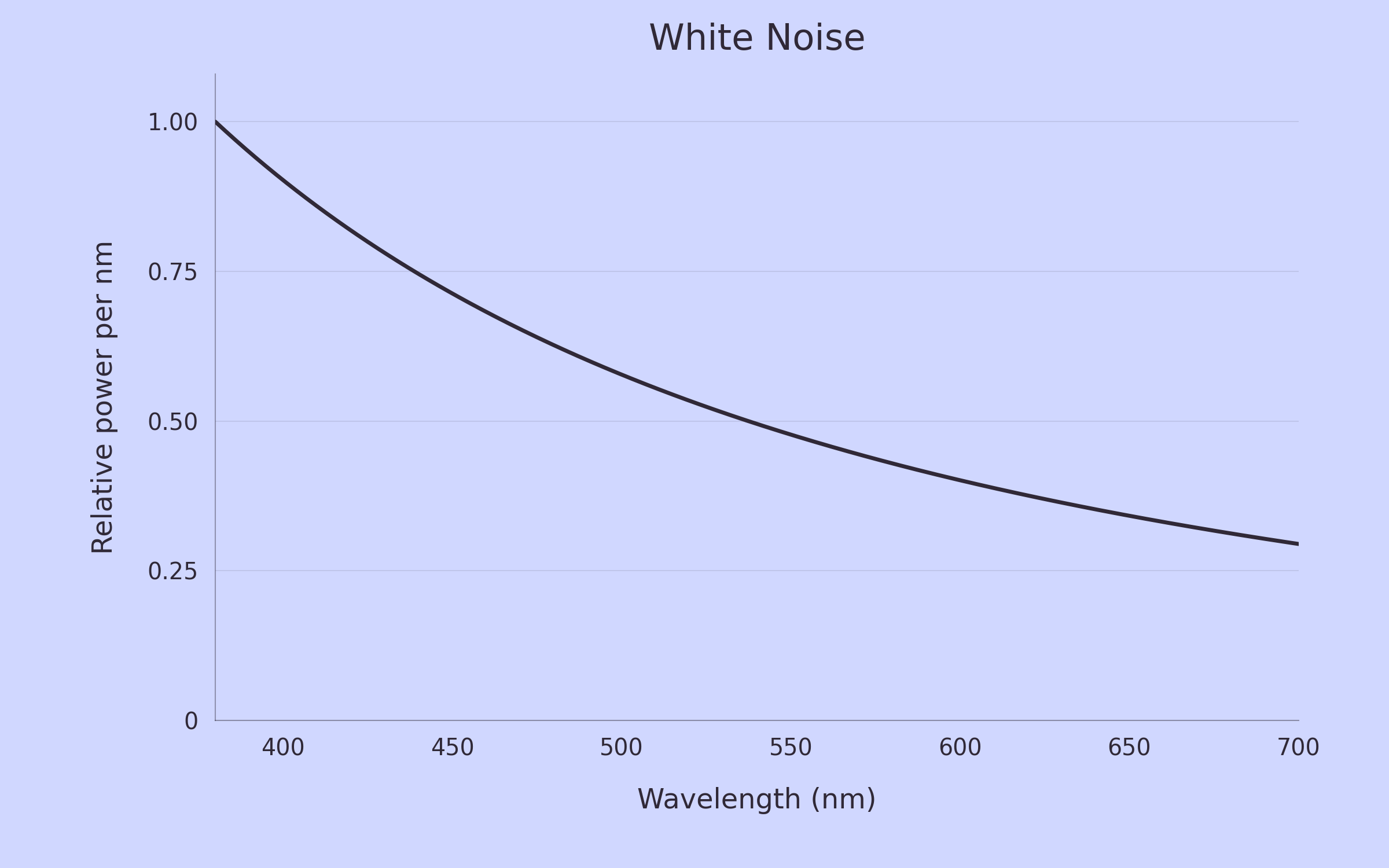
The curve shows power per nanometer, scaled so its maximum is 1.
It’s time to dive into this graph and discuss exactly what we’re plotting and how.
The Math
As with audible white noise, we are taking a frequency interval of light, say 500 to 501 trillion Hz, and giving it the same power as every other interval of the same size. But trillions of hertz is not usually how we talk about light. Typically we use wavelength, and 500 trillion Hz corresponds to about 600 nm.
For light, frequency and wavelength are related by
\(f = \frac{c}{\lambda}\)
where f is frequency, λ is wavelength, and c is the speed of light.
Because we have this 1/x relationship, the interval sizes change when we make that conversion. Here are the actual ranges, rounded to three decimal places. One THz is one trillion Hz:

So even though both intervals are 1 nm wide, the first covers about 2.25 times as much frequency and gets about 2.25 times as much power. Equal power per Hz doesn’t mean equal power per nm, the conversion is:
\(\left|\frac{df}{d\lambda}\right| = \frac{c}{\lambda^2}.\)
Since our power per Hz is constant, the power per unit wavelength is proportional to 1/λ2. That’s why the graph slopes down even though we started with equal power per frequency interval. Switching from frequency to wavelength changes how we divide up the spectrum. Below, I’ll write power per Hz as Sf and power per nm as Sλ.
To generate the actual color that gets displayed, I combined this spectrum using a standard model of human color vision and converted the result to sRGB, the standard color space used for these images. Both of these are approximations and depend heavily on sRGB’s conventions and chosen white point. There is notable nuance here, but for the purposes of this post, we should feel comfortable knowing we’re roughly in the right area.
Now that we have a bit more context, here’s that graph again:
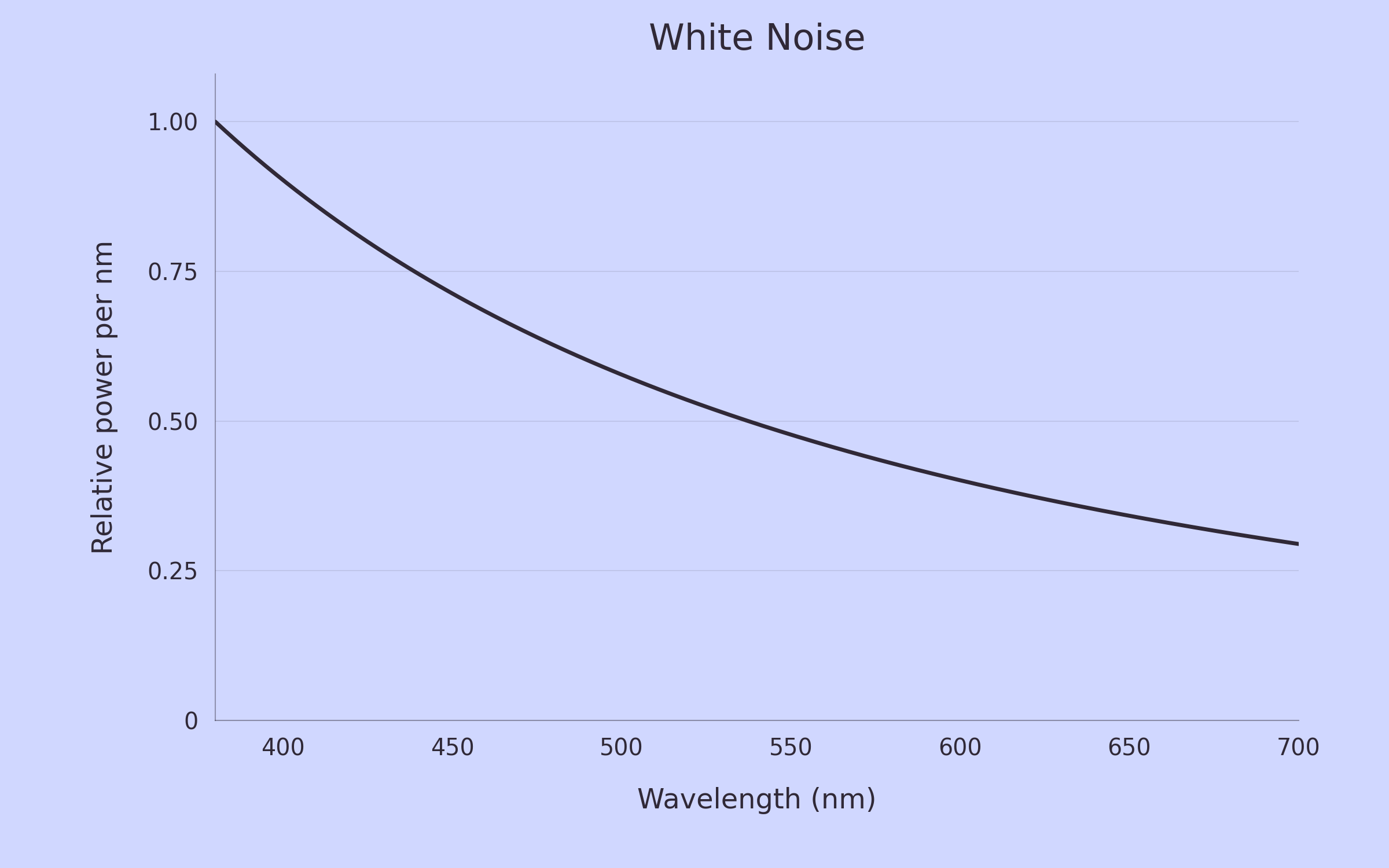
So why does this look blue? Well, our 1/λ2 distribution puts more power into each nanometer on the blue side than on the red side. When we combine that light, the result is slightly bluer than sRGB’s reference white. The analogy with white light is reasonable, but when we actually plot the color it looks a bit blue.
Now that we’ve done the hard work of understanding how we might go from a description of a sound (in terms of power at different frequencies) to a specific color, we can start playing with the other common variations of “x-noise”.
Pink Noise
White noise puts equal power in every equally sized frequency bucket, but we don’t really hear things with equally sized frequency buckets. In music we talk about octaves, since our hearing with respect to frequency is not linear, but closer to logarithmic. But an octave is a doubling of frequency: 100–200 Hz and 200–400 Hz are both one octave. The second contains twice as many hertz, so white noise puts twice as much power there. Keep going and each higher octave gets more power.
Pink noise gives each octave the same amount of power. This isn’t an exact correction for human hearing, we’ll get to that idea with grey noise, but it does make pink noise notably less harsh to listen to. The formal definition of pink noise is
\(S_{f,\mathrm{pink}} \propto \frac{1}{f}.\)
Remember that white noise gave us 1/λ2 in wavelength terms. Pink divides the power per Hz by f. Since 1/f=λ/c, its wavelength spectrum becomes
\(S_{\lambda,\mathrm{pink}} \propto \frac{1}{\lambda^2}\cdot\lambda = \frac{1}{\lambda}. \)
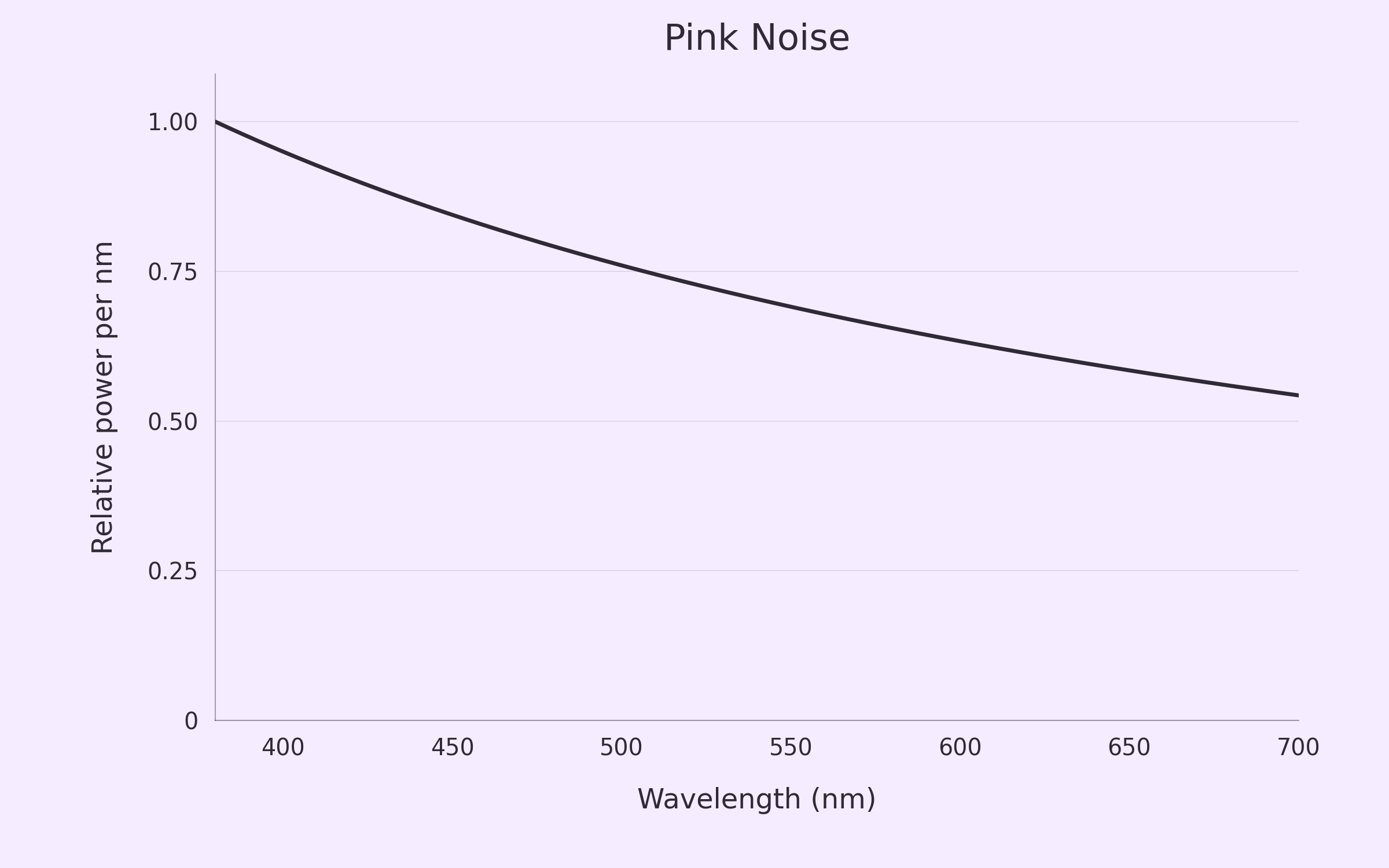
Using the same process as with white noise, we generate the curve and color you saw at the beginning of this article:
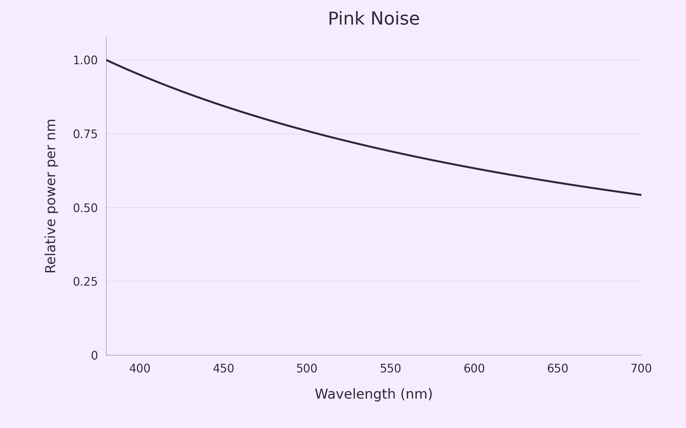
Just like white noise, it has more power per nanometer on the blue side of the spectrum, but it doesn’t drop off quite as aggressively toward the red side. There’s more red relative to blue in the mixture compared to white noise. I might not call this color pink exactly, but it’s not too far off so we can call this a win for color-naming-noises.
Violet and Brown Noise
The last two colors in this family I want to talk about are violet and brown noise. Violet noise, also called purple noise, takes the white-to-pink pipeline and goes the opposite direction. Instead of dividing the power per Hz by f, it multiplies it by f2. Using a similar derivation to pink noise, we end up with
\(S_{f,\mathrm{violet}} \propto f^2 \qquad\Longrightarrow\qquad S_{\lambda,\mathrm{violet}} \propto \frac{1}{\lambda^4},\)
which looks like:
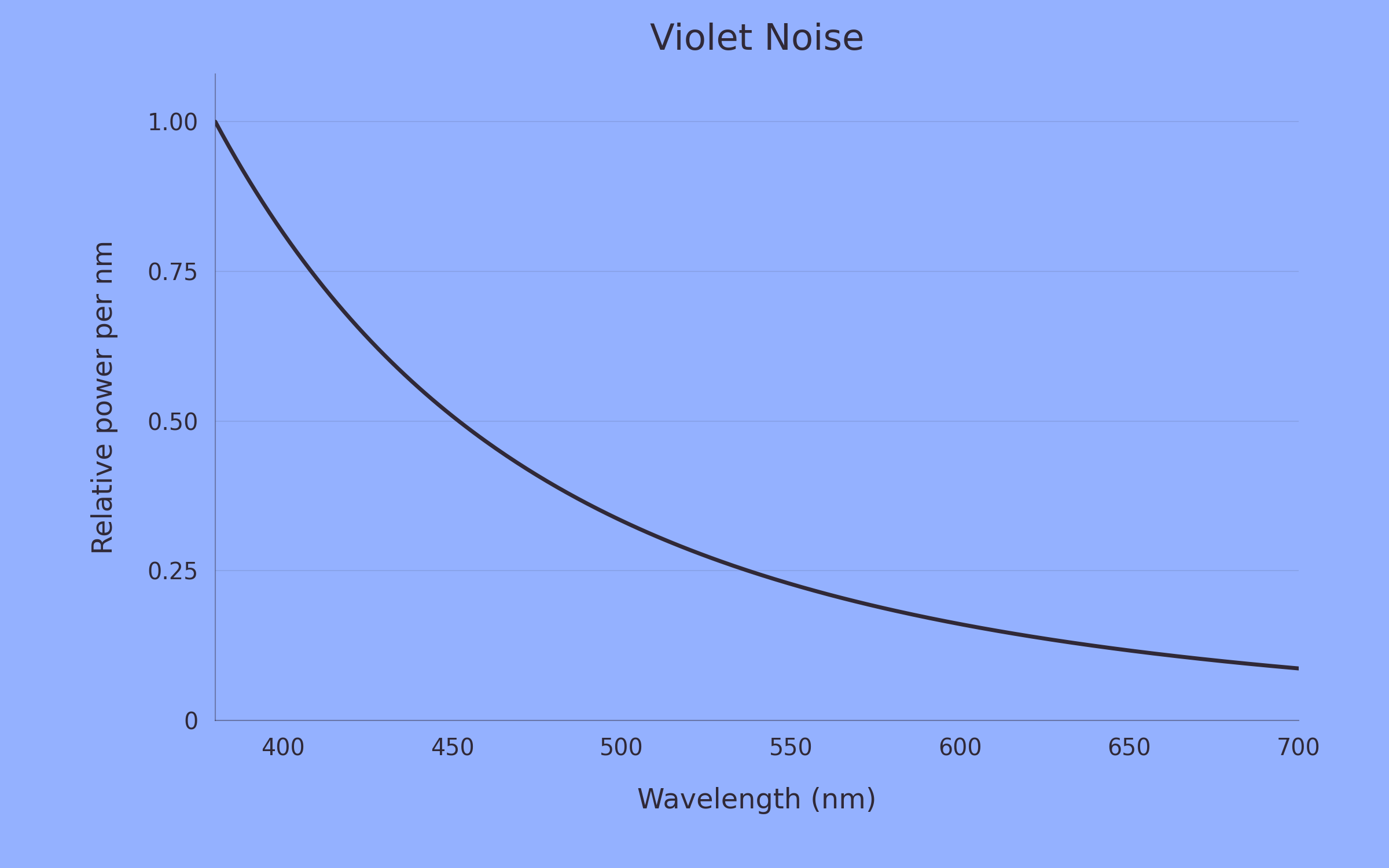
This is basically blue. The power per nanometer drops off rapidly as we move toward longer wavelengths. I’m sure you remember our old friend ROYGBIV, and this distribution strongly favors the V side of things, even though the mixture comes out more blue than violet on our display. It’s worth noting again that this color might not be the “true” version of violet noise that you might see if you truly generated photos proportionally to 1/λ4 because our sRGB conversion is imperfect, but it’s close.
I’ll call this one a moderate success in terms of color-naming-noises.
Brown noise goes in the opposite direction. Formally it’s Brownian noise, named for its connection to Brownian motion, which is named after Robert Brown. The derivation of its power spectrum is beyond the scope of this write-up, but the tl;dr is that its power per Hz falls proportionally to 1/f2. Converting to wavelength gives
\(S_{f,\mathrm{brown}} \propto \frac{1}{f^2} \qquad\Longrightarrow\qquad S_{\lambda,\mathrm{brown}} \propto 1.\)
So this time we really do have equal power per nanometer, and we get this color:
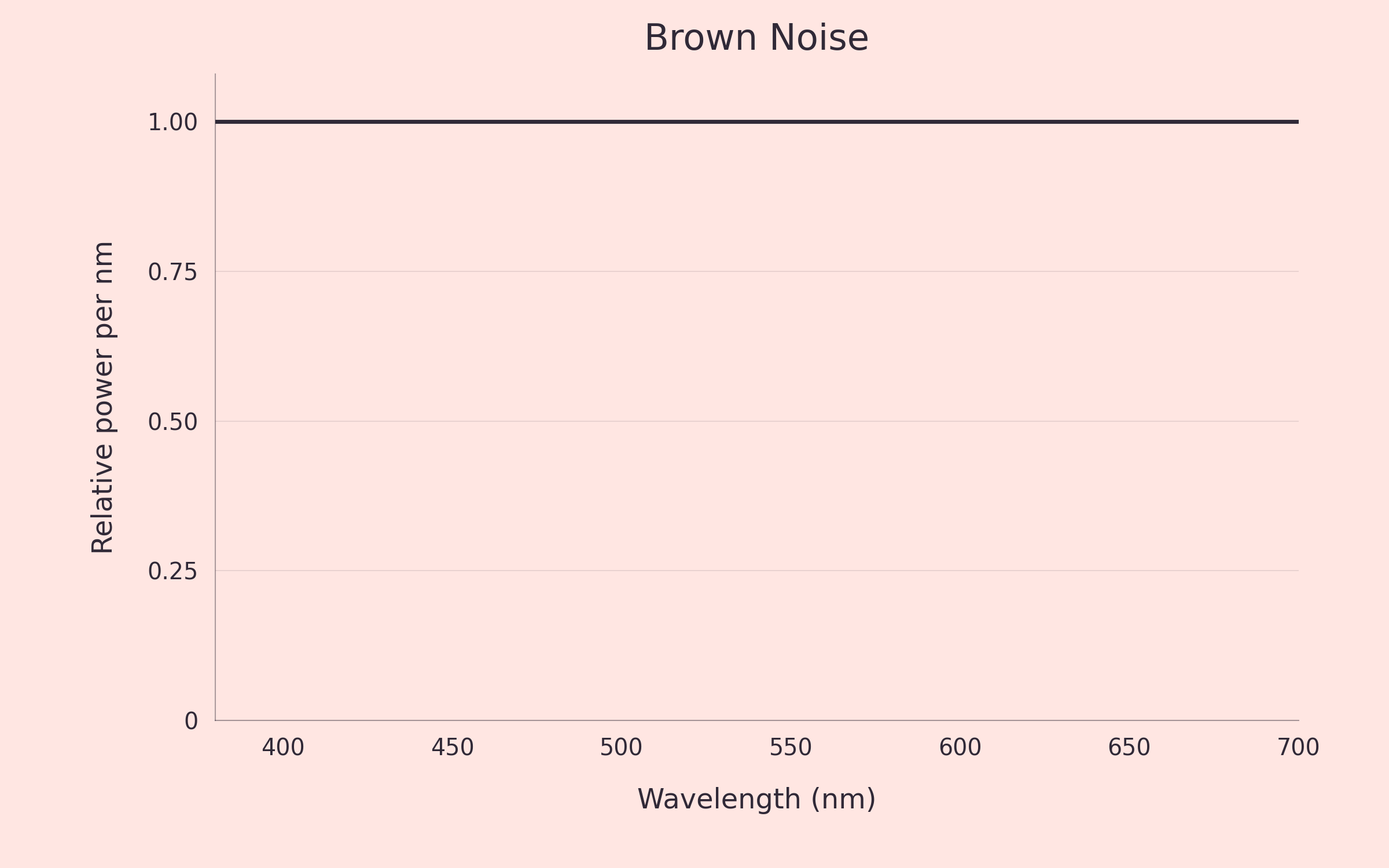
Notice that this is a pale reddish color, note the white you might naively expect and certainly not Brown. Brown is a miss as a color name, but luckily the other common name for this power spectrum is Red Noise which works well enough.
Grey Noise
We don’t (see/hear) all parts of the (visual/audio) spectrum at equal strength. Our hearing sensitivity follows a squiggly curve, and it changes with loudness. Grey noise tries to compensate for this, weighting different frequency regions so they sound equally loud.
For this example, I used the 60-phon equal-loudness contour from ISO 226:2023. These measurements are for pure tones, so using them to shape noise is an approximation. So what grey noise seeks to do is take the frequencies where we are bad at hearing and make them louder, and make the frequencies where we are sensitive a bit more quiet. This way everything should sound roughly uniform to us. Here is how our sensitivity maps onto how we grey noise compensates:
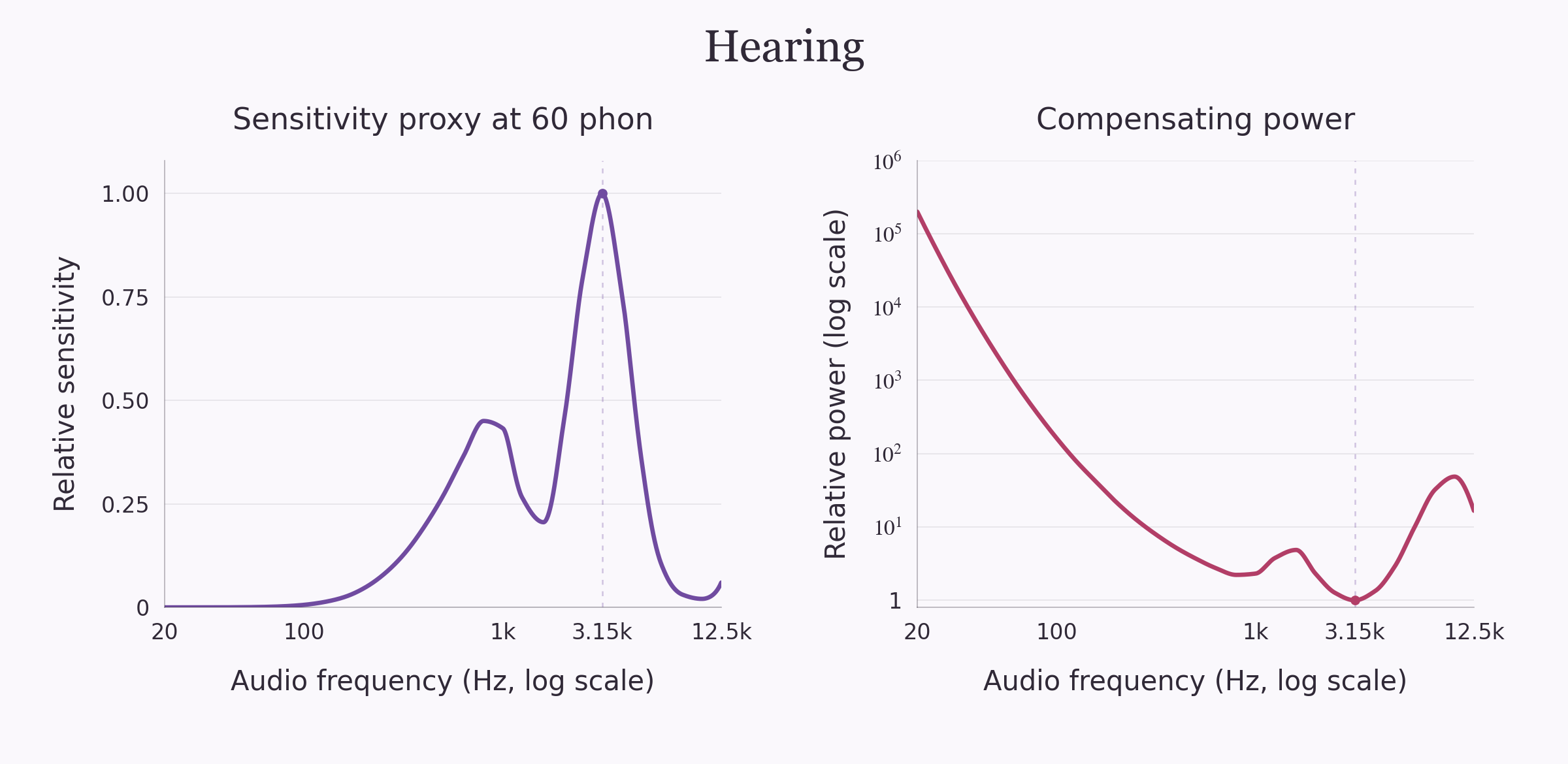
For generating the color, we need to shift some things around since this isn’t a simple 1/f curve. I mapped log audio frequency onto log light frequency, using the 20–12,500 Hz range covered by the data. The low end, 20 Hz, becomes red at 700 nm; 12,500 Hz becomes violet at 380 nm. After accounting for the changing interval widths, just as we did earlier, we get this:
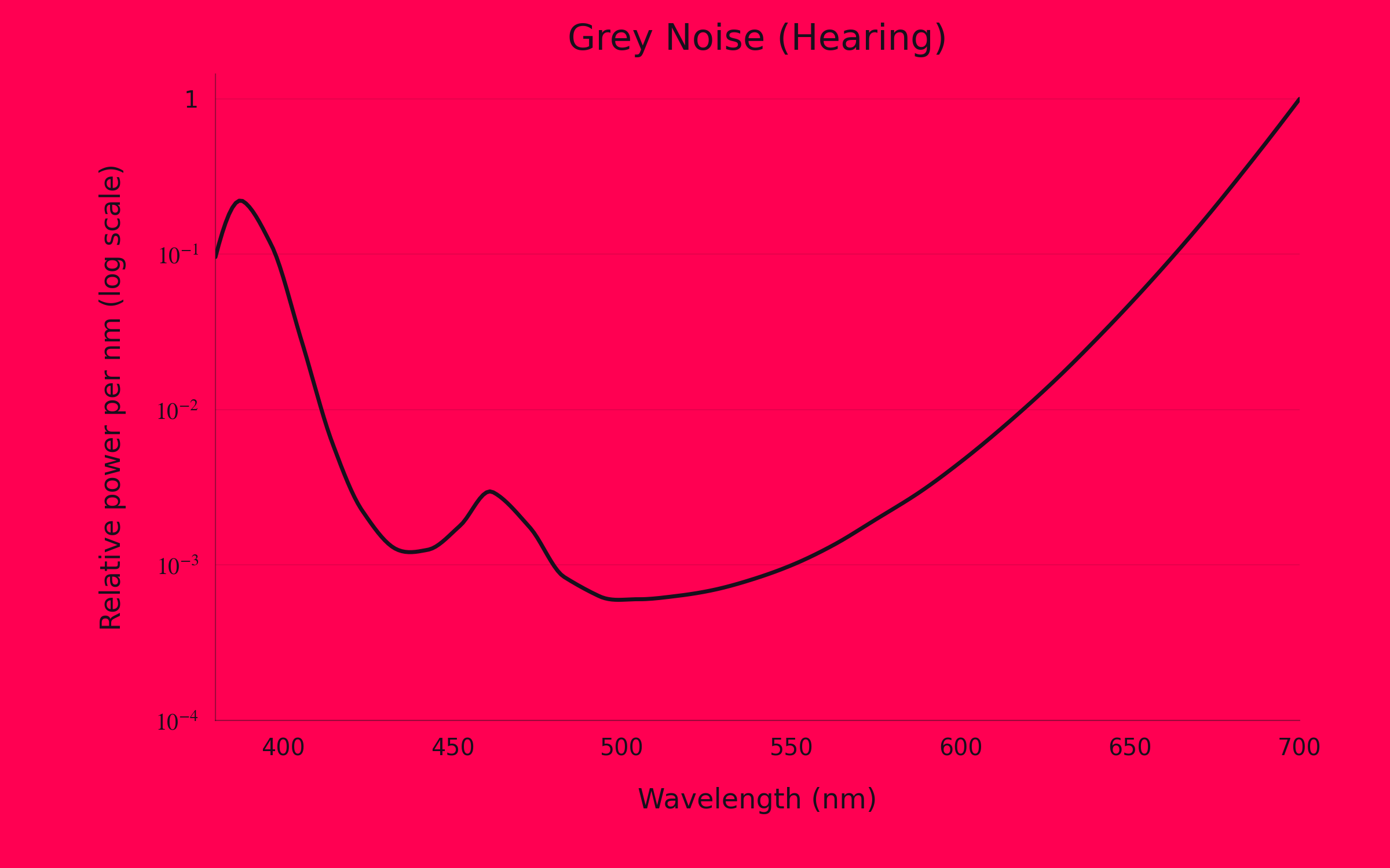
Minimal green, some blue, lots of red. This is one possible color of grey noise under our chosen mapping. A different loudness level or mapping might give a different result, but the core result will be the same: basically no green, lots of red, some blue.
But what is the vision equivalent? What would “grey” color look like if we defined “grey” in the same way for vision as we do for audio?
If we wanted to translate the spirit of grey noise into vision, we could give each equal-width wavelength band the same contribution to brightness. For fancy jargon if you want to look it up, I’m using equal photopic luminance per nanometer: the standard measure for light-adapted vision. Our visual sensitivity curve is simpler than our hearing curve, peaking in the green around 555 nm:
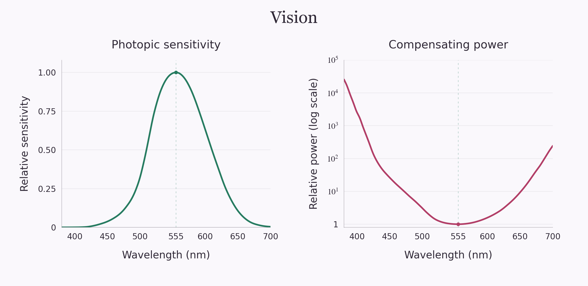
In effect, the color version of grey noise will require us to bump up the amount of light in our weak areas (violet/blue and red) and decrease the amount of light in our strong ones (green). When we do this, we end up with this color:
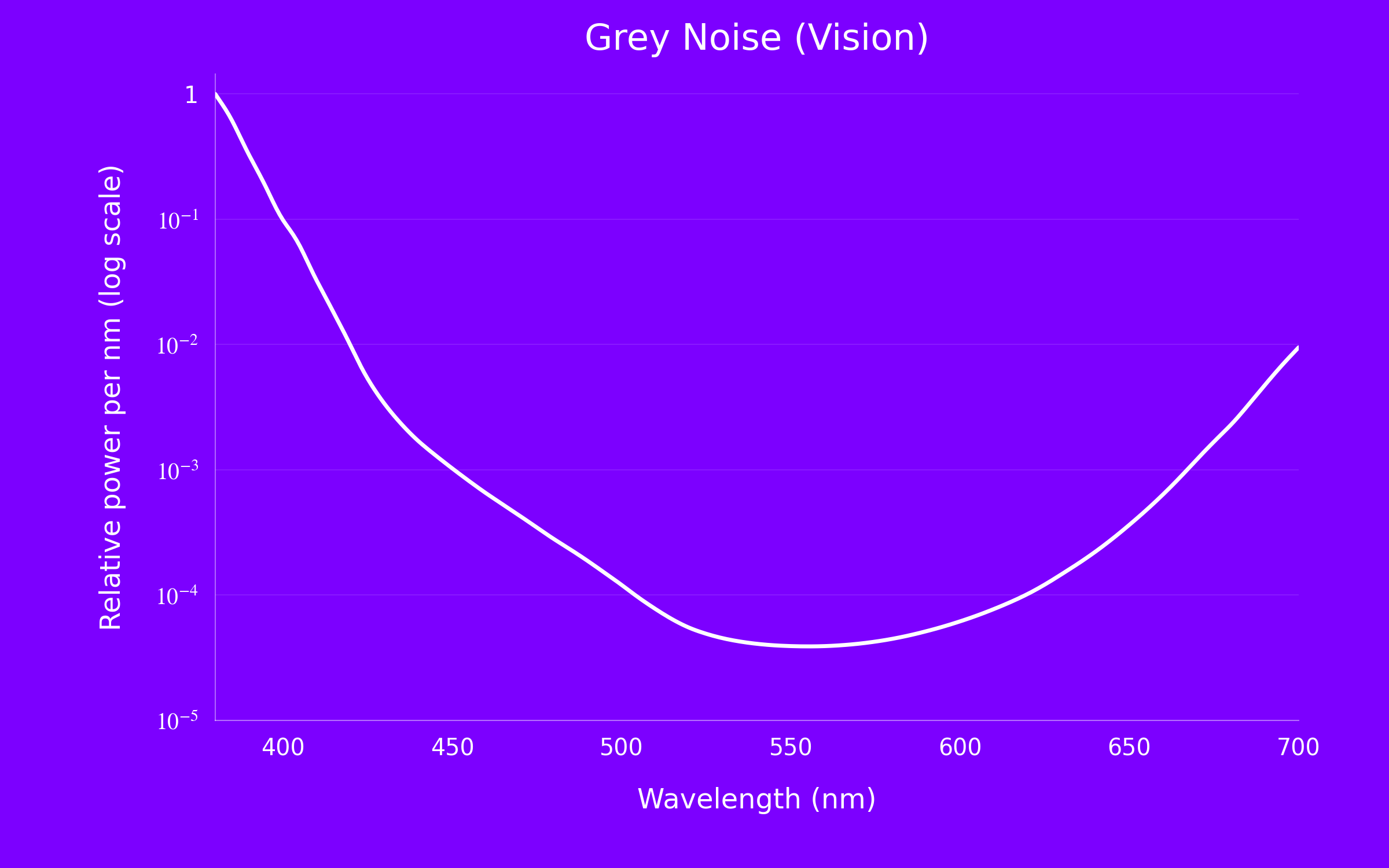
As you can see this is quite purple. Our sensitivity to deep violet drops off strongly, which means we compensate by adding back a ton of violet. In contrast we are extremely sensitive to green, so we allocate much less power there. Further, we need to add back more red than violet light which does a good job mixing with the blue to make things strongly purple.
Side note: at the same power, a green laser looks much brighter than other colors for exactly this reason. We just see green better. This is why green lasers are the best lasers.
Both grey colors technically fall outside the range sRGB can reproduce, so these images are approximations, but they’re still pretty far from the actual color grey.
Verdict?
Honestly, pretty good naming for most of these. White and grey are evocative, and pink, violet, and red are at least in the right neighborhood under our display convention. Brown is a miss as a color name, but the connection with Brownian motion is a stronger sell to me than even white noise.
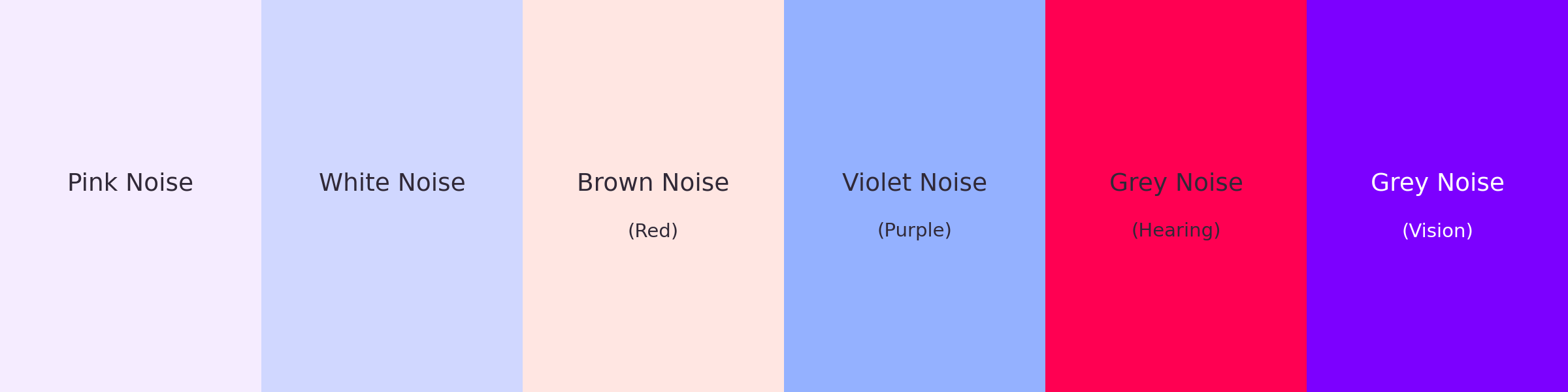
Here’s the original lineup with the answers:
Code can be found on here if you’re curious.