No Planet Money!
Not the fake graph!

I was if it was legit and to elaborate.

The graph makes a fundamental mistake that you don’t need a degree in economics nor statistics to understand.
It compares a median … with a mean.
I think everybody on the internet understands that because of skewed income inequality, the median is the more interesting measure. It’s not affected by outliers.
The blue line measures median wages adjusted for cost of living.
But the productivity line, in orange, is not the productivity of the median worker, but for the average worker - the mean productivity. It’s comparing apples and oranges!
What happens when we look at wages for the mean worker?
The gap disappears. The average worker receives pay according to their average productivity.
Well, whoop-de-doo for the mean worker - but what about the median worker? What’s their productivity? Unfortunately, we don’t have that data.
But, we do have productivity data broken down by industry. Not every industry has seen the same increase in productivity. As you can imagine the last few decades productivity growth has been dominated by computers and information technology.
Now, here’s a little secret, that nobody talks about. Many people’s pay has gone up by more than their corresponding sector’s productivity.
You see what happens is that increasing productivity (and hence pay) in the tech sector changes the overall labor market. Now, if firms outside of tech want to hire people, they have to compete with tech firms offering crazy high wages. This lifts wages everywhere.
To understand why, ask yourself why a taxi driver in America makes so much more than a taxi driver in Guatemala. It’s the same work. But the taxi driver in America has other, better options competing for their labor hours.
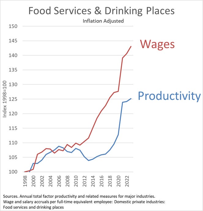
Here, this will blow your mind. This is the true graph for many jobs: The real wages for workers in food services and drinking places rose over 43% since 1998. Whereas productivity in the sector only grew by 25%. The gap goes the other way.

While many promote the myth of wage stagnation, when we look at the cost of living and compare it to median wages we see that in 1964 the median worker made the equivalent of $19 an hour in today’s dollars. Today’ that number is over $30. I wouldn’t call that stagnation.
![11:11
79
...
2% fred.stlouisfed.org/st
+
17
FRED®
Q =
FRED Graph
1Y
5Y
10Y
Max
Edit Graph
Download v.
FRED
-
100*Average Hourly Earnings of Production and Nonsupervisory Employees,
Total Private/Personal Consumption Expenditures: Chain-type Price Index,
Jan 2025=100
32.5
30.0
27.5
25.0
225
May 1964: 19.42418
90*$ per Hour/Index
20.0
17.5
1980
2000
2020
Sources: U.S. Bureau of Economic Analysis; U.S. Bureau of Lab ...
Shaded areas indicate U.S. recessions.
Fullscreen []
Share Graph @
Account Tools
X
f
(in
Notes
Average Hourly Earnings of Production and
<](https://substackcdn.com/image/fetch/$s_!KomK!,f_auto,q_auto:good,fl_progressive:steep/https%3A%2F%2Fsubstack-post-media.s3.amazonaws.com%2Fpublic%2Fimages%2F7609b15d-d3a9-4d2b-970a-054ec5d7b75e_1080x917.jpeg "11:11
79
...
2% fred.stlouisfed.org/st
+
17
FRED®
Q =
FRED Graph
1Y
5Y
10Y
Max
Edit Graph
Download v.
FRED
-
100*Average Hourly Earnings of Production and Nonsupervisory Employees,
Total Private/Personal Consumption Expenditures: Chain-type Price Index,
Jan 2025=100
32.5
30.0
27.5
25.0
225
May 1964: 19.42418
90*$ per Hour/Index
20.0
17.5
1980
2000
2020
Sources: U.S. Bureau of Economic Analysis; U.S. Bureau of Lab ...
Shaded areas indicate U.S. recessions.
Fullscreen []
Share Graph @
Account Tools
X
f
(in
Notes
Average Hourly Earnings of Production and
<")
Edit: A number of people have asked about the relationship between “Average Hourly Earnings of Production and Nonsupervisory Employees” and “Median earnings.” I label the Avg Nonsupervisory Earnings as “median” because it is so closely approximated to the official median series. The problem with the official “median” series is that it only goes back to 1979. But to study the issue at hand, we need a measure similar to median that can go back before the 70’s.
Here are the two series, adjusted for inflation, along with a link to the graph. I also adjust the “hourly” to “weekly” by multiplying it by 40.