A weekly dataset decomposing US financial system liquidity into its three components — the Fed balance sheet, the Treasury General Account, and the Overnight Reverse Repo Facility — revealing how $2.4 trillion in plumbing flows silently offset the largest quantitative tightening in history.
Eco3min Research · Last updated: · Frequency: Weekly · Coverage: Jan 2003 – Mar 2026
The Federal Reserve’s balance sheet is the most-watched number in macro finance. But the balance sheet alone does not measure the liquidity that reaches the financial system. Two largely invisible mechanisms — the Treasury General Account (TGA) and the Overnight Reverse Repo Facility (ON RRP) — absorb or release trillions of dollars without any FOMC vote, press conference, or policy announcement. This page provides a weekly composite dataset that tracks what actually matters: Net Liquidity, defined as the Fed balance sheet minus TGA minus ON RRP.
TL;DR
Between September 2022 and March 2026, the Fed removed $2.14 trillion from its balance sheet via quantitative tightening. Over the same period, $2.37 trillion drained from the Overnight Reverse Repo Facility back into the financial system — more than fully offsetting QT. Net Liquidity barely moved. The S&P 500 rose 78%. The ON RRP buffer is now fully depleted. For the first time since 2022, further balance sheet reduction will hit actual system liquidity with no cushion.
Latest Observation — March 18, 2026
$5.80T
Net Liquidity
$6.66T
Fed Balance Sheet
$0.85T
TGA Balance
~$0T
ON RRP (Depleted)
Key Research Findings
- Net Liquidity — defined as the Fed balance sheet (WALCL) minus the Treasury General Account (WTREGEN) minus the Overnight Reverse Repo Facility (RRPONTSYD) — is a more informative measure of system liquidity than the Fed balance sheet alone. During the 2020–2022 period, Net Liquidity tracked the S&P 500 with a level correlation of 0.81, compared to 0.74 for WALCL alone.
- The single most important finding in this dataset: between September 2022 and March 2026, the RRP facility drained $2.37 trillion back into the financial system, while the Fed removed $2.14 trillion via QT. The RRP drain exceeded QT by $230 billion, producing a net offset of approximately 110%. This is the primary mechanical explanation for why QT did not produce the financial stress that historical precedent suggested.
- During the 63 weeks of “Stealth Easing” — defined as periods when the Fed balance sheet contracted year-over-year while Net Liquidity expanded — the S&P 500 delivered a cumulative return of +64.6%. Investors focused exclusively on the balance sheet were positioned for tightening. The plumbing delivered easing.
- The ON RRP facility is now fully depleted (balance approximately $0 as of March 2026, down from a peak of $2.37 trillion in September 2022). This means the buffer that absorbed QT’s impact has been exhausted. Any further balance sheet reduction will, for the first time since mid-2022, translate directly into reduced system liquidity.
- The current regime classification is “Contraction” — both WALCL and Net Liquidity are declining year-over-year. Net Liquidity stands at $5.80 trillion, down 5.3% year-over-year, at the 80th percentile of its full-sample distribution.
1,212 weekly observations · CC BY 4.0 · Updated weekly · Methodology · Cite this dataset
1,212
Weekly Obs.
$7.14T
Peak Net Liq.
$2.37T
RRP Peak
110%
QT Offset
0.81
Corr. (2020–22)
80th
Current Pctl.
Chart: US Net Liquidity Index vs S&P 500 (2003–2026)
Net Liquidity Index (WALCL − TGA − ON RRP) vs S&P 500 — Weekly, January 2003 to March 2026
Net Liquidity (left axis, trillions USD) decomposes the Fed balance sheet into the cash that actually circulates in the financial system. S&P 500 (right axis). Shaded periods: QT phases.

Key Takeaway
The chart reveals the critical distinction between the balance sheet and system liquidity. During QT2 (2022–2026), WALCL declined steeply — from $8.97 trillion to $6.66 trillion. But Net Liquidity, after falling from $7.14 trillion to $5.74 trillion by September 2022, stabilized and partially recovered as the ON RRP drained. The market tracked the plumbing, not the headline balance sheet number. When all three pipes are visible, the puzzle of QT’s non-impact dissolves.
Sources: FRED (WALCL, WTREGEN), NY Fed (RRPONTSYD), S&P Dow Jones Indices (SP500). Chart: Eco3min Research.
Updated weekly following the H.4.1 release. Latest observation: March 18, 2026.
How to Read This Chart
The chart shows two series: Net Liquidity (the black/blue line, left axis) and the S&P 500 (gray line, right axis). Net Liquidity is computed as the Fed’s total assets minus two drains: the Treasury General Account and the Overnight Reverse Repo Facility. The difference between WALCL and Net Liquidity represents cash that is on the Fed’s balance sheet but is not circulating in the financial system — it is either parked in the Treasury’s account or locked in the reverse repo facility.
When the gap between WALCL and Net Liquidity widens, the plumbing is absorbing liquidity. When it narrows, the plumbing is releasing liquidity. The periods where this gap changed most dramatically — the COVID-era TGA buildup, the 2021–2022 RRP surge, and the 2023–2025 RRP drain — are the key episodes that explain why the balance sheet alone failed to predict market behavior. For context on how the yield curve interacted with these liquidity shifts, inversions preceded the 2020 and 2022 liquidity regime changes.
The shaded areas mark QT phases. During QT1 (2017–2019), the RRP was negligible and Net Liquidity tracked WALCL closely — the balance sheet decline of $0.70 trillion translated into a Net Liquidity decline of $0.51 trillion. During QT2 (2022–present), the plumbing offset was massive: a $2.31 trillion WALCL decline produced only a $0.80 trillion Net Liquidity decline, because the RRP drained $2.37 trillion back into the system simultaneously.
The Three Pipes: Why the Balance Sheet Is Not the Liquidity
The Fed’s balance sheet — reported weekly in the H.4.1 release as Total Assets (FRED series WALCL) — is the most-cited measure of monetary accommodation in financial commentary. When the balance sheet expands, analysts describe it as “liquidity injection.” When it contracts, the narrative is “liquidity withdrawal.” This framing is mechanically incomplete, and in certain periods, empirically wrong.
The reason is that WALCL measures the total size of the Fed’s asset holdings, not the cash that is available to flow through the financial system. Two mechanisms can absorb or release enormous quantities of reserves without any change in the balance sheet:
Pipe 1: The Treasury General Account (TGA)
The TGA is the US government’s checking account at the Federal Reserve (FRED series WTREGEN). When the Treasury issues debt and deposits the proceeds, the TGA rises — mechanically draining reserves from the banking system. When the Treasury spends those funds, the TGA falls — releasing reserves back. The TGA reached a record $1.82 trillion in July 2020, when the government accumulated cash for COVID-era spending programs. Its subsequent drawdown injected over $1.5 trillion into the financial system without any FOMC action. For an examination of how these TGA swings interact with debt ceiling politics, see our research on monetary regimes and market cycles.
Pipe 2: The Overnight Reverse Repo Facility (ON RRP)
The ON RRP (FRED series RRPONTSYD) allows money market funds and other eligible counterparties to park cash at the Fed overnight, earning a risk-free rate. Cash placed in the ON RRP is effectively removed from the financial system — it sits at the Fed rather than being lent, invested, or circulating through markets. Between March 2021 and December 2022, the ON RRP absorbed approximately $2.3 trillion in reserves that had been created through QE but were not being deployed in the real economy. This absorption made the effective liquidity injection of QE significantly smaller than the headline balance sheet expansion suggested.
The subsequent reversal — a $2.37 trillion drain from the ON RRP between September 2022 and March 2026 — is the central empirical contribution of this dataset. As money market funds moved their cash from the ON RRP back into Treasury bills and other instruments, the liquidity that QE had created but the RRP had trapped was released into the system. This “re-release” precisely offset the Fed’s quantitative tightening program.
Pipe 3: The Fed Balance Sheet (WALCL)
The third pipe is the one everyone watches. WALCL measures the Fed’s total assets — primarily Treasury securities and mortgage-backed securities acquired during QE programs. When the Fed buys assets, it creates reserves (expanding WALCL). When it allows assets to mature without reinvestment (QT), reserves are destroyed (contracting WALCL). But the reserves created by QE are only “in the system” if they are not trapped in the TGA or the ON RRP. The balance sheet measures the gross creation of reserves. Net Liquidity measures the net reserves actually circulating.
Net Liquidity = WALCL − TGA − ON RRP
The formula is deliberately simple. Its power comes not from mathematical sophistication but from the empirical fact that the three components can move in opposite directions — producing a Net Liquidity trajectory that diverges sharply from the balance sheet alone. During the 2023–2025 “Stealth Easing” period, WALCL was contracting year-over-year throughout, yet Net Liquidity was expanding year-over-year — meaning the plumbing was releasing more liquidity on a rolling 12-month basis than QT was removing. Over the full QT2 period (from the WALCL peak in April 2022), the Fed removed $2.31 trillion from its balance sheet, but Net Liquidity declined by only $0.80 trillion — the difference absorbed by the RRP drain and TGA shifts. For context on how these flows interact with broader inflation dynamics, the liquidity offset likely contributed to the persistence of asset-price inflation even as goods inflation moderated.
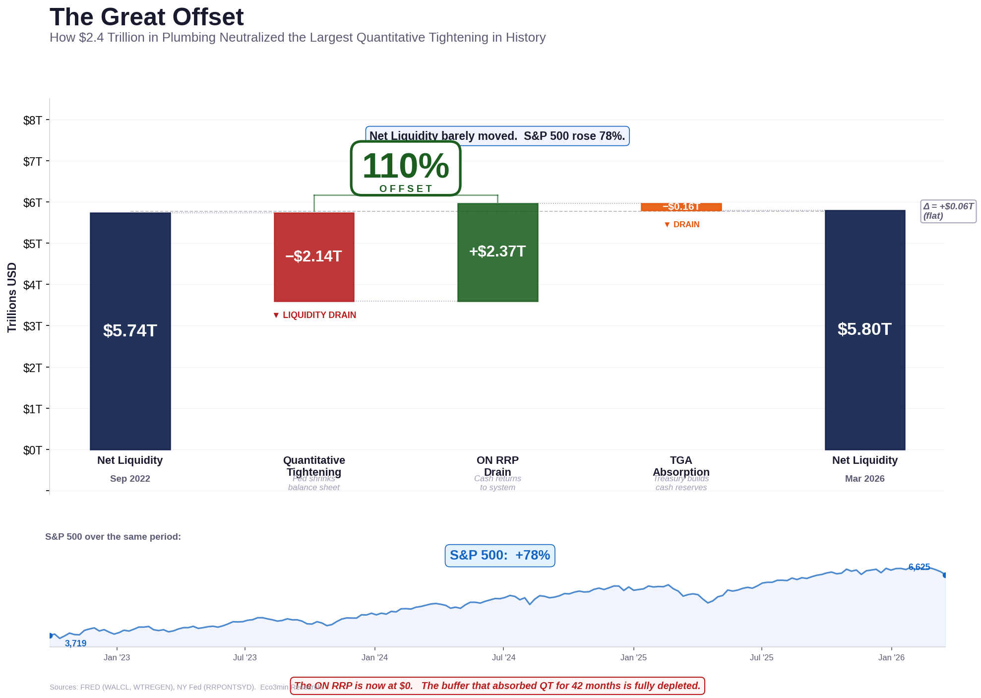
The Great Offset: How $2.4 Trillion in Plumbing Neutralized QT
The central empirical finding of this dataset is the near-perfect offset between quantitative tightening and the ON RRP drain. The following table decomposes the change in each component from the RRP peak (September 28, 2022) to the latest observation (March 18, 2026):
| Component | Sep 2022 | Mar 2026 | Change | Effect on Liquidity |
|---|---|---|---|---|
| WALCL (Fed Balance Sheet) | $8.80T | $6.66T | −$2.14T | Drains liquidity |
| ON RRP | $2.37T | ~$0.00T | −$2.37T | Returns liquidity |
| TGA | $0.69T | $0.85T | +$0.16T | Drains liquidity |
| Net Liquidity | $5.74T | $5.80T | +$0.06T | Essentially flat |
Key Takeaway
The Fed reduced its balance sheet by $2.14 trillion — the largest quantitative tightening program in history. The ON RRP drain returned $2.37 trillion to the financial system — $230 billion more than QT removed. The TGA absorbed a modest $160 billion. The net effect on system liquidity: +$60 billion. The tightening cycle that was supposed to drain liquidity from the system instead rerouted it through the plumbing.
The Great Offset — Liquidity Decomposition, September 2022 to March 2026
Waterfall: change in each component from the ON RRP peak to the latest observation. The RRP drain (+$2.37T) exceeded QT (−$2.14T). Net Liquidity was essentially flat. S&P 500: +78%.

Sources: FRED (WALCL, WTREGEN), NY Fed (RRPONTSYD). Chart: Eco3min Research.
Updated weekly. Latest observation: March 18, 2026.
This offset was not engineered. It was an emergent consequence of the Federal Reserve’s rate-setting framework. As the Fed raised the federal funds rate, the ON RRP rate rose in tandem — but Treasury bill yields rose even faster, making T-bills more attractive than the ON RRP for money market funds. Cash migrated from the ON RRP to the T-bill market, where it funded government spending and circulated through the financial system. The Fed was tightening through the front door (QT) while the plumbing was easing through the back door (RRP drain).
The market implications were profound. Analysts who tracked only WALCL expected QT to produce a replay of the 2018 “taper tantrum” or worse — a view supported by the historical record of equity returns during prior tightening cycles. Instead, the S&P 500 rose from 3,719 at the RRP peak to 6,625 as of March 2026 — a 78% advance during what was nominally the most aggressive balance sheet contraction in modern history. The dataset shows that there was no paradox: the plumbing offset meant that the market was not, in fact, experiencing a liquidity withdrawal.
QT1 vs QT2: Why the Second Time Was Different
The comparison between the two QT episodes in the dataset illustrates why the balance sheet alone is insufficient:
| Metric | QT1 (Oct 2017 – Sep 2019) | QT2 (Jun 2022 – Mar 2026) |
|---|---|---|
| WALCL decline | $0.70T | $2.26T |
| RRP change | ~$0 (facility negligible) | −$1.96T (massive drain) |
| Net Liquidity decline | $0.51T | $0.36T |
| WALCL-to-NL transmission | 73% | 16% |
| Outcome | Repo crisis (Sep 2019) | No systemic stress |
During QT1, the ON RRP was negligible — the facility existed but held less than $120 billion. There was no buffer. The balance sheet decline transmitted almost fully into reduced system reserves, and the process ended in the September 2019 repo market crisis when overnight lending rates spiked to 10%. During QT2, the RRP absorbed the impact like a sponge releasing water: the $2.26 trillion headline reduction translated into only a $0.36 trillion effective decline in circulating liquidity — a transmission rate of just 16%, compared to 73% during QT1. For a broader examination of how credit spreads behaved during both episodes, the absence of a credit stress signal during QT2 is consistent with this liquidity offset framework.
Stealth Easing: When the Balance Sheet Tightens but Liquidity Expands
The dataset introduces a regime classification based on the directional agreement or disagreement between the Fed’s balance sheet and Net Liquidity. The most analytically important regime is “Stealth Easing” — defined as periods when WALCL is contracting year-over-year while Net Liquidity is expanding year-over-year. This occurs when the combined drawdown of the TGA and ON RRP exceeds the pace of QT.
In the 1,212-week dataset, Stealth Easing occurred during 105 weeks (8.7% of the total sample). Of these, 63 weeks fell in the post-QT2 period (May 2023 through December 2025), when the RRP drain was at its most intense. During these 63 weeks, the S&P 500 advanced from approximately 4,159 to 6,846 — a cumulative return of +64.6%.
- During Stealth Easing, the Fed’s balance sheet was shrinking — analysts who tracked only WALCL described the policy stance as “restrictive.” The plumbing was simultaneously easing.
- The mechanism: money market funds migrated $1.96 trillion from the ON RRP to Treasury bills and repos, flooding the short-term funding market with cash that then circulated through the broader financial system.
- The S&P 500’s 64.6% advance during post-QT Stealth Easing weeks is consistent with the real rates dataset showing that moderate positive real rates combined with expanding effective liquidity are historically the most favorable configuration for equity multiples.
- The Stealth Easing regime ended in early 2026 when the ON RRP reached zero — the buffer was exhausted. The current regime has transitioned to “Contraction,” where both the balance sheet and Net Liquidity are declining.
Key Takeaway
The concept of “Stealth Easing” is this dataset’s primary analytical contribution. It identifies periods where the headline policy stance (balance sheet contraction) diverges from the effective liquidity stance (system expansion). The 2023–2025 Stealth Easing episode — 63 weeks, +64.6% S&P 500 return — is the largest such divergence in the dataset and explains why the market rallied through what was nominally the most aggressive QT ever conducted.
Correlation Analysis: What Net Liquidity Explains — and What It Doesn’t
A popular claim in financial commentary holds that Net Liquidity “explains” or “drives” the S&P 500 with a correlation exceeding 0.90. The dataset provides a more nuanced picture. The level correlation between Net Liquidity and the S&P 500 is period-dependent and structurally unstable — as expected for two non-stationary time series.
Level Correlations by Period
| Period | Net Liq ↔ SP500 | WALCL ↔ SP500 | NL Improvement | Obs. |
|---|---|---|---|---|
| Full sample (2016–2026) | 0.73 | 0.60 | +0.13 | 523 |
| COVID era (2020–2022) | 0.81 | 0.74 | +0.07 | 157 |
| QT era (2022–2026) | −0.38 | −0.95 | +0.57 | 199 |
| 2023–2024 only | −0.03 | −0.96 | +0.93 | 104 |
Key Takeaway
The data reveals two distinct findings. First, Net Liquidity is consistently a better explanatory variable than WALCL alone — the improvement ranges from +0.07 to +0.93 depending on the period. This validates the three-component decomposition. Second, the absolute correlation between Net Liquidity and the S&P 500 broke down after 2022: during 2023–2024, the correlation was effectively zero (−0.03) even as the S&P 500 rose over 40%. This means liquidity explains the plumbing offset but does not explain the post-2022 market rally — other forces (AI-driven earnings growth, sector rotation) dominate.
The honest interpretation is that Net Liquidity is not a market-timing indicator. It is a plumbing diagnostic. Its value lies in identifying when the Fed’s headline policy stance diverges from the system’s effective liquidity configuration — not in predicting where the S&P 500 will trade next quarter. The 0.81 correlation during 2020–2022 reflected a period when liquidity flows were the dominant macro force. The near-zero correlation during 2023–2024 reflects a period when other forces — technology sector earnings, AI capital expenditure, and fiscal stimulus — became dominant. For a broader examination of what drives equity valuations across regimes, see our market regimes and liquidity framework alongside the real rates vs CAPE ratio dataset.
The rolling 52-week level correlation between Net Liquidity and the S&P 500 peaked at 0.94 in mid-2021, during a window dominated by the COVID QE cycle. The popular “0.91 correlation” claim cited in financial commentary refers to a similar reading. But this level was specific to that period. By mid-2025, the rolling correlation had fallen to −0.57, and by March 2026 it stood at approximately −0.80. The relationship is not stable across regimes — which is precisely what makes regime classification more useful than simple correlation.
Liquidity Regime Classification
The dataset classifies each weekly observation into one of four regimes based on the year-over-year direction of WALCL and Net Liquidity. This classification captures the interaction between Fed policy (the balance sheet) and system plumbing (TGA and ON RRP) in a way that a single indicator cannot.
Liquidity Regime Map — Net Liquidity vs WALCL Decomposition (2003–2026)
1,212 weekly observations classified by WALCL and Net Liquidity year-over-year direction. The “Stealth Easing” quadrant (WALCL down, NL up) identifies the 2023–2025 episode where plumbing offset QT.

Key Takeaway
The regime map reveals that Stealth Easing — the upper-left quadrant — is a relatively rare configuration (8.7% of observations) that has appeared in only two sustained episodes: during the post-GFC period and during the 2023–2025 QT2 offset. The current observation sits in the “Contraction” quadrant, indicating that the plumbing offset has been exhausted and both the balance sheet and effective liquidity are now declining.
Sources: FRED (WALCL, WTREGEN), NY Fed (RRPONTSYD). Chart: Eco3min Research.
Updated weekly. Latest observation: March 18, 2026.
Embed this chart in your article or newsletter:
Expansion · WALCL ↑ Net Liq ↑
Both the balance sheet and system liquidity are growing. The archetype is QE: March 2020 to March 2022. Accounts for 59% of the dataset. Associated with rising equity markets in most episodes, though the magnitude of the liquidity impulse matters more than the regime label itself.
Contraction · WALCL ↓ Net Liq ↓
Both the balance sheet and system liquidity are shrinking. The current regime (early 2026). Historically associated with rising financial stress indicators. During QT1, this regime preceded the September 2019 repo crisis within 9 months. Whether the same pattern recurs depends on the pace of QT relative to reserve demand.
Stealth Easing · WALCL ↓ Net Liq ↑
The balance sheet is shrinking but system liquidity is expanding — the plumbing is offsetting policy. The 2023–2025 period. Accounts for 8.7% of the dataset. The S&P 500 delivered +64.6% during post-QT Stealth Easing weeks. This regime ends when the plumbing buffers (RRP, TGA) are exhausted.
Stealth Tightening · WALCL ↑ Net Liq ↓
The balance sheet is expanding but system liquidity is contracting — the plumbing is absorbing QE. The 2021–2022 period, when the RRP surged from $0 to $2.37 trillion during active QE. The Fed was creating reserves, but money market funds were parking them right back at the Fed. QE’s effective impact was smaller than the headline suggested.
Interactive Tool
Liquidity Scenario Calculator
Adjust your assumptions for the Fed balance sheet, TGA, and ON RRP to see the implied Net Liquidity level, regime, and change from current. Based on 1,212 weekly observations (2003–2026).
$6.66T
$4.0T$10.0T
$0.85T
$0.0T$2.0T
$0.00T
$0.0T$3.0T
Current ON RRP: ~$0.
Peak was $2.37T (Sep 2022).
$5.80T
Net Liquidity
+$0.00T
Change from Current
80th
Historical Percentile
Contraction
Scenario Regime
Current scenario: A Net Liquidity of $5.80T places this at the 80th percentile of all weekly observations since 2003. The current regime is Contraction — both WALCL and Net Liquidity are declining. With the ON RRP buffer fully depleted, any further balance sheet reduction translates directly into lower system liquidity.
Historical Turning Points: When the Plumbing Moved the Market
September 2008 – March 2009 — The GFC Liquidity Explosion
In September 2008, the Fed’s balance sheet stood at $0.93 trillion and Net Liquidity was approximately equal ($0.92 trillion) — the TGA and RRP were negligible. Over the following six months, WALCL more than doubled to $2.07 trillion as the Fed launched emergency lending facilities and QE1. Net Liquidity tracked almost identically ($1.99 trillion by March 2009), because the plumbing drains had not yet scaled. In this era, the balance sheet was the liquidity. The distinction between the two became meaningful only after the ON RRP facility scaled in 2021.
July 2020 — The TGA Peak and COVID Spending Surge
The Treasury General Account reached its all-time high of $1.82 trillion in July 2020, as the government accumulated unprecedented cash reserves for pandemic relief programs. At that moment, WALCL stood at $6.95 trillion but Net Liquidity was only $5.13 trillion — a gap of $1.82 trillion, almost entirely explained by the TGA (the ON RRP was negligible at the time). Over the subsequent 13 months, as the Treasury disbursed COVID stimulus checks and other programs, the TGA fell to $0.44 trillion by August 2021 — mechanically injecting approximately $1.38 trillion into the financial system with zero FOMC action.
September 2021 — The Net Liquidity Peak
Net Liquidity reached its all-time high of $7.14 trillion on September 15, 2021 — notably, before the Fed balance sheet peaked (April 2022). The divergence occurred because the ON RRP began absorbing reserves rapidly: from approximately $0 in March 2021 to $1.08 trillion by September 2021, partially offsetting the ongoing QE. By the time WALCL peaked at $8.97 trillion in April 2022, the ON RRP had already reached $1.82 trillion and the TGA stood at $0.55 trillion — pushing Net Liquidity down to $6.60 trillion, well below its September 2021 peak. By June 2022, when QT formally began, the RRP had risen further to $1.97 trillion and Net Liquidity had fallen to $6.16 trillion. The market peaked in January 2022 — three months before WALCL peaked — and aligned more closely with the Net Liquidity trajectory.
September 2022 — The RRP Peak and the Start of the Great Offset
The ON RRP peaked at $2.37 trillion on September 28, 2022. The S&P 500 was near its 2022 trough at 3,719. From this point, every dollar that left the ON RRP entered the system — cushioning QT. Over the subsequent 42 months, $2.37 trillion migrated out of the facility. This was not a policy decision. It was a market-driven rotation as rising T-bill yields drew money market funds away from the ON RRP. The Fed’s fastest rate-hiking cycle in decades created the very mechanism that neutralized its own balance sheet tightening. For context, yield curve inversions during this period reflected the rate environment that powered the RRP drain.
March 2023 — The SVB Crisis and TGA Emergency Drawdown
The collapse of Silicon Valley Bank in March 2023 triggered a TGA drawdown and the launch of the Bank Term Funding Program (BTFP). The TGA fell from $0.56 trillion in early February to $0.23 trillion by the week of March 15 — releasing approximately $330 billion as the Treasury drew down its cash reserves during the crisis. Simultaneously, the Fed’s emergency lending expanded the balance sheet by nearly $300 billion in a single week, from $8.34 trillion to $8.64 trillion. The combined effect: Net Liquidity surged from $5.82 trillion in early March to $6.35 trillion by March 15 — a $530 billion liquidity injection that materialized within days. The S&P 500 rallied from the March low over the following weeks as the plumbing absorbed the shock.
March 2026 — Current Observation
The current configuration represents a regime transition. The ON RRP has been fully depleted — the buffer that cushioned QT for 42 months no longer exists. Net Liquidity stands at $5.80 trillion, down 5.3% year-over-year, at the 80th percentile of its historical distribution. Both WALCL and Net Liquidity are declining, classifying the current regime as “Contraction.” Whether the Fed adjusts the pace of QT in response to reserve scarcity — as it did in September 2019 when QT1 pushed reserves below the system’s demand threshold — is the central liquidity question for 2026. For reference, the real rates vs CAPE dataset shows the current equity valuation at historically elevated levels, suggesting limited margin for error if liquidity conditions tighten further.
Methodology
This dataset combines three Federal Reserve series into a single weekly composite — Net Liquidity — designed to measure the effective quantity of reserves circulating in the US financial system, as distinct from the total reserves created by the Federal Reserve.
Net Liquidity Index. Calculated as WALCL minus WTREGEN minus (RRPONTSYD × 1,000). WALCL and WTREGEN are reported in millions of US dollars. RRPONTSYD is reported in billions and is converted to millions for unit consistency. All three series are sourced from FRED and updated weekly (WALCL and WTREGEN on the H.4.1 release) or daily (RRPONTSYD). The daily ON RRP series is matched to the nearest Wednesday date within a 5-day tolerance to align with the weekly WALCL/WTREGEN frequency.
Regime classification. Each weekly observation is classified based on the year-over-year (52-week) direction of WALCL and Net Liquidity: Expansion (both rising), Contraction (both falling), Stealth Easing (WALCL falling, NL rising), or Stealth Tightening (WALCL rising, NL falling).
Net Liquidityt = WALCLt − WTREGENt − (RRPONTSYDt × 1,000)
Dataset Design
| Variable | Description | Unit | Source |
|---|---|---|---|
| date | Observation date (Wednesday) | YYYY-MM-DD | — |
| walcl_m | Fed Total Assets | Millions USD | FRED (WALCL) |
| tga_m | Treasury General Account | Millions USD | FRED (WTREGEN) |
| rrp_b | ON Reverse Repo Facility | Billions USD | FRED (RRPONTSYD) |
| rrp_m | ON RRP (converted) | Millions USD | Calculated |
| net_liquidity_m | WALCL − TGA − RRP | Millions USD | Calculated |
| walcl_t / tga_t / rrp_t / net_liquidity_t | Same variables in trillions | Trillions USD | Calculated |
| sp500 | S&P 500 close (nearest day) | Index points | FRED (SP500) |
| net_liq_yoy_pct | Net Liquidity YoY change | Percent | Calculated |
| walcl_yoy_pct | WALCL YoY change | Percent | Calculated |
| regime | Liquidity regime classification | Categorical | Eco3min |
| divergence_13w | WALCL vs NL directional divergence flag | Binary | Calculated |
Python Reproduction Code
import pandas as pd
import requests
from io import StringIO

# Download FRED series
def get_fred(series_id, start='2003-01-01'):
    url = f"https://fred.stlouisfed.org/graph/fredgraph.csv?id={series_id}&cosd={start}"
    r = requests.get(url)
    df = pd.read_csv(StringIO(r.text), parse_dates=['observation_date'])
    df.columns = ['date', series_id.lower()]
    df[series_id.lower()] = pd.to_numeric(df[series_id.lower()], errors='coerce')
    return df

# Fetch all three components
walcl = get_fred('WALCL')          # Millions USD, weekly
tga   = get_fred('WTREGEN')        # Millions USD, weekly
rrp   = get_fred('RRPONTSYD')      # Billions USD, daily

# Merge weekly series
df = pd.merge(walcl, tga, on='date', how='inner')

# Convert RRP to millions and match to weekly dates
rrp['rrp_m'] = rrp['rrpontsyd'] * 1000
df = pd.merge_asof(df.sort_values('date'),
    rrp[['date', 'rrp_m']].sort_values('date'),
    on='date', direction='nearest',
    tolerance=pd.Timedelta(days=5))
df['rrp_m'] = df['rrp_m'].fillna(0)

# Compute Net Liquidity
df['net_liquidity'] = df['walcl'] - df['wtregen'] - df['rrp_m']

# Export
df.to_csv("us-net-liquidity-index-2003-present.csv")
Explore more macroeconomic datasets:
Eco3min Macro Data Hub
— inflation, yield curves, equity returns, credit spreads and global indicators.
Dataset Download & Reproducibility
The complete dataset is provided in open formats for quantitative analysis and academic research. Updated weekly following the Federal Reserve’s H.4.1 release.
License: Creative Commons Attribution 4.0 (CC BY 4.0). Free for research, academic, and journalistic use with attribution to Eco3min.
For researchers: The dataset includes all variables required to replicate the Net Liquidity calculation, regime classification, correlation analysis, and QT offset decomposition. The CSV contains 1,212 weekly observations with 20 columns including raw inputs, derived composites, and regime labels. Compatible with standard econometric software (R, Stata, Python/pandas).
Data Sources & References
- Primary
Board of Governors of the Federal Reserve System — Total Assets: WALCL (H.4.1 release, weekly). Treasury General Account: WTREGEN (H.4.1 release, weekly). - Primary
Federal Reserve Bank of New York — Overnight Reverse Repurchase Agreements: RRPONTSYD (daily). Temporary Open Market Operations data. - Primary
S&P Dow Jones Indices / FRED — S&P 500 Index (SP500, daily). - Research
Acharya & Rajan (2022) — “Liquidity, Liquidity Everywhere, Not a Drop to Use — Why Flooding Banks with Central Bank Reserves May Not Expand (May Even Contract) Credit.” Explored how QE reserves can be trapped in the financial system rather than entering the real economy.
- Research
Copeland, Martin & Walker (2014) — “Repo Runs: Evidence from the Tri-Party Repo Market,” Journal of Finance. Foundational research on the mechanics of repo market liquidity and the plumbing that connects Fed operations to system reserves.
- Research
Pozsar, Z. (2022) — “War and Interest Rates,” Credit Suisse Global Money Notes. Influential framework for understanding how the ON RRP facility functions as a liquidity buffer within the Fed’s monetary policy transmission mechanism.
- Reference
Federal Reserve Bank of St. Louis (FRED) — Economic data platform. All underlying series retrieved via FRED API (March 2026).
Methodological Limitations
- Incomplete liquidity measurement. Net Liquidity (WALCL − TGA − RRP) captures the three largest components but does not account for other reserve-draining or injecting mechanisms, including foreign repo pool deposits, the Bank Term Funding Program (BTFP, active 2023–2024), or standing repo facility usage. These are typically smaller but can be meaningful during stress episodes.
- Non-stationarity and spurious correlation. Both Net Liquidity and the S&P 500 are non-stationary time series with upward trends. Level correlations between such series can be misleadingly high. The correlation analysis should be interpreted as descriptive of co-movement, not as evidence of a causal or predictive relationship. The structural break in the relationship post-2022 confirms this limitation.
- Frequency mismatch. WALCL and WTREGEN are reported weekly (Wednesday). RRPONTSYD is reported daily. The weekly matching introduces a minor approximation error, as the RRP balance can fluctuate significantly within a week (particularly around quarter-end window dressing).
- Pre-2013 RRP data. The ON RRP facility at its current scale was introduced in 2013. Before that date, reverse repo operations were small and the facility’s role as a liquidity drain was negligible. The three-component decomposition is analytically meaningful primarily from 2013 onward, and most informative from 2020 onward.
- S&P 500 data coverage. The FRED SP500 series begins in March 2016. Correlations and equity-related analysis are limited to the 2016–2026 period (523 observations), not the full 1,212-observation panel.
- Regime classification simplification. The four-regime classification is based on year-over-year directional changes, which can produce regime labels that lag actual turning points by several months. A more granular classification using shorter lookback periods (e.g., 13-week changes) would capture transitions earlier but with more noise.
Frequently Asked Questions
What is the US Net Liquidity Index and how is it calculated?
The Net Liquidity Index measures the effective quantity of Federal Reserve reserves circulating in the US financial system. It is calculated as the Fed’s total assets (WALCL) minus the Treasury General Account (WTREGEN) minus the Overnight Reverse Repo Facility (RRPONTSYD). The formula subtracts two mechanisms that trap reserves outside the financial system — the government’s cash balance and the cash that money market funds park back at the Fed. As of March 2026, Net Liquidity stands at approximately $5.80 trillion, compared to a Fed balance sheet of $6.66 trillion — the difference reflects $0.85 trillion in TGA balances with the ON RRP fully depleted.
Why didn’t quantitative tightening crash the stock market in 2023–2025?
The primary mechanical explanation is the ON Reverse Repo drain. Between September 2022 and March 2026, the Fed removed $2.14 trillion from its balance sheet via QT. Over the same period, $2.37 trillion drained from the ON RRP facility back into the financial system as money market funds rotated into Treasury bills. The RRP drain more than fully offset QT — Net Liquidity barely moved. Additionally, AI-driven earnings growth in the technology sector provided a fundamental tailwind that sustained equity valuations independent of the liquidity backdrop.
Does the Net Liquidity Index predict stock market returns?
Not reliably. During the 2020–2022 period, Net Liquidity tracked the S&P 500 with a level correlation of 0.81. But during 2023–2024, the correlation was effectively zero (−0.03) even as the market rose over 40%. Net Liquidity is a plumbing diagnostic — it identifies when the Fed’s headline policy stance diverges from the system’s effective liquidity configuration. It is not a market-timing indicator. The popular claim of a 0.91 correlation refers to a specific rolling window (mid-2021) and does not hold across the full sample.
What happens now that the ON RRP facility is fully drained?
With the ON RRP at approximately zero as of March 2026, the buffer that absorbed QT’s impact for 42 months is exhausted. Any further Fed balance sheet reduction will translate directly into reduced system reserves — a 1:1 transmission rate, compared to the approximately 16% transmission rate observed during 2022–2025 when the RRP was draining. The key risk is whether reserves fall below the banking system’s demand threshold, which triggered the September 2019 repo crisis during QT1. Whether the Fed moderates the pace of QT in response will depend on reserve-demand indicators that are not publicly observable in real time.
What is “Stealth Easing” and when did it occur?
Stealth Easing is a regime classification introduced in this dataset. It identifies periods when the Fed’s balance sheet is contracting year-over-year (the headline narrative is “tightening”) while Net Liquidity is expanding year-over-year (the system is effectively easing). This occurs when the combined TGA and RRP drain exceeds the pace of QT. The most significant Stealth Easing episode occurred from May 2023 to December 2025 — 63 weeks during which WALCL fell but the plumbing delivered expanding liquidity. The S&P 500 advanced 64.6% during this period.
Can I use this dataset for academic research?
Yes. The complete dataset is available for download in CSV and Excel formats under a Creative Commons Attribution 4.0 (CC BY 4.0) license. It includes all variables needed to replicate the Net Liquidity calculation, regime classification, and correlation analysis. The Python reproduction code is provided on this page. Please cite as: Eco3min Research (2026), “US Net Liquidity Index — Fed Balance Sheet, TGA, and ON RRP Decomposition (2003–Present).”
Source
Eco3min Research (2026)
US Net Liquidity Index — Fed Balance Sheet, TGA, and ON RRP Decomposition (2003–Present).
Eco3min Macro Data Hub — Research Indicators.
Eco3min.fr/en/net-liquidity-index-dataset/
Dataset released under the Creative Commons Attribution 4.0 International License (CC BY 4.0).
Free to reuse with attribution.