Good design is not about what medium you are working in. It’s about thinking hard about what you want to do and what you have to work with before you start. — SK
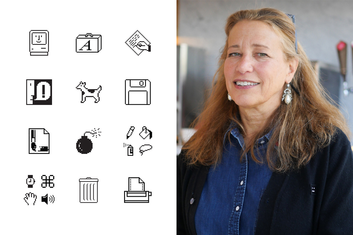
Susan Kare joined Apple in 1982 as the sole creator of screen graphics in the Macintosh group. As the designer “who gave the Macintosh a smile” she is best known for developing the distinctive icons, typefaces, and other pixel elements that gave the Macintosh its characteristic look and feel.
In 1982, Susan Kare was living in the Bay Area, welding a life-size razorback hog for a museum in Hot Springs, Arkansas. Her father, Morley Richard Kare, had founded the Monell Chemical Senses Center in Philadelphia, spending his career studying taste and smell. His daughter had a PhD from NYU, a background in sculpture and fine art, and zero experience with computers.
Then Andy Hertzfeld called. Hertzfeld and Kare had known each other since they were fourteen, classmates at Harriton High School outside Philadelphia. He was now the lead software architect on a secret project at Apple: the Macintosh. He needed someone to design the icons and typefaces for its screen. He told her if she got some graph paper, she could make small images.
Kare went to the University Art supply store in Palo Alto and bought a $2.50 sketchbook. That sketchbook now sits in the Museum of Modern Art in New York.
She went to the Palo Alto public library, checked out every book she could find on typography, and brought them to the interview to prove she knew something about type. “I went into it totally green” she said later. Apple offered her a fixed-length contract to design fonts and icons.
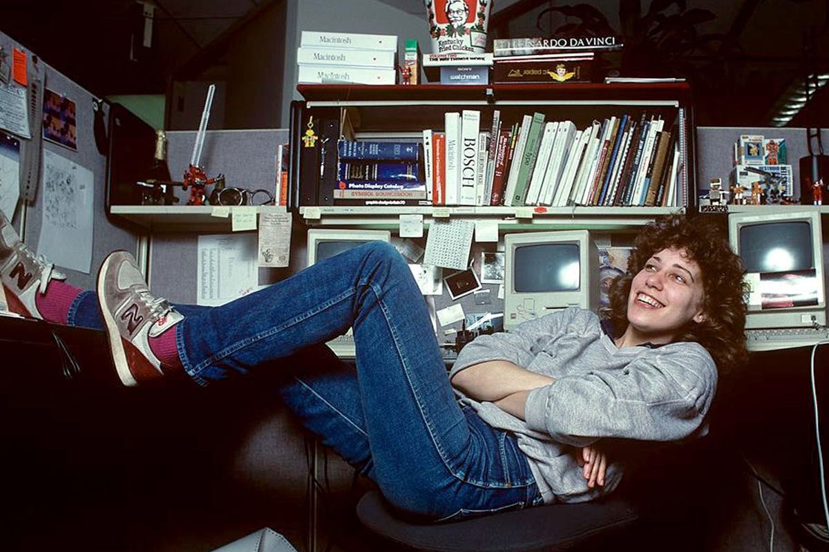
In January 1983, she started working at Apple. Her business card read “Macintosh Artist.”
The Macintosh used a bit-mapped display. The display controlled every pixel on screen. Kare’s canvas was a 32-by-32 pixel grid. 1,024 squares to communicate a single idea.
She understood the constraint immediately. “Bitmap graphics are like mosaics and needlepoint and other pseudo-digital art forms, all of which I had practiced before going to Apple,” she said. “I didn’t have any computer experience, but I had experience in graphic design.”
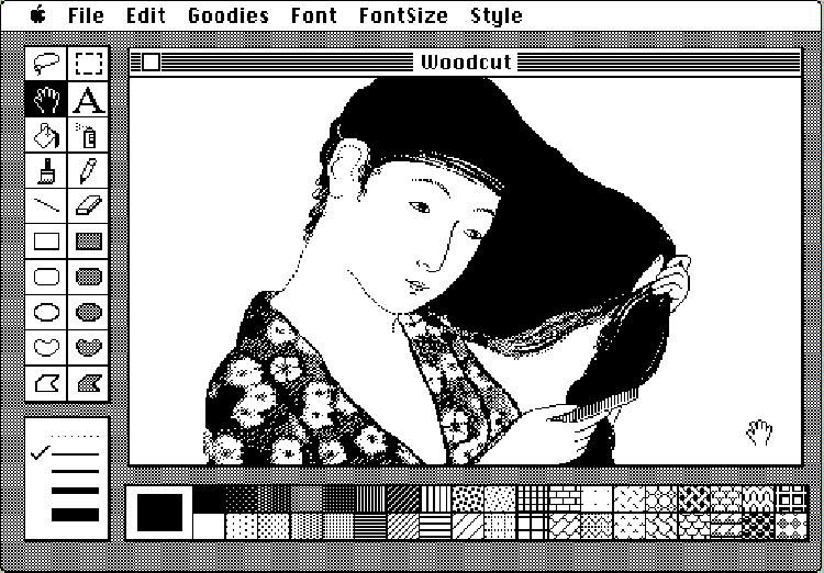
No icon editor existed when she started. She learned to calculate the hex equivalent of her pixel drawings so Hertzfeld could keyboard them into the prototype. He built her a proper editor that generated hex values under the icons. Eventually she used MacPaint itself to create icons.
Some icons already existed from the Lisa, Apple’s earlier computer. The arrow cursor. The document with a folded corner. The trash can. The Lisa’s interface was functional but clinical, icons designed by engineers to label functions, not to invite use. It also used non-square pixels, so every element needed reworking for the Mac’s display. Kare refined the trash can.
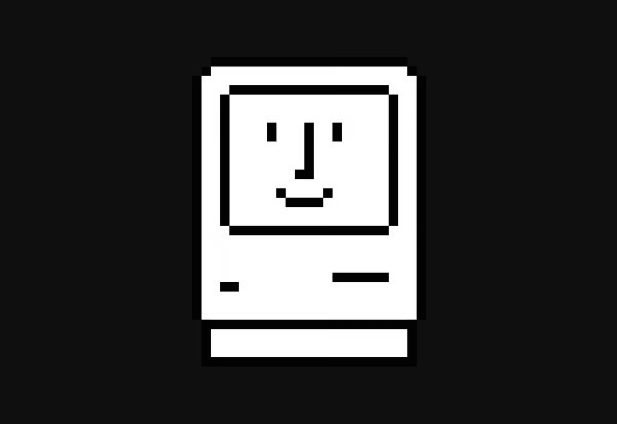
She created the application icon, a hand holding a pencil against a diamond shape, to distinguish apps from documents. She designed the Happy Mac, the smiling face that greeted users at startup. She designed the ticking bomb that appeared during system failures.
For the copy function, she tried drawing a photocopier. Then she drew a cat looking in a mirror. Copy cat. She scrapped it because it wouldn’t translate internationally. The lasso, the paint bucket, the paintbrush. Each icon went through rounds of sketching on graph paper before touching a screen.
Her process was the same as any visual designer working in any medium in any century. Pencil, paper, iteration. The screen was just the final surface.
Most digital typefaces in 1983 were monospaced. Every character occupied the same width. Kare wanted proportional fonts, letters that breathed according to their natural shape.
Each letter had to fit in a grid of 9 by 7 dots. The bold system font started as “Elefont.” It became Chicago, the typeface that would appear on the Macintosh and later the iPod for over twenty years.
Kare and Hertzfeld named the early fonts after commuter train stops on Philadelphia’s Main Line: Overbrook, Merion, Ardmore, Rosemont, Paoli. Steve Jobs told them the names were too parochial. He wanted world-class cities. The fonts became New York, Geneva, London, Toronto, Venice.
One font, Ransom, looked like cutout letters from a kidnapper’s note. Jobs renamed it San Francisco. Another, Cairo, featured tiny pictograms: a palm tree, a crescent moon, a skateboard. Decades before Apple introduced emoji, Kare had already drawn proto-emojis into a font.
Every keyboard needs a modifier key. The Mac team struggled to find the right symbol for theirs.
Kare found the answer in Henry Dreyfuss’s Symbol Sourcebook, a reference she kept at her desk at Apple. The symbol marked interesting features on Swedish campgrounds. It was abstract enough to work as a keyboard glyph, meaningful enough to carry intention. It became ⌘, one of the most recognized symbols in computing.
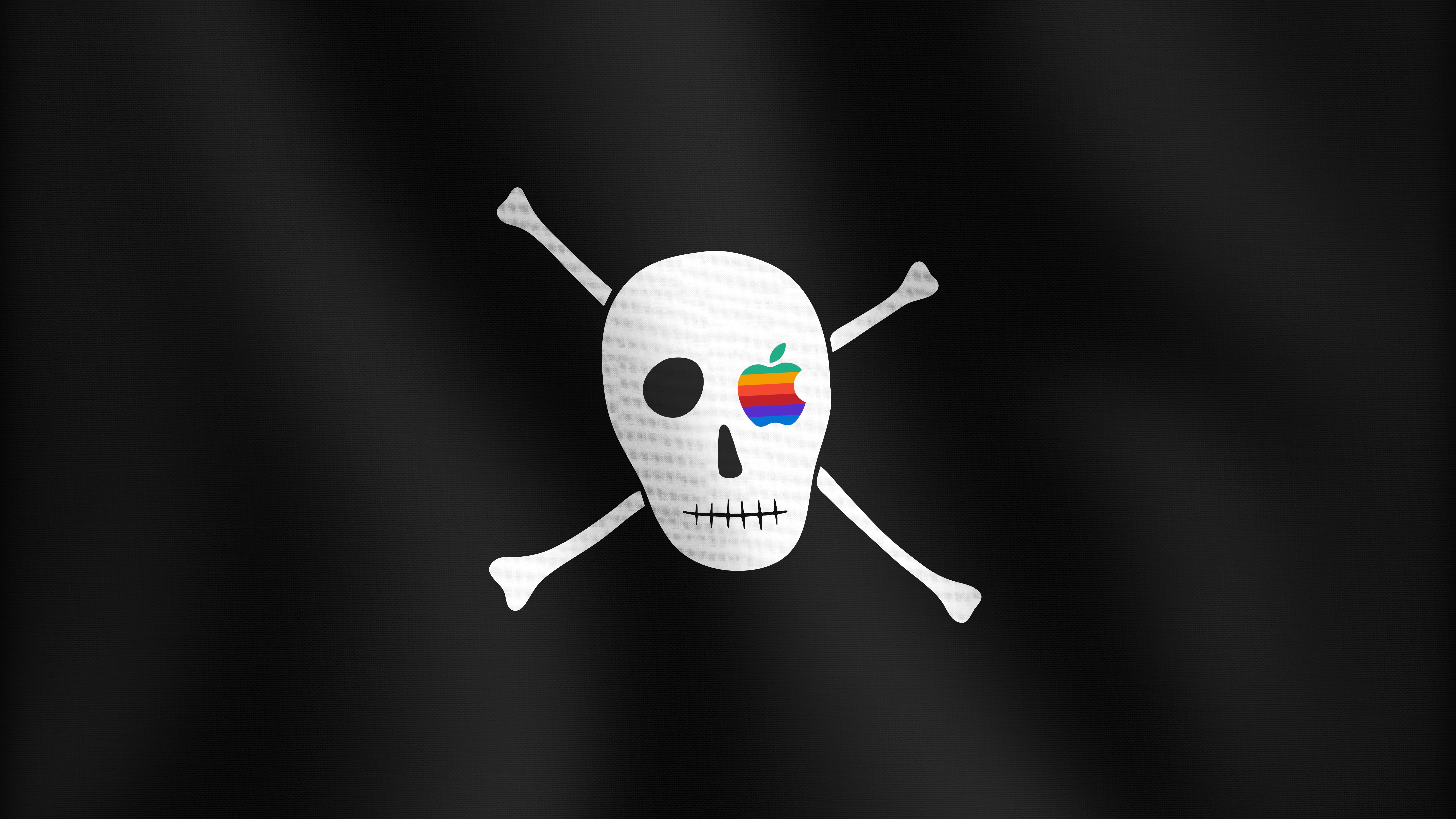
Steve Jobs liked to tell the Mac team: “It’s better to be a pirate than join the navy.” When the team moved into a new building, Bandley 3, programmer Steve Capps wanted a flag. He asked Kare to design one. She drew a Jolly Roger with the eyepatch replaced by Apple’s rainbow logo.
They flew it over the entrance. It stayed there for over a year. At one point, the Lisa team stole it. In 2016, Apple flew the flag again to mark the company’s 40th anniversary.
The Macintosh shipped in January 1984. The entire visual language Kare created came from roughly one year of work.
When Steve Jobs left Apple in 1985, Kare followed him to NeXT as creative director. She was one of the company’s first ten employees.
At NeXT, she connected Jobs with one of her design heroes. Kare was a devoted Paul Rand fan. She introduced Jobs to Rand’s books, and together they hired Rand to design the NeXT logo. Kare and David Kelley visited Rand at his studio. Rand, then in his seventies, told them: “I’ve been doing this for fifty-five years, and I know what you should do.”
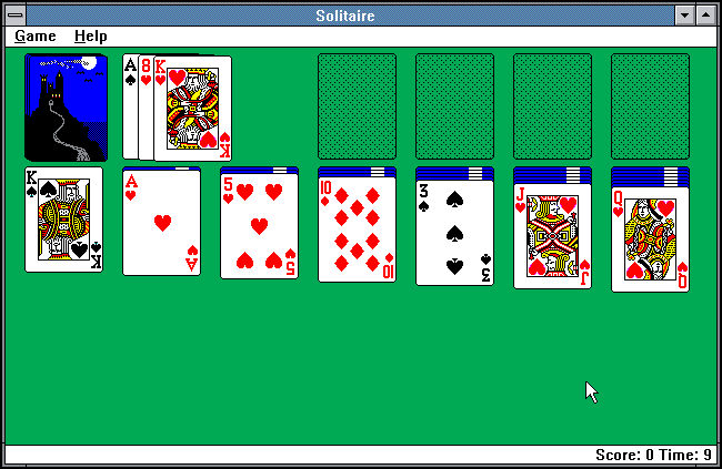
Kare founded her own studio, Susan Kare LLP, in 1989. Over the next three decades, she designed interface elements for Microsoft, Oracle, Facebook, IBM, and Sony Pictures. She designed the card deck for Windows Solitaire, arguably her most-seen work, viewed by hundreds of millions of people who never knew her name. In 2003, she served on the Citizens Coinage Advisory Committee, designing coins for the United States Mint. In 2015, she joined Pinterest as product design lead.
In 2018, AIGA awarded her the AIGA Medal, one of the profession’s highest honors.
The Museum of Modern Art calls Kare “a pioneering and influential computer iconographer.” The label misses the point.
She made the Macintosh feel human and had never touched a computer before Apple hired her. She came from sculpture, fine art, mosaics, needlepoint. She treated the pixel grid the same way she treated any design surface: as a constraint that shapes the work.
“I hoped to help counter the stereotypical image of computers as cold and intimidating,” Kare said. Someone with a $2.50 sketchbook and a sculptor’s eye decided that the visual language of technology should borrow from the one humans already knew. That turned out to be enough.
“I still spend my days turning dots on and off.”
Today, Kare is working as a design architect at Niantic Labs and still runs her own studio in San Francisco. She sells limited-edition signed prints of her icon work, collaborates with brands like Ledger on pixel art for hardware, and her original 1982 sketchbooks remain on display at MoMA.
Apple turns 50 this year. (50 years of thinking different.) Researching Susan Kare felt like walking back to where it all started; reading about how she approached design problems, how she collaborated, how she used constraints to shape the work. They built the foundations of how we use computers today. They had constraints on their screens but none in their minds.
I hope you enjoyed reading this one.
Designer Portraits is an ongoing series about the great minds that inspire us. You can also read about Dieter Rams and Corita Kent.
More portraits are on the way, follow to get notified.
⌘ Website
⌘ Wikipedia page
⌘ Invention Stories: Susan Kare, Iconic Designer
⌘ 2018 AIGA Medalist: Susan Kare
⌘ The icon of icons receives Cooper Hewitt’s Lifetime Achievement Award
⌘ The Woman Who Gave the Macintosh a Smile
⌘ The surprising inspiration behind the design of Apple’s command key
⌘ Say Hello to Susan Kare, the Bob Ross of Macintosh Design
⌘ The Birth of an Icon: Susan Kare and the Creation of Apple’s Graphics
⌘ MoMa
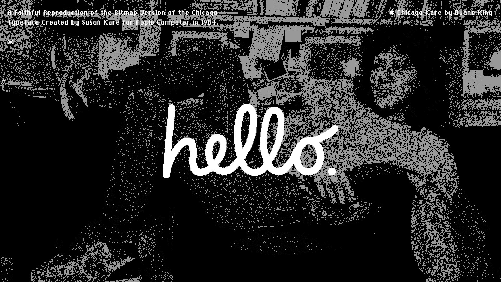
A Faithful Reproduction of the Bitmap Version of the Chicago Typeface Created by Susan Kare for Apple Computer in 1984.
Thanks for reading.
— Bora / Nirmata Studio