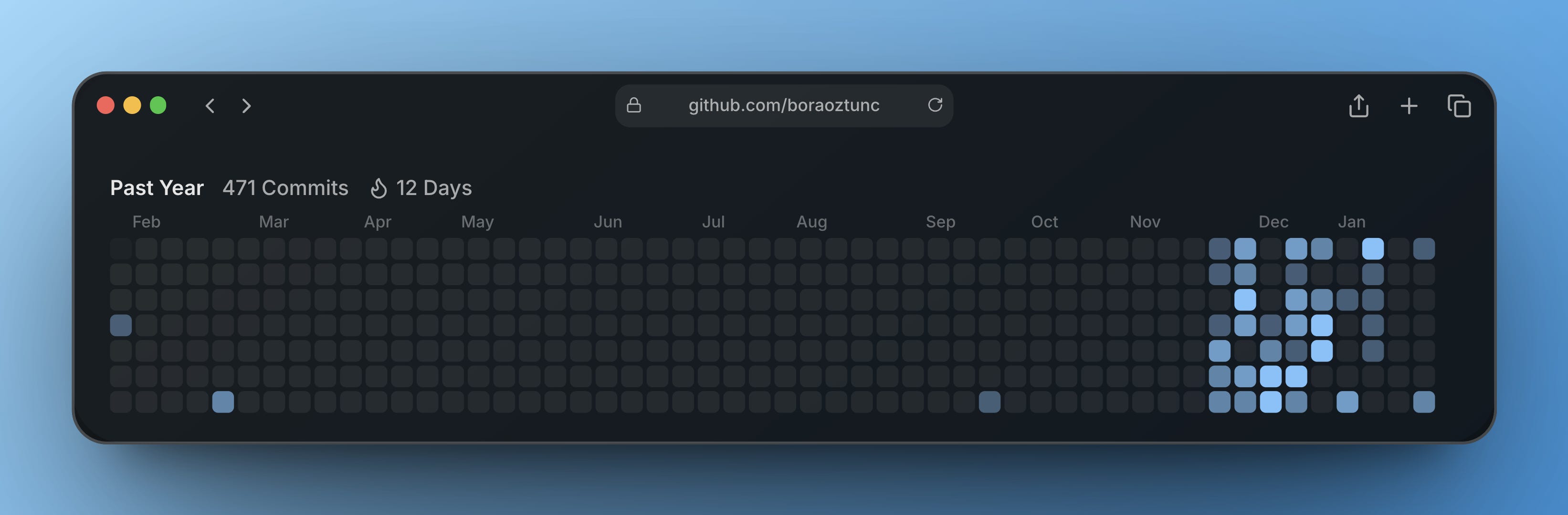
Last year, I made 471 contributions on GitHub. That still feels unusual to write as a designer. For a long time, shipping at that pace was not part of my work. Ideas accumulated faster than they turned into working things.
Learning to work with AI agents changed that balance. I can now take an idea from a rough thought to a functioning product without long handoffs. I design it, implement it, break it, fix it, and ship it. The scope is larger, but the feedback loop is short. That alone changed how I think about building.
Most of my work is guided by a simple bias. As a designer, I build tools for creatives. I am more interested in tools that reduce friction and decision fatigue, not that add process or ceremony.
Bookmarker started from that position. It is meant to be a place to collect, organize, and share links and images without turning the act of saving into work.
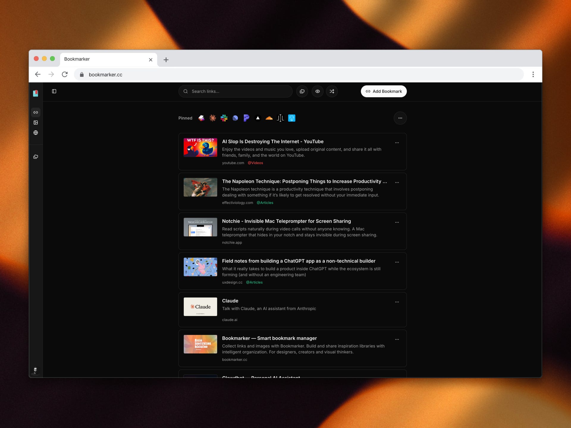
I shipped early and often. Some decisions aged well. Others revealed their weaknesses only after daily use. One of the clearest examples was how links and images should coexist. The initial idea was a single unified space. On paper, it made sense. In practice, it felt wrong. Images behave differently from links. They need more space, a slower rhythm, and fewer competing elements. Treating them as equivalent flattened the experience.
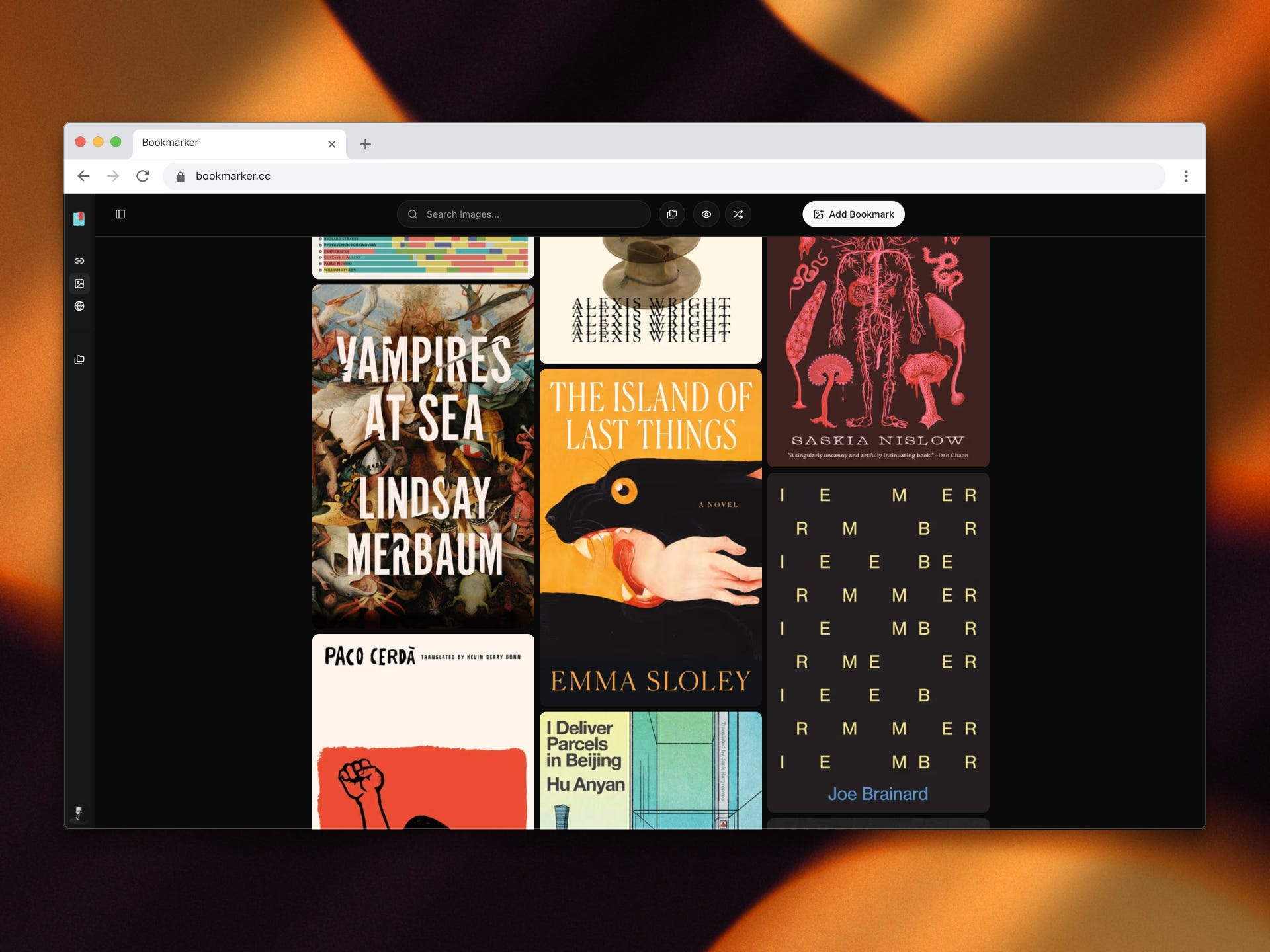
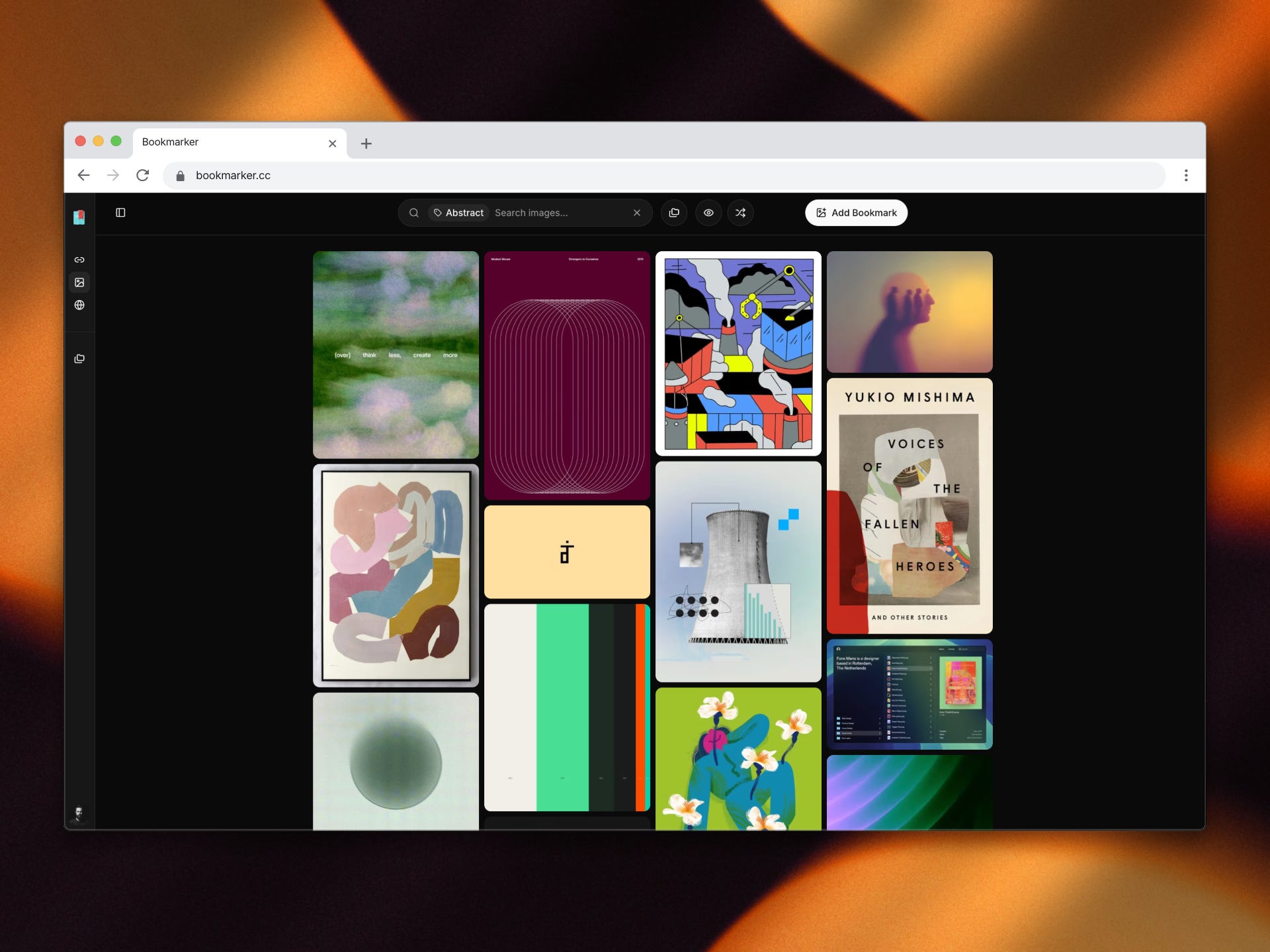
I stopped forcing a single structure and allowed images to have their own visual workspace. A grid with minimal structure. No visual noise. Enough order to support browsing and pattern recognition, but not enough to dictate behavior.
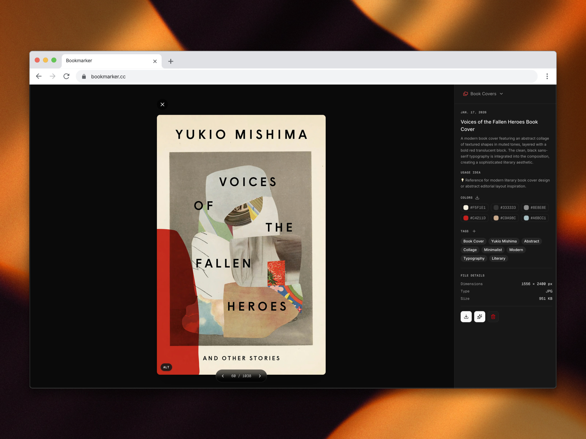
That decision made it possible to introduce supporting systems for creative work. Image titles, descriptions, tags, color palettes, and ALT text are generated automatically. Low‑quality images are upscaled when needed. These systems exist to reduce repetitive decisions and improve retrieval later, not to draw attention to themselves.
I have always struggled with placing images alongside other file types. Part of that discomfort is visual, but part of it is cognitive. Images influence thinking differently. They invite exploration rather than scanning. They benefit from a dedicated pace.
Distraction works against that.
Separating images introduced a different problem. Creative work rarely happens in isolation. References need to connect. Ideas need to move between materials. The visual workspace lived in a separate window, and that separation created friction. The cause was not technical. It was a design decision.
After living with that friction long enough, the direction became clear. The product needed fewer boundaries, not more features.
I shifted my approach from adding to removing. Buttons, microcopy, and visual elements that did not directly support a task were eliminated. Designing through subtraction changed the product. The interface became quieter, and the structure became easier to understand.
Links and images now exist in the same space, with a simple and predictable way to move between them. Navigation remains stable across views. Headers, actions, and controls stay in place. This consistency reduces the effort required to re‑orient and allows attention to stay on the content.
The goal is not engagement with the interface. The goal is focus on the material. Collections should be easy to explore, compare, and revisit. Inspiration should surface naturally through proximity and repetition.
Many of these decisions are grounded in design psychology. Visual consistency reduces cognitive load. Stable layouts support spatial memory. When elements behave predictably, attention is freed for interpretation rather than orientation. This is not aesthetic preference. It reflects how people process information.
Images benefit from separation because the brain handles visual input differently from text. Visual material encourages associative thinking and pattern recognition. Mixing it indiscriminately with other formats increases noise and interrupts flow. A dedicated visual space supports slower scanning and serendipitous discovery.
Reduction matters as well. Removing interface elements lowers decision fatigue and preserves working memory. Fewer choices mean fewer interruptions. This is why quiet interfaces often feel faster, even when performance does not change.
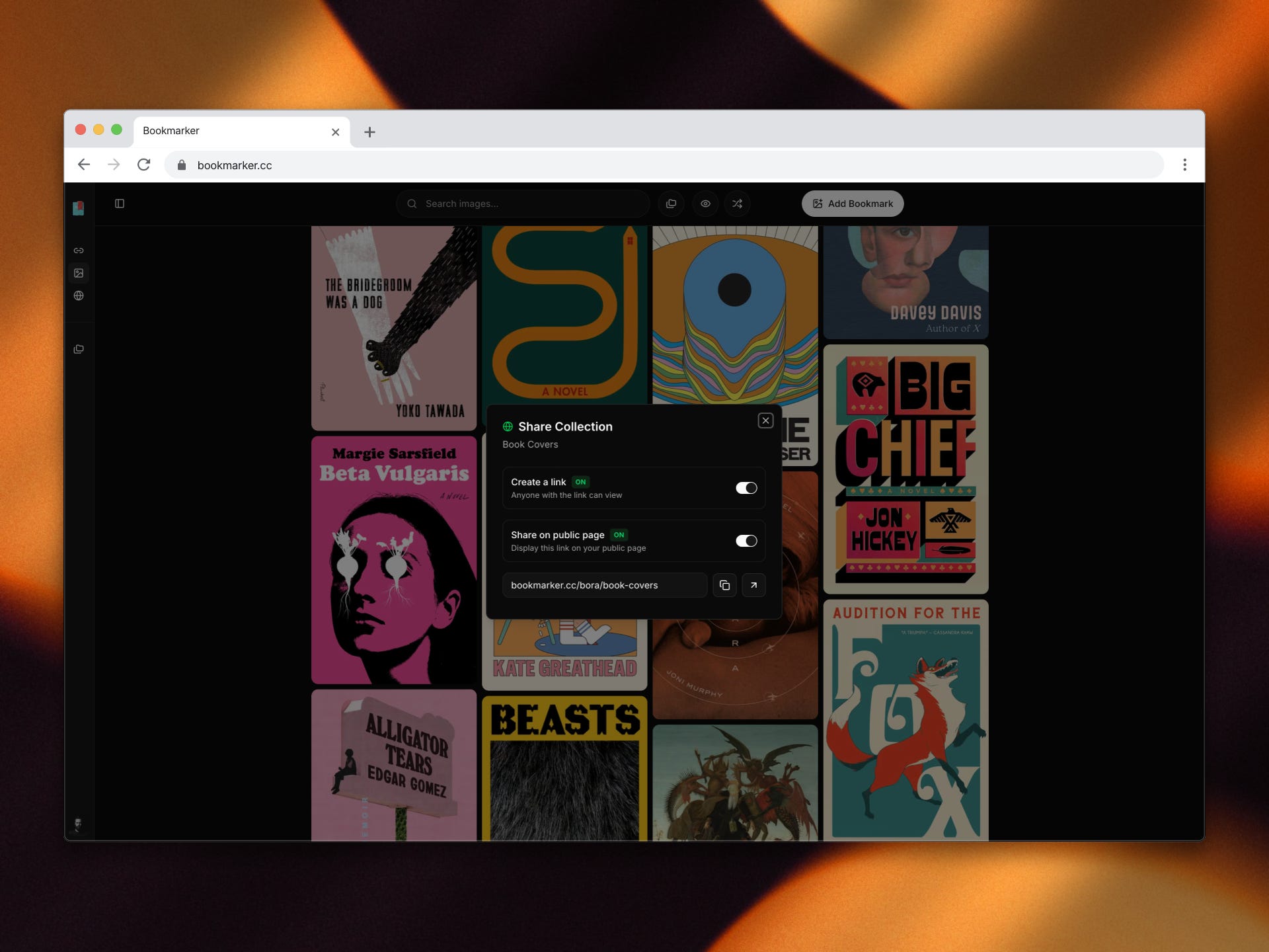
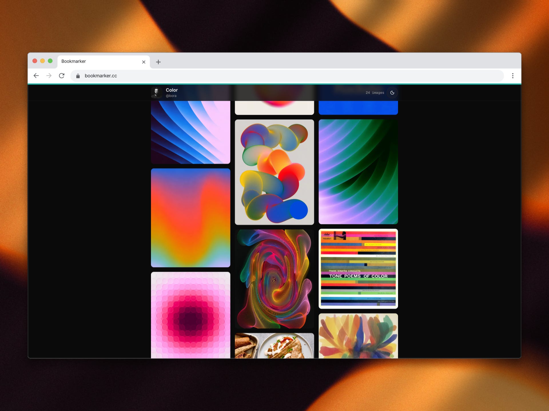
Sharing also alters behavior. When collections are easy to publish and revisit, they move from passive storage to active thinking tools. Repetition, proximity, and context strengthen recall and idea formation. A bookmarking system becomes part of a creative loop rather than just an archive.
Pages emerged from these ideas. They provide a minimal way to publish collections as reference boards. They are designed for sharing ideas with collaborators, clients, or friends without additional explanation or formatting.
From a collector’s perspective, a bookmarking system should function as an input for creative work. It should have a place in daily practice. Not as something that demands attention, but as a quiet tool that supports idea formation over time.
If you are a designer, creator, or visual thinker, Bookmarker might be worth trying. It is free, quiet, and intentionally simple. I built it to help surface inspiration, and to make sharing ideas feel natural.