UI for AI.
A considered CSS component library — warm surfaces, tactile depth, 20 theme families. Two files, zero build step, full substance.
"Daub gives you the speed of a utility framework with the polish of a design system. Built two production apps with it and would reach for it again without hesitation."
Or grab a quick snippet
Classless 1 line
Drop-in styling, no classes needed
<link rel="stylesheet" href="https://cdn.jsdelivr.net/npm/daub-ui@latest/daub-classless.css">
Full 2 lines
All 73 components + JS interactivity
<link rel="stylesheet" href="https://cdn.jsdelivr.net/npm/daub-ui@latest/daub.css"> <script src="https://cdn.jsdelivr.net/npm/daub-ui@latest/daub.js"></script>
Zero classes. Just HTML.
One stylesheet turns semantic HTML into a fully styled page. No classes, no config.
Your HTML
<!-- That's it. No classes. -->
<link rel="stylesheet"
      href="daub-classless.css">

<h1>Hello, DAUB</h1>
<p>Styled automatically.</p>

<form>
  <label>Email</label>
  <input type="email"
         placeholder="[email protected]">
  <button>Subscribe</button>
</form>

<table>
  <thead>
    <tr><th>Feature</th><th>Status</th></tr>
  </thead>
  <tbody>
    <tr><td>Forms</td><td>Styled</td></tr>
    <tr><td>Tables</td><td>Styled</td></tr>
    <tr><td>Typography</td><td>Styled</td></tr>
  </tbody>
</table>
Or use the full library for 76 components with daub.css + daub.js
Fluent in Machine and Human
Every component speaks both languages — structured references for AI agents, refined aesthetics for discerning humans.
Standard ai-plugin.json manifest for AI agent discovery and integration.
Claude Code skill for instant DAUB development — components, themes, and patterns at your fingertips.
MCP Server
Generate UIs from any AI assistant. Learn more ↓
MCP Server
A remote Model Context Protocol server on Cloudflare's edge. Connect your AI assistant and generate complete DAUB interfaces through natural conversation. No API key required.
Add to Claude Code, Cursor, or any MCP client
claude mcp add daub --transport http https://daub.dev/api/mcp
Example conversation
You Build me a settings page with a sidebar, profile card with avatar and form fields, and notification toggles. Use the nord theme.
AI generate_ui Generated a 12-element spec with Sidebar, Card, Avatar, Field, and Switch components. Theme: nord-light. Open in Playground →
You Add a danger zone with a delete account button that opens an alert dialog.
AI generate_ui Updated spec: added danger-card with AlertDialog overlay. Now 16 elements. Validation: all clear.
Copy. Paste. Ship.
Drop these prompts into Claude, ChatGPT, Cursor, or any AI assistant. Each produces a complete, working HTML page.
Dashboard
Analytics Dashboard
Build an analytics dashboard using DAUB (daub.dev/daub.css + daub.dev/daub.js). Include a sidebar with navigation, three stat cards, a sortable data table, and a bar chart. Use the dark theme. Fetch docs from daub.dev/llms.txt first.
Settings
User Settings Page
Create a user settings page with DAUB components. Profile section with avatar and text fields, notifications section with switches, danger zone with delete button that opens an alert dialog. Use the nord theme. Fetch docs from daub.dev/llms.txt first.
E-Commerce
Product Catalog
Build a responsive product catalog with DAUB. Use db-card--media in a db-grid--3 layout, chip filters with data-db-chip-toggle, pagination at the bottom, and a navbar with search. Theme: catppuccin. Fetch docs from daub.dev/llms.txt first.
Productivity
Task Board
Create a Kanban task board using DAUB. Three columns (To Do, In Progress, Done) with db-card components in a db-grid--3. Each card has title, badge for priority, avatar for assignee. Add command palette (Ctrl+K). Theme: tokyo-night. Fetch docs from daub.dev/llms.txt first.
Content
Blog Reading Page
Build a blog reading page with DAUB. Use db-prose for the article, db-breadcrumbs for navigation, author card with db-avatar, table of contents sidebar using db-nav-menu. Theme: github. Include theme switcher. Fetch docs from daub.dev/llms.txt first.
Onboarding
Multi-Step Form
Create a multi-step onboarding form with DAUB's stepper component. Step 1: account info (fields). Step 2: preferences (checkboxes, switches). Step 3: confirmation (summary card). Use db-stepper for progress, buttons to navigate. Theme: ember-light. Fetch docs from daub.dev/llms.txt first.
Minimal Example
Analytics Dashboard in ~40 Lines
| Customer | Amount | Status |
|---|---|---|
| Alice Park | $120 | Paid |
| Bob Chen | $85 | Pending |
| Carol Davis | $240 | Paid |
<!DOCTYPE html>
<html data-theme="light">
<head>
<meta charset="utf-8">
<meta name="viewport" content="width=device-width, initial-scale=1">
<title>Dashboard</title>
<link rel="stylesheet" href="https://cdn.jsdelivr.net/npm/daub-ui@latest/daub.css">
</head>
<body>
<nav class="db-navbar">
<a class="db-navbar__brand" href="/">Acme</a>
<div class="db-navbar__spacer"></div>
<div class="db-navbar__actions">
<div class="db-avatar db-avatar--sm">JD</div>
</div>
</nav>
<main class="db-container" style="padding:var(--db-space-6) var(--db-space-4)">
<div class="db-grid db-grid--3 db-gap-4 db-mb-5">
<div class="db-card" style="padding:var(--db-space-4)">
<div class="db-stat">
<span class="db-stat__label">Revenue</span>
<span class="db-stat__value">$12,450</span>
<span class="db-stat__change db-stat__change--up">↑ 12.5%</span>
</div>
</div>
<div class="db-card" style="padding:var(--db-space-4)">
<div class="db-stat">
<span class="db-stat__label">Users</span>
<span class="db-stat__value">1,284</span>
<span class="db-stat__change db-stat__change--up">↑ 4.3%</span>
</div>
</div>
<div class="db-card" style="padding:var(--db-space-4)">
<div class="db-stat">
<span class="db-stat__label">Orders</span>
<span class="db-stat__value">342</span>
<span class="db-stat__change db-stat__change--down">↓ 2.1%</span>
</div>
</div>
</div>
<div class="db-card">
<div class="db-card__header">
<h3 class="db-card__title">Recent Orders</h3>
<span class="db-badge">Today</span>
</div>
<table class="db-table">
<thead><tr><th>Customer</th><th class="db-numeric">Amount</th><th>Status</th></tr></thead>
<tbody>
<tr><td>Alice Park</td><td class="db-numeric">$120</td><td><span class="db-badge db-badge--new">Paid</span></td></tr>
<tr><td>Bob Chen</td><td class="db-numeric">$85</td><td><span class="db-badge db-badge--warning">Pending</span></td></tr>
<tr><td>Carol Davis</td><td class="db-numeric">$240</td><td><span class="db-badge db-badge--new">Paid</span></td></tr>
</tbody>
</table>
</div>
</main>
<div class="db-theme-switcher"></div>
<script src="https://cdn.jsdelivr.net/npm/daub-ui@latest/daub.js"></script>
</body>
</html>
Built with DAUB
Real products shipping with DAUB in production
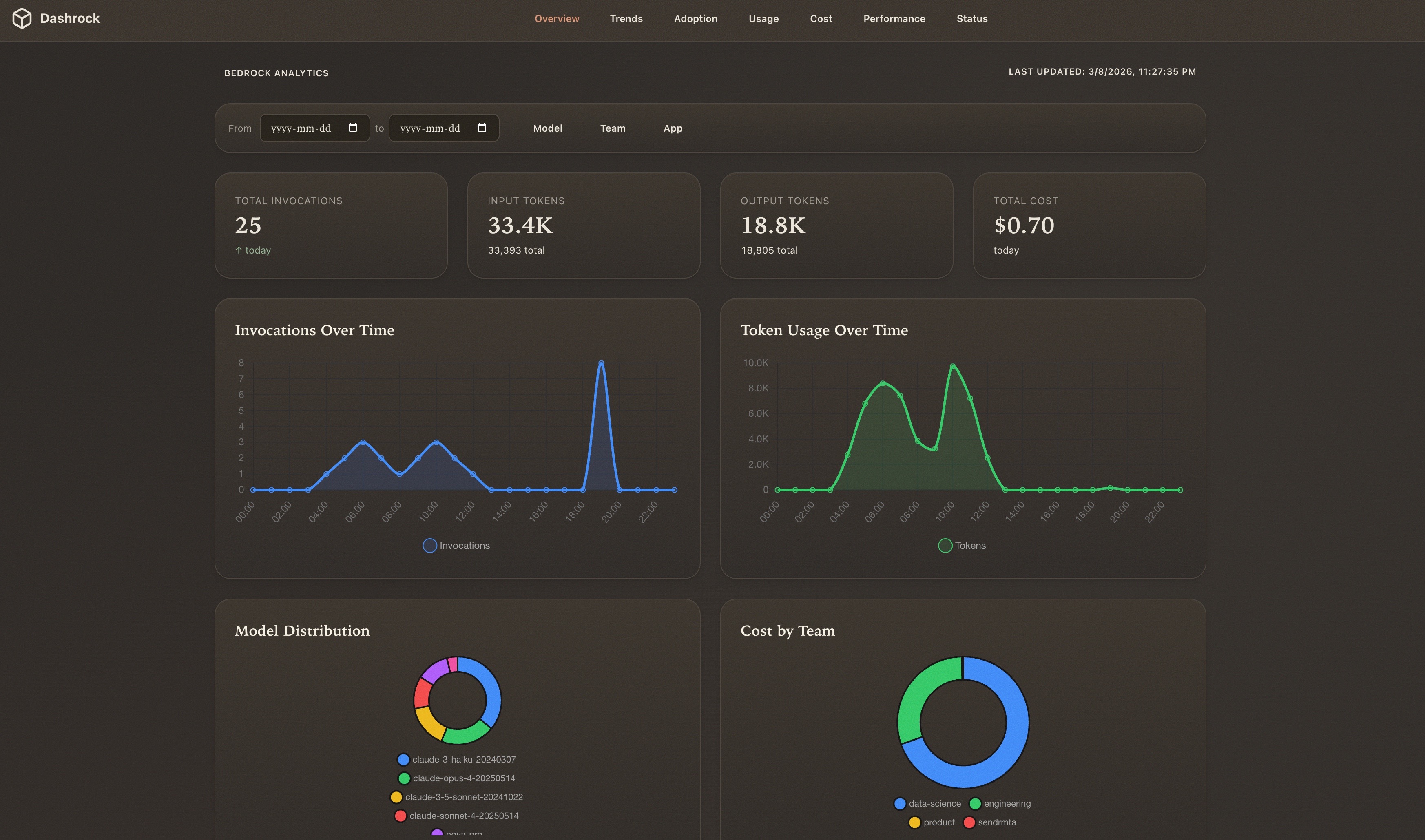
Open-source AWS Bedrock analytics dashboard. Track usage, cost, and performance by team and app. Deploys in ~3 minutes via SST.
"Built dashrock.app, needed to beautifully collect stats on Bedrock, separate respect to @staskulesh for the UI tool." — @Marat_Galiev, Mar 9, 2026
Next.js SST Chart.js DAUB AWS
1. Foundations — Surfaces & Elevation
Base Surface
Raised Surface
Inset Surface
Pressed Surface
Elevation Scale
Elevation 1
Elevation 2
Elevation 3
Typography
Heading 1
Heading 2
Heading 3
Heading 4
Body text — The quick brown fox jumps over the lazy dog. Charter at 16px with 1.6 line height gives comfortable reading.
Caption text — System UI sans-serif for labels and small text.
2. Controls — Buttons
2b. Controls — Text Fields
Your display name
Please enter a valid email
2c. Controls — Checkbox, Radio, Switch, Slider
Checkboxes
Radio Group
Switches
Wi-Fi
Bluetooth
Location
3b. Navigation — Breadcrumbs
3c. Navigation — Pagination
3d. Navigation — Stepper
3f. Navigation — Sidebar (Collapsible)
Click the toggle to collapse the sidebar
4. Data Display — Cards
Passionate about creating interfaces that feel as tangible as the real world. Loves texture and warmth in digital spaces.
Building the bridge between skeuomorphic beauty and modern performance. Ships CSS that sparks joy.
A complete component library with 28 hand-crafted pieces. Warm cream palette, 8px grid, organic feel.
4b. Data Display — List Items
Project Proposal.pdf
Modified 2 hours ago
New
Hero Banner.png
Modified yesterday
daub.css
Modified just now
Updated
4c. Data Display — Badges & Avatars
Badges
New Updated Beta Error
Chips / Tags
Default Bug Done Info Review Pending Design Custom
4d. Data Display — Table
| Name | Category | Score | Status |
|---|---|---|---|
| Button | Controls | 98 | Stable |
| Modal | Feedback | 95 | Stable |
| Stepper | Navigation | 87 | New |
| Toast | Feedback | 92 | Beta |
4e. Data Display — Tooltip
This is a tooltip with helpful info Need help?
5. Feedback — Modal
5b. Feedback — Toast Stack
5c. Feedback — Alert Banners
Heads up
Your trial expires in 3 days. Upgrade to keep all features.
Did you know?
You can customize all colors via CSS custom properties.
Connection lost
Unable to reach the server. Check your internet connection.
All clear
Your account has been verified successfully.
5d. Feedback — Empty State
No items yet
Get started by creating your first item. It only takes a moment.
5e. Feedback — Skeleton & Progress
6. New in v2.0 — CSS-Only Components
Separator
Or continue with
Input (standalone) + Input Group
Input with Icon
Toggle / Toggle Group
Button Group
Native Select
7. Overlays and Interactive
Accordion
DAUB takes a considered approach to interface design. Every component has tactile surfaces, warm shadows, and depth that feels intentional. 73 components, 20 theme families, zero build step.
Six theme families ship with DAUB v2.2: Default, Grunge, Solarized, Ink, Ember, and Bone — each with light and dark variants. Every family is a complete colour system.
No. DAUB is two files — daub.css and daub.js. Link them from a CDN or serve them locally. No bundler, no framework dependency.
Collapsible
These are the advanced configuration options that are hidden by default. Use the collapsible component for progressive disclosure.
Tooltip
This is a tooltip
Are you sure?
This action cannot be undone. This will permanently delete the selected item from your account.
This is a sheet panel that slides in from the right. Use it for detail views, settings, or supplementary content.
Drawer
A mobile-friendly bottom drawer for actions, forms, or navigation.
8. Complex Components
Calendar
Input OTP
-
CSS Bar Chart
Data Table
Custom Select (Combobox)
Accordion
Button
Calendar
Card
Carousel
Command Palette (⌘K)
Navigation
Home ⌘H
Settings
Theme
Light Mode
Dark Mode
No results found.
9. Prose Typography
The Art of Considered Design
Good interface design is invisible. It operates in the space between intention and action, guiding without commanding. The best components feel inevitable rather than clever.
Design is not just what it looks like and feels like. Design is how it works.
Principles
- Honour materiality — surfaces should feel real
- Respect the reader — typography should be comfortable
- Minimize ceremony — components should require no configuration
Inline code looks like var theme = 'light' and links look like this considered anchor.
<link rel="stylesheet" href="https://cdn.jsdelivr.net/npm/daub-ui@latest/daub.css">
<script src="https://cdn.jsdelivr.net/npm/daub-ui@latest/daub.js"></script>
10. New in v2.3 — Layout, Navbar & More
Navbar
Sticky top app bar with brand, nav links, spacer, and action area. Responsive hamburger on mobile.
Grid — 4, 5 & 6 Columns
Extended grid with tablet breakpoint (2 cols at <1024px, 1 col at <640px).
Container Variants
db-container--wide (1200px) and db-container--narrow (640px).
Card — Media Variant
Edge-to-edge images with db-card--media. No padding fights.
Chip — Active State & Toggle
Filter chips with db-chip--active. Wrap in data-db-chip-toggle for click-to-select.
All Nature Food Art Travel Sports
Avatar Group
Overlapping stack with overflow counter.
Search Input
Search box with auto-show clear button when input has text.
Responsive Visibility
Show/hide elements by breakpoint: db-hide-mobile, db-show-mobile, db-hide-tablet, db-show-tablet, db-hide-desktop, db-show-desktop.
Desktop + Tablet Mobile only Desktop only
How DAUB Compares
A quick look at the landscape.
| Feature | DAUB | Pico CSS | DaisyUI | Tailwind |
|---|---|---|---|---|
| Components | 73 | ~20 | ~50 | 0 (utility) |
| Theme variants | 40 | 2 | 32 | N/A |
| Classless mode | Yes | Yes | No | No |
| JS included | Yes (2 KB) | No | No | No |
| Build step | None | None | Required | Required |
| AI docs (llms.txt) | Yes | No | No | No |
Two files. Full surface.
73 components that respond to light, texture, and theme. Drop them in, ship something that feels considered — without the ceremony.
Psst... try me. Every surface changes.