Bulma CSS by @jgthms is just perfect. Simple, easily customizable and doesn't impose Javascript implementations.
After experimenting with @tailwindcss and finding that utility first css is just not my thing, Bulma felt like a breath of fresh air.
The most beautifully written framework I've ever had the pleasure of working with.
Bulma CSS by @jgthms is just perfect.
After 5 minutes I have #bulmaio working. It's a miracle!!!! @jgthms
Bulma, I think I'm in love.
We're very happy that @jgthms created the Bulma CSS framework.
With Bulma, I was able to make each one of my pages on my website’s templates in one single day with no prior knowledge on how to use it.
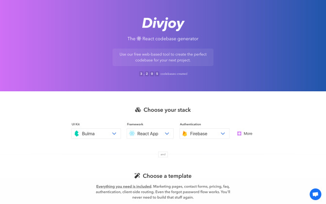
Bulma is a free, open source framework that provides ready-to-use frontend components that you can easily combine to build responsive web interfaces.
No CSS knowledge required!
CSS Variables
Dart Sass
Flexbox
Modular
Open Source
Responsive
Smart Grid
Bulma CSS by @jgthms is just perfect. Simple, easily customizable and doesn't impose Javascript implementations.
After experimenting with @tailwindcss and finding that utility first css is just not my thing, Bulma felt like a breath of fresh air.
Omg I've been fighting with bootstrap and foundation, trying to get them to work with my rails app, for days. After 5 minutes I have #bulmaio working. It's a miracle!!!! @jgthms

I've spent a few hours now with the Bulma CSS framework and I have to say it's the most beautifully written framework I've ever had the pleasure of working with. Nice work @jgthms 👊 bulma.io #bulmaio
One of the main contributors to our success at grox.io: the Bulma framework by @jgthms.
His work is brilliant. It’s very low JavaScript, and it plays very well with @elixirphoenix #liveview.
In short, Bulma provides its value and gets out of the way. Thanks!
We're very happy that @jgthms created the Bulma CSS framework. It has saved us a ton of time and made our site responsive on all devices! pic.twitter.com/lvEM7uhcLn

Okay so with @jgthms’s Bulma, I was able to make each one of my pages on my website’s templates in one single day with no prior knowledge on how to use it, the docs are super easy to understand and it’s a great library. #css

Bulma CSS by @jgthms is just perfect. Simple, easily customizable and doesn't impose Javascript implementations.
After experimenting with @tailwindcss and finding that utility first css is just not my thing, Bulma felt like a breath of fresh air.
Omg I've been fighting with bootstrap and foundation, trying to get them to work with my rails app, for days. After 5 minutes I have #bulmaio working. It's a miracle!!!! @jgthms
I've spent a few hours now with the Bulma CSS framework and I have to say it's the most beautifully written framework I've ever had the pleasure of working with. Nice work @jgthms 👊 bulma.io #bulmaio
Choose a dark theme automatically or by user preference
<div data-theme="dark">
  <h1 class="title">Bulma</h1>

  <p class="subtitle">
    Modern CSS framework based on <a href="https://bulma.io">Flexbox</a>
  </p>

  <div class="message is-success">
    <div class="message-body">
      Changes successfully saved
    </div>
  </div>

  <div class="field">
    <input class="input" type="text" placeholder="Your Name">
  </div>

  <div class="field">
    <div class="select">
      <select><option>Select dropdown</option></select>
    </div>
  </div>

  <div class="buttons">
    <a class="button is-link is-soft">Save Changes</a>
    <a class="button is-danger is-soft">Cancel</a>
  </div>
</div>Just add columns, they will resize themselves
While it's possible to add as many columns as you want, it is
recommended to stick with 12 columns.
If you want smaller divisions, you can always
nest columns.
Get a design started within minutes
So, I was making an exam and in a matter of 30 minutes I had my structure complete with responsive, Bulma is crazy. Thanks @jgthms
Simply set your own Sass variables before importing Bulma
Wanted a dark mode and discovered that in my build steps for @bulmaio inverting the values for $black, $white and greyscales and setting a bg-color for the html element is 90% of the work done. Relly great work by @jgthms to make stuff like this SO easy! #coding #webdev pic.twitter.com/nm84fBXcbU
@use "sass:color";

// Set your brand colors
$purple: #8a4d76;
$pink: #fa7c91;
$brown: #757763;
$beige-light: #d0d1cd;
$beige-lighter: #eff0eb;

// Path to Bulma's sass folder
@use "path/to/bulma/sass" with (
  $family-primary: '"Nunito", sans-serif',
  $grey-dark: $brown,
  $grey-light: $beige-light,
  $primary: $purple,
  $link: $pink,
  $control-border-width: 2px,
  $input-h: color.hue($beige-lighter),
  $input-s: color.saturation($beige-lighter),
  $input-background-l: color.lightness($beige-lighter),
  $input-border-l: color.lightness($beige-lighter),
  $input-shadow: none
);

// Import the Google Font
@import url("https://fonts.googleapis.com/css?family=Nunito:400,700");CSS only, so it integrates in any JS environment

See what Bulma developers are building

See what Bulma fans are tweeting
Want a change of pace from Bootstrap? Try Bulma. It's my BFF right now #bestframeworkforever scotch.io/bar-talk/get-t…
Rebuilt our entire frontend in Bulma! Loved every minute of it. Our dashboard is next 😁. @jgthms
Just dropped for my next project PureCSS – which I love – to try #Bulma by @jgthms 🤝 I'm already 100% in 💚 with it.
So many classes. Super cool #UI elements. A complete documentation. #Opensource
I mean, if you didn't try Bulma #css yet, check it out 👉 bulma.io
I've been working on some @reactjs layouts components along with some #CSS extensions to #bulmaio from @jgthms - Featuring side panels, collapsible/flexible boxes and popout window that stay in sync through react portals! I can create desktop like web apps now 👍 pic.twitter.com/G7OqZD7XSn
Bloody hell.... To think that I was using my own simple framework for all of the #Frontend #webdevelopment. Here is a my old login page vs #bulmaio framework... Me so dumb. Why reinvent the wheel? Amazing job @jgthms #CSS pic.twitter.com/X5NnKZxyQq
One of the main contributors to our success at grox.io: the Bulma framework by @jgthms.
His work is brilliant. It’s very low JavaScript, and it plays very well with @elixirphoenix #liveview.
In short, Bulma provides its value and gets out of the way. Thanks!
thanks Bulma for saving my day.
@jgthms
when-a-developer-is-asked-to-design-a-website pic.twitter.com/i44O1nDMNd
Still like #bulma, more than #bootstrap. Even the syntax is cleaner. @jgthms
Spent months comparing frontend frameworks for both #css and #javascript. Settled on @jgthms's #bulmaio for CSS and @Rich_Harris's @sveltejs for Javascript. Works great, there is a clear separation of look and function, and the resulting code is super clean. Perfect combo ! 🚀