Happy Ada Lovelace Day!
Several months ago, we sought to recreate Ada Lovelace’s now-famous 1843 Notes on Charles Babbage’s Analytical Engine. You can see the final result here.
The first big question we ran into was how the book’s big Note G foldout worked in the original, as we hoped to make a nearly perfect facsimile. Note G features an algorithm for using the Analytical Engine to calculate the Bernoulli numbers. No online sources could definitively answer our questions.
So we headed across the Charles River to the Department of Distinctive Collections at MIT Libraries, where we could settle every question we had.
The folds along Note G’s diagram were seemingly placed with wonderful intention. The long sheet features a Z-fold, with two creases along the diagram. When fully folded, the final result columns could be seen, with the row numbers from the first column still visible. When unfolded, the final result columns can be viewed while reading the pages above it.


Another question I had was whether or not there really was a missing dash in the bottom row; online sources were clear on the second-to-last row saying, “by a Variable-card.” and the final row, “by a Variable card.”. This probably sounds like a very minor detail, but one of the primary goals of the project was to faithfully recreate and print what Ada Lovelace had written. It turns out, to the best of my judgement, there certainly did appear to be an attempt at printing the hyphen in the bottom line - whether it didn’t stamp onto the page fully, or the ink has since degraded, it appears that it was intended to be there. The former case certainly wouldn’t be a surprise when using hand-set movable type, as the piece for that little hyphen may have been nicked or it may not have been seated fully flush with the rest of the line. (I am kicking myself for not taking a close-up picture of this particular detail - lost in the moment while holding a precious artifact!)
The one thing we did intentionally change was Ada’s attribution. She did not initially credit herself, but when her husband William urged her to, she simply appended the initials “A.A.L.” to the end of each note. What we see in the original is indeed six “A.A.L.”s, but at the end of Note G, the final note, we instead see “A.L.L.”. Given that these were her own initials, it seems more likely that this was a publisher’s mistake rather than her own - and either way, another goal of this project was to give proper attribution to Ada Lovelace for her contribution; fixing this typo seemed within that spirit.
Next up was the design of our edition. This work is layered: there was a memoir, initially published in French, written by Luigi Menabrea (who would go on to be Prime Minister of Italy), which Lovelace translated into English, and then her seven appended Notes A - G, which the reader is suggested to read at certain points as they proceed through the translation of the memoir.
A spritely conversation with two good friends, Andy Milburn and John Underkoffler, gave way to many ideas: Could we put her annotations on translucent pages which overlay the original? Might we color-code each of the seven Notes, made consistent with the markers in the memoir and colored tabs in the sections of Notes themselves?
Ultimately, we landed on what the book has since become: a two-sided construction, in which the memoir and the Notes may simultaneously be read.
We got to work on a first prototype:


A few things worked well here, and a few things didn’t. The hardware we used was too bulky, the top margins needed to be larger (and on the pages below the top two, they needed to be much larger), and the paper needed to be cut short-grain so that it would bend up with ease. But the idea had promise.
We initially set text written by Lovelace in red, and the translation in black; a decision we reversed by final printing, to set Lovelace’s Notes and footnotes (the majority of the whole work) in black, and all other text in red.
Next came production, sourcing, and print tests. This book has specific requirements for its paper, and demands several hand machines for getting all of the holes punched in the right places of each component.


We decided to cut our paper to the needed short-grain ourselves, printing the books 3-up, so that we could adjust for damaged ream corners on the fly. This problem had snagged us on our last book’s production run, and would have bitten on this project too.
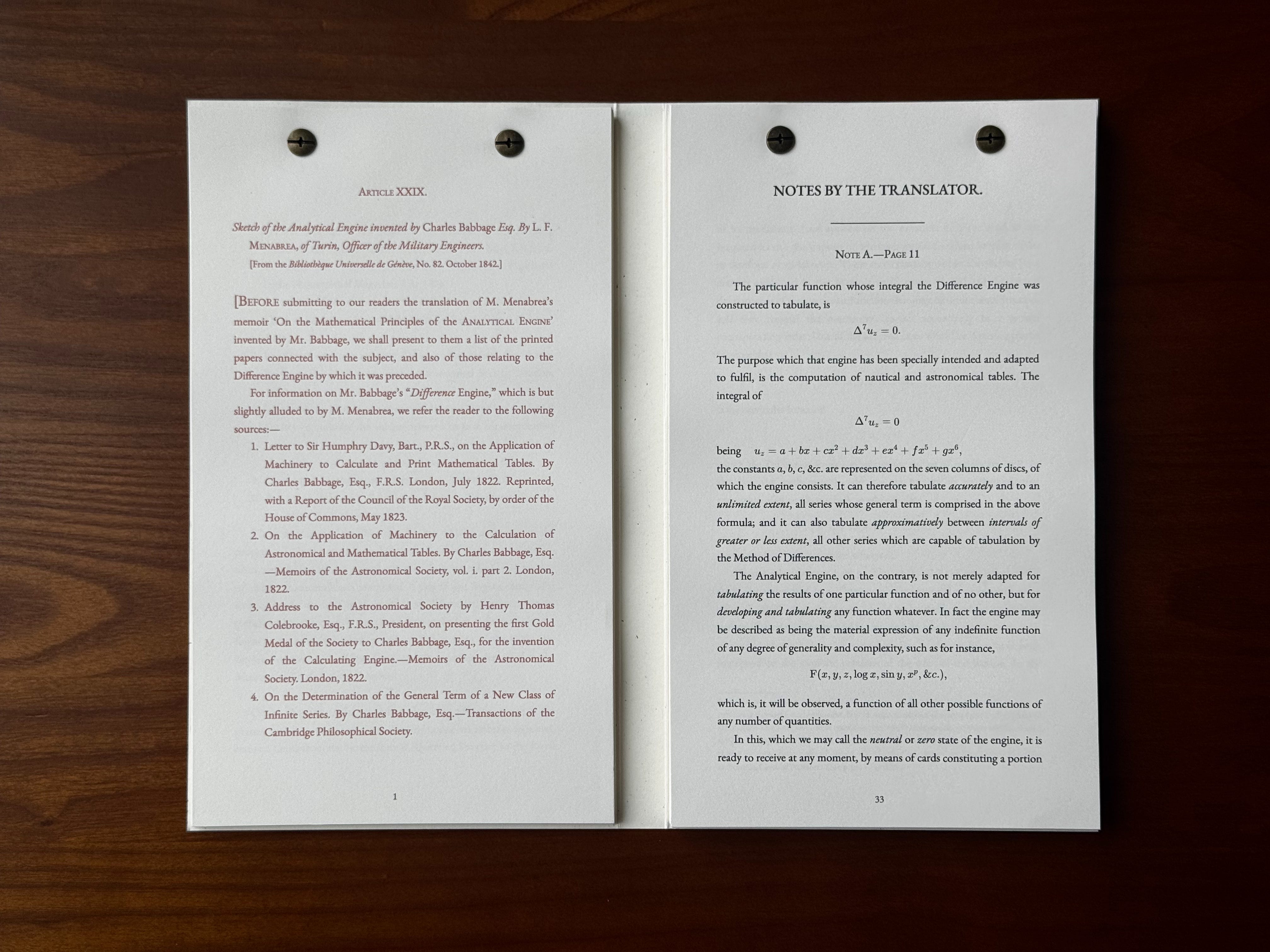
The result is a really lovely artifact that captures an important text from the history of computing, science, and mathematics in a new construction.
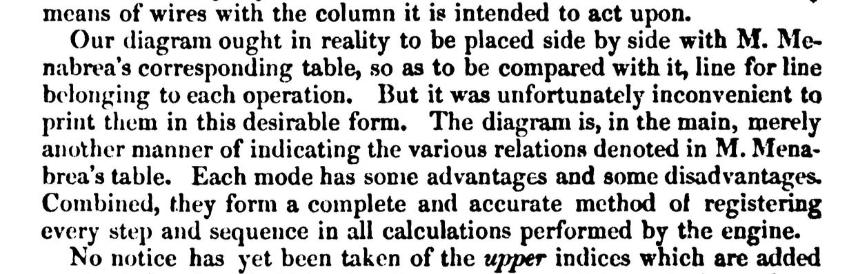
183 years ago last month, Ada Lovelace began proudly distributing the work amongst her family and friends, after nearly a year of tiresome work. We think she’d be happy with this new edition - in Note D, she comments:
We hope you enjoy our edition too. Happy Ada Lovelace Day!