https://accessibility.blog.gov.uk/2016/06/09/research-with-blind-users-on-mobile-devices/
I’m Ed, a designer at GDS. Last year we did some usability research with users with a range of visual impairments. We found out lots of interesting things, and one in particular was about the way blind users of touchscreen devices experience the web.
People often assume that because users are blind or partially sighted they won't be able to use touch-screen devices. That's not the case - for the most part our participants could use them easily, often preferring their phone or tablet to their desktop or laptop. However using a screen reader by touch is different than using it by keyboard - our research found that there are different usage patterns and new design challenges to think about.
Different ways of using the web
These observations come from watching blind users in the lab using VoiceOver on iPads and iPhones, but it may apply to other touchscreen devices.
VoiceOver is a screen reader that comes included on Apple devices. On Macs users usually use the keyboard to navigate their screen readers. On iPhones and iPads it works differently - users navigate by touch. Users can read out each section in order, or can read out the content beneath the user's finger. It's this last behaviour that was particularly interesting.
Navigating by touch
Rather than reading out the hierarchy of the page, some of the users navigated by moving their finger around to 'discover' content. We saw a few different ways of doing this.
One user swept their finger left to right (like using a metal detector). Another user ran their finger down the middle of the screen from top to bottom, listening to the items getting read out as they passed over them. When the user felt they'd missed something they started tracing their finger further to the left, often from the top, skipping quickly past bits they'd heard already, before eventually searching on the right.
https://www.youtube.com/watch?v=o_hxi0qQZAM
In the attached video a user slides their finger down the middle of an iPad screen. VoiceOver is playing so they hear the page's content as they browse. Their finger goes down the middle of the screen so they miss the "Upload your photo" button, which is on the left.
This was really interesting - traditionally good structure for screen readers is about order and hierarchy. But for these users, the physical placement on the screen was also really important (just as it is for sighted users). We don't know how common this usage is, but it was still really interesting.
Finding smaller elements
Navigating by touch also mean that small elements on the page may be harder to find and locate. In the video above you can see a user miss our 'Start now' button, because the it was far over to the left. Fortunately there were clues in the content to direct them there, but it’s worth exploring other ways to make sure we don’t confuse users with elements that seem to be missing.
Note: on smaller screens (like mobiles) we use full-width controls, so this shouldn't be an issue.
It’s definitely a nudge to be consistent and not place elements in unexpected places on the page. Having a linear order that you can scan down with your finger worked well. That's not to say you can't have multiple columns, but that you should think about their use carefully.
Elements close together
The other problem with small page elements was overlap. ‘Date of birth’ caused problems for one of our users. There are three fields and three labels very close together. The close placement of these meant that the labels were being read out very quickly, with small changes in the position of the user's finger suddenly triggering another label getting read out.
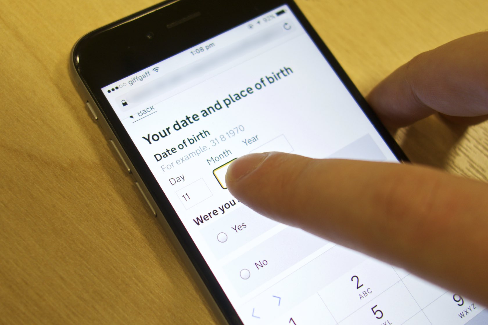
It took a long time for the user to find the right box and input, even though they knew what they needed to do. My takeaway was that we should possibly just move our boxes apart slightly so they might be more easily distinguished.
Tablets are really focused
The great thing with using the tablet or phone was that users only ever had one context to think about at a time. Often that means there’s less to go wrong. Error messages didn’t pop up and disrupt the workflow in quite the same way, and other programs didn’t grab focus – a huge problem when those apps aren’t accessible.
More research needed
Usage of mobile devices has increased rapidly over the last few years - including among those with disabilities. Much of what I've learned doing this research has been that we need to be doing far more in this area, think more about how these new technologies may affect usage, and how we design for these new behaviours. If you've got any learnings or research in this area, we'd love to hear from you.
Follow Ed on Twitter and don't forget to sign up to email alerts.