This is the most recent in a series of two posts on The Interrobang (‽). Start at PART 1 or view ALL POSTS in the series.
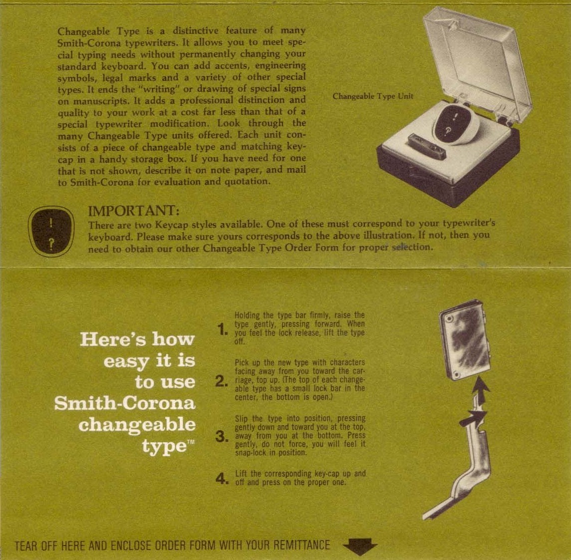
The interrobang’s arrival on the keyboard of Remington Rand’s Model 25 typewriter brought with it a new wave of interest in the character. In common with its appearance in Richard Isbell’s Americana,1 the mark’s transition from hot metal type to the typewriter keyboard was the result of a happy coincidence: a Remington Rand graphic designer saw ATF’s sample brochure for the font2 and lobbied in turn for its provision on his company’s typewriters. The Model 25’s replaceable key and typehead3 allowed different characters to be installed as required, providing the perfect vehicle for promoting this as-yet unproven mark of punctuation. Remington Rand entertained ideas of effecting a revolution in punctuation with its new interrobang key, and said as much in an internal newsletter:
[…] Interrobang is already receiving favorable comments from typographers who are said to commend it for its ability to express the incredibility of modern life.4
Grandiose as this might sound, there was an almost feverish interest in Martin Speckter’s invention after the release of the new interrobang key. The typewriter was the dominant method of text entry of the time, with offices echoing incessantly to the clacking report of ranks of typists, and this was not lost on the American media; for months during the autumn and winter of 1968-1969 newspapers and magazines across the country devoted column inches to the character and its newfound accessibility. These articles varied markedly in length and tone: as already described, the Wall Street Journal contented itself with a matter of fact one-liner,5 while Newsweek stretched to a cautiously optimistic paragraph hedged with the disclaimer that “the Interrobang symbol is not fully approved by grammarians and lexicographers”.6 William Zissner of Life magazine, though, was moved to pen a half-page essay ranging from incredulity (“Look at Spanish. ¿I mean, do they need all that stuff just to ask a question? ¡Ridiculous!”) to plainitive nostalgia (“We need plain words to express plain truths. […] The only trouble is that nobody uses them any more.”).7 One suspects that for Zissner, the novelty of the interrobang was merely the straw which broke the camel’s back.
Not all stories were hedged by caveats or tainted with polemic. Don Oakley, writing for the Kansas City Kansan, considered that “[t]he interrobang is a welcome addition to the writer’s arsenal”,8 and the Globe of Joplin, Missouri declared that “We can hardly wait for it to be installed on the regular typewriter keyboard, for it fits the times and comes none too soon when there’s a new crisis or calamity almost every day”.9* Most fittingly, Type Talks itself also covered the return of the character first aired in its pages six years earlier: for the November-December 1968 issue, Martin K. Speckter contributed an interview with Kenneth Wright, the designer of Remington Rand’s interrobang glyph.3
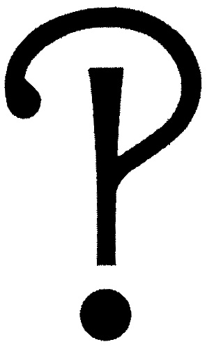
Whether or not it had occurred to Speckter that he himself might “join the exalted ranks of Aldus, Bodoni et al” as he had exhorted his readers to do in 1962,11 he had succeeded — in the minds of some observers at least — in creating the first new mark of punctuation since the quotation mark of three centuries previous.12
Unfortunately, the interrobang’s status as a typographical cause célèbre during the late 1960s and early 1970s proved to be ephemeral, and its popularity had reached a plateau even as Remington Rand finally let the average writer of the time make use of it in a convenient manner. A creation of the advertising world — and considered by some an unnecessary one at that13,6 — the interrobang faced an uphill struggle to gain acceptance in literary and academic spheres, while more prosaic technical difficulties faced it at almost every turn.
Cutting a letter punch for the casting of hot metal type was a costly business, but more problematic was the fact that the automated typesetting machines of the time often supported only a fixed number of glyphs. The Linotype machine, a baroque keyboard-driven device which set individual lines of type from a ‘magazine’ of individual letter matrices,† was the standard newspaper typesetting device for much of the 20th century, and could accommodate only 90 different characters;16 the similar Monotype machine supported only thirty more.17 Despite the flexibility in type size and letter placement which arrived with the phototypesetting or ‘cold type’ machines which succeeded them, for technical reasons many optical typesetting devices suffered from the same limitation.18 In either case, faced with evicting an existing character to make room for the upstart interrobang, more often than not a type foundry would choose convention over innovation. For this reason, the interrobang was slow to appear in machine-set types.
Americana’s own evolution, from hand-set hot metal type to phototypesetting and beyond, graphically illustrates the technological upheaval under way in the printing industry and the compromises that came with it. Hand-set as it was,3 Americana could include an interrobang without having to displace an existing character, but the inherently slow nature of setting type by hand made it unsuitable for the majority of day-to-day printing carried out for newspapers and magazines. When, years later, the phototypesetting company Compugraphics stumbled upon Americana’s interrobang and produced variants of it for some of its new optical typefaces, the familiar pressures of the fixed character set meant they never left the drawing board.19 Perhaps the final irony is that even now, when digital fonts can contain near-limitless numbers of unique characters, Americana’s latest software incarnations still have no interrobang;20 its loss in the transition from hand-set hot metal printing to phototypesetting seems to have become permanent.
This combination of factors — the six-year delay in clearing the new character’s way from composition to printing; the sheer inertia of punctuation practice; doubt as to the grammatical necessity for a new symbol — sent the interrobang to an early grave. By the early 1970s it had largely fallen out of use, and the chance for its widespread acceptance seemed to have been missed.
The interrobang’s rise and fall is not without precedent in the world of punctuation. Before the advent of the printing press, the imprecision of manual copying meant that punctuation evolved as it passed from scribe to scribe, encompassing both bright new avenues and dark culs-de-sac along the way. Many once-important marks (the pilcrow not least among them) were created, mutated and killed off on the road from Aristophanes’ three dots to today’s system.21
The most uncanny parallel actually occurs a hundred years after the invention of the printing press brought a degree of standardisation to language and punctuation. For fifty years or so, beginning around 1575, a curiously reversed question mark (⸮) could be found in certain works of both printed and handwritten origin. This was the ‘percontation mark’, used to indicate a rhetorical question.22 While trivial to write by hand, few printers took the trouble to carve a new letter punch for the character and instead relied on an italic (?) or blackletter (?) question mark to convey its meaning. This use of differently-styled question marks (but question marks nonetheless) confused the interpretation of the mark in some contexts, making it difficult to be entirely sure that the writer intended to use a percontation mark. With the development of digital printing technology, though:
Those [percontation marks] that certainly exist […] now can and should be reproduced, and post-metal printing offers the percontation-mark a true second chance.23
Not only does this echo the predicament of the interrobang, edged out of typefaces because of the simple expense of including it, but in a more fundamental way the percontation mark and the interrobang represent two sides of the same linguistic coin. In formal rhetoric, percontatio is the asking of an open-ended question, where any answer can be given, while interrogatio attempts to confirm or deny a previous argument.24 It is not hard to imagine that had it been known to him, Speckter would have seized upon the percontation mark’s cause with enthusiasm.
There is the glimmer of a happy ending for Speckter’s invention, though, despite its failure to gain lasting approval beyond its first brief foray into the public eye. Some seed of fascination with the word or the symbol itself has lodged itself immovably into the world of typography, so that the debates over its utility continue to this day. Opposing typophiles seek to bury or praise the interrobang, presenting new interpretations of its shape and cursing the difficulty of creating them, all the while arguing over its grammatical correctness.25 It has quietly made its way into Unicode,26 the standard computer character set, even if it is not widely included in Unicode fonts. The artisan printers of Interrobang Letterpress have adopted its name, harking back to Martin Speckter’s own printing endeavours.27
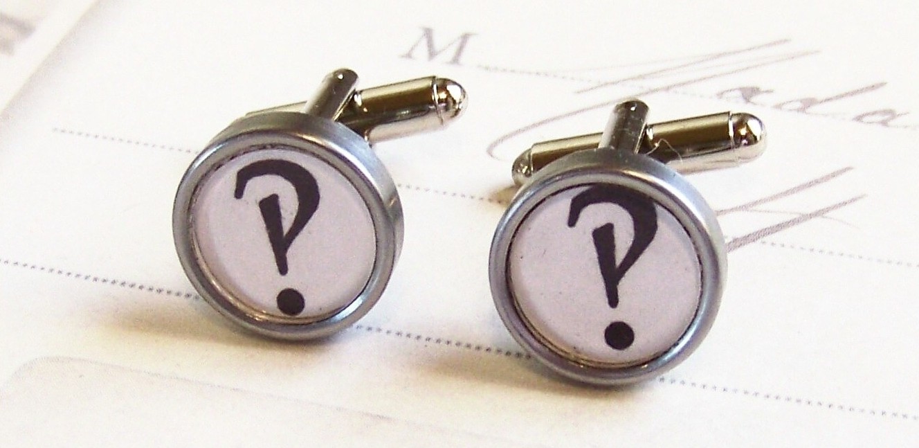
The interrobang also thrives beyond the boundaries of the typographical world as a name (and sometimes emblem) for countercultural artefacts such as punk records,28 limited run ’zines29 and student newspapers.30 One can buy cufflinks made from vintage typewriter keys with screen-printed interrobangs laid over their original letters,31 and Facebook boasts at least three distinct interrobang revival groups. The interrobang has become, if such a thing is possible, a cult punctuation mark.
- 1.
- 2.
-
Benson, Jeff, and Don McLean. “Did You Say Interrobang‽”. Syosset, New York: Sperry Rand Corporation, November 1968.
- 3.
-
Speckter, Martin K. “Interrobang”. Edited by Martin K Speckter. Type Talks, no. Nov-Dec (1968): 17+.
- 4.
-
Kerney, John E. “Interrobang Is Newest Mark Of Punctuation”. Univac News.
- 5.
-
Wall Street Journal. “Business Bulletin.”
- 6.
-
Newsweek. “What’s Newest.”
- 7.
-
Zinsser, William. “For Clear Expression: Try Words”. Life.
- 8.
-
Oakley, Don. “Look, Girls, a New Key on Typewriter”. The Kansas City Kansan.
- 9.
-
Joplin Globe. “Handy ‘Interrobang’.”
- 10.
-
“Something New:”. Richmond, Virginia: Richmond Newspapers Inc, September 1968.
- 11.
-
Speckter, Martin K. “Making a New Point, Or, How about that. ”. Edited by Martin K Speckter. Type Talks, no. March-April (1962).
- 12.
-
Consuegra, David. American Type : Design & Designers. Allworth Press, 2004.
- 13.
-
Muffwinkle, Elmer. “A Line o’ Type or Two”. Chicago Tribune.
- 14.
-
Glaister, Geoffrey A. “Matrix”. In Glossary of the Book, 252+. George Allen and Unwin, 1960.
- 15.
-
Glaister, Geoffrey A. “Punch”. In Glossary of the Book, 334+. George Allen and Unwin, 1960.
- 16.
-
Linotype Machine Principles. Mergenthaler Linotype Co, 1940.
- 17.
- 18.
-
Belzer, Jack, Albert George Holzman, and Allen Kent. “Encyclopedia of Computer Science and Technology”. In. M. Dekker, 1975.
- 19.
-
Haley, Allan. “The Interrobang Is Back”. x-height: FontHaus’ Online Magazine.
- 20.
-
“Americana® Roman”. Monotype Imaging, April 13, 2011.
- 21.
-
Parkes, M. B. Pause and Effect: Punctuation in the West. University of California Press, 1993.
- 22.
-
Parkes, M. B. “Plates 34-35. The Percontativus Used by Two Sixteenth-Century London Printers: Henry Denham and Abell Jeffs”. In Pause and Effect: Punctuation in the West, 218-219. University of California Press, 1993.
- 23.
-
Lennard, John. “Percontation Mark”. In The Poetry Handbook, 121. Oxford University Press, 2005.
- 24.
- Unknown entry ↢
- 25.
-
Brenner, Michael W. “!?: Interrobang”. Typophile, February 2005.
- 26.
- 27.
- 28.
-
“?!INTERROBANG?!”. Stubborn Records, April 2011.
- 29.
-
Drew, Astrid, Corinne Wahlberg, Julia Ramsey, Dan Sergeant, Stuart Window, Sarah Andrea, Zach Bartlett, and Douglas Thomas, eds. “Interrobang?! Magazine”. Interrobang?! Magazine, April 15, 2011.
- 30.
-
“Interrobang”. Fanshawe Student Union, April 2011.
- 31.
- *
- Some of these newspaper articles contain distinctly unsubtle clues of the age in which they were written. For instance, alert to the fact that the typing pools which could now make use of the interrobang were populated almost exclusively by women, Don Oakley gave his article the blithely misogynistic title ‘Look, Girls, a New Key on Typewriter’.8 Another story on the subject, this time in the notoriously conservative Richmond News Leader, contains the example “‘What do you mean, you’ve overspent your allowance (interrobang),’ asked by the man of the house when the lady of the house asks for a supplemental appropriation to tide her over until payday.”10 ↢
- †
- The metal block on which an individual letter is engraved for use with a Linotype or Monotype machine is termed a ‘matrix’,14 while the corresponding term for hand-set type is ‘punch’.15 ↢