 I love this quote from Richard Branson:
Complexity is your enemy. Any fool can make something complicated. It is hard to make something simple.
Is there any place Mr. Branson’s words are more relevant than in our big data world?
We are not as awesome as we need to be when it comes to presenting data clearly, logically and simply, and I’m convinced that this contributes to the business world being less than ideally data driven.
And I’m not talking about just in a once-a-month “omg we have to send that pretty dashboard to the big boss so let’s call our agency and get some sparklines and tiny fonts” kind of way, but rather in how we communicate with data every day.
So, today a short lesson on how to apply the power of unpacking the data to increase the chances that it clearly communicates the story we want to tell.
The Data Presentation Challenge.
This point came to the fore recently when I saw this “module” on top of a dashboard…
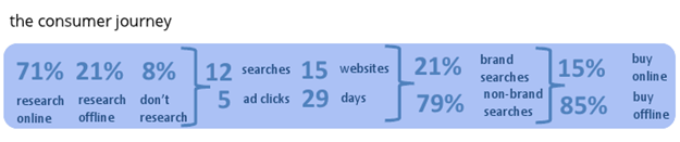
My first question on seeing any collection of data is: “What the heck is it showing?”
The words “the consumer journey” help. In couple of minutes of moving your eyes back and forth it is easy to see there is some very cool data here. We can see that it is showing research data from the awesome Google Consumer Barometer. The next bit is some digital data, perhaps over 29 days (days to conversion?). Then we see what is surely online Search behavior data. Then back to data likely from the Barometer.
There is online and offline data at the start and end.
The data does seem quite interesting. But what is the story?
And my biggest challenge was: Will a lay person (CEO!) actually understand what we are trying to say here?
Here’s what I don’t want to do in this post: Question the data, or judge the wisdom of putting 6 completely different sources and 11 metrics next to each other, or question the missing pieces.
I’m going to put myself in the position in which we find ourselves every day. We’ve collected some data, or someone just gave us a bunch of data, and we have quickly figure out how to communicate the key point in the data.
So I spent 15 minutes with the module above and attempted to create a structure that would more clearly tell the story. I ended up with two ways to communicate the above data more effectively.
Simplifying the Story: Attempt One: Excel Power!
When I look at a set of data the very first thing I want to do is see if it is logically structured. It might be my background as a mechanical engineer, but I like things to be laid out cleanly, I love symmetry, and I love clear connections and flow.
Because of the way the data is presented above, the first thing I’m uncomfortable with is the implication that it presents one whole story
It is not.
Thing 1 is a big thing. Thing 2 is a small part of thing 1. Thing 3 is a small part of thing 2. Thing 4 is… back to thing 1, the big thing.
If you are a person pressed for time (CxO!) it can take much longer than necessary to figure out the point because of this riddle, wrapped in a mystery, inside an enigma structure.
Another subtle problem is that, completely unintentionally, it makes digital look bigger than it might be. While I love digital (Go Internet!), as an Analyst I’m not comfortable with any bias (remember in this case it is unintentional). If you get caught, it looks sub-optimal.
Every time I look through a cluster of data these questions go through my mind:
Are things laid out logically?
Can someone see the multiple strands in the whole story, and pick out the relevant strands?
Do I have extraneous data that I can remove?
Is the macro point being made clearly?
For the module above the answers are: No on 1, 2, 4. Yes on 3.
So how do we fix it, in time-pressed situations?
This might seem odd but the two places where I can lay things out and work through them are PowerPoint and Excel. I find that the boxes in Excel force a good discipline on me, and it is impossible to communicate anything too complicated with PowerPoint (ok, it is possible but I’m unable to do that! :)).
So I open Excel and attempt to pick out all the strands and lay things out logically. All the numbers go into cells. As I identify each riddle and each mystery I simply insert rows and click the Merge & Center icon to group clusters of data.
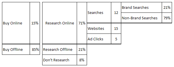
Remember we started with this…
This is what I ended up with after a few minutes…

I really wanted the various strands of the story to be crystal clear. For example, it is clear now that most of the data we have is about Research Online. That was less instantly obvious before.
The flow starts with Research Online and then moves into illustrating what it takes to get one sale in this industry category (12 searches, 15 website visits and 5 display ad clicks).
From there it drills down into search (very clearly) and highlights that 79% of the searches are non-brand!
It ends by showing where people ultimately end up making the purchase.
The key point, communicated hopefully by the “bookends” above, is while only 15% of the people buy online in this category, 71% of the decisions are influenced by online. (So buy digital ads! :))
While the table is unsexy (it really is) I think it works better. What do you think?
Did you notice that the darker cell lines? It is my subtle way of visualizing the flow of data and more clearly mark the strands in the story.
Did you notice the “air gap” between the last set of data and the rest? I like using air gaps to visually communicate “stuff on the right is a bit different from stuff on the left of the air gap.” It works really well because your eyes have to pause – sometimes that is a good thing.
Finally, did you notice that I killed the Days number? Even though I was not judging the data, that point was just so distracting that I could not bring myself to keep it.
Ok, can we leave the good enough alone?
Of course not.
At this point I wondered if it would be better to put the key elements of the macro point next to each other, rather than as “bookends.” The buying behavior next to the research behavior.
Two seconds later, I have this…
Ahhh… much better.
Anyone can instantly see that while purchases are overwhelmingly offline (85%), the influence process is overwhelmingly online (71%). The rest of the “so what is it that the average consumer does online?” data flows from this.
The new format seems to pass the initial sniff test.
At this point my mild obsessive compulsiveness kicks in. Remember I’m a mechanical engineer who likes symmetry, and there is an empty space under Buy Offline, nothing next to Don’t Research.
I don’t like the “unbalanced” view.
But that’s easy to fix in Excel. One more click on Merge and Center icon and boom!

Ahhh … so pretty. I’ve perfectly placed all the Tetris blocks. It really flows from left to right, and the space under thing three and thing four does not look as odd either!
Done? Not yet. (Are you seeing how the sniff tests and not being done are core skills to develop? :))
One of my habits is that when I’m done with the work, I got back and look at the whole story all over again. Just to make sure.
When I do that, I see a problem. One subtle thing that might be easy to miss if I just cared about the numbers, but I actually care about the story more.
My table above is implying is that 8% of the people who Don’t Research buy offline. That is actually not true. We don’t know where they buy.
Then (obsessive compulsiveness!) I also worry that the dark line for buy and research (between online and offline on both sides of the air gap) might cause the CxO to infer that everyone who researched offline bought offline as well (ditto for online). Also not true.
Dang it!
While I’ve made my table balanced and clean and even pretty, I might now be implying things that I should not imply. And when you have to make a choice between sexy and functional, choose functional.
So back to square one. I kill my final version and end up sharing the first version of the table…
It communicates the story much better than the initial module. Most CxOs will grasp the macro points immediately.
But this layout also adds a couple of visual hurdles. They’ll be great places for the audience to ask questions. That, when you present eleven metrics from six data sources, is a good thing.
Simplifying the Story: Attempt Two: PowerPoint Power!
I love PowerPoint. I love making numbers invisible. I love trying to figure out how to visually tell a simple, yet compelling, story.
One immense benefit of working with Directors, VPs, CxOs is that the higher up you go in a company, the less likely it is that anyone cares about or can even internalize lots of numbers. (Remember this!)
It took me just five minutes to think about the table above and then to come up with this simple visualization to tell the story using PowerPoint…
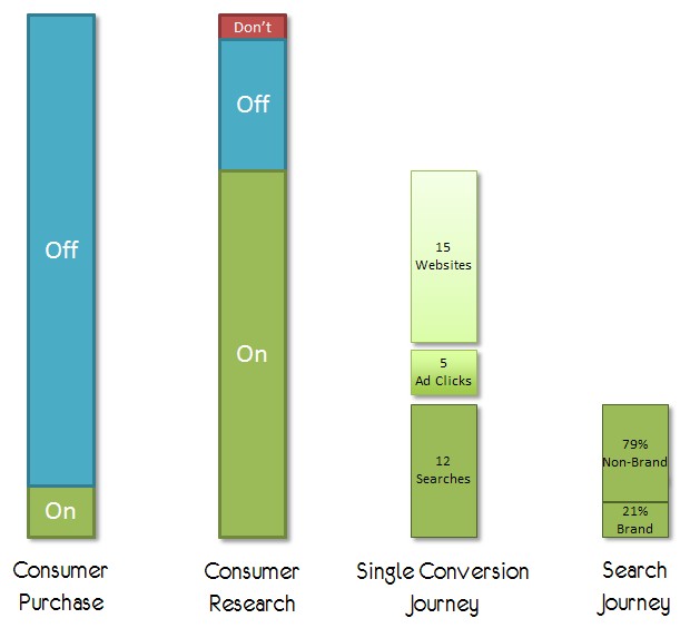
Ironically by having fewer numbers I feel this works even better. The relative proportionality of the boxes is more than sufficient to communicate the point.
I’ve used colors to highlight the three strands of data (teal, green and red). And then shades green to communicate the sub-strands of the digital story.
As digital is always held to a higher standard (and an unreasonable one compared to TV/Mags/Radio), I include the numbers in the sub strands.
There is enough air gap between the elements that each can stand on its own (avoiding the problem with my clean Tetris table above), and yet the colors help your eyes flow nicely from left to right as you pick out the key data segments.
Awesome, right?
Amazingly sometimes you do all this work just for yourself.
In this particular use case I knew going in that it would be impossible to use the above PowerPoint version of the visualization because very little real estate was available in a dashboard. I knew that we would have to go with the table.
Still, the five minutes spent thinking about the problem and five minutes spent in creating it was time well spent – it exercised the brain and it helped me ensure I understood the story well enough.
What do you think? Does the PowerPoint version work for you?
Six Quick, Simple, Data Presentation Tips.
If you want to communicate for impact, in time-compressed situations or when you are not presenting the data yourself, I would like to offer the following six tips for your consideration:
1. You need to ensure that you are not presenting a riddle, wrapped in a mystery, inside an enigma .
It is your job to unwrap the data and the insights and present them as logically and with the simplest flow possible.
2. Consider these two questions: “What is the macro story here?” “What are the sub strands?”
The answers will be illuminating.
3. Every row, every column, every number you present will contain a message. Use this power.
Send a message with what goes first, what goes next, what’s metaphorically underlined.
4. Good analysts are great assassins. They are great at finding lame metrics and dimensions and assassinating them.
I was genuinely sad that the only thing I could kill above was the number of days. If I had a bit more time or context, I would have killed at least 3 more metrics (I can see them now!).
5. Sometimes you don’t have a choice, but whenever you have a choice use a visualization – even if a simple one created in PowerPoint – and not a table.
6. It might not have been completely obvious above, but in this case I knew about the business situation, the marketing landscape, and the platforms the data was describing. Data presentation and visualization is always easier if you actually understand the business, because you are trying to simplify and communicate what you already know well.
That is the primary reason I’ve consistently said that great Analysts are good at marketing, they are good at understanding the business.
I hope that you see that it does not take a long time to take something complex and create a simple, logical, and yet powerful story about the key points you are trying to communicate. That way, even if you are not there to explain the data, the person at the other end will likely understand most of the story. If your data presentation can pass that test, you win.
As always, it is your turn now.
Do you have quick and simple tips you would add to my list above? If you got the first blue module and you had ten minutes, would you go down the same route as I did? Perhaps a different one? Of my three table attempts, would you have ended up back with table one? Which of the 11 metrics would you have assassinated? Got an example of complexity to simplicity that you might be willing to share with us?
Please add your stories, tips, critique, kudos via comments below.
Thank you!