Skeuomorphism is a fancy word for a visual design technique. But many designers misuse skeuomorphism when they use it for aesthetics instead of function.
When designers apply skeuomorphism to an interface the interface mimics a real-world object’s appearance. However, it doesn’t add anything useful to the user experience. A skeuomorphic interface needs to also mimic a real-world object’s function. Otherwise, skeuomorphism has no place for being.
Skeuomorphism is best used to convey the functional experience of an interface. This is because a user interface doesn’t need to adapt a real-world object metaphor in order for users to understand what it does.
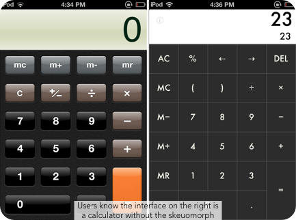
For example, a calculator interface doesn’t need to look like a real-world calculator for users to know how to use it. Users will still be able to use a non-skeuomorphic calculator just as effectively without the fancy textures.
The only difference is that one was more aesthetically difficult to design than the other. Yet the amount of time and effort the designer spent on the skeuomorphic calculator doesn’t even amount to the little gain it has on the user experience.

Skeuomorphic design is useful when the functionality of an interface mimics a real-world object. It is only then that skeuomorphism has a place in design to make the functionality rich and real. For example, this eBook reader interface allows users to turn pages by swiping the screen.
The skeuomorph that adds to this function is the page curl. When users swipe the screen, the page curls up from the corner and flips like a real book. Skeuomorphism wasn’t just used for appearance, but rather it was used to convey the functional experience of the interface.
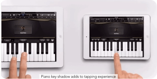
Another good use of skeuomorphism is this piano interface. Users tap the screen to play the piano. This interface’s function matches the real-world object of the keys on a piano. The size, shape, color, texture and physics of real piano keys are felt when users tap the piano keys on the interface.
When a user taps the piano key, the interface displays a shadow on the key that gives users the feeling that they are pressing down on the piano key. The interface’s functionality matches the real-world object of a piano, and the skeuomorphic design conveys the functional experience.
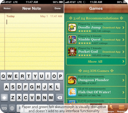
Poor uses of skeuomorphism are found on interfaces that only look like, but do not function like the real-world object it’s mimicking. Some users find these type of interfaces tacky and visually disruptive. These two skeuomorphic interfaces mimic paper found on notepads and green felt found on poker tables.
The skeuomorphic textures lend nothing useful to the functional experience of the interface. They’re not necessary for users to understand how the user interface works. Without the skeuomorphic textures, the user gets a clearer view of the content without getting distracted by the visual noise.
Functionality is important in skeuomorphic design. Skeuomorphism can only enhance the user experience when an interface actually functions like a real-world object. Not all interfaces will have functions that merit the use of skeuomorphism.
Designers should never use skeuomorphism as a crutch for creativity or an opportunity to flex their design skills. A skeuomorphic interface may seem appealing at first, but if it doesn’t add to any type of interface function, its appeal won’t last. Instead, it’ll look fake, tacky and visually disruptive to users who can see through the glitz after using the interface for a while.
Affiliate
