How easy is it for users to scan your form? If your form is hard to scan, it could take longer than expected for users to complete it. This leads to form abandonment and loss of potential sign ups. The way to avoid this is to make your fields quick to scan when users first see them and after they fill them out.
Scanning Pre-fill & Post-fill
When users first see a form, they scan it to size up the amount of time and effort it’ll take to fill it out. If they can’t scan it quickly, they’ll feel like it’s going to take too much time and effort and move on.
After filling out a form, users will scan it again to check if their input is correct. If your fields aren’t easy to check, users could fear submitting the wrong information and abandon the form.
To prevent form abandonment, you have to make your fields quick to scan pre-fill and post-fill. The quicker they are to scan, the less overwhelming your form will feel. The less overwhelming your form feels, the more it motivates users to complete it.
Problem with Most Forms Today
Most designers today align their form field labels in a way that takes time and effort to scan.
The two most common ways are:
- Top aligned labels
- Infield labels
While both are quicker to scan than left aligned labels, users still experience scanning issues.
Many Visual Fixations

In the top aligned form above, there are only 4 fields. But when you scan the form, it feels like there’s more to fill out. This is because there are 8 distinct elements that users have to scan.
The labels and fields are individual elements separated by whitespace. As a result, users process these elements with 8 separate visual fixations. The extra visual fixations give users more scanning to do, and makes them feel like there’s a lot to fill out.
Rows of Whitespace

Top aligned labels require rows of whitespace to group labels and fields. But these rows of whitespace act as invisible barriers that interrupt the user’s scanning flow. Users won’t fixate on them for a long time, but they’ll still get short unnecessary fixations.
The more fields you add, the more the form length grows. But with top aligned labels, the form length can grow a lot faster. Not only do the fields take up space, but the rows of whitespace add to the length even more.
Slow Checking Flow
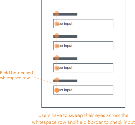
When users finish filling out the fields, checking their input isn’t quick to do either. Users have to sweep their eyes up and down from label to input to see if they match up. The whitespace row and field border gets in the way of their visual path and slows their flow down.
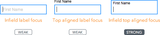
Infield Labels
Fairly Quick Pre-fill Scan
The other common way designers align form labels is by placing them inside the field. The upside of this method is that users won’t feel like there are more fields than expected to fill out. This is because the field and label are one element. When users fixate on a label, they also fixate on the field, leaving no extra visual fixations.
Sometimes the color contrast on infield labels can look too faint. Infield forms that use light gray text for their labels can make them harder to read and slower to scan.
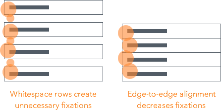
Infield labels can also have rows of whitespace that create unnecessary visual fixations. But you can prevent this by aligning the fields edge-to-edge with each other, whereas on top aligned forms you cannot.
Slow and Painful Checking
The downside of infield labels is that it makes it impossible for users to scan and check their input before they submit the form. This is because the label disappears when the field contains user input.

Users have to delete their input to see the label again. But if they do, they can’t even compare because their input is gone. This forces them to have to use their memory to recall the labels for each field.
Infield labels not only create unnecessary physical work, but also unnecessary cognitive work. This can cause user frustration that leads to form abandonment.
Introducing Infield Top Aligned Labels
The ideal form is quick to scan before and after the user fills it out. Users need to feel that the form won’t take much of their time and effort. They also need to feel certain that they’re submitting the correct information. When your form meets both these needs, the chances of users completing it are high.

Minimal Visual Fixations
It’s clear that top aligned and infield labels aren’t the quickest and easiest to scan, but what’s a better approach? The better approach is infield top aligned labels.

Infield top aligned labels require as few visual fixations as possible when scanning. Each field contains both the label and user input. When users scan a field, their fixations hit the label and input at the same time. The close proximity and lack of visual barriers allow users to process each field quicker.
Lean and Compact
Infield top aligned forms take up as little space as possible. The fields align flush to each other in a grid, removing the rows of whitespace that cause extra fixations. This creates a lean and compact form that focuses the user’s eye movements in a concentrated area.
The grid’s efficient spacing also creates stronger association between relevant fields. The side by side placement of relevant fields (e.g. first & last name) allow users to focus on filling out the form row by row. Users don’t need to sweep their eyes in different directions because it’s the same pattern throughout the form.
Easy Input Checking
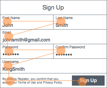
Checking user input is quick and easy. The labels don’t disappear like on infield forms, and there are no visual barriers like on top aligned forms. Instead, one visual fixation per field is all it takes to compare label and input.
The text styling also helps users check their input quicker. By making the input text bold and larger, and the label text smaller, users can distinguish them at a glance.
Stronger Field Focus
When users select a field on top aligned forms, the field highlights, but not the text label. When users select a field on infield forms, the field highlights, but the text label can disappear or turn faint.
Infield top aligned labels give users the strongest field focus. The highlight border surrounds the field, label and input altogether. Users get a clear view on what field they’re on, and what they’re typing at all times.
The strong field focus is even more important on mobile where users look at the keypad when they type. After they’re done typing, they’ll look back up to the form to check if they typed their input right. The field and input are quick to spot because they’re highlighted together.
Guiding Form Grid
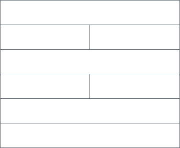
Grids are often used in design to guide element placement. Infield top aligned forms offer a form grid that help guide field placement. Since the width of the your fields will dictate the width of your form, it’s easy to figure out which fields belong next to each other.
The form grid creates itself when you stack and align fields into equidistant rows. This gives the form its compact and uniform look. Each field should have enough height to fit both the label and input text. You can divide a row into as many fields as needed, as long as the row’s width is equal to the others.

The field should not only be able to hold text, but other form elements as well. Your fields should have enough space to fit radio buttons, checkboxes and select menus if needed. All form elements become apart of the grid.
Paper Form Metaphor
Most tech-savvy users can recognize form fields when they see them. But older, less tech-savvy aren’t used to interacting with online forms. Infield top aligned forms resemble the look of paper forms. This can help those users feel more comfortable filling them out.
Infield Top Aligned Form Examples
Facebook’s sign up form looks overwhelming at first glance. It doesn’t encourage users to fill it out and it’s a pain to check your input. Turning it into an infield top aligned label form makes it easier to look at and more inviting to fill out.

Even with only 4 fields, Square’s sign up form takes work to scan. Turning it into an infield top aligned form makes it quicker to scan and encourages users to fill it out.

Infield top aligned labels don’t just work on short, simple forms. It also works on complex forms with multiple sections. Treehouse’s long sign up form has multiple sections and many elements. Turning it into an infield top aligned form not only makes the form lean and compact, but it also makes each section clearer.

When Top Aligned or Infield Labels Might Work Better
Not every form needs quick scanning for better conversion. Top aligned and infield forms still have a place in certain situations. Sometimes you need a form that’s simple to implement. Top aligned labels would suit you better in this case because you don’t have to worry as much about field sizing or label aligning.

Sometimes you’re working with a form that has very few fields, such as logins and newsletter boxes. Infield labels work best in these situations because there aren’t a lot of labels the user needs to recall. These forms almost always have the same field pattern that users can expect (e.g. username & password).
Different situations call for different methods. But when scanning speed and conversion are most important, choose infield top aligned labels.
Final Thoughts
Most websites today either use top aligned or infield form labels because they aren’t aware of a better way. But now there is one. With infield top aligned labels, users won’t feel discouraged or overwhelmed when they first see your form. Nor will they have trouble checking their input.
You meet user expectations and decrease form abandonment when your form is as quick as possible to scan. A successful form doesn’t just reduce the work users have to do with their fingers, but also the work they have to do with their eyes.
Affiliate
