Designing a pleasant user experience requires attention to detail. But there are so many aspects of design that it’s hard to remember them all.
Here are a few small, but important user experience details that most websites miss. Missing these details can frustrate users and lead to website abandonment. Make sure your website handles each of these the right way.
Mark Visited Links with a Different Color
Visiting links on a web page is sometimes a frustrating task for users if the website doesn’t mark the links the user has already visited. Being able to see the links they’ve visited prevents them from accidentally clicking the same link twice. With so many links on a typical web page, it’s hard for users to remember what they have clicked on and what they haven’t, unless the visited links are clearly marked.
Make it clear to users by marking visited links with a color that’s different from the original link color. Use a color that has a similar hue to your original link color, but with slightly faint effect. For example, violet is a good color for highlighting visited links because it has a washed out effect on the blue, giving users the impression that the link has already been used and touched.
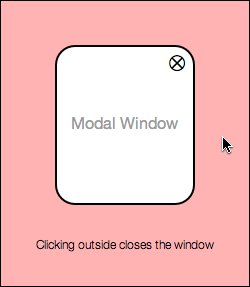
Close Modal Windows When Users Click Outside It
Modal windows are commonly used among different websites. Many of them have an ‘X’ button in the corner of the window that users use to exit the window. However, this ‘X’ button is not an easy enough escape route for the average user. When users want to exit a modal window, many of them instinctively click the background to get back to their original screen.
When your modal window forces users to have to click the ‘X’ to leave it, it makes exiting difficult for the user. It takes more time and effort to click the ‘X’ because it’s smaller in size and the user has to spot and target it with their mouse. Instead, allow users to exit the modal window when they click the background area outside of it.
Set Keyboard Focus to First Text Field When Form Displays
When users see a form on their screen, they know they will have to switch from their mouse to their keyboard. Make it easy for users to fill out your form by setting the keyboard focus to the first text field. This way they can move their hands straight to their keyboard without having to target and click the first text field before they begin typing. Instead, all they have to do is begin typing.
![]()
Make Pressing the “Enter” Key Submit the Form
Another detail websites miss on forms is allowing users to submit the form by pressing the “enter” key. By enabling this shortcut, users can submit forms faster and easier. This is especially important for login forms, where users have to type their username and password often and hit the login button. Forcing them to have to target and click the button every time can annoy users and slow them down.

Put Tool Tips on Icons to Describe Their Action
Icons are an elegant way to describe specific actions on a website. However, not all users will intuitively understand what action an icon represents. It’s important to show tool tips that describe an icon’s function when the user hovers their mouse over it. This allows first time users to get used to what the icons mean without having to guess and make mistakes clicking the wrong icons.
![]()
Put a Link Back to Home Page on Blog Page
Many websites have a specific page dedicated to blogging. Sometimes websites will use a subdomain (blog.website.com) for a customized WordPress blog. One small detail that websites miss is linking the blog back to the home page. It’s annoying if there’s no link to the home page and users have to clear the address bar and type the home page address to get back to it. A simple link pointing back to the home page is all that’s needed, but many websites miss this.
![]()
Display Larger Images When User Clicks to Enlarge
Sometimes websites will have images that users can click to enlarge. Some websites make the mistake of displaying the same size image on a different background when the user clicks the thumbnail. Users expect a larger image, so they should get an image that’s more than slightly larger than the thumbnail they clicked on. Putting the image on a dark background won’t help users much if the size of the image doesn’t actually change.

Allow Users to Edit What They Post
Websites that allow users to post comments or content need to remember that users aren’t perfect and can make mistakes when posting. Many websites don’t offer users a way to edit the content they post. This can frustrate users who make posting mistakes, such as selecting the wrong section, linking to the wrong URL or spelling something wrong. A simple edit function allows users to correct their mistakes so that other users on the site can view and enjoy the content they post in the best light.

Don’t Use “Sign In” and “Sign Up” Together
The words “sign in” and “sign up” are commonly used on websites. However, using them together can cause a cognitive clash in the user’s thinking, and make them click the wrong one. This is because they both have the word “sign” in them, which makes it unclear the differences in their function.
Instead of using “sign in” and “sign up” together, choose to use one or the other. Then use an alternative phrase for the one you choose not to use. For example, another way of saying “sign in” is “log in”, and another way of saying “sign up” is “create account”.
![]()
The difference between a lackluster and pleasant user experience is all about the details. Many websites miss these details and users suffer because of it. Paying attention to these small details won’t necessarily make your website a huge success, but it’ll certainly make users appreciate the care you put into your website, and how easy it is to use.
Affiliate
